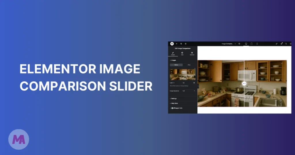
Static side-by-side images don’t do your work justice. A photo edit, a home renovation, a product transformation, they all deserve better than two pictures sitting next to each other. An elementor image comparison slider fixes that. Visitors drag a handle across the image to reveal the before and after versions themselves, and that bit of interaction keeps them on your page longer.
I’ve been using the Master Addons Image Comparison widget on client landing pages, and it consistently gets more engagement than static screenshots. This tutorial covers setup, customization, and a few things worth knowing before you publish. The free Elementor before/after slider widget is part of Master Addons, it sits inside Elementor’s panel like any other widget, and you can have it running in about two minutes.
What this guide covers:
- What an image comparison slider is
- Who needs a before/after slider
- What you get with the free widget
- How to create one (step by step)
- Tips for a better comparison
- Troubleshooting common problems
- Master Addons vs. alternatives
- Why Master Addons
- Get started
- Frequently asked questions
What Is an Image Comparison Slider?
An image comparison slider layers two images on top of each other with a draggable divider between them. Users slide it left and right (or up and down) to reveal one image over the other. You set a “before” image and an “after” image in the editor, and the widget handles the rest.
You’ve probably seen these on photography portfolios, dental websites, or real estate pages showing renovation projects. Instead of passively looking at two separate photos, visitors physically interact with the comparison. That interaction increases time on page, which helps your SEO and pulls down bounce rates.
Who Needs a Before After Slider in Elementor?
Anyone who wants to show a transformation. These are the use cases I run into most often:
Web Designers and Agencies
Website redesigns look great in a comparison slider. Letting a potential client drag between the old and new design builds more trust than a flat screenshot ever will. You can pair this with the Image Hover Effects widget if you want extra visual variety on portfolio pages.
Photographers and Photo Editors
Probably the most natural fit. If you do retouching, color grading, or restoration work, an image comparison slider lets potential clients see exactly what you can do. Raw file on the left, edited version on the right. Says more than any caption could.
E-commerce Stores
Selling skincare, cleaning products, or anything with visible results? A before after image comparison on your product page is more convincing than a paragraph of copy. I’ve seen this work particularly well for cosmetic and home improvement products where the visual difference is dramatic.
Real Estate and Architecture
Renovation projects are a natural match. Take a photo before the work starts, take another when it’s done, drop both into the comparison widget. Your portfolio gets more interactive, and visitors tend to spend more time browsing your projects.
Digital Marketers
Analytics dashboards, ad performance, website traffic charts. Show the “before working with us” and “after working with us” results with a drag-to-compare slider. Works better than pasting two screenshots into a case study.
Master Addons Image Comparison Widget: What You Get
There are several ways to add a before after slider in Elementor. Some require standalone plugins, some need custom code, and some are locked behind premium addon subscriptions. Master Addons includes the Image Comparison widget in the free version. Worth noting because most competing addons (Ultimate Addons, PowerPack, The Plus Addons) put this feature behind a paywall.
The widget includes:
- Native Elementor integration: Drag and drop from the Elementor panel. No shortcodes, no separate settings page. Install from the WordPress plugin repo and it shows up in your widget list right away.
- Free to use: The image comparison widget is part of the free version. No Pro license required.
- Handle control: Mouse drag and swipe in the free version. Mouse Move (hover) and Mouse Click handles come with Master Addons Pro. Both horizontal and vertical comparison orientations are supported.
- Custom labels: Change the “Before” and “After” text to anything you want, in any language. Label colors, typography, and positioning are all adjustable.
- Responsive: Works on desktop, tablet, and mobile. Touch and swipe gestures work on mobile devices.
Master Addons has 80+ widgets and extensions total. The image comparison widget is one that comes up a lot in landing page and portfolio projects.
How to Create a Before After Slider in Elementor (Step by Step)
Before you start, you need both Elementor and Master Addons installed and activated. Both are free. Go to Plugins > Add New, search for each plugin name, install, and activate.
Step 1: Enable the Image Comparison Widget
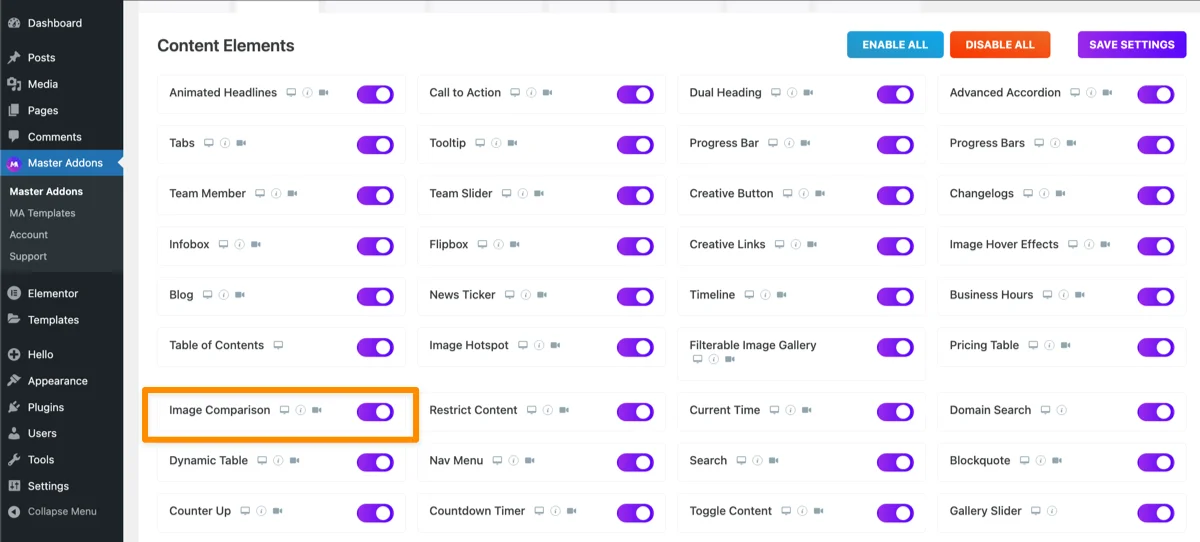
The Image Comparison widget is enabled by default. If you’ve turned off some widgets to keep your panel lean, check that it’s still on. Go to Master Addons > Addons & Extensions in your WordPress dashboard and confirm Image Comparison is toggled on. The Image Comparison documentation has the full setup details. While you’re in that dashboard, you might notice other widgets worth turning on, like Animated Headline or Gallery Slider.
Step 2: Open a Page in Elementor
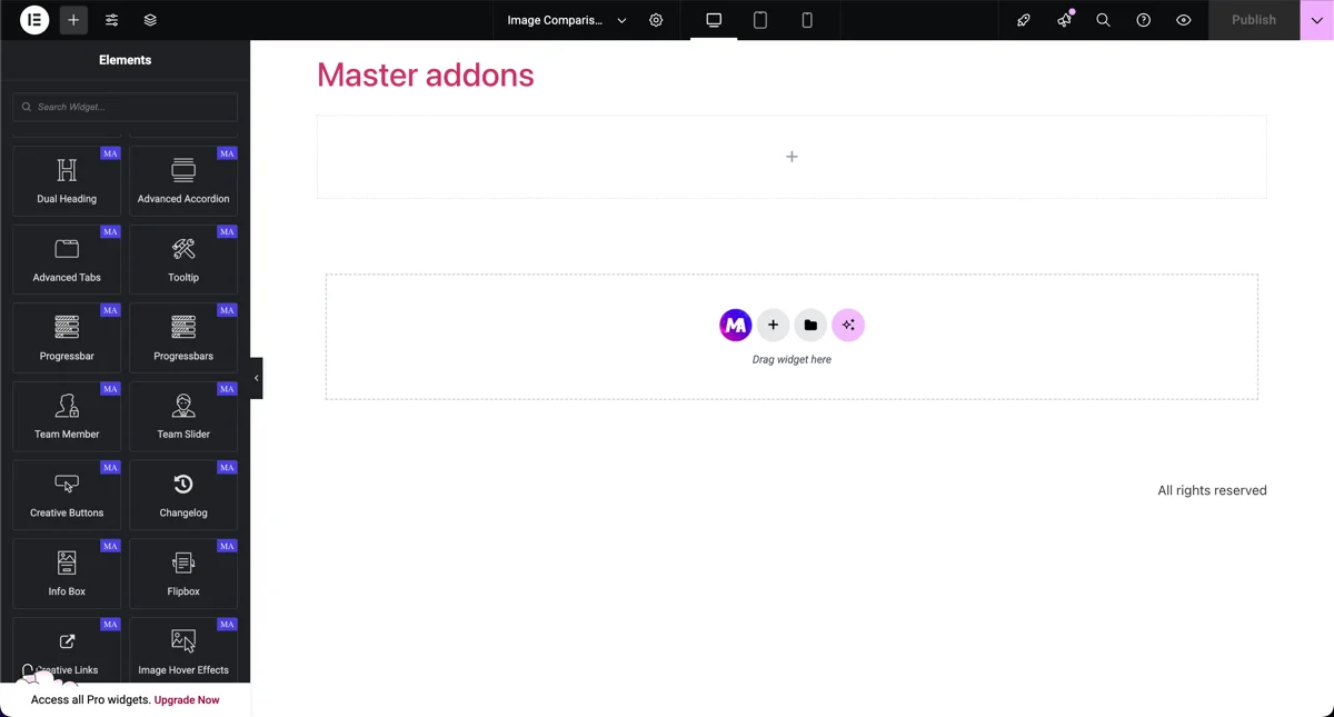
Create a new page or open an existing one with Elementor. I’ve created a fresh landing page for this tutorial, but the comparison slider drops into any existing page the same way.
Step 3: Add the Image Comparison Widget
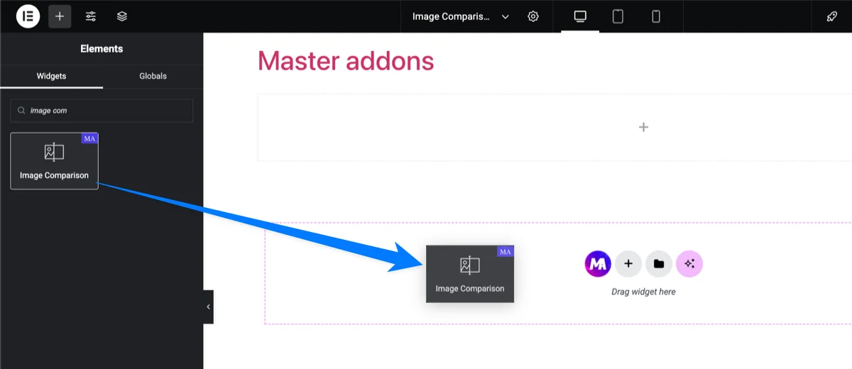
In the Elementor panel on the left, search for “Image Comparison” (you’ll see the Master Addons icon next to it). Drag the widget into your page wherever you want the slider to appear.
Step 4: Upload Your Before and After Images
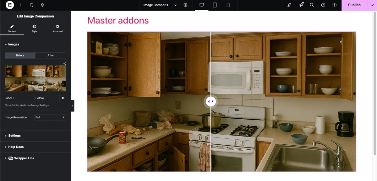
Click the widget and you’ll see two image upload fields: one for the before image, one for the after image. Upload both, and the preview updates immediately with the divider handle in the center.
Quick heads-up: both images should be the same dimensions. If one is 1200×800 and the other is 900×600, the layout will look off. Crop them to the same size before uploading. This trips people up more than anything else.
Step 5: Customize the Label Text
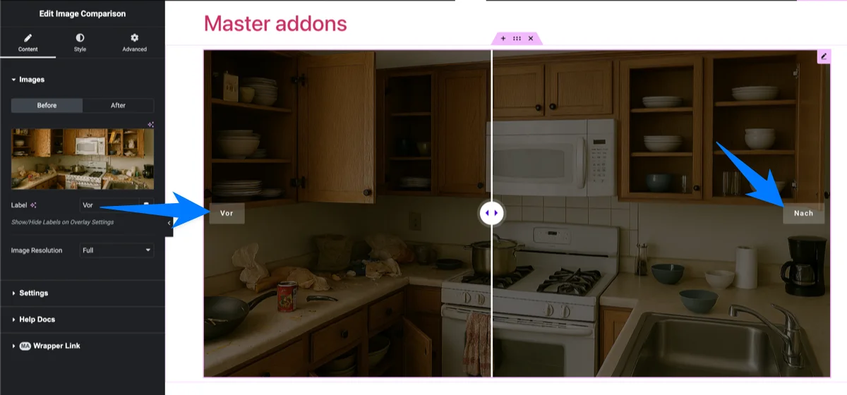
The default labels say “Before” and “After,” but you can change these to anything. Selling a product? Use “Without” and “With.” Showing a renovation? Try “Day 1” and “Finished.” The label fields accept any text, including non-English characters, so localization isn’t a problem.
Step 6: Configure Slider Settings
In the Settings section of the Content tab, there are a few more options worth adjusting:
- Orientation: Switch between horizontal (left/right) and vertical (top/bottom) comparison. Horizontal is the default and works for most cases.
- Visibility Ratio: Controls where the divider starts. Set it to 50% for a centered split, or shift it to show more of one image initially.
- Overlay: Show or hide the overlay layer that holds the Before and After labels. Its color is set in the Style tab.
- Move Handle: Mouse Drag/Swipe is free and works on desktop and touch screens. Mouse Move (the handle follows the cursor) and Mouse Click are Pro options. Mouse Move feels fluid on desktop, but touch screens have no hover, so keep Drag/Swipe if much of your traffic is mobile.
Choosing Orientation for Tall or Wide Photos
Horizontal (left and right) suits wide landscape shots such as rooms, websites and street views. Vertical (top and bottom) usually reads better for tall or portrait images, because a narrow left and right strip does not show enough of a tall photo at once. Set a fixed Image Resolution on both the Before and After tabs so the two images load at the same size.
Step 7: Style the Slider
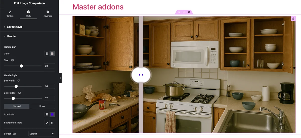
Switch to the Style tab for visual customization. You can change the handle bar color and size, style the handle box, add a border and padding around the comparison container, and adjust label color, typography, border and spacing. Border Radius and Box Shadow on the container are Pro options. Spend a couple minutes here to match your site’s design. There’s enough control that you won’t end up with a generic-looking slider.
Hit Publish and your before after slider is live. About two minutes from start to finish, assuming your images are ready.
Tips for a Better Image Comparison
The widget handles the technical side, but the comparison itself is only as good as your setup. A few things I’ve picked up from building these on client sites:
Match Your Image Dimensions
I mentioned this already, but it’s the mistake I see most often. If your before image is 1920×1080 and your after image is 800×600, the slider will force them to align and the result looks distorted. Crop both images to the exact same pixel dimensions before uploading. Every time.
Keep the Composition Similar
Take both photos from the same angle, same distance, same framing. If your before photo is a wide shot and the after is a close-up, the contrast doesn’t land the way you want. The slider looks best when the only difference between the two images is the actual change.
Center the Transformation
Put the most visible change near the center of the image. That’s where the divider starts, so it’s the first thing people notice when they interact with the slider. If the change is off to one side, adjust the visibility ratio to draw attention to it.
Don’t Overdo It
One strong comparison per page section is enough. I’ve seen pages with five or six sliders stacked on top of each other, and it waters down the impact. Pick your best before-and-after pair and feature that one. If you have multiple comparisons, organize them in a Filterable Image Gallery or Image Carousel instead.
Add a CTA Nearby
If the comparison sits on a sales or portfolio page, drop a call-to-action button right below it. Someone who just dragged through an impressive transformation is already engaged. A “Get a Free Quote” or “Shop Now” button right there tends to convert well.
Troubleshooting: When the Slider Isn’t Behaving
Most setups just work, but a few things trip people up. Here’s how to fix the ones I get asked about.
- The slider isn’t showing up. Nine times out of ten the widget got disabled. Go to Master Addons, then Addons and Extensions, and confirm Image Comparison is toggled on. If it’s on and still missing, clear your cache (LiteSpeed, WP Rocket, or Cloudflare) so an old copy of the page stops serving.
- The handle won’t drag. This is almost always a JavaScript conflict or a caching plugin that combined or deferred the widget’s script. Exclude Master Addons scripts from JS combine and defer, clear the cache, and test again.
- The two images look stretched or misaligned. They’re different dimensions. Crop both to identical pixel dimensions and re-upload, this is the single most common cause.
- It works on desktop but not on mobile. Check that no parent container has an overflow-hidden style clipping the touch area, and that nothing is sitting over the slider catching the swipe. Touch works out of the box, so a swipe failure is almost always a layout or z-index issue.
- The before and after labels are cut off. Shorten the label text or reduce the label font size under the Style tab; very long labels can spill outside the image on small screens.
If none of these fix it, post the details in the Master Addons support forum with your theme and active plugins, it’s usually a conflict that’s quick to pin down.
Image Comparison Widget vs. Alternatives
A quick look at how Master Addons compares to other wordpress image comparison slider options for Elementor:
| Feature | Master Addons | Ultimate Addons (UAE) | ElementsKit | PowerPack |
|---|---|---|---|---|
| Free image comparison widget | Yes | No (Pro only) | Yes | No (Pro only) |
| Horizontal + vertical | Yes | Yes | Yes | Yes |
| Custom label text | Yes | Yes | Yes | Yes |
| Mouse hover mode | Yes | Yes | No | Yes |
| Visibility ratio control | Yes | Yes | No | Yes |
| Mobile touch/swipe | Yes | Yes | Yes | Yes |
| Total widgets in addon | 80+ | 40+ | 90+ | 60+ |
The big difference is free availability. If you don’t want to pay for a Pro addon just to get a before-and-after slider, Master Addons and ElementsKit are your options. Master Addons also includes text overlay techniques and image hover effects in the free tier, so you get a wider set of image tools without upgrading.
Why Master Addons for Your Image Comparison?
The image comparison widget is one of 80+ elements and extensions in Master Addons for Elementor. A lot of users install it for one widget and end up using several others on the same project. That’s how I got started with it too.
Beyond individual widgets, you get a Theme Builder for custom headers, footers, and archive pages. There’s a Popup Builder with exit intent and scroll triggers. And a Template Library with pre-built sections you can import in one click.
V3.0.0 is noticeably faster than older versions, the plugin is actively maintained, and it’s running on 30,000+ WordPress sites. Master Addons Pro adds the Widget Builder, White Label mode, and premium support if you need those down the line.
Get Started
Setting up a before after image comparison slider in Elementor takes a couple of minutes with Master Addons. No code, no premium addon purchase, no separate comparison plugin to install. The widget is free, works with any Elementor setup, and the customization covers everything from label text to divider color.
Download Master Addons for free and try the Image Comparison widget on your next project. If you need more across your Elementor builds, check out the Pro plans.
Related reading: Elementor Image Carousel Tutorial | Elementor Filterable Gallery Plugins | 25 Elementor Text Over Image Techniques
Prefer to watch? Here’s a quick walkthrough in Elementor:
Frequently Asked Questions
How do I add a before and after slider in Elementor?
Install Master Addons (free), open your page in Elementor, search for the Image Comparison widget in the panel, and drag it onto your page. Upload your before and after images, adjust the labels if you want, and publish. Takes about two minutes.
Is there a free image comparison widget for Elementor?
Yes. Master Addons includes a free Image Comparison widget with horizontal and vertical modes, custom labels, a drag and swipe handle, and style options. Hover and click handles, container border radius and box shadow need Master Addons Pro.
What is the best before after slider plugin for WordPress?
For Elementor users, Master Addons is a solid free option with native integration and multiple control styles. If you are not on Elementor, standalone plugins like BEAF (Before After Gallery) work with Gutenberg and other builders.
How to create before and after images without coding?
Use Elementor with the Master Addons Image Comparison widget. Drag it onto your page, upload two images, configure settings from the visual panel. No code needed at any point.
Can I use image comparison slider on mobile?
Yes. The widget is responsive and supports touch gestures. Visitors swipe the divider with their finger to compare images, same as dragging on desktop.
What size should before and after images be?
Both images need to be the exact same dimensions. 1200×800 or 1920×1080 are common choices. Mismatched sizes cause the slider to force-align them, which distorts the comparison.
How do I make a horizontal and vertical image comparison?
In the widget settings, look for the Orientation option under the Content tab. Switch between Horizontal (left/right divider) and Vertical (top/bottom divider). Horizontal is the default.
Does an image comparison slider slow down my page?
Not meaningfully, as long as your images are optimized. The widget script is lightweight; the real weight is the two images themselves. Serve them as compressed WebP at the size they actually display and keep each around 150KB or less, and the slider adds negligible load time.
Why is my image comparison slider not working after I published?
Almost always caching or a script conflict. Purge your page cache (LiteSpeed, Cloudflare, or WP Rocket) and hard-reload. If the handle still will not drag, exclude Master Addons JavaScript from any combine or defer setting, clear the cache, and retest. A recently disabled Image Comparison widget in the Master Addons Addons and Extensions panel is the other common cause.