


Key Takeaways
- Elementor and Elementor Pro have no timeline widget, so an Elementor horizontal timeline needs an addon widget or a hand-built row of containers with custom CSS.
- The Master Addons Timeline widget switches from vertical to horizontal with one control, Timeline Style, found in the Content tab under the Timeline section.
- A horizontal timeline in the Master Addons widget is a carousel, and its Navigation control offers six options: Arrows and Dots, Arrows and Fraction, Arrows, Dots, Progress and None.
- Carousel Settings in the Timeline widget include a Carousel or Coverflow layout, Autoplay with a default speed of 5000 ms, Pause on Hover, Slides to Scroll, Center Slide and Loop.
- The horizontal layout works with Custom Timeline items only, because a Post Timeline built from blog posts stays vertical.
An Elementor horizontal timeline lays your dates out left to right, with a point on the line above each card and arrows to move along it. Elementor has no timeline widget of its own, so this guide uses the Timeline widget in Master Addons, where the horizontal layout is a single dropdown.
The six steps below start from an ordinary vertical timeline and finish with a working carousel. Every screenshot comes from Elementor 4.3 with the widget on a test page. If you have not placed a timeline yet, the full timeline tutorial covers the basics first.
Table of Contents
When a horizontal timeline is the better choice
Use a horizontal timeline when you have a short run of steps and limited vertical space. A vertical timeline with three cards can take more than a full screen of scrolling. The same three cards side by side fit in one row, which is why horizontal layouts show up on home pages and landing pages, while vertical ones suit long About pages.
| Factor | Horizontal timeline | Vertical timeline |
|---|---|---|
| Best length | 3 to 8 items | Any length |
| Space it needs | One row | Grows with every item |
| How visitors move | Arrows, dots or swipe | Scrolling the page |
| Typical use | Process steps, product roadmap, yearly highlights | Company history, changelog, long story |
| Source in Master Addons | Custom Timeline items | Custom items or blog posts |
A horizontal timeline is a kind of carousel. If you are unsure which of the two terms fits your design, carousel vs slider in Elementor explains the difference.
How to create a horizontal timeline in Elementor
You need Elementor and Master Addons installed, then six steps in the editor. Nothing below needs custom CSS.
Step 1: Add the Timeline widget
Open your page with Elementor, search the widget panel for Timeline and drag it onto the page. It arrives as a vertical timeline with three sample items. Leave Timeline Type on Custom Timeline, because the horizontal layout is only offered for custom items.
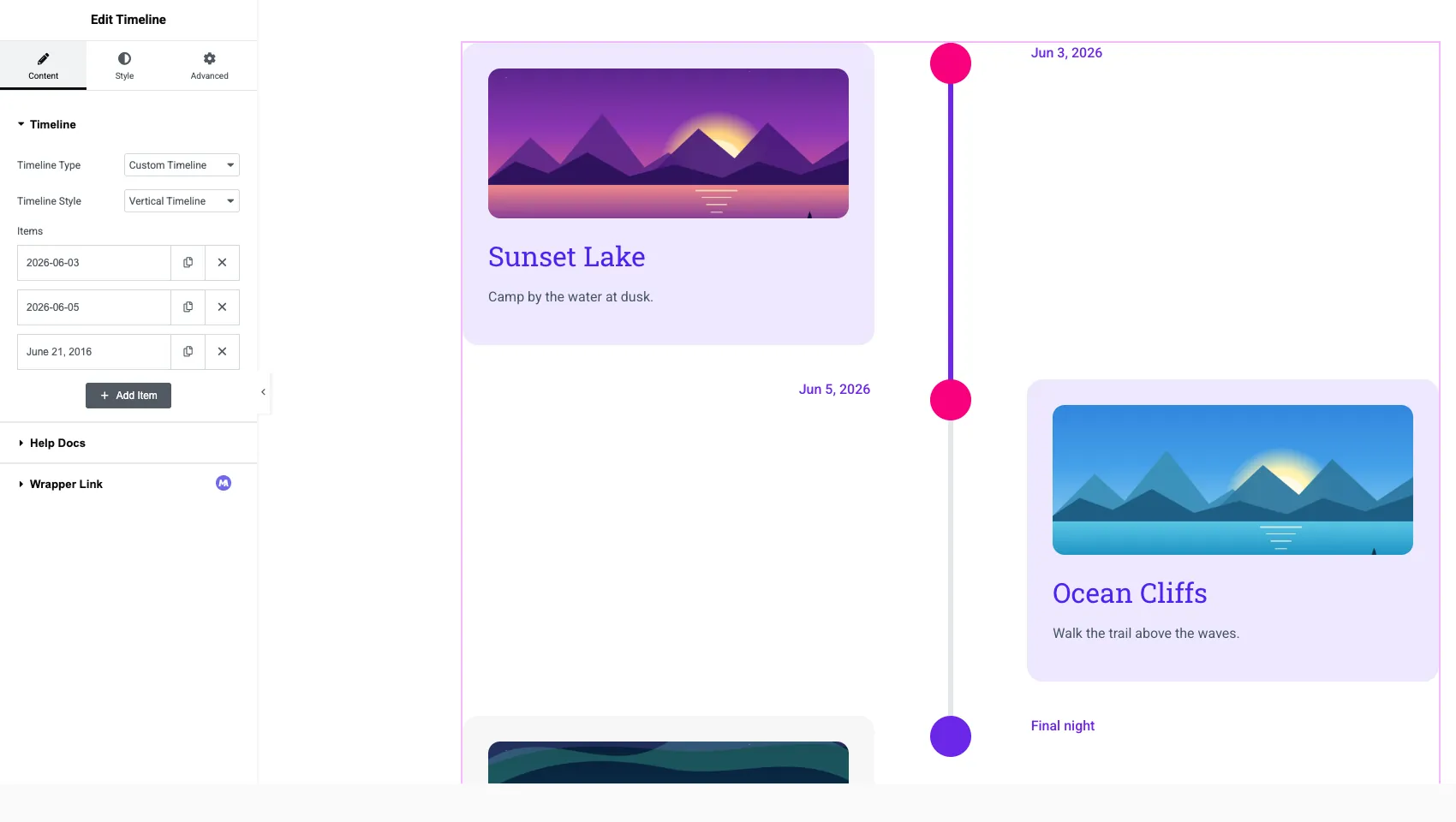
Step 2: Switch Timeline Style to Horizontal
In the Content tab, open the Timeline section and change Timeline Style from Vertical Timeline to Horizontal Timeline. The cards move into a row, the line runs across the top, and each point sits above its card with the date over it. Two new sections appear in the panel: Navigation and Carousel Settings.
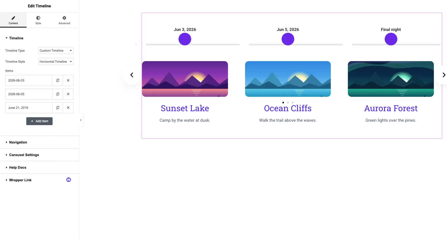
Step 3: Edit the items
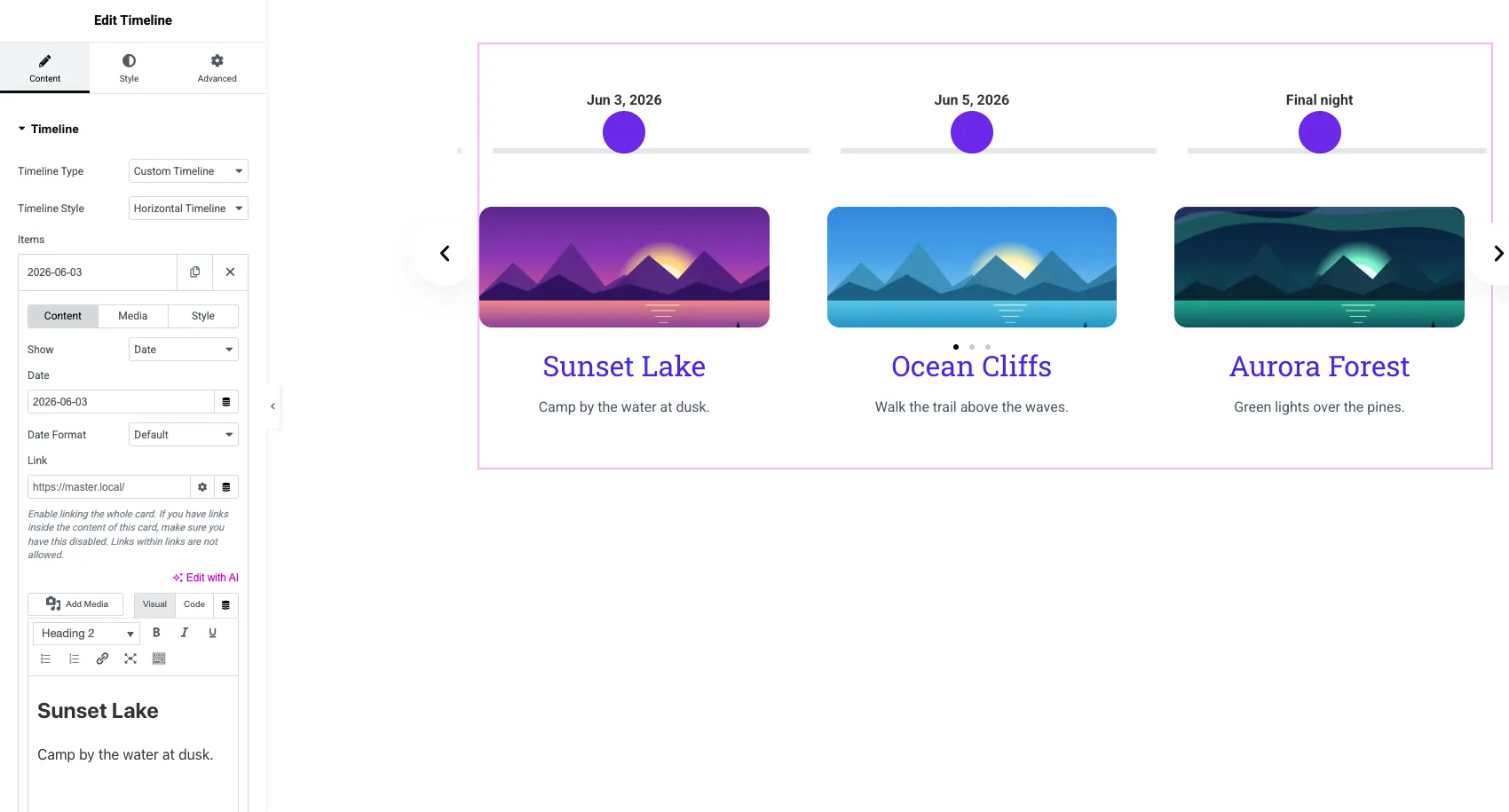
Click a row under Items to open it. Each item has three small tabs: Content, Media and Style.
- Show decides what sits above the point: a Date or a Custom Label such as “Phase 1”.
- Date and Date Format set the date and how it is written.
- Link makes the whole card clickable.
- The content editor holds the heading and the description. There is no separate title field, so the first line is the heading.
- The Media tab adds an image to the card.
Wide images work better than tall ones here. Three tall photos push the text far down the screen.
Step 4: Choose the navigation
Open the Navigation section and pick how visitors move through the timeline. The Navigation dropdown has six options.
| Navigation option | What visitors see | Good for |
|---|---|---|
| Arrows and Dots | Previous and next arrows plus a dot per slide | Most timelines |
| Arrows and Fraction | Arrows plus a counter such as 2 / 6 | Long timelines where dots get crowded |
| Arrows | Arrows only | Clean layouts |
| Dots | Dots only | Touch-first designs |
| Progress | A bar that fills as the carousel advances | Process steps |
| None | Swipe or autoplay only | Decorative strips |
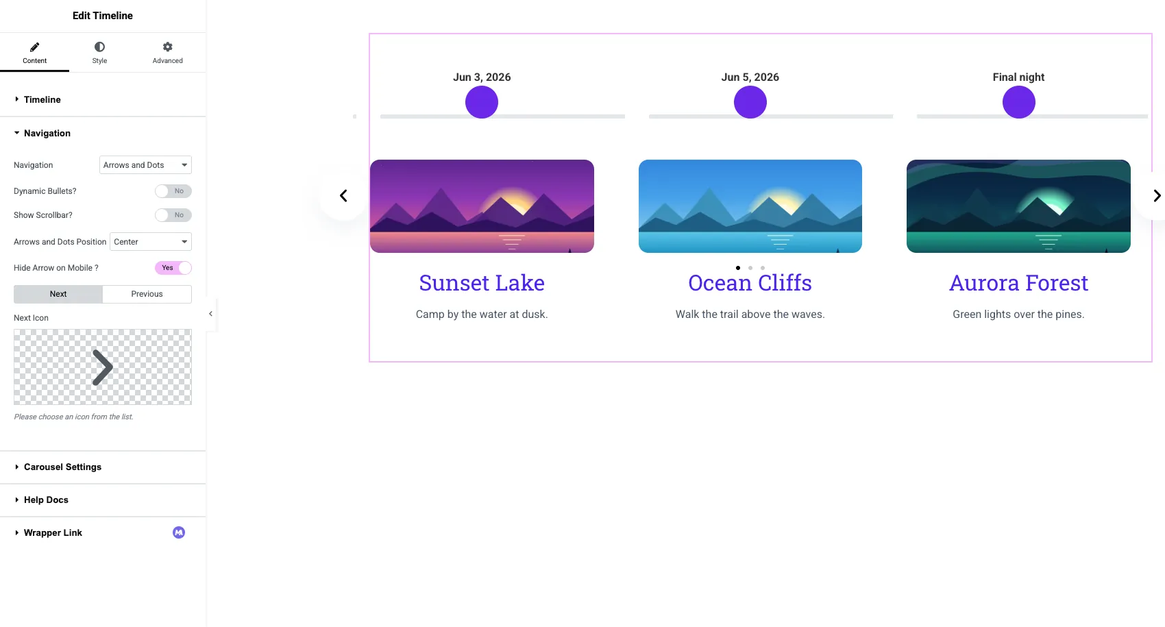
Below the dropdown you can turn on Dynamic Bullets?, add a scrollbar with Show Scrollbar?, set the position, and swap the Next and Previous icons. Hide Arrow on Mobile ? is on by default, which leaves phone visitors with swipe and dots.
Step 5: Set the carousel behaviour
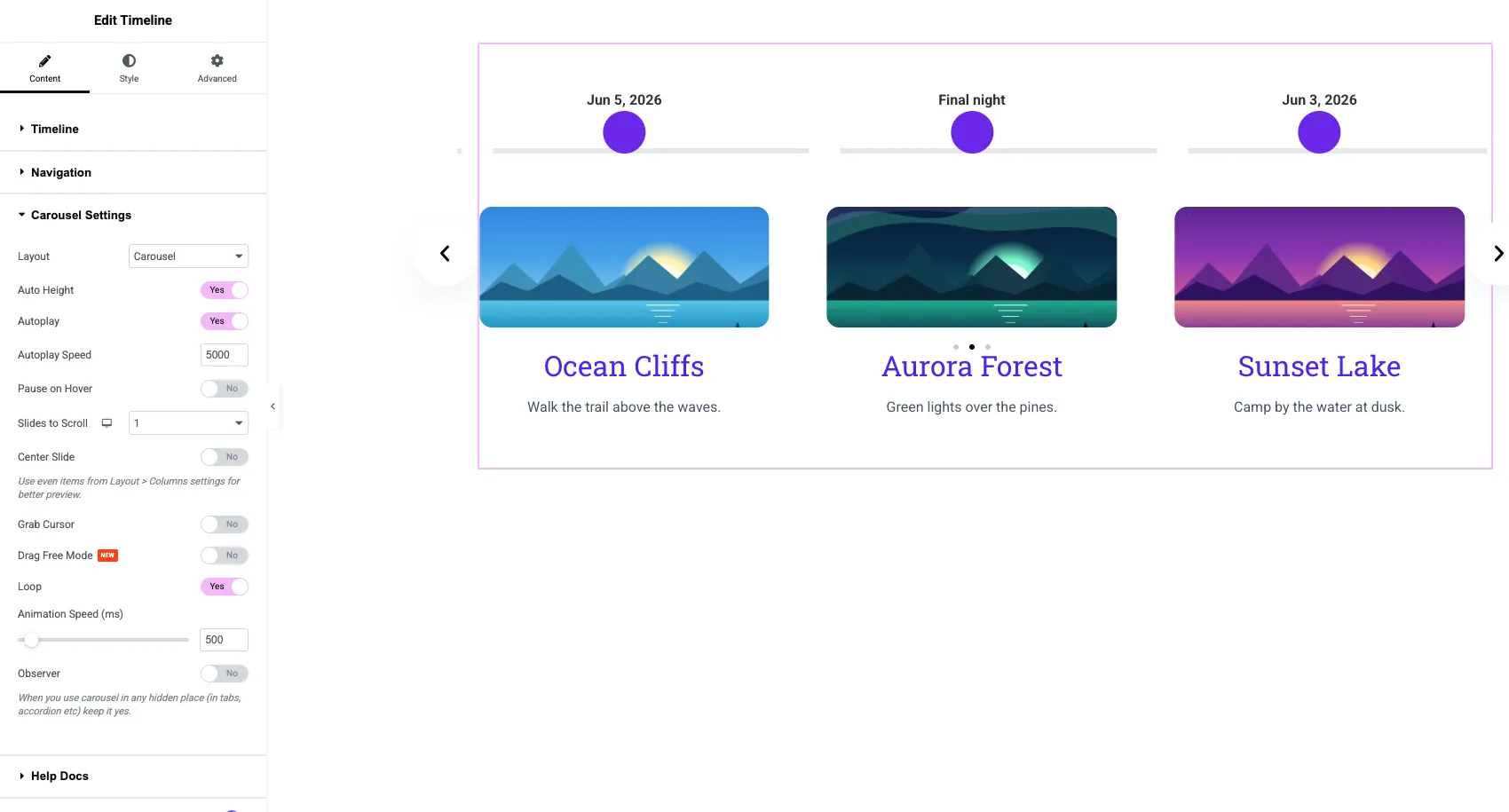
Open Carousel Settings to control how the timeline moves.
- Layout: Carousel for a flat row, or Coverflow for a 3D effect with Rotate, Stretch and Depth controls.
- Autoplay and Autoplay Speed: the default speed is 5000 ms, so a new slide every five seconds.
- Pause on Hover: stops autoplay while the pointer is over the timeline.
- Slides to Scroll: how many cards move per click, set per device.
- Center Slide, Grab Cursor and Drag Free Mode for the feel of the drag.
- Loop: returns to the first item after the last one.
- Animation Speed (ms): how long each slide transition takes, 500 by default.
For a real timeline, think twice about autoplay. Dates have an order, and a card that slides away while someone is reading it is annoying. Autoplay with Pause on Hover is a fair middle ground.
Step 6: Style the arrows, points and cards
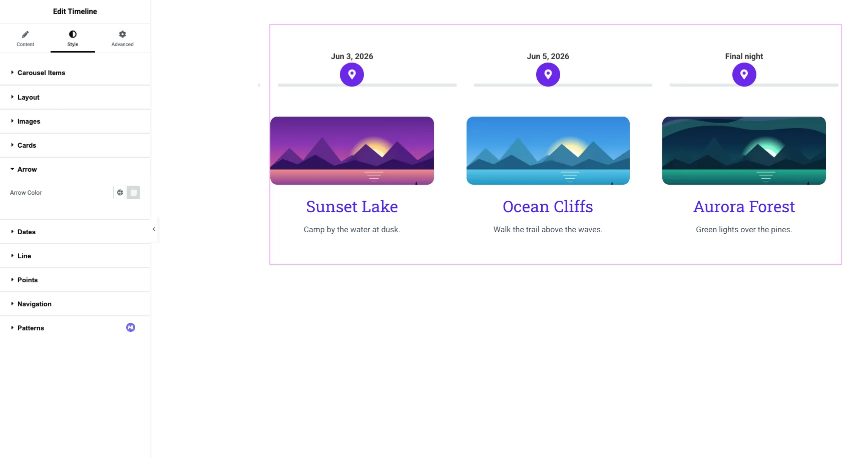
Switch to the Style tab. It has ten sections: Carousel Items, Layout, Images, Posts, Cards, Arrow, Dates, Line, Points and Navigation.
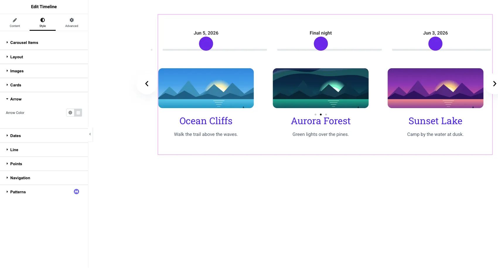
- Cards: padding, border radius, title and content colors, plus a separate look for the focused card.
- Dates: typography and color of the date or label above each point.
- Line: the track color and thickness.
- Points: a plain dot, an icon or an image, with size and colors.
- Navigation: colors and sizes for arrows, dots and the scrollbar.
Publish the page and test it on a phone. Cards per row drop on smaller screens, so check that the text still fits.
Want the vertical layout as well? The Elementor Timeline widget page lists every layout, alignment and style option in one place.
Video tutorial
This video builds a timeline from an empty page and switches it to the horizontal carousel at 3:44.
Four things that go wrong
Most problems with a horizontal timeline come from treating it like a vertical one.
- Too many items. Past eight or so, visitors stop clicking. Use a vertical timeline or split the story by year.
- Uneven card heights. One long description stretches the row. Trim the text or turn on Auto Height in Carousel Settings.
- Arrows over the first card. If the arrows sit on top of the content, change the position in the Navigation section.
- Expecting blog posts. The Post Timeline type is vertical. For posts in a row, use the Blog widget in carousel mode.
Also read: 20 Elementor slider templates, which include a timeline slider design.
Frequently asked questions
Can I make a horizontal timeline in Elementor without Elementor Pro?
Yes. Elementor Pro does not include a timeline widget either, so Pro makes no difference here. Add a timeline widget from an addon such as Master Addons, set Timeline Style to Horizontal Timeline, and the items become a carousel.
How do I add arrows to a horizontal timeline in Elementor?
Open the Navigation section in the Content tab and choose Arrows and Dots, Arrows and Fraction, or Arrows. You can then set the arrow position and replace the Next and Previous icons from the same section.
Can a horizontal timeline autoplay?
Yes. Turn on Autoplay under Carousel Settings and set the Autoplay Speed in milliseconds. The default is 5000, which is five seconds per slide. Pause on Hover stops it while a visitor is reading.
Is a horizontal timeline responsive?
Yes. It is a carousel, so it shows fewer cards on tablets and phones and visitors swipe to move. Slides to Scroll has separate values per device.
Can I show blog posts in a horizontal timeline?
Not with the Post Timeline type, which is vertical only. Add the posts by hand as Custom Timeline items, or use a post carousel.
Final thoughts
An Elementor horizontal timeline comes down to one setting and two sections: Timeline Style set to Horizontal Timeline, then Navigation with its six options and Carousel Settings for autoplay, loop and speed. Keep it to three to eight short cards and test it on a phone.
The Timeline widget page has live demos of both layouts, including a horizontal roadmap demo.
Related reading

2 Responses
The point that the horizontal layout only works with Custom Timeline items, not the Post Timeline, is easy to miss and would break a build late. Before switching Timeline Style, confirm every item is a custom one, since blog-post-driven timelines stay vertical. A practical tweak: set Navigation to Arrows and Dots, then test on a narrow phone width, because the carousel arrows can crowd the cards and the dots make swiping clearer for readers.
Thank you for sharing these helpful tips! 😊 You're absolutely right that checking the timeline item type and testing the layout on smaller screens can help avoid unexpected issues. We appreciate you pointing this out and helping other Master Addons users build better, more responsive timelines. Thanks for being part of our community!