Elementor Custom Breakpoints: Add More Device Sizes (Free Plugin)
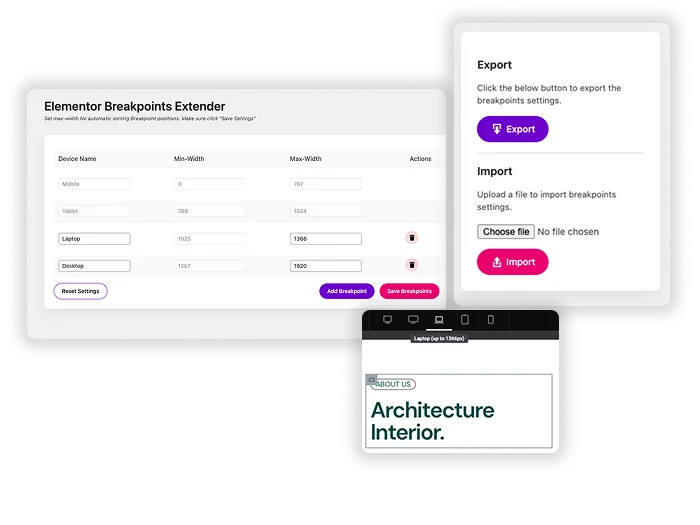
Custom Breakpoints for Elementor is a free plugin from the Master Addons team that adds your own device sizes to Elementor’s responsive mode. Elementor stops at seven device views. This plugin adds breakpoints on top of those, like a 600px small phone or a 1440px desktop, each with its own name and pixel width. The free version includes 3 custom breakpoints, and Master Addons Pro makes them unlimited. It works with or without Master Addons installed.
How to add a custom breakpoint in Elementor
First check Elementor’s own extra views in Site Settings > Layout > Breakpoints. If none of them fit, add your own:
- Install Custom Breakpoints for Elementor from Plugins > Add New and activate it.
- Open Breakpoints in your dashboard menu. If Master Addons is active, it sits under the Master Addons menu.
- Add a device, give it a name and enter its max width in pixels, for example 600 for small phones.
- Save. The plugin sorts the list and adjusts the neighboring ranges.
- Edit a page with Elementor, pick the new view in responsive mode and style your elements for it.
See it working in the live breakpoints demo, or read our guide to custom breakpoints for Elementor for more examples.

Custom device sizes with your own names
Name the device and enter its max width in pixels. The plugin sorts every breakpoint by width and works out the ranges for you, so a 600px Small Mobile view covers screens up to 600px and the next view starts at 601px. Saved breakpoints appear in Elementor’s responsive toolbar next to the built-in views.
- 3 custom breakpoints free, unlimited with Master Addons Pro.
- Breakpoints sort by width automatically, so ranges never overlap.
- A reset button to return to Elementor’s defaults, plus import and export with Pro.
Works inside Elementor's responsive mode
Custom breakpoints behave like Elementor’s own. Pick the new view in the responsive toolbar, then set font sizes, padding, column widths and other responsive values that apply only inside that range. The plugin hooks into Elementor’s breakpoint system, so the extra views show up on responsive controls in Elementor and in Master Addons widgets.
- Choose custom views from the same toolbar as Mobile and Tablet.
- Set typography, spacing and layout values for each view.
- Fix layouts that break between two of Elementor’s built-in widths.

Elementor's built-in breakpoints vs Custom Breakpoints
Elementor free and Pro share the same seven device views: Mobile Portrait (767px), Mobile Landscape (880px), Tablet Portrait (1024px), Tablet Landscape (1200px), Laptop (1366px), Desktop and Widescreen (2400px and up). Every width is editable, but you can’t add an eighth view.
| Elementor breakpoints | Custom Breakpoints plugin | |
|---|---|---|
| Price | Free | Free, unlimited with Master Addons Pro |
| Device views | Up to 7 | Elementor’s 7 plus 3 custom (free) or unlimited (Pro) |
| Names | Fixed | Your own |
| Widths | Editable | Editable |
| Import and export | No | With Pro |
For how to style each device once your breakpoints are set, read our guide to responsive design with Elementor breakpoints. To show or hide whole sections by device, use Display Conditions (Pro).

Frequently Asked Questions For Custom Breakpoints
What's a real-world example of needing a custom breakpoint?
Text and buttons that look fine at 767px can feel cramped on a 360px phone. Add a Small Mobile breakpoint at 400px, then increase the font size and button padding just for those screens. Everything wider keeps the regular Mobile styles.
Will adding many breakpoints make the Elementor editor slower?
A few extra breakpoints won’t make a noticeable difference. Each one adds another responsive value to every control, so ten or more can make the editor feel heavier. Add only the views you will actually style. Five or six in total, defaults included, is enough for most sites.
Do these custom breakpoints affect my live site's CSS and performance?
Each breakpoint adds CSS media queries to the stylesheet Elementor generates. That is a small amount of CSS, so visitors won’t notice a difference in load time.
Can I set a breakpoint for "Mobile Landscape" vs. "Mobile Portrait"?
You may not need a custom one. Elementor already has Mobile Landscape (880px) and Tablet Landscape (1200px) views that you can switch on in Site Settings > Layout > Breakpoints. Add a custom breakpoint when you need a width those views don’t cover.
Trending Elementor Widgets & Extensions
Build sophisticated websites in less time.

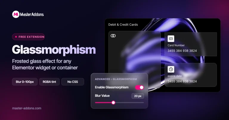
Glassmorphism

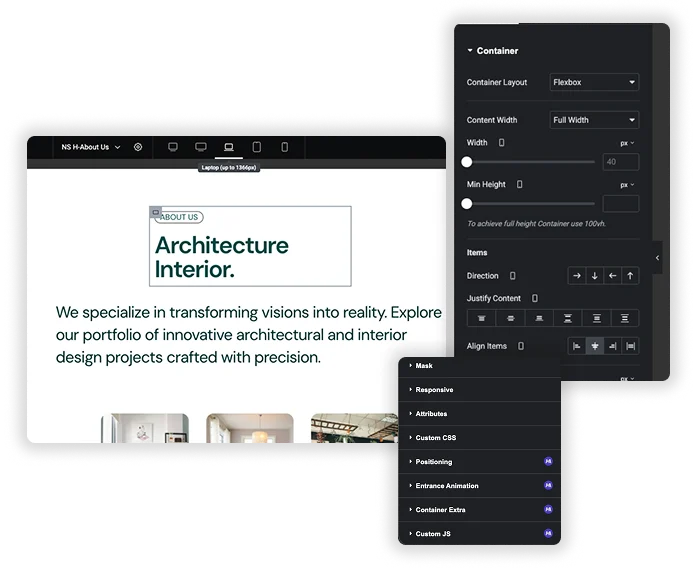
Container Extras

Patterns
![Master Addons Post/Page Duplicator extension for Elementor: MA Duplicator row link in the WordPress Pages list creating a Landing Page - [Duplicated #128] draft](https://d1asvmc6qcowgk.cloudfront.net/wp-content/uploads/2026/09/15102930/post-page-duplicator-768x403.webp)
Post/Page Duplicator