You’ve seen tooltips everywhere. Hover over a toolbar icon in Google Docs and a small label tells you what that button does. That’s a tooltip. In WordPress, tooltips let you add short hints that appear when someone hovers over (or clicks) an element on your page. No extra page real estate, no cluttered layout.
Master Addons for Elementor gives you two ways to add tooltips: the Tooltip Element, a standalone widget you drop onto the page, and the Tooltip Extension, which attaches a tooltip to any Elementor widget, section, or container that already exists. This guide covers both methods, when to use each, and how to style them.
Table of Contents
What are tooltips and why do they matter?
A tooltip is a short message that appears when a visitor hovers their cursor over a specific element on your page. On WordPress sites, tooltips serve a few practical purposes:
- Explain terms without breaking flow. If your content uses jargon, a tooltip lets readers get a quick definition on hover without interrupting the paragraph.
- Add context to images and icons. When you display product icons, team member photos, or feature icons, a tooltip provides extra detail without taking up visual space.
- Keep pages clean. Instead of cramming every piece of information into the visible layout, tooltips hide secondary details until the reader actually wants them.
- Improve engagement. Interactive elements like tooltips encourage visitors to explore your content. Pages that invite interaction tend to hold attention longer.
What you’ll need
- WordPress installed on your site
- Master Addons for Elementor installed and activated. The free version covers the Tooltip Element; the Tooltip Extension needs Master Addons Pro.
- Elementor page builder (free or Pro)
Master Addons is a WordPress plugin with 80+ widgets and extensions for Elementor, including both tooltip features covered here.
Tooltip Element vs. Tooltip Extension: which one should you use?
They solve different problems. Picking the right one saves time.
| Feature | Tooltip Element | Tooltip Extension |
|---|---|---|
| What it is | A standalone Elementor widget | An extension that works on any widget |
| Works on | Text, images, and icons (within the tooltip widget) | Any Elementor container, section, or element |
| Best for | Creating dedicated tooltip content blocks | Adding tooltips to existing page elements |
| How to access | Drag and drop from the Elementor widget panel | Enable from the Advanced tab of any widget |
| Content types | Text tooltip, image tooltip, icon tooltip | Text-based tooltip on any element |
| Use case | You want to build a section specifically designed around tooltips | You want to add a quick tooltip to a button, heading, image, or any widget already on your page |
The short version:
- Need to add a tooltip to a heading, button, or any widget already on your page? Use the Tooltip Extension.
- Need a dedicated content block where users hover over specific text, images, or icons to see tooltip content? Use the Tooltip Element.
You can use both on the same page. They don’t conflict with each other.
Method 1: how to add tooltip in Elementor using the Tooltip Element
The Tooltip Element is a standalone widget. You drag it onto your page and users hover over text, an image, or an icon to reveal a tooltip message.
Use this when you want to create image tooltips, text tooltips, or icon tooltips as a dedicated section of your page.
Step 1: open your page in Elementor
From your WordPress dashboard, navigate to the page you want to edit and click Edit with Elementor.
Step 2: search for the Tooltip widget
In the Elementor widget panel on the left side, type “Tooltip” in the search bar. The MA Tooltip widget appears under the Master Addons section. Drag it onto your page where you want the tooltip to appear.

Step 3: choose your content type
Click the widget to open its settings. Under the Content tab, the Content Type option gives you three choices:
- Text. Visitors hover over your text to see the tooltip message.
- Image. Visitors hover over an image to see the tooltip.
- Icon. Visitors hover over an icon to reveal additional information.
Pick the content type that fits your use case.

Step 4: set up the tooltip content
After choosing your content type, configure both parts:
The trigger content (what visitors see on the page):
- For Text: enter the word or phrase visitors will hover over
- For Image: upload an image from your WordPress Media Library
- For Icon: pick an icon from the icon library
The tooltip content (what appears on hover):
- Go to the Tooltip Settings section
- Enter your tooltip text in the built-in editor
- You can format the text with bold, italic, links, and more
Step 5: configure tooltip direction and speed
In the Tooltip Settings, set how the tooltip appears:
- Tooltip Direction. Choose where the tooltip pops up relative to the trigger: Top, Bottom, Left, or Right.
- Tooltip Speed. Set the animation speed in milliseconds. Lower values make it appear faster.
Tip: Keep tooltip speed between 300-500ms. Too fast feels abrupt, too slow feels unresponsive.

Step 6: style your tooltip
Switch to the Style tab to customize the look of your Elementor tooltip widget:
- Content Max Width. Controls how wide the tooltip box can get.
- Background Color. Set the tooltip background.
- Text Color. Change the tooltip font color.
- Typography. Adjust font family, size, weight, and spacing.
- Box Shadow. Add depth with a shadow effect.
- Border. Add borders and set border radius for rounded corners.
- Padding. Control the space between the text and tooltip edges.
You can set different styles for the normal and hover states to add visual feedback.

Below the general styles, the Tooltip Styles section gives you control over the bubble itself. Set the tooltip width in pixels, pick background and text colors, adjust typography, configure padding on all four sides, choose a border type, set border radius for rounded corners, control the distance between the trigger and the bubble, align text inside the tooltip, and add a box shadow for depth.

For a full walkthrough of every setting, check the Tooltip Element documentation or watch the video tutorial.
Method 2: how to add tooltip to any Elementor widget using the Tooltip Extension
The Tooltip Extension works differently from the element. Instead of being a standalone widget, it adds a Tooltip section to the Advanced tab of every Elementor element. Select any widget, container, column, or section that already exists on your page, flip the switch, type your text, and visitors see a small bubble when they hover over that element. Each element carries its own tooltip, so three cards in a row can each explain themselves with different text.
The extension splits into two sub-tabs: Settings for behavior (text, placement, animation, trigger, timing) and Style for looks (colors, width, padding, typography).
Step 1: enable the Tooltip Extension
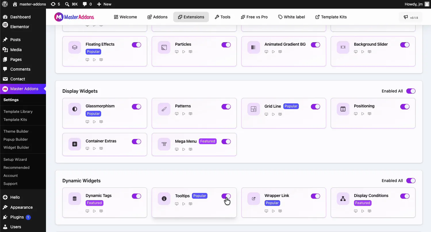
From your WordPress dashboard, go to Master Addons and open the Extensions tab. Tooltips sits in the Dynamic Widgets group. Click its toggle so it turns purple, then hit Save Changes at the top and wait for the green “Settings saved successfully” notice.
Step 2: open your page in Elementor
Navigate to the page you want to edit and click Edit with Elementor.
Step 3: select any element
Click on any existing element where you want to add a tooltip. This works with headings, buttons, images, icons, pricing tables, containers, columns, sections, and any Elementor widget or Master Addons element. The tooltip section appears on the Advanced tab of every element.
Step 4: go to the Advanced tab and enable the tooltip
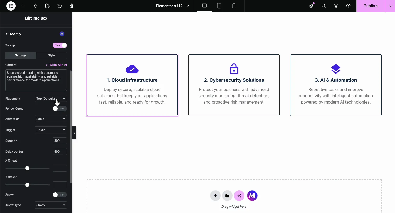
With your element selected, click the Advanced tab in the settings panel. Scroll down until you find the Tooltip section with the purple MA badge. Expand it and flip the Tooltip switch to Yes. The Settings sub-tab opens first.
Step 5: configure the tooltip settings
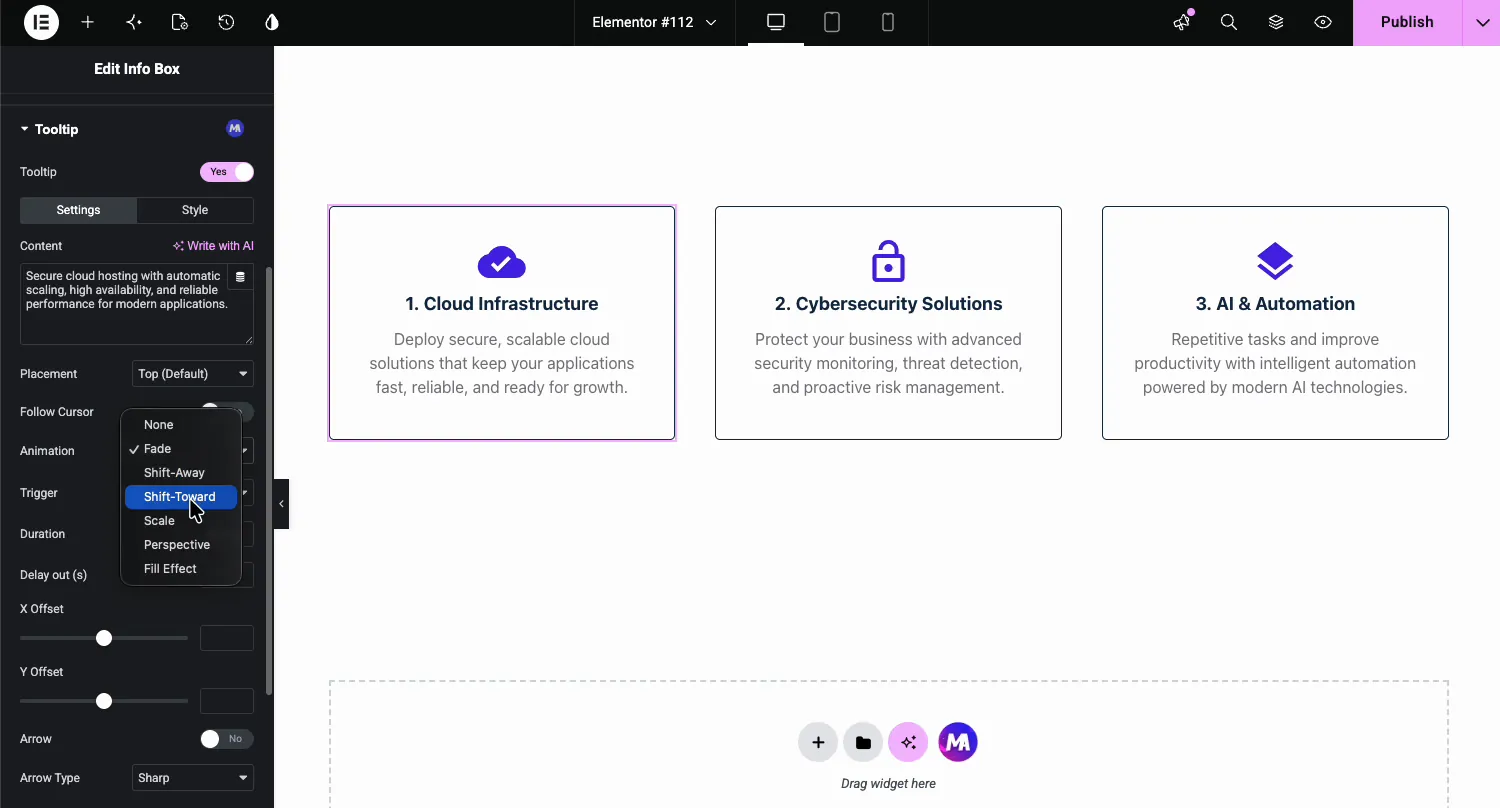
The Settings sub-tab gives you control over how the tooltip behaves:
- Content: the tooltip text. Type it in or pull it from a dynamic tag. If your site has Elementor AI turned on, Elementor’s own Write with AI link also shows up here.
- Placement: which side of the element the bubble prefers: top (the default), bottom, left, or right.
- Follow Cursor: makes the tooltip trail the mouse instead of sitting still. Useful for maps, charts, and diagrams where each area under the cursor needs its own label.
- Animation: how the bubble enters. Seven choices: None, Fade, Shift-Away, Shift-Toward, Scale, Perspective, and Fill Effect.
- Trigger: what opens the tooltip. Hover by default, or click for touch-screen-friendly persistent hints.
- Duration and Delay out: the animation speed in milliseconds and how long the bubble lingers before closing.
- X and Y Offset: nudge the bubble away from its default spot by a specific number of pixels.
- Arrow and Arrow Type: add the little pointer connecting bubble to element, with sharp or round style options.
Step 6: style the tooltip
Switch to the Style sub-tab to make the bubble match your design instead of looking like a browser default.
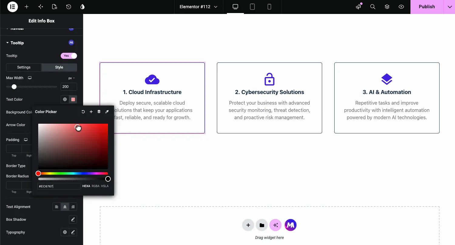
- Max Width: caps how wide the bubble grows so long text wraps instead of stretching across the screen.
- Text, Background, and Arrow Color: full color control, including the pointer.
- Padding, Border Type, and Border Radius: the shape of the bubble.
- Text Alignment, Box Shadow, and Typography: finish the look with your own font and depth.
Step 7: check the result
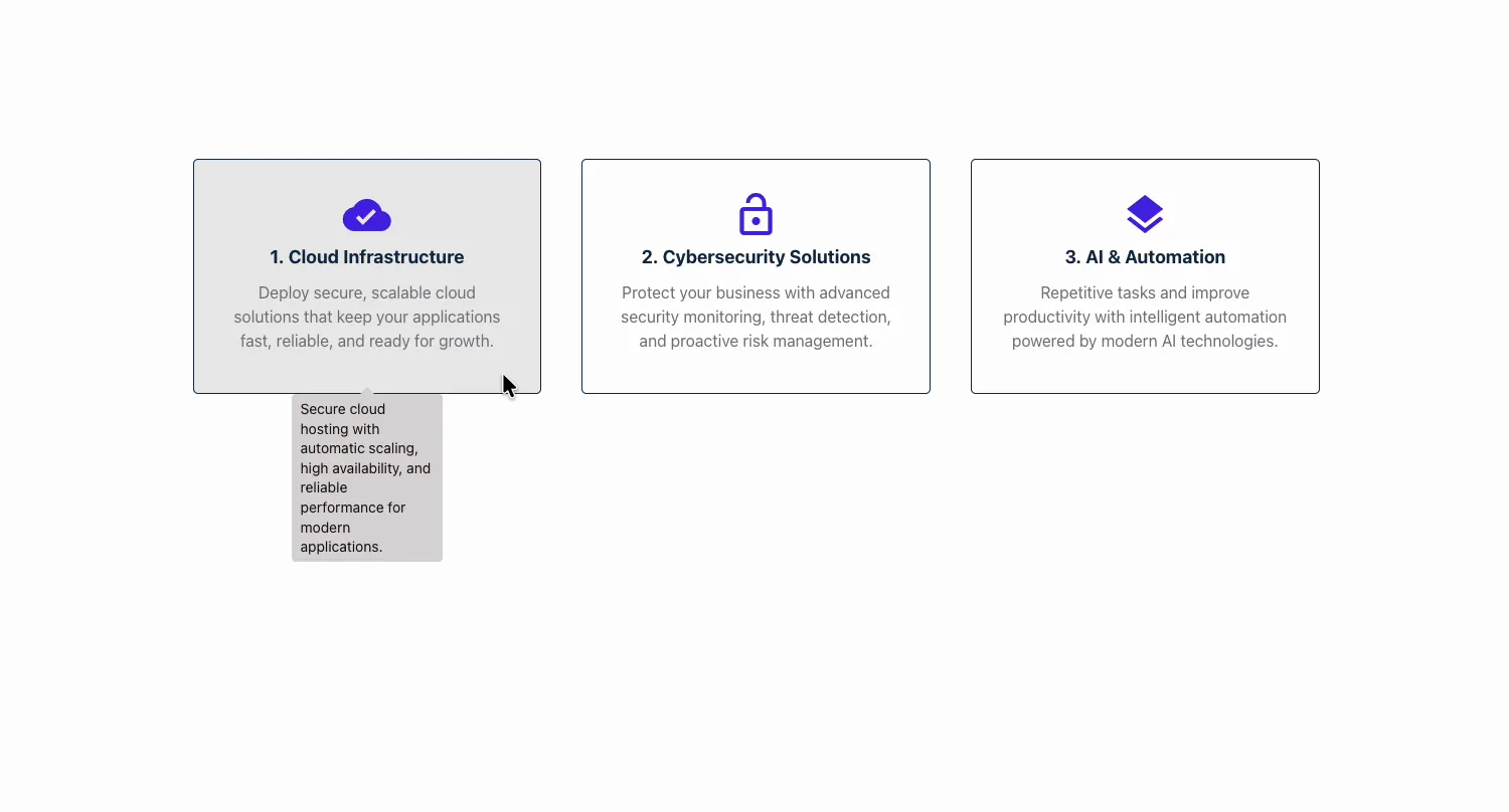
Save and view the page. Hover over the element and the tooltip fades in with the text you wrote, using the animation, colors, and width you set. Move the cursor away and it closes after the delay. Repeat for the other elements on the page.
For full configuration details, see the Tooltip Extension documentation or watch the video tutorial.
Practical use cases for each method
When to use the Tooltip Element
The Tooltip Element is a dedicated content block. Use it when tooltips are the main point of the section:
- Feature showcase pages. Display product features as icons or images with tooltip descriptions.
- Glossary sections. Create an inline glossary where readers hover over terms to see definitions.
- Portfolio items. Add image tooltips to portfolio thumbnails showing project details.
- Team pages. Place icons or photos with tooltip details about team roles.
- Educational content. Let students hover over keywords to see explanations without leaving the page.
When to use the Tooltip Extension
The Tooltip Extension adds context to elements that already exist on your page:
- Feature cards. A sentence of extra detail without lengthening the card.
- Pricing tables. Explain what “priority support” actually covers, right where people wonder. See our Pricing Table widget for more.
- Buttons and icons. Label icon-only controls so nobody guesses.
- Team members. A fun fact or role note on hover over each photo.
- Technical terms. Short definitions on jargon, cheaper than a glossary page.
Combining both methods
You can use both on the same page. For example, use the Tooltip Element to build a feature comparison section where visitors hover over icons to learn about each feature, then use the Tooltip Extension on your CTA button at the bottom to add a “Free 14-day trial, no credit card required” tooltip.
There’s no conflict between the two. They serve different purposes and can coexist on any page.
Tooltip best practices for WordPress
- Keep tooltip text short. Aim for 1-2 sentences. If you need more than that, the information probably belongs on the page itself, not hidden in a tooltip.
- Use consistent positioning. Pick one direction (top or bottom works best for most cases) and stick with it across your site. Mixing positions feels random.
- Don’t overuse tooltips. If every element on your page has a tooltip, visitors won’t bother hovering over any of them. Use them where they genuinely add value.
- Make sure tooltips work on mobile. Hover doesn’t exist on touchscreens. The Tooltip Element and the Tooltip Extension both support a click trigger, which works better for mobile users. Test your tooltips on a phone before publishing.
- Match your site’s design. Customize tooltip colors, fonts, and borders to match your existing theme. Default tooltip styling can look out of place on a polished site.
Tooltip Element vs. Tooltip Extension: quick comparison
| Feature | Tooltip Element | Tooltip Extension |
|---|---|---|
| Setup | Drag and drop a new widget | Enable on any existing widget’s Advanced tab |
| Trigger content | Text, images, icons (built into the widget) | Any Elementor element: headings, buttons, images, sections, containers |
| Best for | Dedicated tooltip content blocks | Adding tooltips to existing designs |
| Plan | Free | Pro |
| Animations | 7 options: None, Fade, Shift-Away, Shift-Toward, Scale, Perspective, Fill Effect | Same 7 options |
| Follow Cursor | Yes | Yes |
| Customization | Full styling control | Full styling control (Style sub-tab) |
| Multiple tooltips per page | Yes | Yes (each element carries its own) |
| Learning curve | Minimal | Minimal |
The Tooltip Element comes with the free Master Addons for Elementor plugin. The Tooltip Extension is part of Master Addons Pro.
Frequently asked questions
How do I add a tooltip in WordPress without a plugin?
You can add basic tooltips using HTML by adding a title attribute to any element (e.g., <span title="Your tooltip text">Hover here</span>). But this method offers zero styling control and looks different across browsers. For custom, styled tooltips in WordPress, a plugin like Master Addons gives you full control over design, animation, and positioning.
Can I add a tooltip to an image in Elementor?
Yes. Master Addons offers two ways. Use the Tooltip Element and select “Image” as the content type to create a dedicated image tooltip. Or use the Tooltip Extension on any Elementor Image widget to add a tooltip to an existing image on your page.
Do tooltips work on mobile devices?
Standard hover-based tooltips don’t work on touchscreens since there’s no cursor to hover. Both the Master Addons Tooltip Element and Tooltip Extension have a click trigger, so the tooltip opens when someone taps the element on a phone.
What’s the difference between a tooltip and a popover?
A tooltip is a small, text-based hint that appears on hover and disappears when you move the cursor away. A popover is usually larger, can contain rich content like images, buttons, or forms, and often requires a click to open and close. The Master Addons Tooltip Element can include formatted text, making it flexible for both simple tooltips and richer hover content.
Are tooltips good for SEO?
Tooltip content is rendered in the HTML, so search engines can crawl the text inside them. However, since tooltip content is hidden by default and only visible on hover, search engines may give it less weight. Don’t hide important content in tooltips. Use them for supplementary information that adds value to the user experience.
Can I use both Tooltip Element and Tooltip Extension on the same page?
Yes. They work independently and don’t conflict with each other. Use the Tooltip Element for dedicated tooltip content blocks and the Tooltip Extension to add quick tooltips to any existing Elementor widget on the same page.
Start adding tooltips to your WordPress site
With Master Addons, you get two options: the Tooltip Element for creating dedicated tooltip content with text, image, and icon triggers, and the Tooltip Extension for adding tooltips to any existing Elementor element on your page.
The Tooltip Element works with the free plugin, and the Tooltip Extension needs Pro. If you want tooltips pinned to specific spots on an image, look at the Image Hotspot widget (Pro).
Download Master Addons for Elementor to get started.