Free Elementor Circle Progress Bar Widget
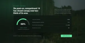
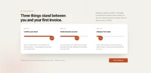
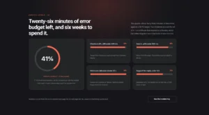
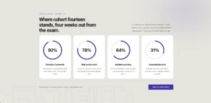
Elementor’s free Progress Bar widget draws a straight line. The Progress Bar widget in Master Addons is also free, and it can draw the bar as a line, a line with a percentage bubble, a full circle or a half circle fan gauge. Give it a title and a value from 0 to 100, pick a style preset, then color the filled bar and the track behind it. It works well for funding goals, course progress, ratings and single stats. For a list of skill bars inside one widget, use Progress Bars. For a bar that fills as visitors scroll through a post, use Reading Progress Bar.
How to Add a Circle Progress Bar in Elementor
The widget is part of the free Master Addons plugin, so all you need is Elementor and Master Addons.
- Install and activate Master Addons from WordPress.org.
- Edit your page with Elementor and search the widgets panel for Progressbar.
- Drag it into a column. For a row of circles, put one widget in each column.
- In Content, type the Title and set the Value from 0 to 100.
- In Style, General Styles, set Style Presets to Circle, or to Fan for a half circle gauge.
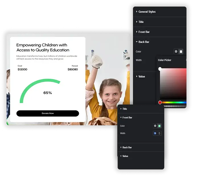
- Set the Front Bar and Back Bar colors and widths, then style the Title and Value text.
Every setting is covered in the Progress Bar widget settings guide.
Line, Line Bubble, Circle and Fan Presets
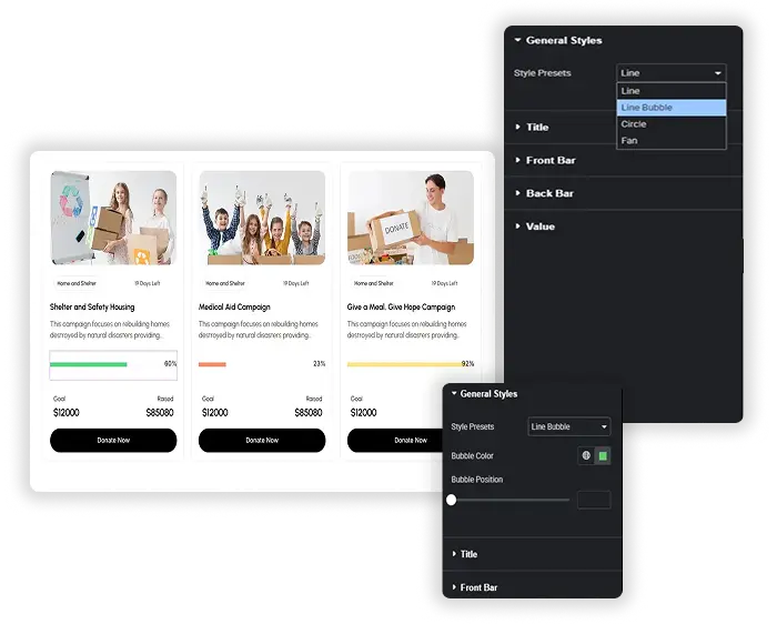
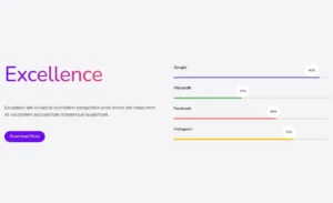
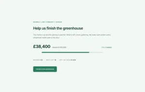
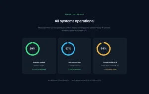
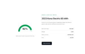
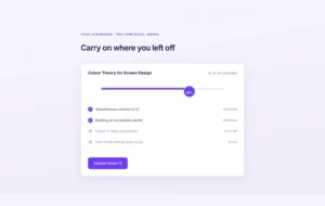
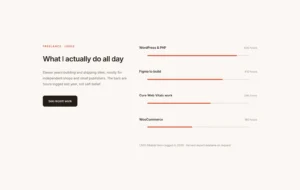
Pick the shape in Style, General Styles, Style Presets. Line is a flat horizontal bar with the title above it. Line Bubble adds a round label that slides along to the fill point and shows the percentage. Circle draws a full ring with the value in the middle, and Fan draws a half circle gauge.
- Switch presets at any time and the title, value and colors stay as they are.
- Bubble Color sets the fill of the bubble on Line Bubble.
- Bubble Position moves the bubble up or down against the bar.
Title and Value
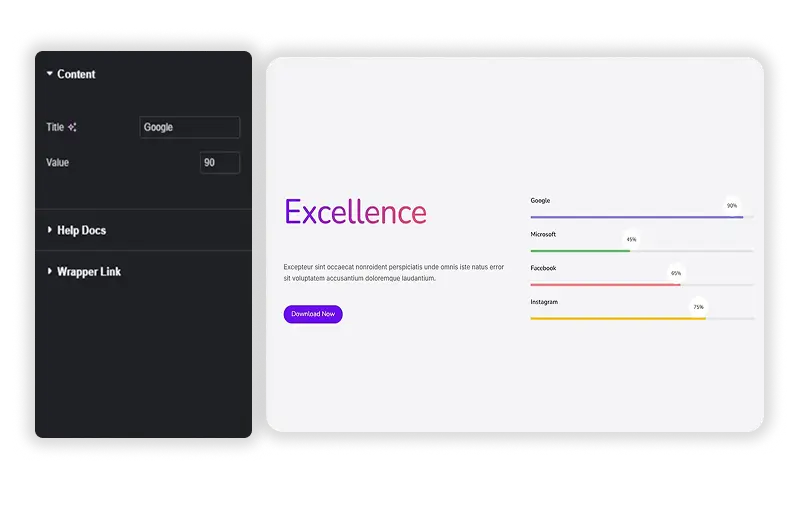
The Content tab has two fields. Title is the label, like Fundraising goal or Course progress. Value is a number from 0 to 100 (60 by default) that sets how far the bar, ring or gauge fills, and it shows as a percentage.
- The fill animates from zero to your value over about one second when the page loads.
- There is no custom maximum, so 45 of 60 lessons goes in as 75.
- One widget is one indicator. Duplicate it to build a row of circles or a stack of lines.
Front Bar and Back Bar Styling
Front Bar is the filled part and Back Bar is the track behind it. Each has its own Color and a Width number for the stroke thickness, 5 by default. A thick front bar over a thinner light track is easy to read, especially on the Circle and Fan presets.
- Default colors are purple (#704aff) on a light grey (#ddd) track.
- Colors are solid. There is no gradient fill option.
- Width is one number for all devices, so check the result on mobile.
Title and Value Text
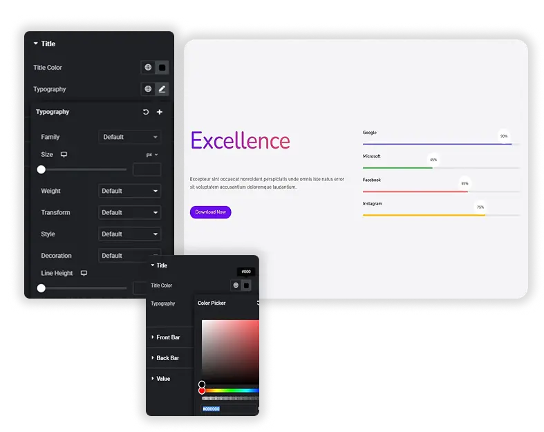
The Title and Value style sections each have a color picker and a full Typography group, so the percentage can be bigger or bolder than the label. On the Circle and Fan presets the value sits inside the shape.
- The title is output as an H6 heading and defaults to black.
- Value color and typography also apply to the Line Bubble label.
Elementor Progress Bar vs Master Addons Progress Bar
Both widgets are free. Elementor’s Progress Bar is a straight bar that can hold a line of text inside it. Master Addons adds round shapes, so the choice mostly comes down to the shape you need.
| Feature | Elementor Progress Bar | Master Addons Progress Bar |
|---|---|---|
| Price | Free in Elementor | Free in Master Addons |
| Shapes | Line only | Line, Line Bubble, Circle and Fan |
| Value | Percentage slider with dynamic tags | Number from 0 to 100 |
| Text | Title with HTML tag choice, Display Percentage, Inner Text | Title (H6) and a percentage label |
| Bar size | Height and Border Radius | Front Bar and Back Bar Width |
| Colors | Bar color and background color | Front Bar and Back Bar colors, Bubble Color |
| Animation | Fills when the bar scrolls into view | Fills when the page loads |
Use Elementor’s widget for a simple line that animates as visitors reach it or pulls its value from a dynamic tag. Use Master Addons when you want a ring or a gauge. Related free widgets: Progress Bars for skill bars in one widget, Reading Progress Bar for a scroll progress indicator, and Counter Up for animated numbers.


Frequently Asked Questions For Progress Bar
What is the difference between Progress Bar, Progress Bars and Reading Progress Bar?
Progress Bar (this widget) is one indicator shown as a line, a line with a bubble, a circle or a fan gauge. The Progress Bars element is a list of horizontal skill bars that you add inside one widget. Reading Progress Bar is an extension that shows how far a visitor has scrolled through the page.
Does the progress bar animate when it scrolls into view?
No. The fill runs from zero to your value in about a second as soon as the page loads, so a bar far down the page may finish before anyone sees it. Elementor’s own Progress Bar and the Master Addons Progress Bars widget both start filling when they come into view.
Is the Master Addons Progress Bar widget free?
Yes. It comes with the free Master Addons plugin on WordPress.org, and all four presets are included without a Pro license.
Can I make a circle progress bar for a score out of 100?
Yes. Set Style Presets to Circle and Value to the score, for example 85. The ring fills to 85 percent with 85% in the middle. For a score out of another number, convert it to a percentage first, since the widget has no custom maximum.
Trending Elementor Widgets & Extensions
Build sophisticated websites in less time.
Glassmorphism
Container Extras
Patterns
![Master Addons Post/Page Duplicator extension for Elementor: MA Duplicator row link in the WordPress Pages list creating a Landing Page - [Duplicated #128] draft](https://d1asvmc6qcowgk.cloudfront.net/wp-content/uploads/2026/09/15102930/post-page-duplicator-768x403.webp)
Post/Page Duplicator