
How to Make a Responsive Table in Elementor (3 Ways)
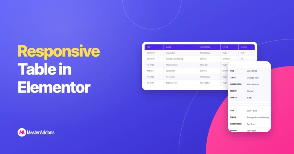
Key Takeaways An Elementor responsive table is one that stays readable on a phone, and tables do not do that by themselves. Columns need more width than a phone has, so the table usually pokes out of the right side of the screen. There are three ways to deal with it. We built all three […]