

Feltet Visuelt valg føjer en række klikbare billedkort til en brugerdefineret widget, der er bygget med Master Addons Widget Builder. Hvert kort er et lille billede af en mulighed, så redaktører vælger et layout eller en stil ved at se på det. Din skabelon får nøglen til det kort, de klikkede på.
Visual Choice er et Pro-felt. Det gratis plugin indeholder en begrænset Widget Builder, og det fulde sæt felter leveres med Master Addons Pro.
Hvad Visual Choice feltet gør #
- Det viser dine muligheder som billedkort i Elementor panelet. Det valgte kort får et highlight.
- Hver mulighed har en nøgle, en titel og et billede. Titlen bruges som kortets værktøjstip og alt-tekst.
- Din skabelon modtager den valgte nøgle, som f.eks
gridellerlist, som du kan bruge i et klassenavn eller en{% if %}check. - Indstillingen Kolonner styrer, hvor mange kort der sidder i én række af panelet.
Hvis du ikke har bygget en widget endnu, så læs Widget Builder oversigt først. For valg, der læser fint som tekst eller ikoner, den vælge og Vælg felter er hurtigere at sætte op.
Før du starter #
- WordPress med Elementor installeret og aktiv.
- Master Addons til Elementor og Master Addons Pro, begge aktive. Den installationsvejledning covers opsætning.
- Et lille billede for hver mulighed. Simple stregtegninger omkring 240 gange 160 pixels, gemt som PNG med en gennemsigtig baggrund, ser rene ud på Elementors mørke panel.
- En widget åben i Widget Builder. Eksemplet i denne vejledning er en “Team Showcase” widget med tre layouts: Grid, List og Spotlight.
Sådan tilføjes et Visual Choice-felt #
- Gå til Master Addons > Widget Builder og åbn din widget.
- På tilfreds tab, tilføj en sektion. En layoutvælger går normalt først, så redaktører vælger strukturen før noget andet.
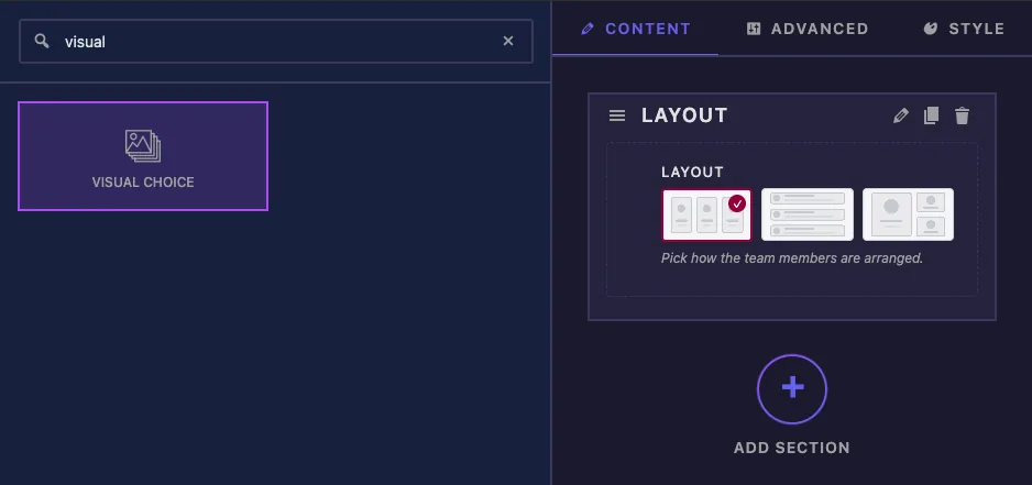
- skrift
visuali feltsøgefeltet til venstre. - vod visuelt valg ind i sektionen. Dens indstillinger åbnes i venstre sidebjælke.
Visual Choice feltindstillinger forklaret #
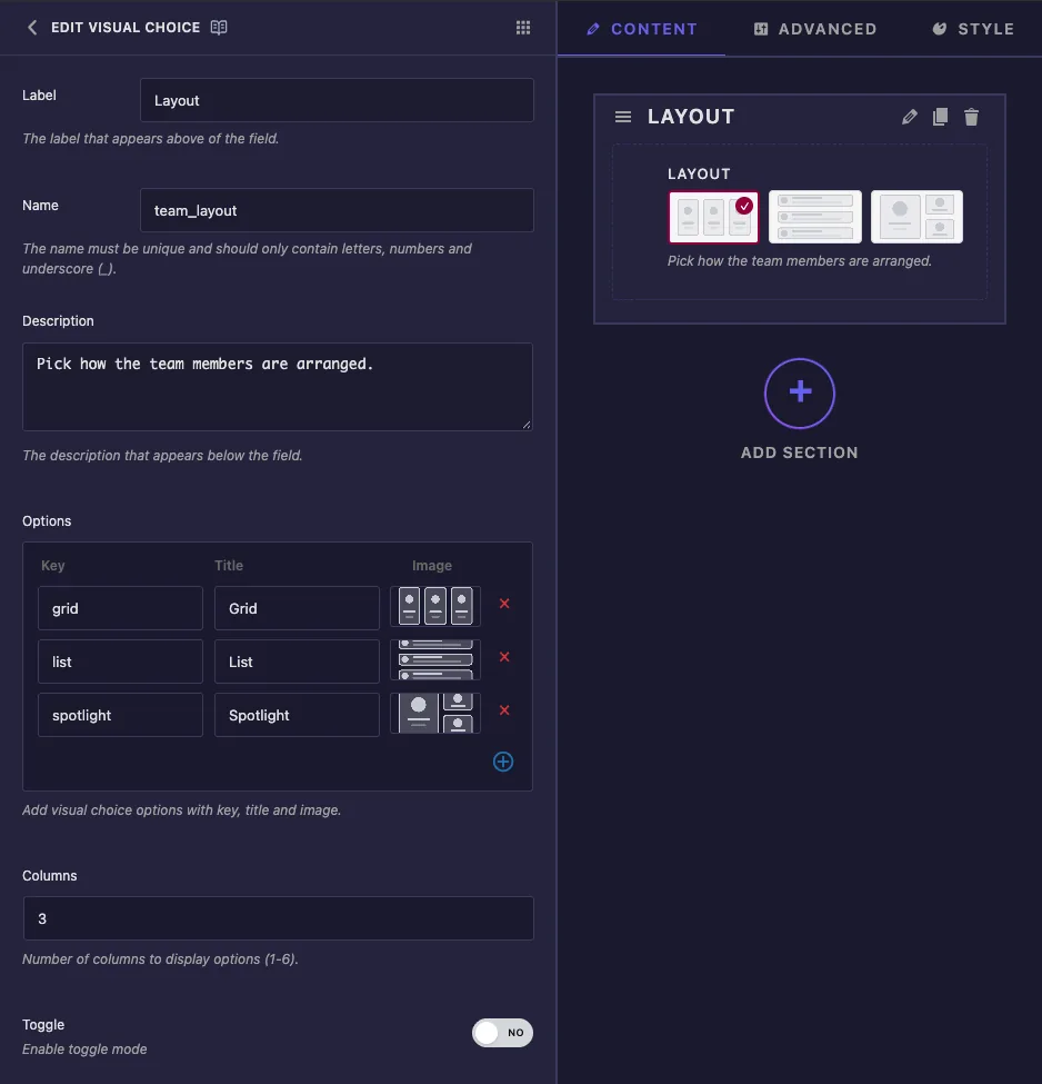
- skilt er teksten over kortene i Elementor, for eksempel “Layout”.
- ry er feltets unikke ID og dets skabelon-token, så
team_layoutbliver{{team_layout}}. Kun bogstaver, tal og understregninger. - art vises under kortene i Elementor.
- muligheder holder en række pr. kort. forklaring er den værdi din skabelon får (hold den kort og små bogstaver, som
grid). navn navngiver kortet. Klik på spejlbillede boks for at åbne vinduet Vælg billede, uploade en fil eller vælge en fra mediebiblioteket, og klik derefter på Brug dette billede. Plusikonet tilføjer en række, og det røde kryds fjerner en. - Kolonner indstiller hvor mange kort der passer i én række, fra 1 til 6. Skriv nummeret selvom boksen allerede viser 2. Det viste tal gemmes ikke før du ændrer det, og uden en gemt værdi sætter Elementor et kort i hver række.
- Skift er opført i panelet, men i vores tests gjorde det ingen forskel. Redaktører kunne altid klikke på det valgte kort igen for at rydde det.
De almindelige indstillinger nedenfor fungerer, som de gør på andre felter, herunder Betingelser. Panelet har ingen Standardværdi for dette felt, så en ny kopi af widget starter uden valgt kort.
Klik Gem indstillinger når du har tilføjet mulighederne.
Brug den valgte nøgle i din skabelon #
{{team_layout}} udskriver nøglen til det valgte kort. Den enkleste måde at bruge det på er en modifikatorklasse:
<div class="ts-team ts-team--{{team_layout}}">
  ...
</div>
Med Grid valgt, gengiver det ts-team--grid. Når et layout har brug for en anden markup, skal du kontrollere nøglen med {% if %}. Eksemplet viser en kort bio kun i List layout:
{% if team_layout == 'list' %}
  <p class="ts-bio">Leads brand and product design across every client project.</p>
{% endif %}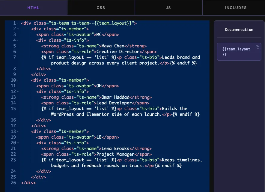
Skriv derefter ét sæt CSS-regler pr. nøgle:
.ts-team--grid { grid-template-columns: repeat(3, 1fr); }
.ts-team--list { grid-template-columns: 1fr; }
.ts-team--spotlight { grid-template-columns: 1.4fr 1fr; }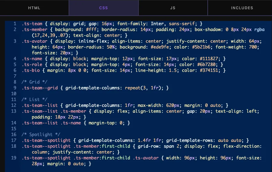
Indtil en redaktør klikker på et kort, udskriver tokenet intet, og klassen ovenfor bliver ts-team--. Giv basen .ts-team klassificer et layout, der ser fint ud alene, så widgetten aldrig vises brudt, før der træffes et valg.
Brug Visual Choice-kontrolelementet i Elementor #
Føj widgetten til en side, eller genindlæs editoren, hvis siden allerede var åben. Kortene vises på fanen Indhold. Klik på en, og lærredet opdateres med det samme.
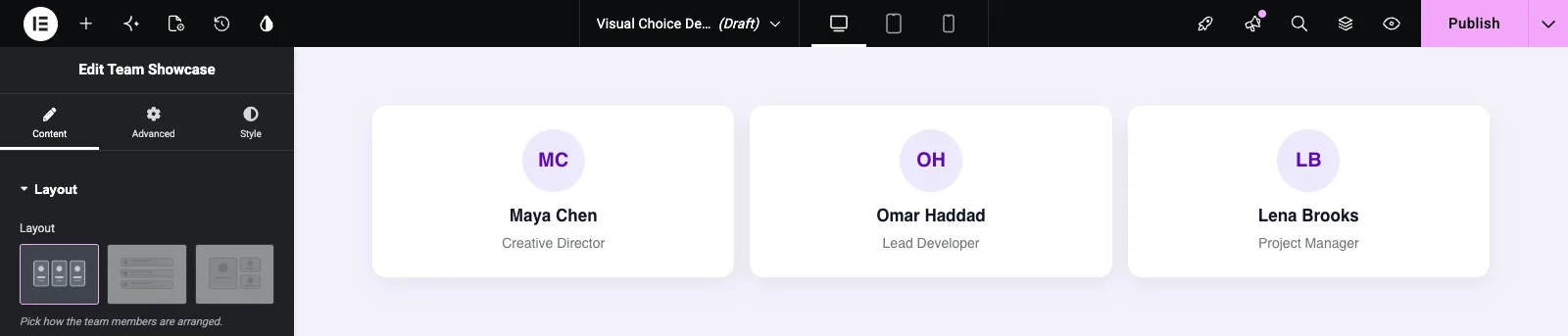
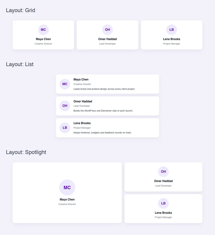
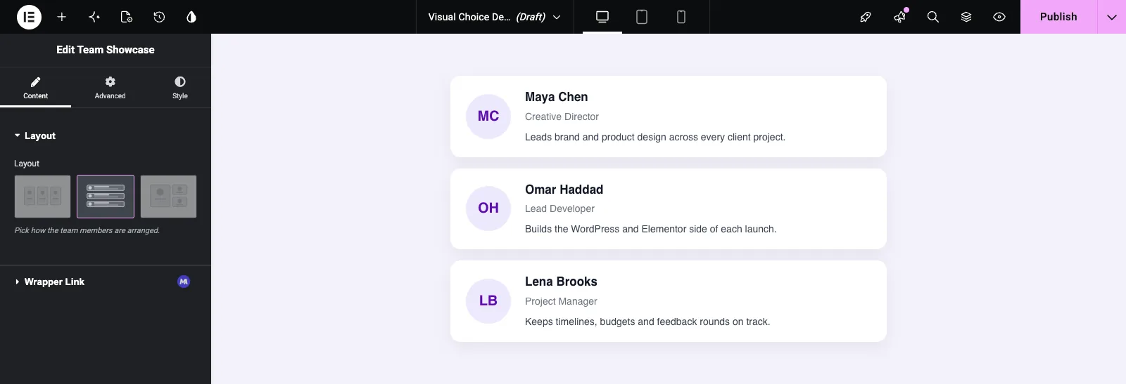
Klikliste skifter holdet til rækker, og {% if %} block tilføjer bios:
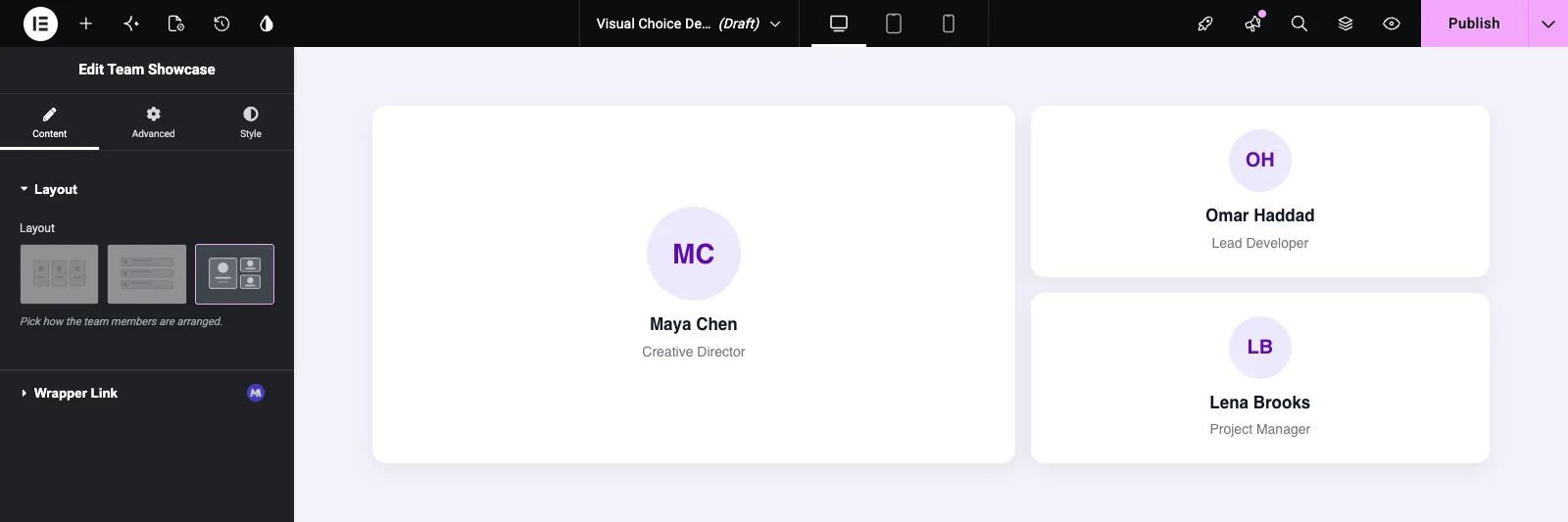
Spotlight gør det første medlem større:
Klik på det valgte kort igen for at rydde valget. Skabelonen får derefter en tom nøgle, som beskrevet ovenfor.
Almindelige brugstilfælde #
- Layoutvælgere til team-, blog-, portefølje- og testimonial-widgets.
- Kort- eller overskriftsstile, der er nemmere at genkende fra et billede end fra et navn.
- Billedpositionsvalg, såsom billede til venstre, billede til højre eller billede øverst.
- Forudindstillede designs, der skifter flere CSS-regler på én gang med én klasse.
Tips til at arbejde med Visual Choice feltet #
- Brug den samme tegnestil for hvert valgbillede, så kortene ligner ét sæt.
- Hold tasterne korte, små og fri for mellemrum. De ender i klassenavne.
- Omdøb ikke en nøgle, når widgetten er i brug. Sider, der gemte den gamle nøgle, matcher ikke din nye CSS.
- Indstil kolonner til antallet af muligheder, når du har tre eller færre, så alle kortene sidder i én række.
- Style den tomme tilstand. Indtil nogen vælger et kort, er nøglen tom.
Ofte stillede spørgsmål #
Er Visual Choice-feltet gratis?
Nej. Visual Choice er et af Pro-felterne i Widget Builder, så Master Addons Pro skal være aktiv, før du kan føje det til en widget.
Hvad får skabelonen, når et kort er valgt?
Indstillingens nøgle. Hvis Gitterkortet har nøglen grid, {{team_layout}} udskriver grid. Titlen og billedet bruges kun i panelet.
Hvorfor viser min widget kun ét kort pr. række i Elementor?
Kolonner blev ikke gemt. Skriv et tal i boksen Kolonner, selvom det allerede viser 2, og gem derefter widgetten og genindlæs Elementor.
Kan jeg indstille hvilket kort der er valgt som standard?
Ikke fra feltpanelet, som ikke har nogen Standardværdi for Visuelt valg. Style basisklassen, så widgetten ser ud lige før et kort er valgt.
Kan Visual Choice tilføje en klasse til widget-indpakningen?
Ikke fra feltpanelet. Udskriv nøglen inde i din egen markering i stedet for f.eks class="ts-team ts-team--{{team_layout}}", og målrette den klasse i din CSS.
Indpakning #
Giv hver indstilling en nøgle, en titel og et billede, skriv en kolonneværdi, og brug {{field_name}} i et klassenavn eller en {% if %} check. Planlæg for den tomme tilstand, da intet er valgt, før en editor klikker på et kort. For at vælge fra en tekstliste i stedet, se Vælg2 felt, og kontrollere prissætning for hvad hver plan indeholder.


