

El Campo divisor dibuja una delgada línea de borde entre dos controles en el panel de opciones de su widget personalizado. Es un ayudante de diseño para el panel en sí: no imprime nada en la página, no agrega nada a su HTML y nunca aparece en la interfaz. Su único trabajo es separar visualmente un grupo de opciones del siguiente, para que las personas que editan su widget en Elementor puedan escanear el panel más rápido.
Incluso un control solo de interfaz de usuario como el Divider admite Condiciones, por lo que puede aparecer y desaparecer todo un grupo de opciones junto con su divisor. La salida de la plantilla en todo el generador es representada por Motor de plantilla de sintaxis de ramita; Ambas guías cubren los detalles.
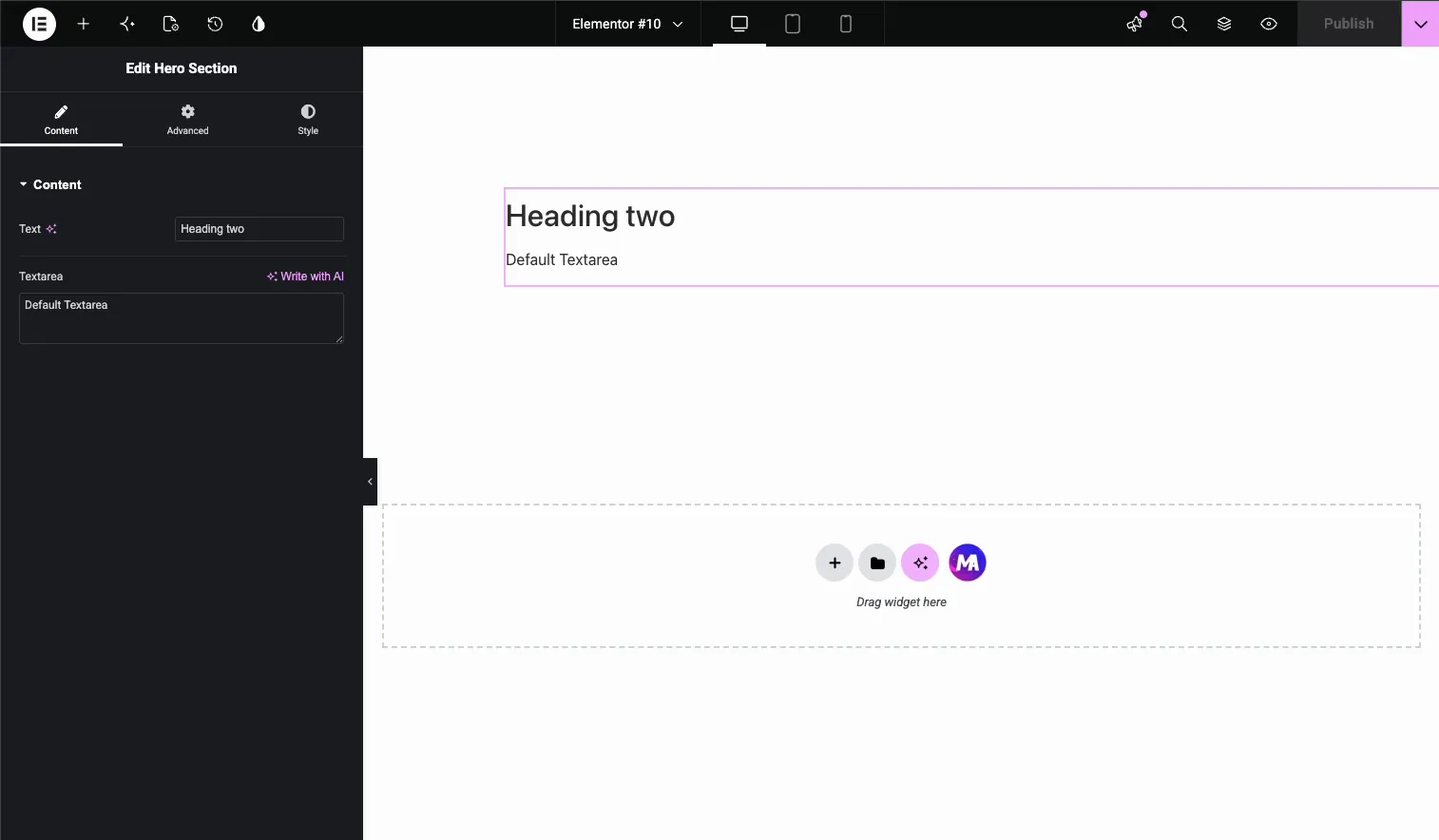
Dentro de los complementos maestros Creador de widgets, sueltas el Divisor entre dos campos cualesquiera, guardas y Elementor representa una pequeña línea horizontal en ese lugar exacto del panel del widget. En el tutorial a continuación, el divisor va entre a Campo de texto y a Campo de área de texto.
Qué hace el campo Divisor #
Un divisor representa un borde horizontal sutil dentro del panel del editor Elementor, justo donde lo colocas entre dos controles. Esa es toda la característica y ese es el punto. Cuando un widget personalizado tiene cinco o seis entradas apiladas en una sección, un par de divisores convierten una pared de campos en grupos claros.
Dos cosas que hace el Divisor no hazlo, entonces no habrá sorpresas después:
- No tiene salida. A diferencia de los campos Texto o Área de texto, el Divisor no agrega ningún código corto a la barra lateral de Documentación. No hay
{{divider}}token para colocar en su HTML, CSS o JS. - Nunca toca la página. La línea aparece sólo en el panel de opciones del widget dentro del editor Elementor. El área de vista previa y la interfaz en vivo permanecen exactamente iguales.
Si desea un divisor que los visitantes realmente vean en la página, esa es una herramienta diferente: use un divisor o un widget separador en el diseño de su página. Este campo es exclusivamente para organizar la experiencia de edición. Si eres nuevo en la creación de widgets, comienza con Descripción general del creador de widgets primero.
Antes de empezar #
- wordpress con elemento instalado y activo.
- Complementos maestros para Elementor instalado y activo. ¿Nuevo en el complemento? Ver el guía de instalación.
- Se abre un widget personalizado en el editor Widget Builder, con al menos dos campos ya instalados. Aquí utilizamos un campo Texto y un campo Área de texto.
Cómo agregar un campo Divisor #
En el editor Widget Builder, desplácese por el panel de campos de la izquierda hasta encontrar el archivo Divisor campo. Se encuentra cerca de la parte inferior de la lista, al lado de Text Shadow, y su ícono parece una línea entre dos flechas pequeñas.
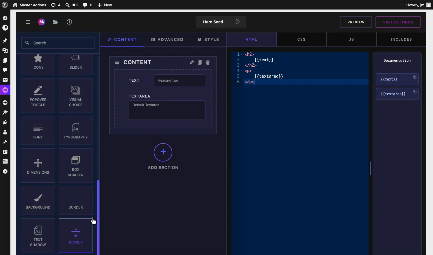
Arrastre el divisor a su sección y déjelo donde debería aparecer el separador. En nuestro ejemplo, la sección Contenido ya contiene un campo Texto y un campo Área de texto, y el Divisor aterriza entre ellos. Si aterriza en el lugar equivocado, agarre la manija de su lado izquierdo y arrástrela a su lugar, de la misma manera que reordena cualquier otro campo.
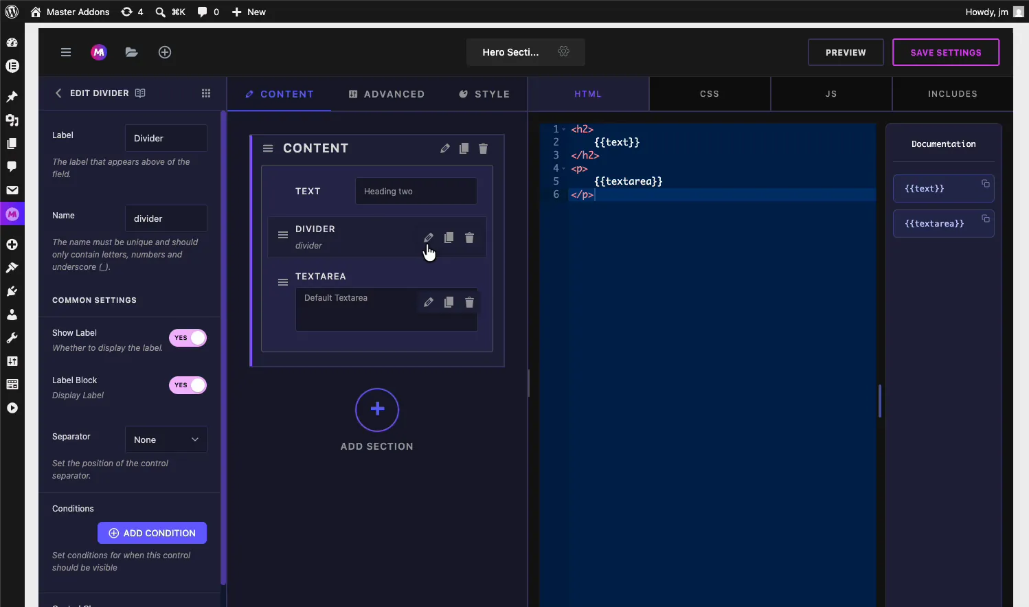
Una vez que el Divisor se encuentra entre los dos campos, la sección lee Texto, Divisor, Área de texto de arriba a abajo. Haga clic Guardar configuración para almacenar el cambio.
Se explicaron las opciones del campo del divisor #
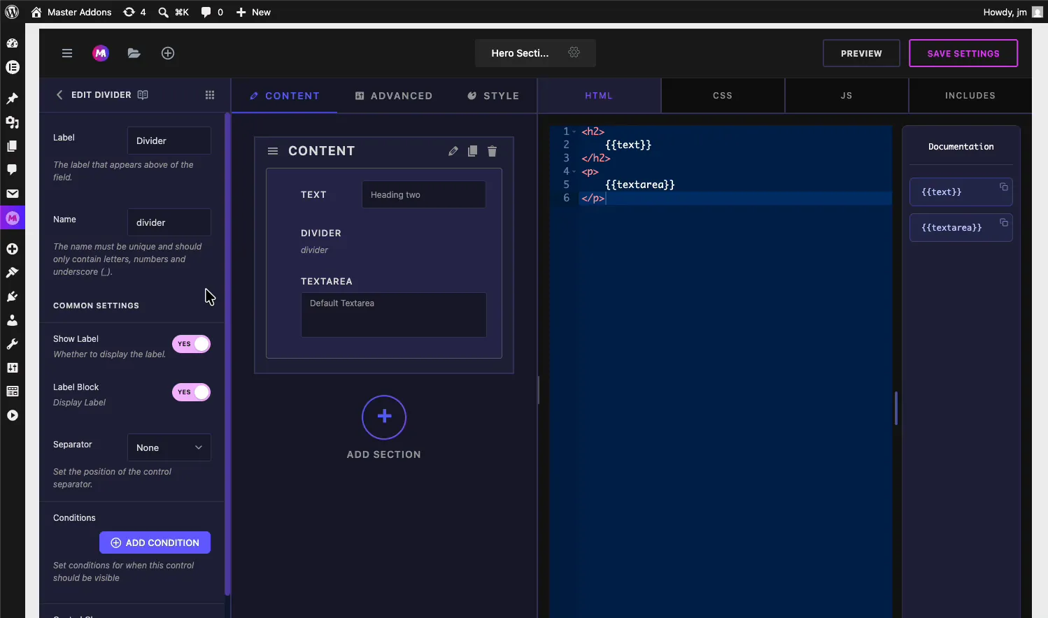
Seleccione el Divisor para abrir su configuración a la izquierda. Tiene muchas menos opciones que un campo de entrada, porque no hay valor para recopilar.
- Etiqueta: el nombre interno que se muestra en la tarjeta de campo del generador, “Divisor” de forma predeterminada. Le ayuda a diferenciar varios divisores mientras edita el widget.
- Nombre: el identificador único del campo. Debe contener sólo letras, números y guiones bajos. El divisor no genera ningún código corto, por lo que permanece detrás de escena, pero cada campo aún necesita un nombre único.
- Mostrar etiqueta y Bloc de etichete: la etiqueta estándar alterna que aparece en cada campo del Creador de widgets.
- Separador: establece la posición del separador de control (Ninguno, Antes, Después, Predeterminado).
- Condiciones: muestra u oculta el divisor según el valor de otro control. Haga clic Agregar condición para establecer la regla. Práctico cuando los campos a su alrededor también son condicionales, por lo que una línea nunca flota por encima de un control oculto.
Para la mayoría de los widgets, coloca el Divisor en su lugar y nunca toca estas configuraciones. La ubicación es la configuración que importa.
Vea el divisor en el editor Elementor #
Ahora abra una página en Elementor que use su widget personalizado o arrastre el widget a una página. Si la página ya estaba abierta mientras editaba el widget, recarga el editor Elementor entonces retoma la nueva disposición del panel.
Seleccione el widget y mire su pestaña Contenido. Ahora hay una pequeña línea fronteriza entre el control de Texto y el control de Área de Texto, exactamente donde dejó caer el Divisor en el generador.
Verifique la vista previa a la derecha: el encabezado y el párrafo representan lo mismo que antes. El divisor no cambió nada sobre la salida, solo el panel. Eso es exactamente lo que debería pasar.
Casos de uso comunes #
- Agrupación de insumos relacionados, como un encabezado y su subtítulo encima de la línea, y una etiqueta de botón y un enlace debajo de ella.
- Separar el contenido del comportamiento, por ejemplo, campos de texto arriba, alterna y cambia abajo.
- Rompiendo secciones largas donde dividirse en secciones separadas sería excesivo pero diez campos apilados parecen pesados.
- Marcar extras opcionales, con los campos obligatorios encima del divisor y configuraciones agradables debajo.
Consejos para trabajar con el campo Divisor #
- Utilice divisores entre grupos, no entre todos los campos. Una línea después de cada control es tan ruidosa como ninguna línea.
- Busque un divisor antes de una nueva sección. Si dos grupos de campos pertenecen a la misma pestaña y al mismo tema, un divisor los mantiene unidos sin el costo de otra sección plegable.
- Vuelva a cargar el editor Elementor después de guardarlo. Una pestaña del editor que estuvo abierta durante el cambio no mostrará la nueva línea hasta que se actualice.
- Recuerde que es invisible para los visitantes. Si un cliente solicita una línea en la página, ese es un elemento de diseño en el HTML del widget o un widget separado, no este campo.
Preguntas frecuentes #
¿cuál es el campo Divisor en Master Addons Widget Builder?
El campo Divisor traza una delgada línea horizontal entre dos controles en el panel de opciones de un widget personalizado. Organiza el panel visualmente dentro del editor Elementor y no tiene ningún efecto sobre la salida del widget o la interfaz de su sitio.
¿el campo Divisor muestra algo en mi sitio web?
No. El divisor aparece sólo en el panel de opciones del widget en el editor Elementor. No imprime nada en la página, en la vista previa o en la interfaz. Para mostrar una línea visible a los visitantes, agregue una en el HTML de su widget o use un widget separador.
¿por qué no puedo ver el divisor en Elementor después de agregarlo?
Recargue el editor Elementor. Una pestaña que estaba abierta mientras guardaba el widget aún conserva el diseño del panel anterior. Después de una actualización, seleccione el widget y aparecerá una delgada línea entre los dos controles donde colocó el campo Divisor.
¿el campo Divisor crea un código corto?
No. Los campos de entrada como Texto generan tokens como {{texto}} en la barra lateral de Documentación, pero el Divisor no recopila ningún valor, por lo que no agrega ningún código corto. Lo colocas en el panel y esa es toda la configuración.
¿debo usar un Divisor o una sección nueva?
Utilice un divisor para dividir grupos de campos relacionados dentro de una sección. Cree una nueva sección cuando los campos cubran un tema completamente diferente y merezcan su propio encabezado plegable en el panel Elementor. Los divisores son más ligeros, las secciones tienen una separación más fuerte.
Envolviendo #
El campo Divisor es la herramienta más pequeña del Widget Builder y una de las más útiles para cualquiera que edite su widget más adelante. Déjelo entre dos campos, guárdelo, recargue el editor Elementor y el panel obtendrá una línea limpia justo donde las opciones cambian de tema. Emparejarlo con el Texto y Área de texto campos para construir paneles que se lean como un formulario, no como un montón de entradas. Explora el resto del Widgets y extensiones de complementos maestros, y mira el página de precios por lo que incluye cada plan.


