

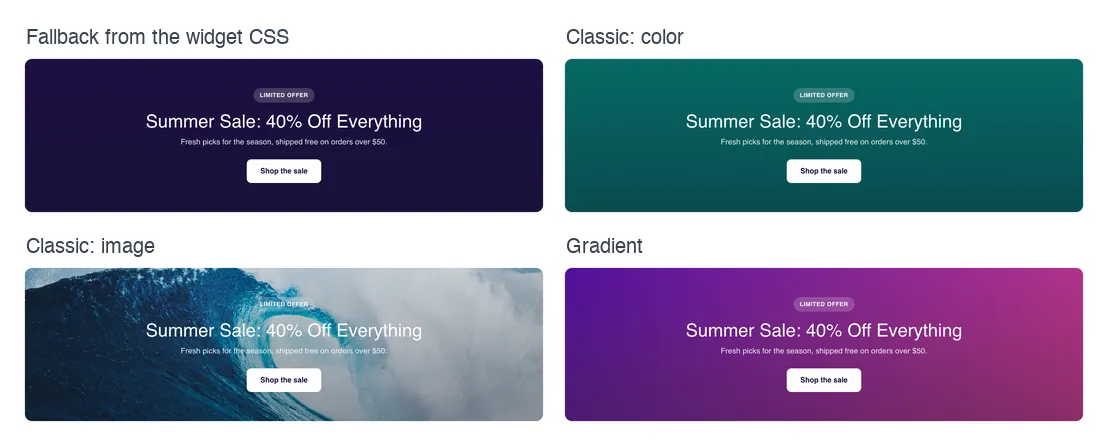
El campo Fondo agrega el control de fondo de Elementor a un widget personalizado creado con los complementos maestros Creador de widgets. Los editores eligen un color sólido, una imagen o un degradado en el panel Elementor, y los estilos van al elemento al que apunta su selector CSS. Se adapta a banners, tarjetas y cualquier caja cuyo fondo deba cambiar de una página a otra.
El fondo es un campo profesional. El complemento gratuito incluye un Widget Builder limitado y viene con el conjunto completo de campos Complementos maestros Pro.
Qué hace el campo Antecedentes #
- Agrega el control Tipo de fondo de Elementor a la pestaña Estilo de su widget, con un icono por tipo de fondo que permita.
- Clásico proporciona un color y una imagen, con ajustes de posición, archivo adjunto, repetición y tamaño una vez elegida una imagen.
- El degradado da dos colores con sus ubicaciones, un tipo lineal o radial y un ángulo o posición.
- Elementor escribe el CSS en el elemento de la opción Selector. No necesitas un token en tu HTML o CSS.
Si aún no ha creado un widget, lea el Descripción general del creador de widgets primero.
Antes de empezar #
- WordPress con Elementor instalado y activo.
- Master Addons para Elementor y Master Addons Pro, ambos activos. El guía de instalación configuración de cubiertas.
- Un widget abierto en Widget Builder. El ejemplo de esta guía es un widget “Promo Banner” cuyo cuadro exterior tiene la clase
promo-banner.
Cómo agregar un campo de fondo #
- Ir a Complementos maestros > Creador de widgets y abre tu widget.
- Haga clic en el Estilo tabule y agregue una sección, por ejemplo “Fondo del banner”.
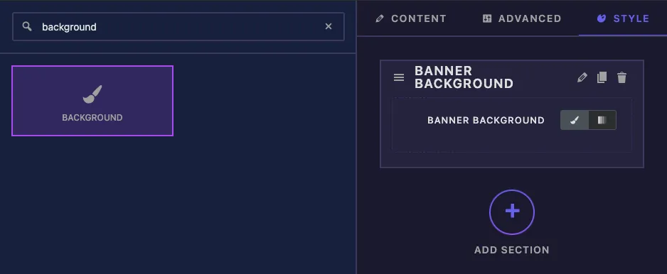
- Tipo
backgrounden el cuadro de búsqueda de campo de la izquierda. - Arrastrar Antecedentes en la sección. Su configuración se abre en la barra lateral izquierda y la vista previa de la sección muestra los íconos de tipo.
Opciones de campo de fondo explicadas #
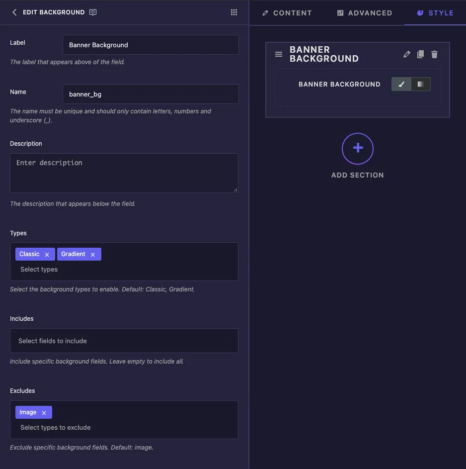
- Etiqueta nombra el campo en el constructor, por ejemplo “Antecedentes del banner”. En Elementor, los editores ven el título de la sección y un control llamado Tipo de fondo.
- Nombre es el ID único del campo. Sólo letras, números y guiones bajos.
- Descripción es una nota para ti dentro del constructor.
- Tipos establece qué tipos de fondo pueden elegir los editores: Clásico, Degradado, Vídeo y Presentación de diapositivas. Un nuevo campo muestra Clásico y Degradado.
- Incluye y Excluye están destinados a agregar u ocultar configuraciones individuales dentro del control. En nuestras pruebas ninguno cambió el panel Elementor. Excluye muestra Imagen de forma predeterminada, pero la configuración Imagen aún apareció, así que deje ambas como están.
Mantenga los tipos en Clásico y Degradado. El video y la presentación de diapositivas agregan su configuración al panel, pero cuando los probamos en un widget personalizado, un enlace de video y una galería de presentaciones de diapositivas no atrajeron nada detrás del banner. Elementor solo crea el marcado adicional que esos dos tipos necesitan para sus propias secciones y contenedores.
Desplácese hasta la parte inferior de la barra lateral del Selector. Las configuraciones comunes encima (Mostrar etiqueta, Separador, Condiciones y el resto) trabajan como lo hacen en otros campos.
Configure el selector #
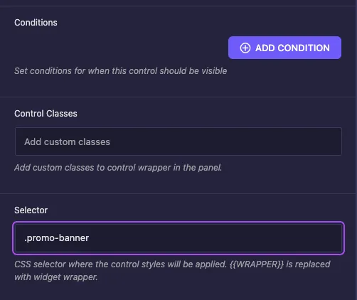
El Selector le dice a Elementor qué elemento obtiene el fondo. Para el banner es la clase en el cuadro exterior:
.promo-bannerNo tienes que escribir {{WRAPPER}} para este campo. El constructor lo agrega frente a su selector, entonces .promo-banner se convierte {{WRAPPER}} .promo-banner y sólo afecta a este widget. Con una lista separada por comas, cada parte obtiene la suya propia {{WRAPPER}}. Si el Selector está vacío, el fondo pasa al contenedor exterior del widget en lugar de a su elemento.
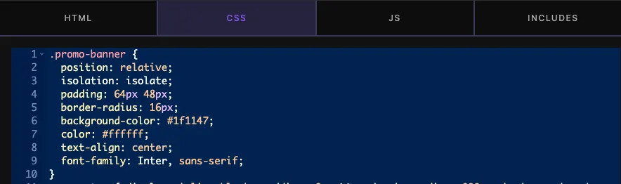
Dale al elemento un fondo alternativo en la pestaña CSS. Se muestra hasta que un editor elige algo y los estilos del control lo reemplazan después de eso:
.promo-banner {
  background-color: #1f1147;
  color: #ffffff;
}
Hacer clic Guardar configuración cuando hayas terminado.
Utilice el control de fondo en Elementor #
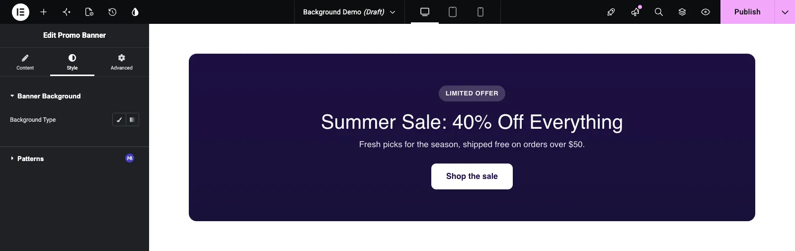
Agregue el widget a una página o recargue el editor si la página ya estaba abierta. Seleccione el widget y abra el Estilo pestaña. Su sección muestra el tipo de fondo con un ícono para cada tipo que permitió. El banner mantiene su color alternativo hasta que elijas uno.
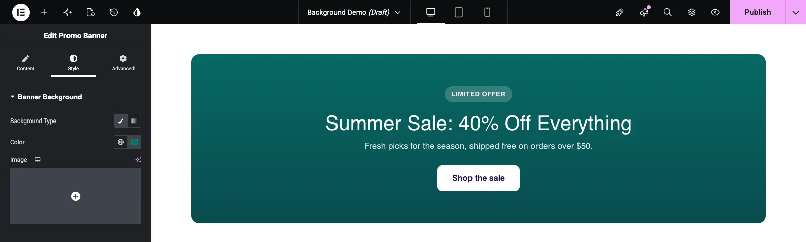
Haga clic en el icono del pincel para Clásico y elige un ruborizarse. El banner se actualiza de inmediato.
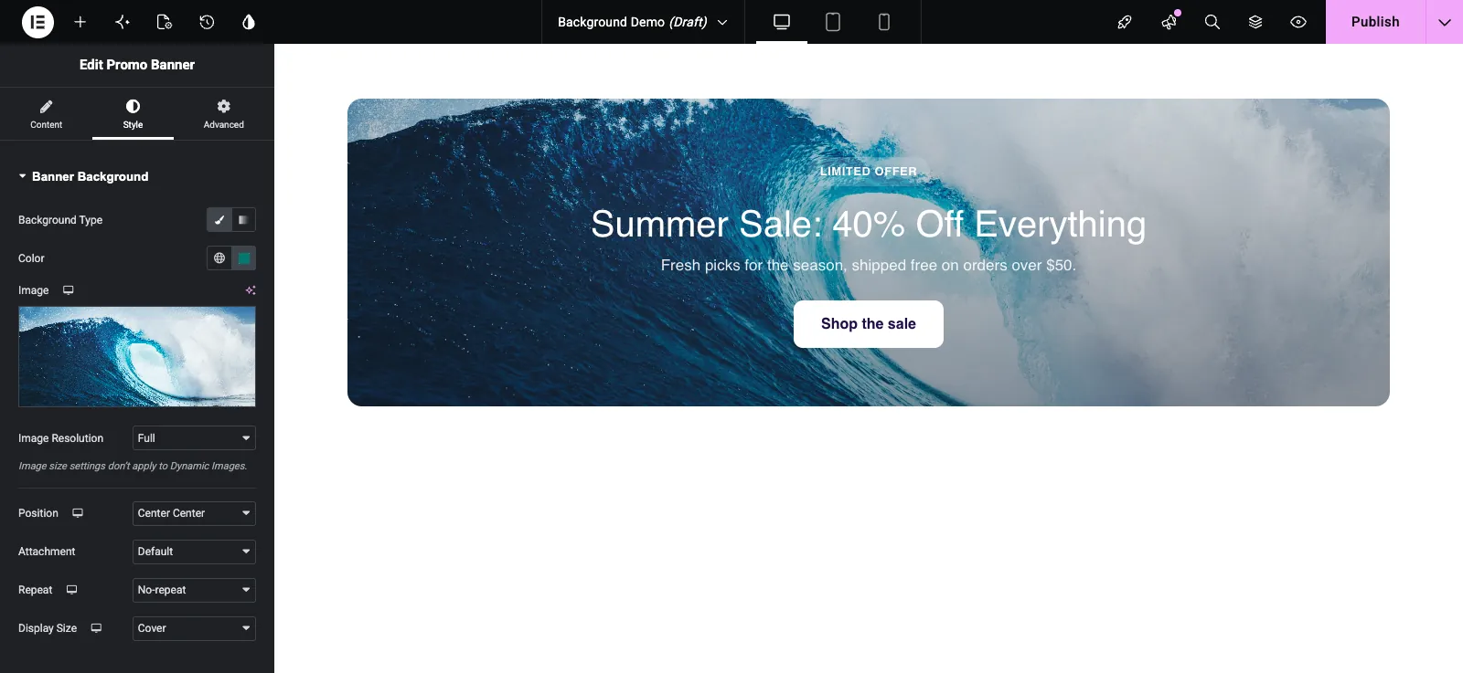
Debajo del color, haga clic en Imagen cuadro para elegir una imagen de la Biblioteca multimedia. Aparecen más configuraciones una vez configurada una imagen: resolución de imagen, posición, conexión, repetición y tamaño de visualización. Centro central, sin repetición y cubierta funcionan bien para la mayoría de los banners.
Haga clic en el segundo icono para Degradado. Establece el primero ruborizarse y su Ubicación, el Segundo color y su ubicación, luego elige Lineal con un Ángulo o radial con una posición.
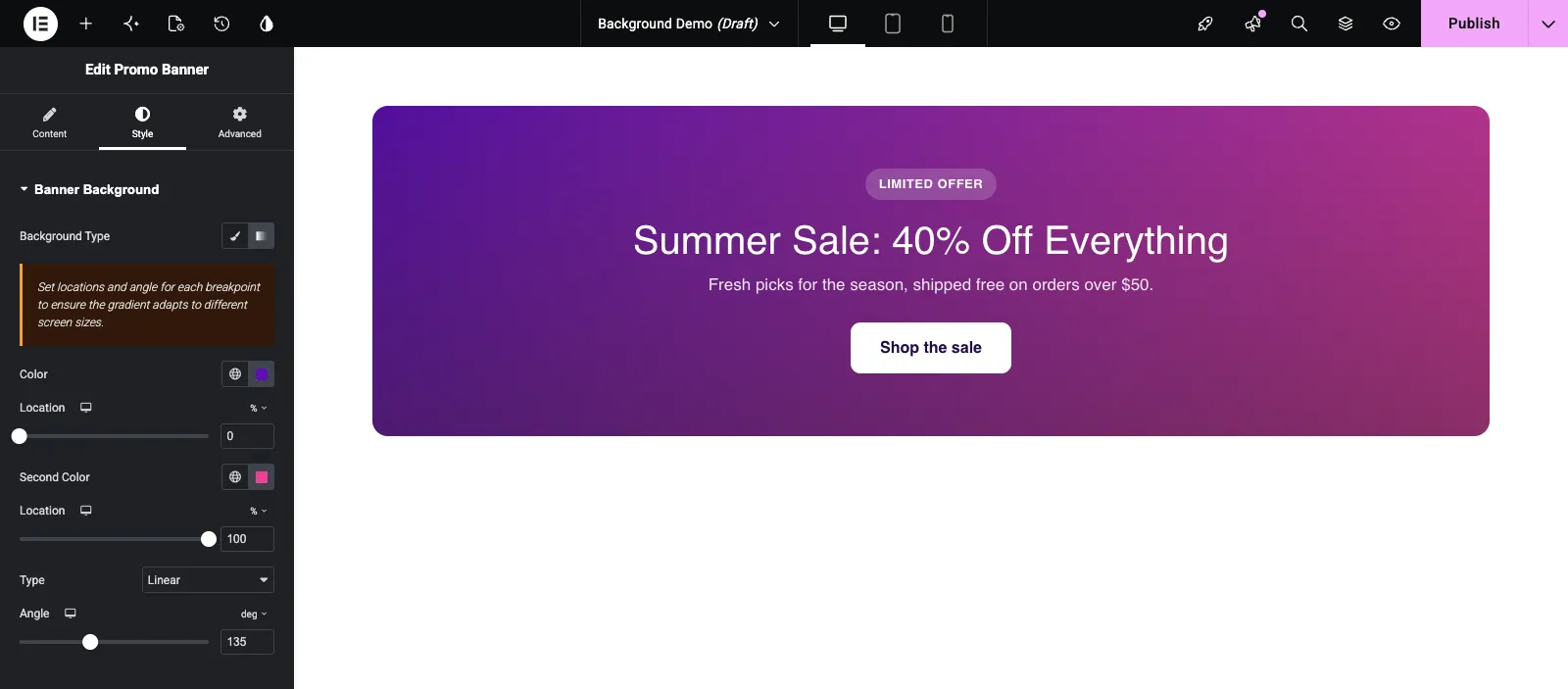
Casos de uso comunes #
- Banners de héroes y promocionales que obtienen una nueva imagen o degradado para cada campaña.
- Tarjetas en tablas de precios, cuadrículas de equipos y listas de funciones.
- Tiras de llamada a acción que cambian entre un color de marca y una foto.
- Un panel interior o capa superpuesta, apuntando el Selector hacia ese elemento en lugar de hacia la caja exterior.
Consejos para trabajar con el campo Antecedentes #
- Mantenga siempre una alternativa
background-coloren la pestaña CSS. Cubre nuevos widgets y el momento antes de que se cargue una imagen. - Mantenga el texto legible en las fotos. El banner de ejemplo agrega una capa oscura con
.promo-banner::beforeyisolation: isolateen el cuadro, el texto blanco sigue siendo legible en imágenes brillantes. - Apunte el Selector a un elemento. Varios campos de fondo en diferentes selectores son más fáciles para los editores que un campo compartido por muchas partes.
- Siga en Tipos clásicos y degradados para obtener widgets personalizados.
- Para un solo color plano sin imagen ni degradado, el Campo de color es más sencillo para los editores.
Preguntas frecuentes #
¿el campo Antecedentes es gratuito?
No. Background es uno de los campos Pro en Widget Builder, por lo que Master Addons Pro debe estar activo antes de poder agregarlo a un widget.
¿necesito agregar {{WRAPPER}} al selector de fondo?
No. Añade el constructor {{WRAPPER}} frente al selector del campo Fondo para ti, entonces .promo-banner es suficiente. Escribirlo usted mismo también funciona.
¿dónde está el token de fondo de mi CSS?
No hay ninguno para usar. El fondo cubre muchas propiedades CSS a la vez, por lo que Elementor escribe las reglas en el Selector por usted.
¿por qué no se muestra el fondo del vídeo o la presentación de diapositivas?
Esos tipos necesitan un marcado adicional que Elementor solo agrega a sus propias secciones y contenedores. En un widget personalizado aparecen sus configuraciones, pero no se dibuja nada. Utilice Clásico o Degradado.
¿por qué se me acabó el color alternativo después de elegir un degradado?
Un degradado establece el color de fondo en transparente y pinta el degradado en la parte superior. Su respaldo regresa si el editor desactiva el tipo de fondo.
Envolviendo #
Agregue el campo Fondo a una sección Estilo, mantenga los Tipos en Clásico y Degradado y configure el Selector en el elemento que debería cambiar. Coloque un color alternativo en la pestaña CSS y los editores podrán tomarlo desde allí. Para conocer el estilo del resto del elemento, consulte Frontera y Sombra de caja campos y comprobar precios por lo que incluye cada plan.


