The Border field gives a custom widget a full set of border controls in one drop: a Border Type dropdown, per-side Border Width inputs, and a Border Color picker. Inside the Master Addons Widget Builder, you add the field once, place its shortcode in your CSS, and anyone editing the widget in Elementor can restyle the border without touching code.
The field maps straight to the CSS border shorthand. Whatever type, width, and color the user picks in the panel prints into your stylesheet wherever you put the token.

What the Border field does #
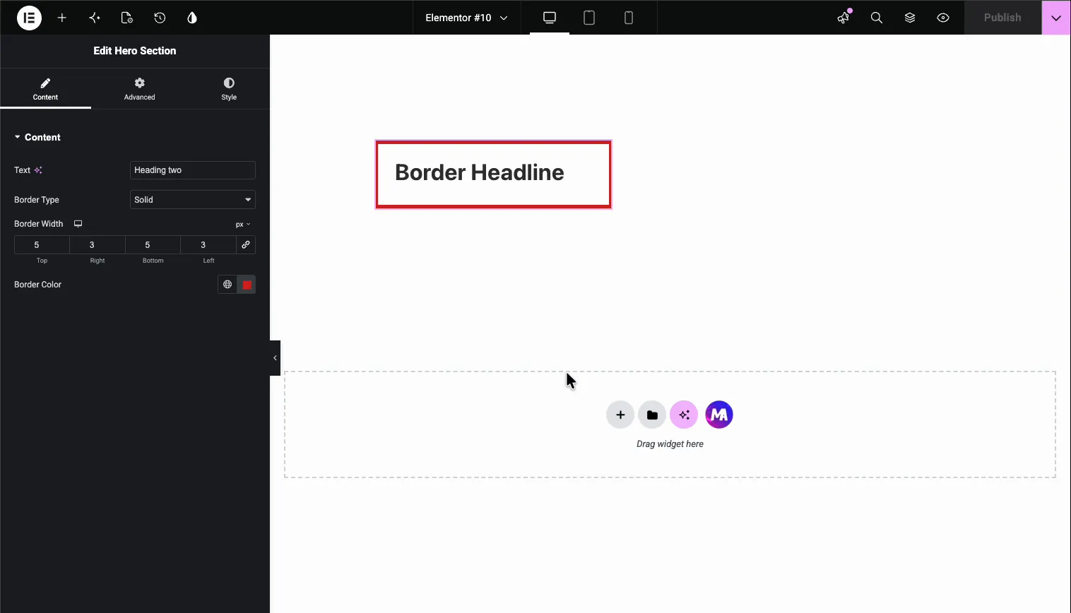
A Border field renders Elementor’s familiar border group control in your widget’s option panel. Select the widget and three related controls show up:
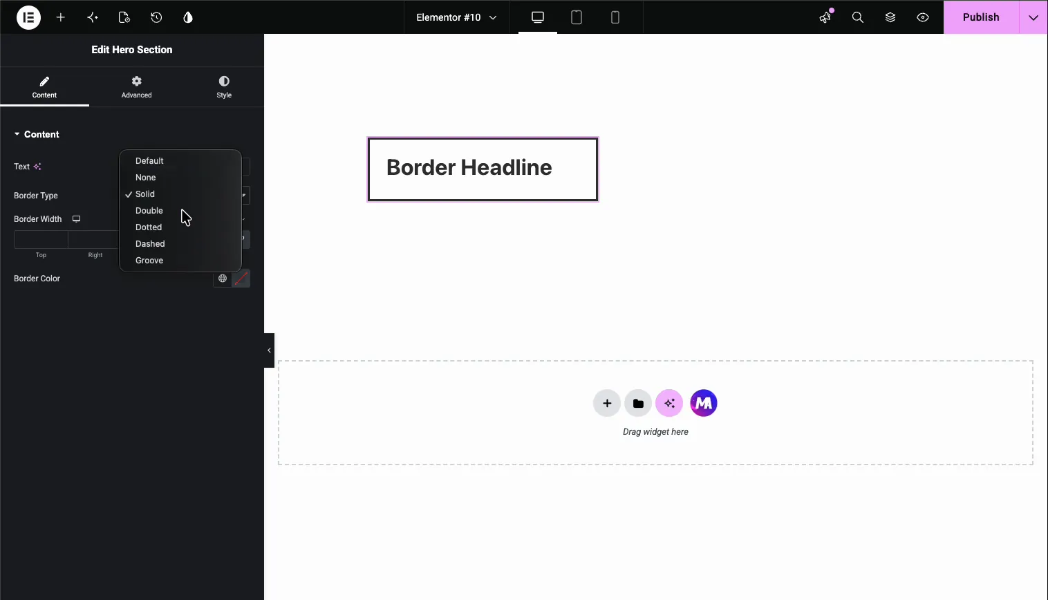
- Border Type: a dropdown with Default, None, Solid, Double, Dotted, Dashed, and Groove.
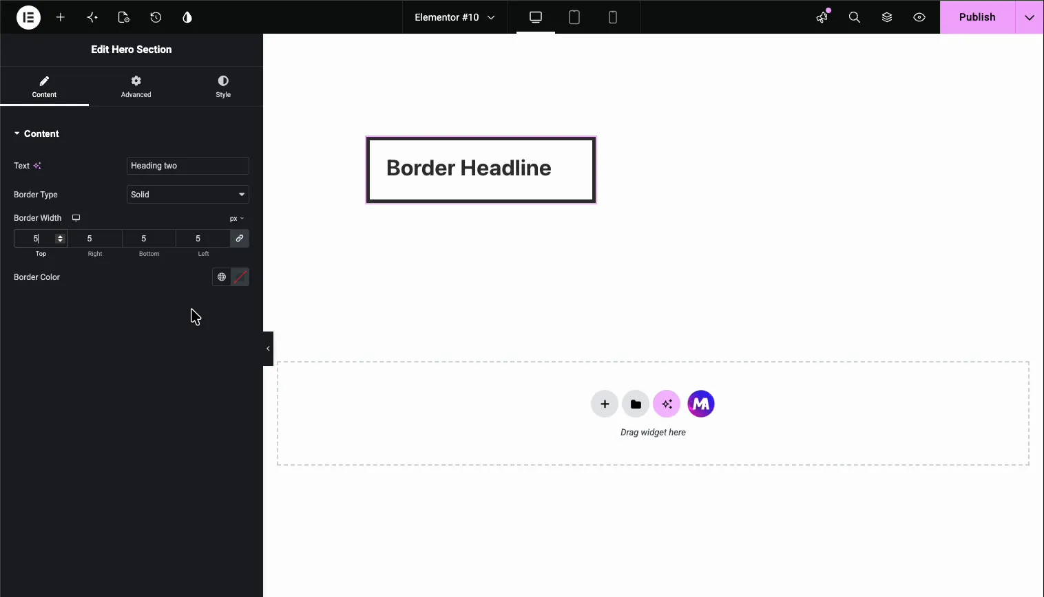
- Border Width: Top, Right, Bottom, and Left inputs with a link toggle to set all four at once, plus a device icon for responsive values.
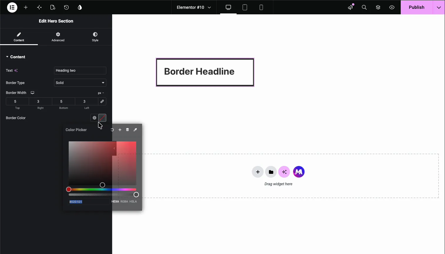
- Border Color: a color picker with access to your global colors.
The Width and Color controls stay hidden until the user picks a border type other than Default or None, which keeps the panel clean when no border is in use. This is the same pattern as the Text field and the other Widget Builder fields: drop the field, name it, use the token. If you are new to building widgets, start with the Widget Builder overview first.
Before you start #
- WordPress with Elementor installed and active.
- Master Addons for Elementor installed and active. New to the plugin? See the installation guide.
- A custom widget open in the Widget Builder editor. Our example is a heading widget with an
<h2 class="border-title">in its HTML.
How to add a Border field #
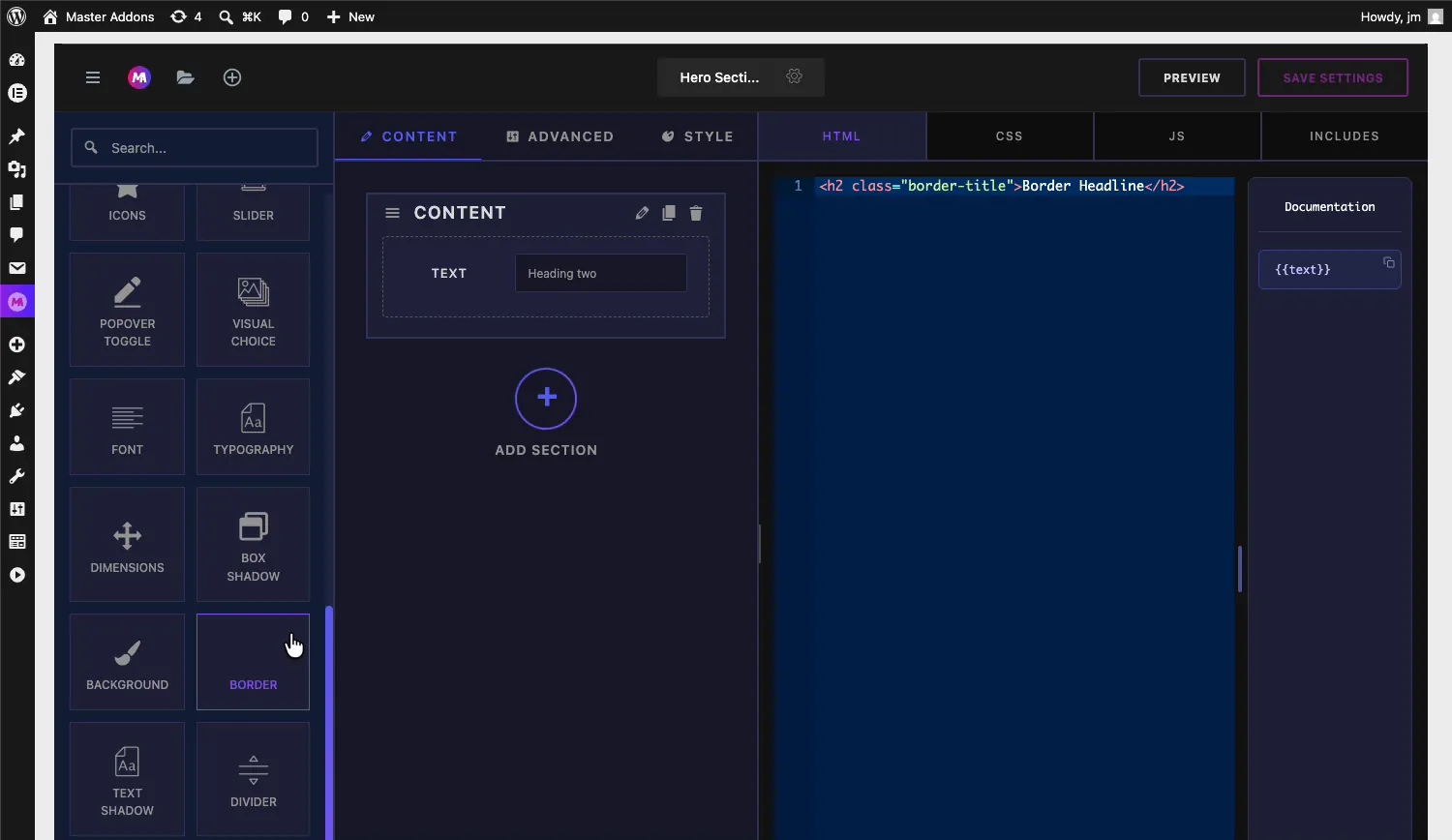
In the Widget Builder editor, scroll the fields panel on the left until you find the Border field. It sits near the bottom of the list, between Background and Text Shadow.

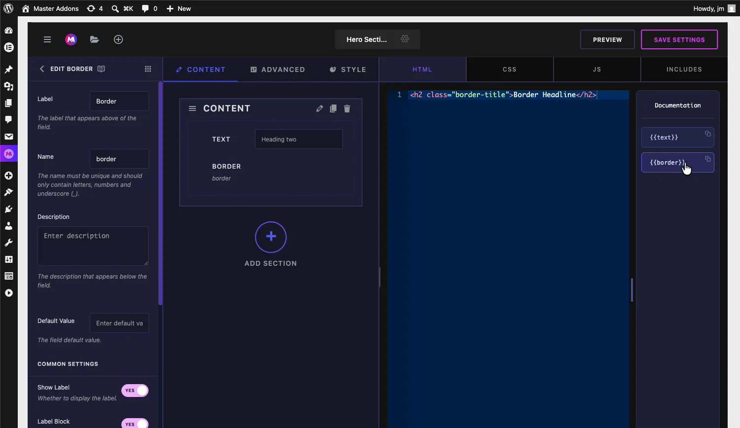
Drag the Border field into a section under the Content, Style, or Advanced tab. Style is the natural home for it, though it works anywhere. Once it lands, the field’s options open on the left and its shortcode shows up in the Documentation sidebar next to the code editor.

Border field options explained #
Select the Border field to open its settings. They follow the same layout as every other Widget Builder field.
- Label: the text shown above the control in Elementor, “Border” by default.
- Name: the unique identifier for the field. It must contain only letters, numbers, and underscores. A field named
bordergives you the{{border}}shortcode. - Description: optional helper text shown below the control.
- Default Value: the border the widget starts with, written as CSS shorthand, for example
1px solid #333. Leave it empty and the widget ships with no border until a user sets one. - Show Label and Label Block: the standard label toggles, plus the usual Separator and Conditions controls further down.
Connect the field to your CSS #
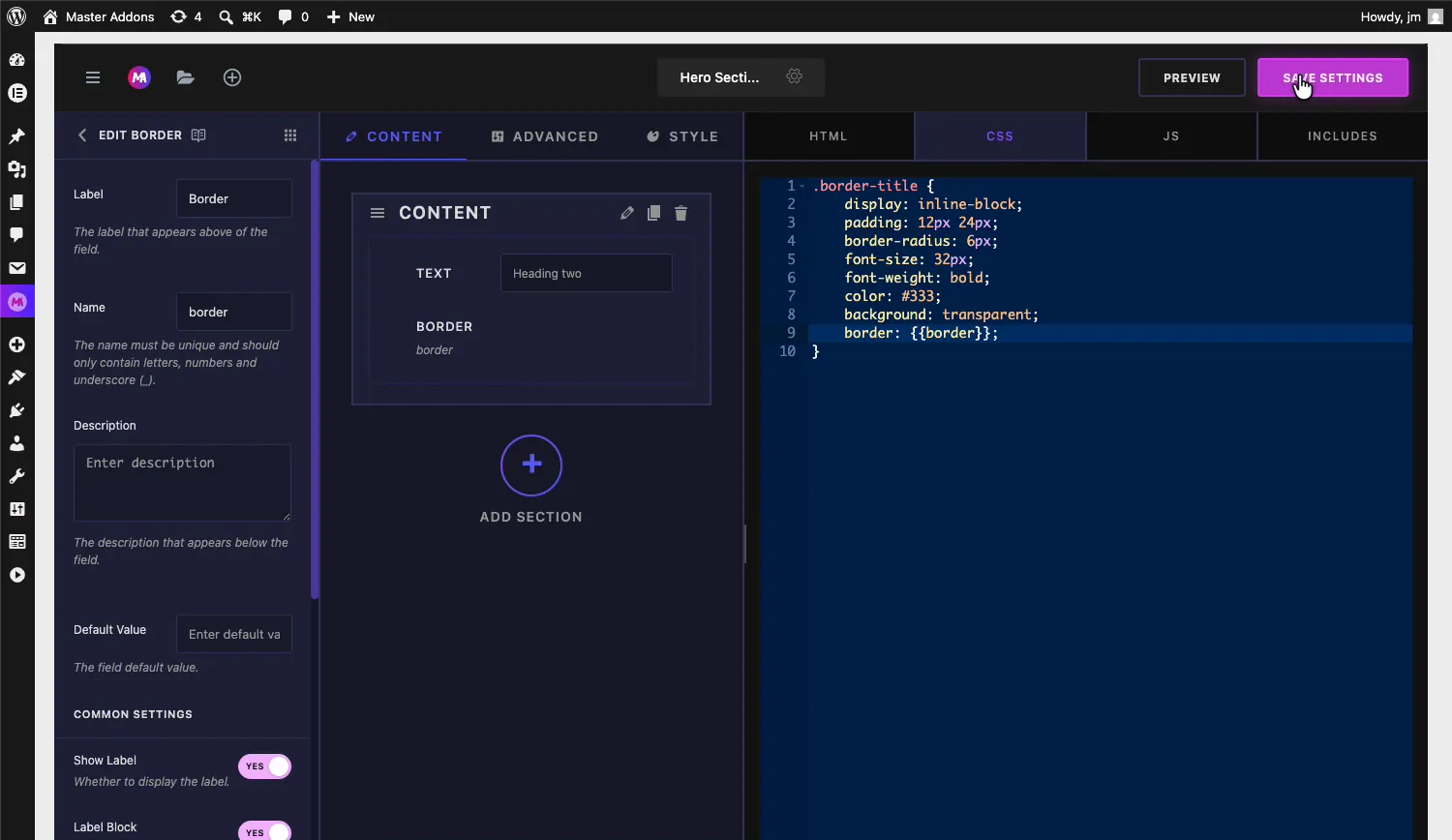
The Border field’s token belongs in your stylesheet, not your HTML. Open the CSS tab and use it as the value of the border property on whatever selector should carry the border. With our heading example:

- The rule reads
border: {{border}};inside the.border-titleselector. - At render time, the token expands to the full shorthand the user picked, like
5px solid #e02b20.
Click Save Settings when the rule is in place. You can drop the same token on any selector in the widget, so one Border control can outline a card, its image, or both.
Use the Border control in Elementor #
Add your custom widget to a page in Elementor, or reload the editor if the page was already open. Select the widget and the Border control appears in its panel with the label you set.
Pick a border type #
The Border Type dropdown lists Default, None, Solid, Double, Dotted, Dashed, and Groove. Pick any type other than Default or None and two more controls appear below it: Border Width and Border Color. The preview updates as soon as you choose, so picking Dashed draws a dashed outline around the widget right away.

Set the border width #
The Border Width control takes separate Top, Right, Bottom, and Left values. Keep the link icon on to change all four sides together, or unlink it for uneven borders, like a thick top and bottom with thin sides. The device icon next to the label lets you set different widths per breakpoint.

Choose the border color #
The Border Color control opens Elementor’s color picker. Use the globe icon to pull from your global colors, or pick a custom value with the picker and hex, RGBA, or HSLA input.

Every change lands live in the preview. In our example the heading ends up with a solid red border, 5 pixels on top and bottom and 3 pixels on the sides.

Common use cases #
- Card and box outlines where each site needs its own border weight and color.
- Highlighted headlines like the boxed heading in this example.
- Image frames on team, portfolio, or product widgets.
- Button styles where an outline variant needs a user-editable border.
- Callout and notice boxes that switch between solid and dashed styles.
Tips for working with the Border field #
- Put the token in CSS, not HTML. The shortcode expands to a CSS value, so it only makes sense as a property value like
border: {{border}};. - Set a Default Value in shorthand form. Something like
1px solid #333makes the widget look finished before anyone opens the panel. - Pair it with border-radius. The field covers type, width, and color. Add a Dimensions field or a fixed
border-radiusrule for rounded corners. - Remember None is a real choice. Users can switch the border off from the panel, so do not rely on the border to hold the layout together.
- Reuse the token where it helps. The same
{{border}}value can style several selectors, and they all follow the one control.
Frequently Asked Questions #
What is the Border field in the Master Addons Widget Builder?
The Border field adds Elementor’s border group control to a custom widget: a Border Type dropdown, per-side Border Width inputs, and a Border Color picker. Its shortcode prints the resulting CSS border shorthand into your widget’s stylesheet.
Where do I place the border shortcode?
In the CSS tab of the Widget Builder, as the value of a border property. A field named border is used as border: {{border}}; on the selector that should carry the border. It does not belong in the HTML editor.
Which border types does the control support?
The Border Type dropdown offers Default, None, Solid, Double, Dotted, Dashed, and Groove. Choosing any type except Default or None reveals the Border Width and Border Color controls below the dropdown.
Can users set a different border width on each side?
Yes. The Border Width control has separate Top, Right, Bottom, and Left inputs. The link toggle changes all four together; unlink it to set uneven values, like 5 pixels on top and bottom with 3 pixels on the sides.
Why don’t I see Border Width and Color in the panel?
Those controls stay hidden while Border Type is Default or None. Pick Solid, Dashed, or any other visible type and both controls appear. If the whole Border control is missing, reload the Elementor editor so it picks up the saved widget.
Wrapping up #
The Widget Builder Border field packs a border type dropdown, responsive per-side widths, and a color picker into a single drag and drop. Name the field, set border: {{border}}; in your CSS, and border decisions move out of your stylesheet and into the Elementor panel where editors can handle them. Combine it with the Text field and a Divider to build a widget panel that covers content and style in one place. Explore the rest of the Master Addons widgets and extensions, and see the pricing page for what each plan includes.