

Os grupos de campos Tabs controlam em uma faixa de tabulação no painel Elementor, como as guias Normal e Hover nos estilos de botão do próprio Elementor Você o constrói nos Complementos Master Construtor de widgets: adicione as guias, coloque campos dentro de cada uma e leia cada valor em seu HTML ou CSS com um token de três partes, como {{ button_states.hover.bg }}.
Tabs é um campo Pro. O plugin gratuito inclui um Widget Builder limitado, e o conjunto completo de campos vem com Complementos mestres Pro.
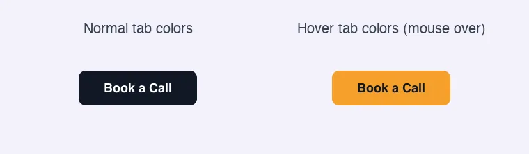
O que o campo Tabs faz #
- Ele adiciona uma linha de guias clicáveis a uma seção do painel do seu widget Clicar em uma guia mostra os campos dentro dele.
- Cada guia possui um nome, um rótulo e sua própria lista de campos.
- O campo Tabs não armazena nenhum valor em si Os valores pertencem aos campos dentro das tabs.
- Os modelos leem esses valores com
{{ tabs_name.tab_name.field_name }}. Duas guias podem usar os mesmos nomes de campo, o que mantém as regras Normal e Hover fáceis de comparar.
Se você ainda não construiu um widget, leia o Visão geral do Widget Builder primeiro.
Antes de começar #
- WordPress com Elementor instalado e ativo.
- Master Addons para Elementor e Master Addons Pro, ambos ativos. O guia instalação coberturas configuração.
- Um widget aberto no Widget Builder O exemplo neste guia é um widget “Hover Button”: um campo Texto para o rótulo do botão, além de um campo Tabs nomeado
button_statescom uma guia Normal e uma guia Hover. Cada guia contém dois campos de coresbgetext.
Como adicionar um campo Tabs #
- Ir para Complementos mestres > Construtor de widgets e abra seu widget.
- Clique no Estilo tab e adicione uma seção, por exemplo “Button Style”.
- Tipo
tabsna caixa de pesquisa de campo à esquerda. - Arrastar Guias na seção. Suas configurações abrem na barra lateral esquerda e a visualização da seção mostra a faixa de guias.
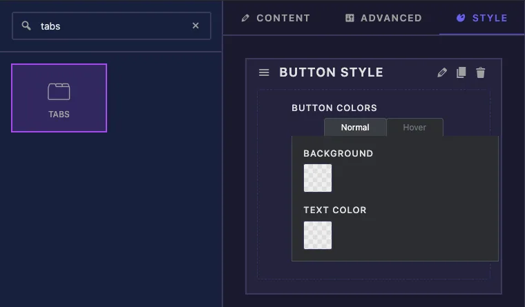
Um novo campo de guias é nomeado tabs e vem com duas abas vazias, tab_1 e tab_2. Renomeie-os antes de escrever qualquer tokens, porque os nomes passam a fazer parte de cada caminho.
Opções de campo das guias explicadas #
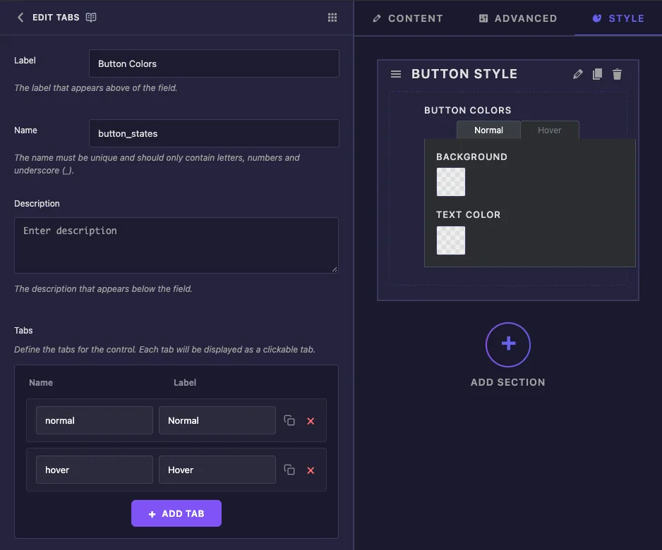
- Etiqueta nomeia o campo dentro do construtor No Elementor, os editores veem o título da seção e os rótulos das guias, não este rótulo.
- Nome é a primeira parte de cada token, então
button_statesdá{{ button_states.normal.bg }}. Apenas letras, números e sublinhados. - Descrição é uma nota para você dentro do construtor.
- Guias é a lista de guias. Cada linha tem a Nome (usado em tokens, como
hover) e a Etiqueta (mostrado na aba, como Hover).Clique Adicionar guia para outra linha, ou a cruz vermelha para remover uma.
Na lista de guias, a barra lateral mostra uma Campo de guia tabela por guia, intitulada com o rótulo da guia É para lá que vão os campos.
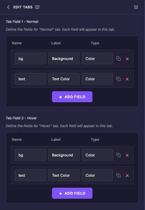
- Nome é a última parte do token. Você pode reutilizar o mesmo nome em todas as guias, como
bgetextestão aqui. - Etiqueta é o texto ao lado do controle no Elementor.
- Tipo define o controle: Texto, Número, Área de texto, WYSIWYG, Código, Oculto, Comutador, Escolha, Cor, Fonte, Tipografia, Data Hora, URL, Mídia, Galeria, Ícones, Slider, Dimensões ou Fundo.
- Clique Adicionar campo para adicionar uma linha a essa guia.
As configurações comuns mais abaixo (Mostrar Rótulo, Separador, Condições e o resto) não alteram a forma como um campo de Tabulações aparece no Elementor, para que você possa deixá-las em paz.
Leia os valores das guias em seu modelo #
Cada valor dentro de uma guia é lido com três nomes unidos por pontos: o campo Tabs, a guia e, em seguida, o campo.
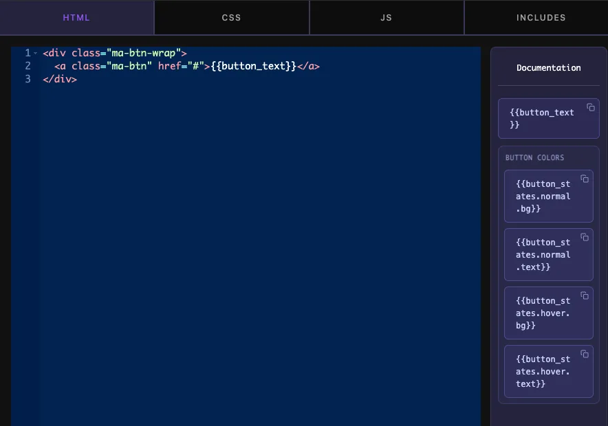
{{ tabs_name.tab_name.field_name }}Você não precisa digitar estes Depois de salvar, o painel Documentação ao lado do editor HTML lista todos os caminhos sob o rótulo do campo Tabs, e o ícone de cópia copia um.
Os tokens funcionam na guia CSS, bem como na guia HTML O botão de exemplo mantém sua aparência base em uma regra e lê as cores da guia nas próximas duas:
.ma-btn {
  background: #652dd9;
  color: #ffffff;
}

.ma-btn {
  background: {{ button_states.normal.bg }};
  color: {{ button_states.normal.text }};
}

.ma-btn:hover {
  background: {{ button_states.hover.bg }};
  color: {{ button_states.hover.text }};
}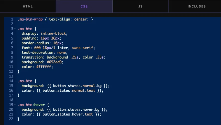
A primeira regra é um fallback Até que um editor escolha uma cor, um token não imprime nada e a linha se torna background: ;. Os navegadores pulam essa linha inválida, para que as cores da primeira regra permaneçam no lugar.
Só o caminho completo funciona Em testes, {{ bg }}, {{ hover.bg }} e {{ button_states.hover }} todos não imprimiram nada, enquanto {{ button_states.hover.bg }} imprimiu a cor Se um valor sair vazio, verifique primeiro três partes e a ortografia exata.
Clique Salvar configurações quando terminar.
Use o controle de guias no Elementor #
Adicione o widget a uma página ou recarregue o editor se a página já estiver aberta Selecione o widget e abra o Estilo guia. Sua seção mostra a faixa de guias com a guia Normal aberta.
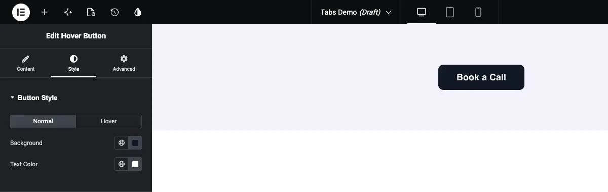
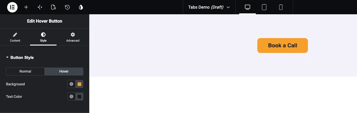
Defina as cores na guia Normal e clique em Pairar e defina o segundo par Mova o mouse sobre o botão na visualização para verificar as cores do hover.
Casos de uso comum #
- Cores normais e Hover para botões, cartões e links.
- Estilos ativos e inativos para filtros, alternâncias e itens de menu.
- Versões claras e escuras de um componente, editadas de uma seção.
- Conteúdo dividido em grupos, como uma guia Frente e Voltar em um cartão flip, com campos de texto e mídia em cada um.
Dicas para trabalhar com o campo Tabs #
- Escolha primeiro o nome do campo Tabs e os nomes das tabs. Renomear qualquer um deles mais tarde significa atualizar todos os tokens que os usam.
- Reutilize nomes de campos nas guias.
normal.bgehover.bgsão mais fáceis de ler do que dois nomes não relacionados. - Evite alterar o Label de um campo assim que o widget estiver nas páginas ao vivo O Elementor armazena os valores salvos sob uma chave construída a partir do rótulo, para que um novo rótulo possa fazer com que os valores existentes desapareçam dessas páginas.
- Coloque estilos padrão em uma regra antes da regra do token, para que um valor vazio nunca quebre o design.
- Dê às suas classes um prefixo (como
ma-btn). CSS da guia CSS do widget se aplica a toda a página, portanto, nomes genéricos como.buttonpode colidir com outros estilos. - Para um único grupo liga/desliga de configurações em vez de guias, consulte o Campo de alternância Popover. Para uma lista à qual o editor pode adicionar linhas, use o Campo repetidor.
Perguntas frequentes #
O campo Tabs é gratuito?
No. Tabs é um dos campos Pro no Widget Builder, então Master Addons Pro tem que estar ativo antes que você possa adicioná-lo a um widget.
Como leio um valor de uma guia específica?
Use três nomes unidos por pontos: o nome do campo Tabs, o nome da guia e, em seguida, o nome do campo Por exemplo {{ button_states.hover.bg }} lê o bg campo do hover guia.
Duas guias podem conter campos com o mesmo nome?
Sim. o nome da aba faz parte do caminho, então {{ button_states.normal.bg }} e {{ button_states.hover.bg }} mantenha valores separados.
Por que meu token de guia não imprime nada?
Ou o caminho está incompleto ou o editor ainda não definiu um valor Verifique se o token tem todas as três partes e corresponde aos nomes no construtor Para valores vazios, mantenha uma regra de fallback antes da regra do token no seu CSS.
Os tokens funcionam na guia CSS?
Sim. O mesmo {{ tabs_name.tab_name.field_name }} os tokens funcionam nas guias HTML e CSS.
Embrulhando #
Nomeie o campo Tabs e suas guias, adicione campos a cada guia e leia-os com {{ tabs_name.tab_name.field_name }} no seu HTML ou CSS Mantenha uma regra de fallback para valores vazios e estabeleça nomes antes que o widget entre em operação O Campo cor doc cobre o controle de cor usado neste exemplo e preços mostra o que cada plano inclui.


