

দ্য শিরোনাম ক্ষেত্র আপনার কাস্টম উইজেটের বিকল্প প্যানেলের ভিতরে একটি ছোট গাঢ় শিরোনাম প্রিন্ট করে। মত বিভাজক ক্ষেত্র, এটি প্যানেলের জন্যই একটি লেআউট হেল্পার: এটি পৃষ্ঠায় কিছুই আউটপুট করে না, আপনার কোডে কোনো শর্টকোড যোগ করে না এবং ফ্রন্টএন্ডে কখনই প্রদর্শিত হয় না। এর একটি কাজ হল নিয়ন্ত্রণগুলির একটি গ্রুপের নাম দেওয়া, তাই প্যানেলটি ইনপুটগুলির একটি দীর্ঘ স্ট্যাকের পরিবর্তে লেবেলযুক্ত বিভাগগুলির সাথে একটি ফর্মের মতো পড়ে।
প্রতিটি উইজেট বিল্ডার নিয়ন্ত্রণের মতো, শিরোনামটি সমর্থন করে শর্তাবলী, তাই একটি বিভাগ লেবেল শুধুমাত্র তখনই দেখাতে পারে যখন এর সম্পর্কিত বিকল্পগুলি করে। বিল্ডার জুড়ে টেমপ্লেট আউটপুট এর মাধ্যমে চলে টুইগ-সিনট্যাক্স টেমপ্লেট ইঞ্জিন; উভয় গাইড সেটআপ এবং সীমাবদ্ধতা কভার করে।
মাস্টার অ্যাডঅন ভিতরে উইজেট নির্মাতা, আপনি শিরোনামটি যে নিয়ন্ত্রণগুলি প্রবর্তন করা উচিত তার উপরে ফেলে দিন, শিরোনামটি তার লেবেলে টাইপ করুন এবং সংরক্ষণ করুন৷ নীচের ওয়াকথ্রুতে, "কালার স্টাইল" নামক একটি শিরোনাম একটি উইজেটে একটি রঙ নিয়ন্ত্রণের উপরে যায় যেখানে ইতিমধ্যেই পাঠ্য, সীমানা এবং রঙের ক্ষেত্র রয়েছে৷।
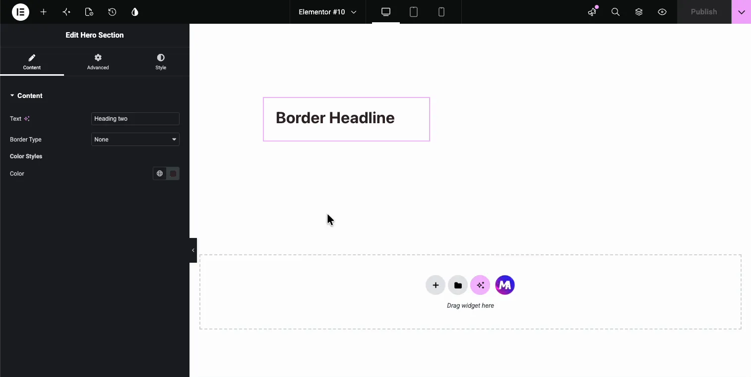
শিরোনাম ক্ষেত্র কি করে #
একটি শিরোনাম এলিমেন্টর এডিটর প্যানেলে একটি সাহসী মিনি-টাইটেল হিসাবে তার লেবেল রেন্ডার করে, ঠিক সেই জায়গায় যেখানে আপনি এটিকে নিয়ন্ত্রণের মধ্যে রেখেছেন। সম্পাদকরা সেই গোষ্ঠীর অন্তর্গত নিয়ন্ত্রণগুলির উপরে বসে "রঙের শৈলী" (বা আপনি এটির নাম যাই বলুন না কেন) দেখতে পান।
শিরোনাম দুটি জিনিস করে না করবেন:
- এর কোনো আউটপুট নেই। ক্ষেত্রটি প্রতিটি উইজেট বিল্ডার ক্ষেত্রের মতো একটি নাম পায়, কিন্তু ডকুমেন্টেশন সাইডবারে কোনো টোকেন দেখা যায় না। নেই
{{heading}}আপনার HTML, CSS, বা JS এ স্থাপন করতে। - এটি কখনই পৃষ্ঠা স্পর্শ করে না। শিরোনামটি শুধুমাত্র উইজেটের বিকল্প প্যানেলে থাকে। প্রিভিউ এবং লাইভ ফ্রন্টএন্ড ঠিক একই থাকে।
একটি শিরোনাম যা দর্শকরা পৃষ্ঠায় পড়ে তা একটি ভিন্ন কাজ: এটি একটি পাঠ্য ক্ষেত্র আপনার HTML এ মুদ্রিত। শিরোনাম ক্ষেত্রটি শুধুমাত্র প্যানেলটিকে লেবেল করে। আপনি যদি উইজেট তৈরিতে নতুন হন তবে শুরু করুন উইজেট নির্মাতা ওভারভিউ প্রথম।
আপনি শুরু করার আগে #
- ওয়ার্ডপ্রেস সঙ্গে এলিমেন্টর ইনস্টল এবং সক্রিয়।
- এলিমেন্টরের জন্য মাস্টার অ্যাডঅন ইনস্টল এবং সক্রিয়। প্লাগইনে নতুন? দেখা ইনস্টলেশন গাইড.
- উইজেট বিল্ডার এডিটরে একটি কাস্টম উইজেট খোলা হয়েছে যেখানে কয়েকটি ক্ষেত্র ইতিমধ্যেই রয়েছে। আমাদের উদাহরণে পাঠ্য, সীমানা এবং রঙের ক্ষেত্র রয়েছে।
কিভাবে একটি শিরোনাম ক্ষেত্র যোগ করতে হয় #
উইজেট বিল্ডার এডিটরে, বাম দিকে ফিল্ড প্যানেলের উপরের দিকে তাকান। দ্য শিরোনাম ফিল্ড হল তালিকার প্রথমটি, হিডেনের ঠিক পাশে একটি H আইকন দিয়ে চিহ্নিত৷।
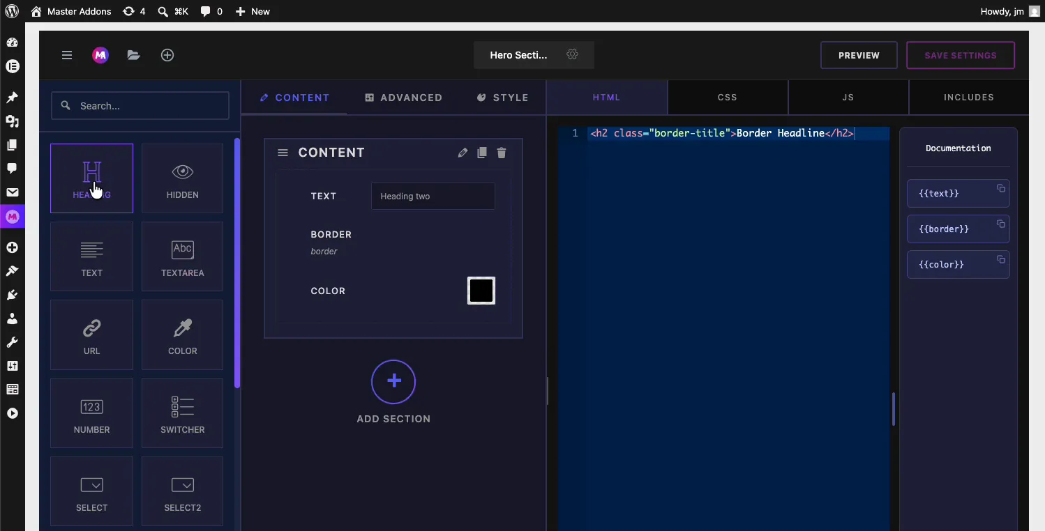
শিরোনামটি আপনার বিভাগে টেনে আনুন এবং এটিকে যে নিয়ন্ত্রণগুলি প্রবর্তন করা উচিত তার ঠিক উপরে ফেলে দিন। আমাদের উদাহরণে এটি বর্ডার ফিল্ড এবং কালার ফিল্ডের মধ্যে অবতরণ করে, তাই এটি কালার গ্রুপের ক্যাপশন দেবে। যদি এটি ভুল জায়গায় নেমে যায়, তাহলে হ্যান্ডেলটি তার বাম দিকে ধরুন এবং এটিকে জায়গায় টেনে আনুন।
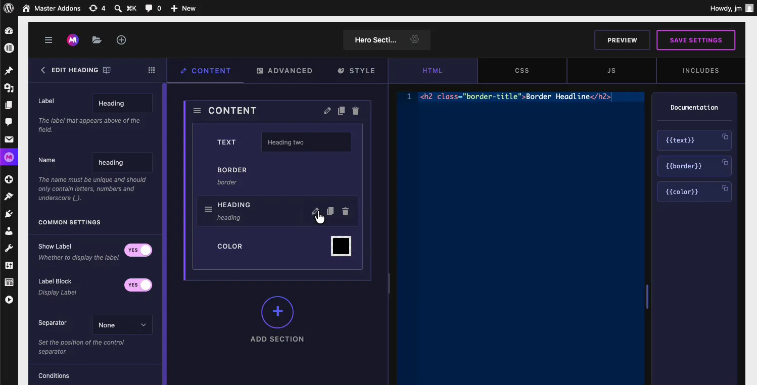
শিরোনাম ক্ষেত্রের বিকল্পগুলি ব্যাখ্যা করা হয়েছে #
এর সেটিংস খুলতে শিরোনাম নির্বাচন করুন। লেবেল হল একমাত্র বিকল্প যা এখানে সত্যিই গুরুত্বপূর্ণ, কারণ লেবেল হল সেই পাঠ্য যা শিরোনামটি প্রদর্শন করে।
- লেবেল: প্যানেলে দেখানো শিরোনাম, ডিফল্টরূপে "শিরোনাম"৷ গ্রুপের যা প্রয়োজন তাতে এটি পরিবর্তন করুন; আমরা “Color Styles” টাইপ করেছি।
- নাম: ক্ষেত্রের জন্য অনন্য শনাক্তকারী। এটিতে শুধুমাত্র অক্ষর, সংখ্যা এবং আন্ডারস্কোর থাকতে হবে। শিরোনামটি কোন শর্টকোড তৈরি করে না, তাই নামটি পর্দার আড়ালে থাকে।
- লেবেল দেখান এবং লেবেল ব্লক: স্ট্যান্ডার্ড লেবেল টগল করে। লেবেল দেখান চালু রাখুন, যেহেতু লেবেলটি এই ক্ষেত্রের সম্পূর্ণ পয়েন্ট।
- বিভাজক: নিয়ন্ত্রণ বিভাজকের অবস্থান সেট করে (কোনটিই নয়, আগে, পরে, ডিফল্ট)।
- শর্ত: অন্য নিয়ন্ত্রণের মানের উপর ভিত্তি করে শিরোনামটি দেখান বা লুকান, যাতে একটি গ্রুপ শিরোনাম তার শর্তসাপেক্ষ নিয়ন্ত্রণের সাথে একসাথে অদৃশ্য হয়ে যেতে পারে।
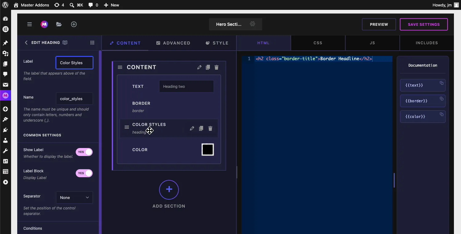
এখনই মাঝের কলাম আপডেটে লেবেল এবং ফিল্ড কার্ডের নাম পরিবর্তন করুন। ক্লিক করুন সেটিংস সংরক্ষণ করুন যখন এটি আপনার ইচ্ছামত পড়ে।
Elementor সম্পাদকের শিরোনাম দেখুন #
আপনার কাস্টম উইজেট ব্যবহার করে এমন একটি পৃষ্ঠা খুলুন, বা এলিমেন্টর এডিটর পুনরায় লোড করুন যদি এটি ইতিমধ্যেই খোলা থাকে, যেহেতু একটি বাসি ট্যাব পুরানো প্যানেল বিন্যাস রাখে। উইজেট নির্বাচন করুন এবং এর বিষয়বস্তু ট্যাব পরীক্ষা করুন।
প্যানেলটি এখন পাঠ্য, বর্ডার টাইপ, তারপর একটি বোল্ড পড়ে রঙ শৈলী শিরোনাম, তারপর এটির অধীনে রঙ নিয়ন্ত্রণ। শিরোনামটি চিহ্নিত করে যেখানে রঙের গ্রুপ শুরু হয় এবং ডানদিকের পূর্বরূপটি অস্পর্শিত।
সাধারণ ব্যবহারের ক্ষেত্রে #
- নামকরণ শৈলী গ্রুপ যেমন একটি বিভাগের ভিতরে "রঙের শৈলী", "টাইপোগ্রাফি" বা "স্পেসিং"।
- নকশা নিয়ন্ত্রণ থেকে বিষয়বস্তু বিভক্ত করা যখন উভয়ই একই ট্যাবের অধীনে থাকে।
- ক্যাপশন পুনরাবৃত্তি নিদর্শন, যেমন একটি উইজেটে "প্রাথমিক বোতাম" এবং "সেকেন্ডারি বোতাম" গ্রুপ।
- ক্লায়েন্টদের গাইডিং দীর্ঘ প্যানেলের মাধ্যমে যেখানে ইনপুটগুলির একটি প্লেইন স্ট্যাক ব্যাখ্যা করতে হবে।
শিরোনাম ক্ষেত্রের সাথে কাজ করার জন্য টিপস #
- এটি একটি বিভাজকের সাথে যুক্ত করুন। ক বিভাজক শিরোনামের উপরে একটি পরিষ্কার রেখা আঁকে যেখানে পূর্ববর্তী গ্রুপটি শেষ হয় এবং নামযুক্ত গ্রুপটি শুরু হয়।
- শিরোনাম ছোট রাখুন। একটি লেবেল হিসাবে পড়া দুই বা তিনটি শব্দ; একটি বাক্য বিশৃঙ্খল হিসাবে পড়া হয়।
- ছোট গোষ্ঠীর জন্য একটি নতুন বিভাগের পরিবর্তে এটি ব্যবহার করুন। দুই বা তিনটি সম্পর্কিত নিয়ন্ত্রণ খুব কমই তাদের নিজস্ব সংকোচনযোগ্য বিভাগের প্রাপ্য; তাদের উপরে একটি শিরোনাম কম ওজন সঙ্গে একই কাজ করে।
- সংরক্ষণ করার পরে এলিমেন্টর সম্পাদক পুনরায় লোড করুন। আপনি রিফ্রেশ না হওয়া পর্যন্ত একটি খোলা ট্যাব নতুন শিরোনাম দেখাবে না।
প্রায়শই জিজ্ঞাসিত প্রশ্নাবলী #
মাস্টার অ্যাডনস উইজেট বিল্ডারে হেডিং ফিল্ড কী?
শিরোনাম ক্ষেত্রটি একটি কাস্টম উইজেটের বিকল্প প্যানেলের ভিতরে একটি সাহসী শিরোনাম হিসাবে তার লেবেল প্রদর্শন করে। এটি এলিমেন্টর এডিটরে নিয়ন্ত্রণের একটি গ্রুপের নাম দেয় এবং উইজেটের আউটপুট বা আপনার সাইটের সামনের দিকে কোন প্রভাব ফেলে না।
শিরোনাম ক্ষেত্র কি আমার ওয়েবসাইটে কিছু দেখায়?
না। শিরোনামটি শুধুমাত্র এলিমেন্টর এডিটরের উইজেটের বিকল্প প্যানেলে প্রদর্শিত হয়। একটি শিরোনাম প্রিন্ট করতে দর্শকরা পড়তে পারেন, একটি পাঠ্য ক্ষেত্র যোগ করুন এবং আপনার উইজেটের HTML-এ একটি শিরোনাম ট্যাগের ভিতরে এর শর্টকোড রাখুন।
শিরোনাম প্রদর্শন করে আমি কিভাবে পাঠ্য পরিবর্তন করব?
উইজেট বিল্ডারে শিরোনাম ক্ষেত্রটি নির্বাচন করুন এবং এর লেবেল সম্পাদনা করুন। লেবেলটি ঠিক যা প্যানেলে রেন্ডার করে, তাই "কালার স্টাইল" টাইপ করলে এটি অনুসরণ করা নিয়ন্ত্রণগুলির উপরে একটি গাঢ় রঙের শৈলী শিরোনাম দেখায়। এলিমেন্টর এডিটর সংরক্ষণ করুন এবং পুনরায় লোড করুন।
শিরোনাম ক্ষেত্র কি একটি শর্টকোড তৈরি করে?
না। ইনপুট ক্ষেত্র যেমন টেক্সট বা কালার আপনার কোডের জন্য টোকেন তৈরি করে, কিন্তু শিরোনাম কোনো মান সংগ্রহ করে না, তাই ডকুমেন্টেশন সাইডবারে কোনো টোকেন দেখা যায় না। এর নাম শুধুমাত্র একটি অভ্যন্তরীণ শনাক্তকারী হিসাবে বিদ্যমান।
আমার কি একটি শিরোনাম, একটি বিভাজক বা একটি নতুন বিভাগ ব্যবহার করা উচিত?
নিয়ন্ত্রণের একটি ছোট গোষ্ঠীর নাম দিতে একটি শিরোনাম ব্যবহার করুন, গোষ্ঠীগুলির মধ্যে একটি রেখা আঁকতে একটি বিভাজক এবং একটি নতুন বিভাগ ব্যবহার করুন যখন ক্ষেত্রগুলির একটি সেট তার নিজস্ব সংকোচনযোগ্য এলাকার প্রাপ্য। শিরোনাম এবং বিভাজকগুলি ভালভাবে একত্রিত হয়: লাইন প্রথম, এটির নীচে শিরোনাম।
মোড়ানো #
উইজেট বিল্ডার শিরোনাম ক্ষেত্রটি নিয়ন্ত্রণের স্ট্যাককে লেবেলযুক্ত গ্রুপে পরিণত করে। এটিকে যে নিয়ন্ত্রণগুলি প্রবর্তন করা উচিত তার উপরে ফেলে দিন, গ্রুপের নামটি তার লেবেলে রাখুন, প্যানেলে বোল্ড শিরোনাম দেখতে এলিমেন্টর সম্পাদকটিকে সংরক্ষণ করুন এবং পুনরায় লোড করুন৷ সঙ্গে এটি ব্যবহার করুন বিভাজক ক্ষেত্র পরিষ্কার গ্রুপ বিরতি জন্য, এবং মত ক্ষেত্র সঙ্গে টেক্সট এবং সীমানা নিজেদের ব্যাখ্যা করে এমন প্যানেল তৈরি করতে। বাকি অন্বেষণ মাস্টার অ্যাডঅন উইজেট এবং এক্সটেনশন, এবং দেখুন মূল্য পৃষ্ঠা প্রতিটি পরিকল্পনা অন্তর্ভুক্ত কি জন্য।


