

Поле Select2 добавляет раскрывающийся список с возможностью поиска к пользовательскому виджету, созданному с помощью главных аддонов Виджет Строитель. Редакторы набирают тип для фильтрации списка, а при включенном "Показать несколько" они могут выбрать несколько вариантов одновременно. Используйте его для длинных списков опций или для выбора в стиле тега, где одного ответа недостаточно.
Выберите2 является Поле Pro. бесплатный плагин включает ограниченный Виджет Строитель, и полный набор полей приходит с Мастер Аддоны Про.
Что делает поле Select2 #
- Добавляет на панель виджета в Elementor раскрывающийся список с полем поиска.
- При выключенном Show Multiple редактор выбирает один вариант, и ваш шаблон получает ключ этого параметра.
- При включении "Показать несколько" редактор выбирает любое количество параметров, отображаемых в виде съемных тегов, и ваш шаблон получает список ключей, которые вы печатаете с помощью a
{% for %}петля. - Каждый вариант имеет ключ и метку Редакторы видят метки, и ваш HTML всегда получает ключи.
Если вы еще не создали виджет, прочтите Обзор виджета-строителя первый. Для короткого списка с одним выбором без поиска, равнина Выбрать поле проще.
Прежде чем начать #
- WordPress с установленным и активным элементом Elementor.
- Мастер-аддоны для Elementor и Master Addons Pro, оба активные. The руководство установки настройка обложек.
- Виджет, открытый в конструкторе виджетов Пример в этом руководстве - виджет “Portfolio Card” с полем Текст для названия проекта и двумя полями Select2: Тип проекта (один выбор) и Теги проекта (несколько вариантов).
Как добавить поле Select2 #
- Перейти к Мастер-аддоны > Виджет-строитель и откройте виджет.
- На Содержание вкладка, добавить раздел, если его еще нет.
- Тип
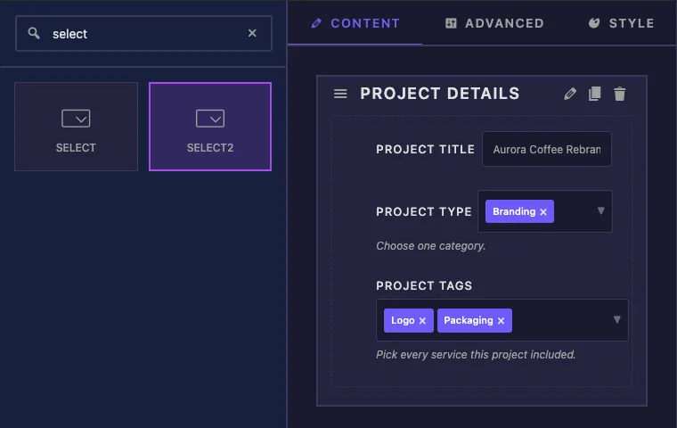
selectв поле поиска слева Выберите и Выберите2 come up. - Драг Выбрать2 в раздел Его настройки открываются в левой боковой панели.
Новое поле Select2 начинается с включения "Показать несколько" и трех вариантов выборки (value-1 чтобы value-3). Замените их своими, прежде чем писать шаблон.
Объяснены параметры поля Select2 #
Вот поле Тип проекта, настроенное на один выбор:
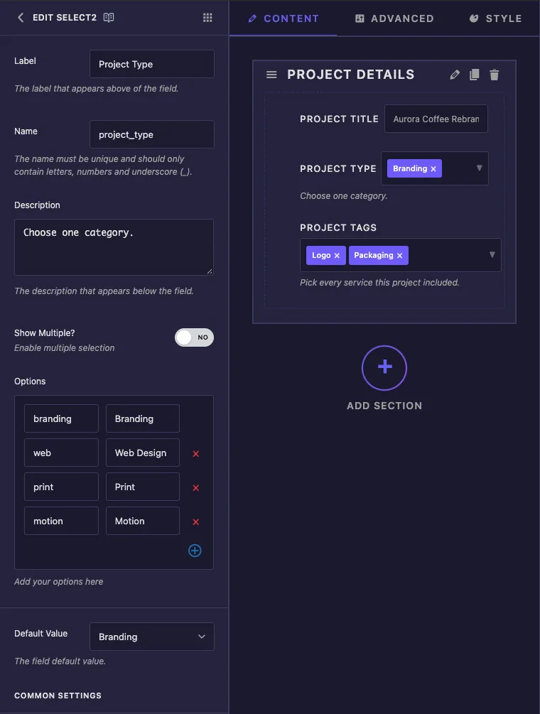
- Этикетка является текстом рядом с элементом управления в Elementor, например “Project Type”.
- Имя является ли поле уникальным идентификатором (только буквы, цифры и подчеркивания).Это также токен, который вы используете в шаблоне, так что
project_typeстановится{{project_type}}. - Описание появляется под контролем в Elementor.Используйте его для короткого подсказки, например “Выберите одну категорию.”
- Показать несколько? переключается между одним выбором (Нет) и многими выборами (Да). Это меняет то, что получает ваш шаблон, поэтому решите, прежде чем писать HTML.
- Опции является список выбора. левое поле является ключом, который ваш шаблон получает (
branding,web).Правое поле - это метка редакторы см. (Брендинг, Веб-дизайн). Используйте значок плюс, чтобы добавить строку и красный крест, чтобы удалить один. - Значение по умолчанию то, что выбрано, когда виджет впервые добавлен на страницу В одиночном режиме это обычное раскрывающееся значение Если вы оставите его пустым, выбирается первый вариант.
Теги проекта используют те же параметры с включенным Показать несколько. поле Значение по умолчанию становится тегом выбора, поэтому вы можете предварительно выбрать более одного варианта. оставьте его пустым и первый вариант будет предварительно выбран.
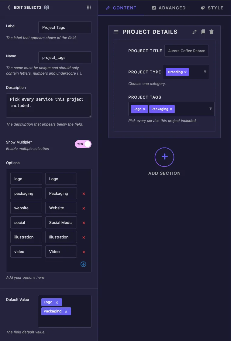
Если список Значение по умолчанию по-прежнему показывает старые параметры образца после редактирования Параметры, нажмите Сохранить настройки и снова открыть поле.
Ниже значения по умолчанию вы найдете общие настройки, общие для большинства полей: "Показать метку", "Блок метки", "Отзывчивое управление", "Динамическая поддержка", "Доступный интерфейс", "Разделитель" Условия и Классы управления. блокировки меток стоит включить для нескольких полей, поскольку затем элемент управления получает полную ширину панели для своих меток.
Используйте значения Select2 в своем шаблоне #
То, как вы распечатаете значение, зависит от "Показать несколько".
Единый режим: печать ключа #
Один Select2 работает как любой другой токен. {{project_type}} печатает выбранный ключ, поэтому вы можете использовать его как текст или построить из него CSS-класс:
<article class="portfolio-card type-{{project_type}}">
  <span class="card-type">{{project_type}}</span>
При выборе брендинга это отображается type-branding и branding. Вы также можете сравнить это: {% if project_type == 'web' %}...{% endif %}.
Несколько режимов: переключение клавиш #
Несколько Select2 содержат список, и {{project_tags}} на собственных принтах ничего. Вместо этого зацикливайтесь на нем:
<ul class="card-tags">
  {% for tag in project_tags %}
    <li class="card-tag">{{ tag }}</li>
  {% endfor %}
</ul>
Цикл запускается один раз для каждого выбранного варианта, в том порядке, в котором редактор выбрал их. Внутри него, {{ tag }} это один ключ и фильтры, такие как {{ tag|upper }} работайте тоже. The Руководство по синтаксису Twig перечисляет все, что поддерживает механизм шаблонов.
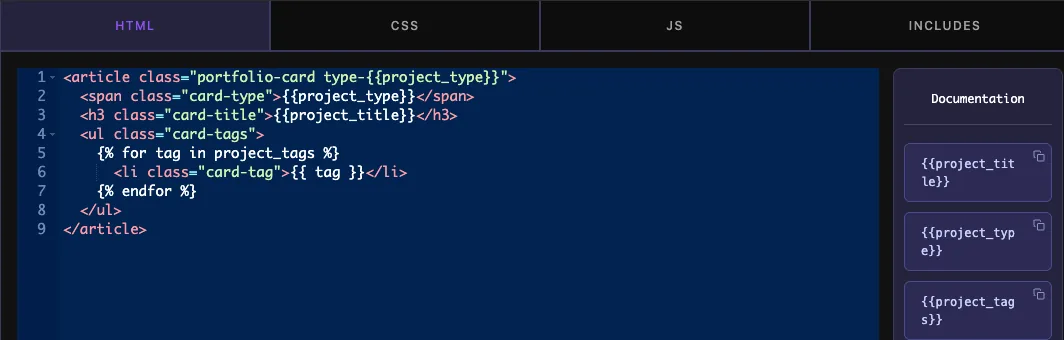
Панель Документация рядом с редактором кода перечисляет токен для каждого поля Копирование {{project_tags}} отсюда хорошо для отдельных полей, но цикл по-прежнему нужен нескольким полям.
Нажмите Сохранить настройки когда шаблон сделан.
Используйте элемент управления Select2 в Elementor #
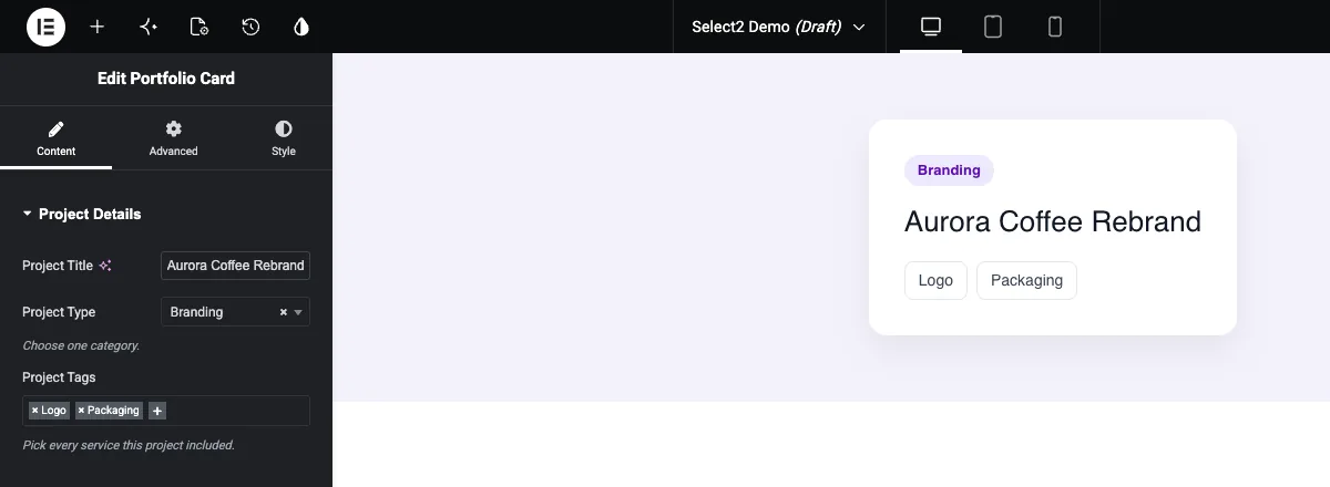
Добавьте виджет на страницу, или перезагрузите редактор, если страница уже была открыта Оба элемента управления Select2 появляются на вкладке Содержимое с уже выбранными по умолчанию.
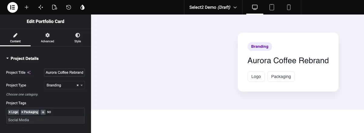
В множественном управлении нажмите кнопку плюс или пустое место после тегов и начните печатать Список сужается по мере ввода, и Enter добавляет выделенный параметр. у каждого тега есть небольшой крестик, который удаляет его.
Единый элемент управления открывает раскрывающийся список с собственным окном поиска. выберите опцию или используйте крестик рядом с текущим значением, чтобы очистить его.
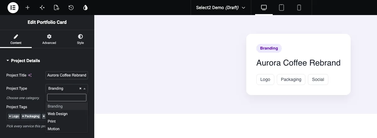
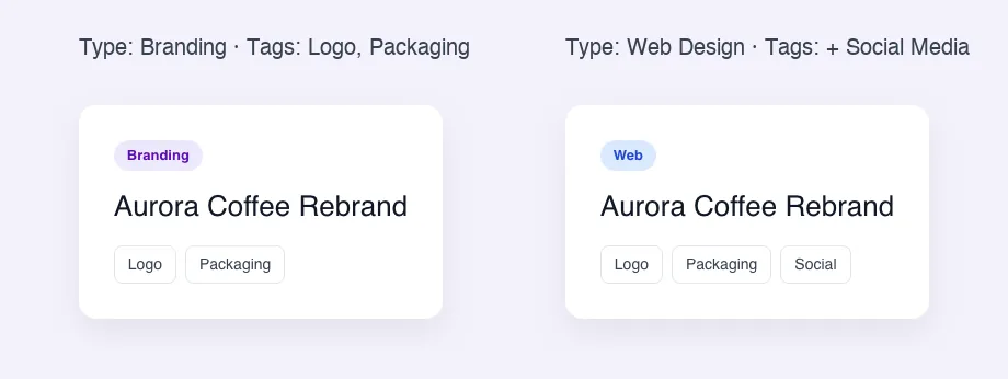
Холст обновляется сразу Обратите внимание, что на панели отображаются этикетки (Web Design, Social Media), в то время как карта печатает клавиши (Web Design, Social Media)web, social):
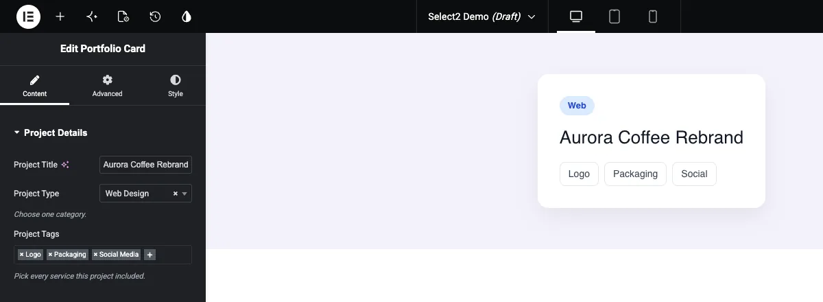
Если вам нужен текст метки на странице, либо сделайте ключ достаточно читаемым для отображения, либо сопоставьте его в шаблоне:
{% for tag in project_tags %}
  <li class="card-tag">{% if tag == 'social' %}Social Media{% else %}{{ tag }}{% endif %}</li>
{% endfor %}
Обычные случаи использования #
- Теги или услуги на портфолио, тематическом исследовании и командных картах.
- Выбор категории или стиля, добавляющий класс CSS, например
type-web. - Длинные списки, такие как страны, отрасли или наборы значков, где поиск сохраняет прокрутку.
- Списки функций на ценовых картах или картах продуктов, зацикленные на элементах списка.
Советы по работе с полем Select2 #
- Сначала решите показать несколько. Переключить его позже означает изменить
{{field}}в петлю или наоборот. - Напишите клавиши строчными буквами без пробелов (
social,web). Они попадают в названия классов и сравнения. - Не переименовывать ключи после того, как виджет в использовании Страницы, которые уже сохранили старый ключ, не будут соответствовать новому.
- Например, стилизуйте вывод с помощью клавиши
.type-web .card-type { ... }. - Для нескольких кнопок значков вместо раскрывающегося списка используйте Выберите поле.
Часто задаваемые вопросы #
Поле Select2 бесплатно?
№ Select2 - одно из полей Pro в сборщике виджетов, поэтому Master Addons Pro должен быть активен, прежде чем вы сможете добавить его в виджет.
Как показать каждое значение, выбранное в нескольких Select2?
Петля над полем: {% for tag in project_tags %}{{ tag }}{% endfor %}, где project_tags имя поля. Петля выполняется один раз за выбранный вариант.
Почему мой токен Select2 ничего не печатает?
Показать Multiple вероятно на. Несколько поле держит список, и {{field_name}} не могу распечатать список Используйте a {% for %} зацикливайтесь или выключите "Показать несколько", если одного выбора достаточно.
Получает ли шаблон метку опции или ключ?
Ключ. Если опция web имеет метку Веб-дизайн, шаблон получает web. Чтобы распечатать этикетку, используйте читаемый ключ или сопоставьте его с помощью {% if %}.
Чем отличаются Select и Select2?
Оба используют опции клавиш и метки. Select2 добавляет поле поиска и может удерживать несколько пиков одновременно с помощью Show Multiple. Используйте выбор для коротких списков с одним выбором.
Завершая #
Добавьте поле Select2, установите ключи и метки и выберите один выбор и множество, прежде чем писать HTML. Распечатайте одно значение с помощью {{field_name}} и перейдите через несколько с {% for %}. Чтобы повторить группы полей, а не список вариантов, посмотрите на Поле ретранслятораи проверьте ценообразование за то, что включает каждый план.


