Master Addons introducing Tooltip Extension for Elementor Page builder. You can insert Tooltip in any elementor Elements. We’ve released a Tooltip Elements a long ago, time passes and we noticed sometimes it’s necessary to add tooltips for image, heading, infobox, and many more elements.
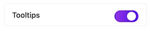
Before jumping into the guideline, make sure you have enabled the “Tooltip” extension from the Master Addons Extension manager page.
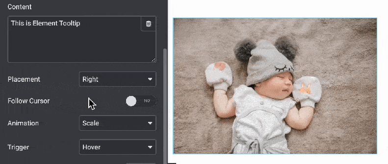
Now drag and drop any elements where you like to add a tooltip. For example – in the following screenshot, I added an Image element and navigated to the advanced tab. There you will see “Tooltip” option. By default it’s disabled, just click on the switcher and you are ready to customize your tooltip.
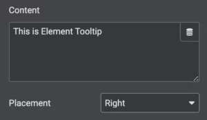
Tooltip Content & Position: Start putting your content in the first option. Underneath this content option, you will see the tooltip placement position. There are a total of 15 different tooltip positions available, just select the suitable one that fits properly on your desire.
Follow Cursor: If you like to move the tooltip with the mouse cursor, then just enable it. It will disable the default tooltip position option. When someone hovers on your element, the tooltip will follow cursor movement.
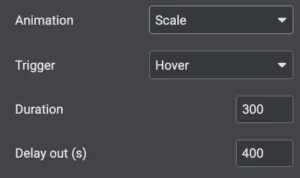
Tooltip Animation and Trigger: Select the perfect animation from our pre-built animation list. We have 6 different animations inside our package. Also, there are 3 trigger options – hover, click, and custom class. You can define the animation delay and duration too.
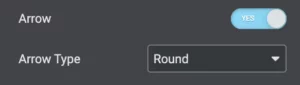
Tooltip Arrow: Enable or disable the Tooltip arrow at the last content option. If enabled, you will see two arrow types, sharp and round. Select the best one for your element and tooltip preview.
Let’s move to the style area. Using the style options you can control the overall interface of your Tooltip.
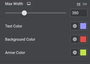
Tooltip Width and Color: Define your tooltip width in px or em. Then select the text, background, and arrow color. Make sure to select the proper color for text and background, otherwise, you may lose visibility.
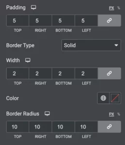
Padding and Border: Define some padding to make your tooltip more attractive and use a perfect border with border radius to catch the visitor’s eye.
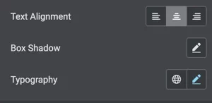
Typography: Select your desired font, box-shadow and define the text alignment here. It will help you to control the overall typography of your tooltip.
That’s all about the tooltip element by Master Addons. Feel free to get in touch with us via oursupport forum and contact pageif you face any problems.