Custom Elementor Breakpoints Setup & Configuration

Unless you want your website to lose customers, providing a good user experience across all device types is crucial. Custom Elementor breakpoint is a way to have different layouts for a website depending on the device being used.


If you are planning to create a fully responsive website for any device then you need Custom Breakpoint for Elementor. By default, Elementor provides just three breakpoints.


Master Addons P|ro will help you to add as many breakpoints as you need. In free Master Addons, you will get a maximum of 3.


This technique will make it easier for you to show the right content for your visitors depending on the screen size. The breakpoint is usually set at a specific browser width like 320px, 768px, or 1024px and displays different layout templates at that width.


In this article, I will try to simplify how to add custom breakpoints in Elementor.


Before jump into the article, You should watch the following video on Custom Elementor Breakpoints, which is enough to set up and configure different breakpoints.


Custom Elementor Breakpoint Installation:

If you are a Master Addons user, then maybe noticed the “Custom Breakpoints” option inside the extension tab. You can install the Custom Elementor Breakpoint plugin by clicking on this little download option. 

custom elementor breakpoint installation
Elementor breakpoints option by Master Addons

Within a few seconds it will be installed and activated inside your website. Now it’s your turn to set different device max widths. Hover on the “Master Addons” menu and there is a new menu added called “Breakpoints”. Just click on this breakpoint option and it will redirect you to the breakpoint input page. 

How to add Custom Breakpoint in Elementor?

Take a look at the following screenshot, this is how elementor breakpoint input page looks like. You can add or remove elementor breakpoints from this option. There are three default breakpoints added by Elementor, Mobile, Tablet, & Desktop. You can’t edit these default breakpoints. But you can add your desired custom elementor breakpoints here. The default breakpoints value will be adjusted automatically. 


Let’s add a new elementor breakpoint, you need to set the max-width only, and don’t worry about the min-width field. I’m going to add 600px as max width for small mobile devices.


After saving a new breakpoint for 600px, you will notice the default elementor mobile breakpoint’s min-width is 601 px. That means the “Small Mobile” breakpoint will work when browser width will be equal to or less than 600px. Perhpas, the elementor default breakpoint “Mobile” will work for all browsers which width, greater than 600px but less than 768px. 

Custom Breakpoint For Elementor

That’s all about the custom elementor breakpoint settings and configuration. Now it’s time to check how custom elementor breakpoints works in the elementor page editor.

Custom Elementor Breakpoint Usages

It can be simply used for defining different font sizes and alignment for any element like heading. Here is a general process, how to set different font sizes and alignment for the heading element.


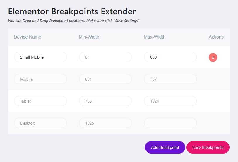
Click on Responsive mode and you will see all custom breakpoints including the elementor default breakpoint. And add a new Title element. Navigate to the font size and define multiple font sizes for the different breakpoints. Update the page and enjoy custom elementor breakpoint. Enjoy the following Gif image and you can understand how elementor breakpoint works.

Custom Elementor Breakpoint Preview

If you still face any problems regarding Custom Elementor Breakpoint by Master Addons, feel free to drop a message to us. We will try to get back to you as soon as possible.