

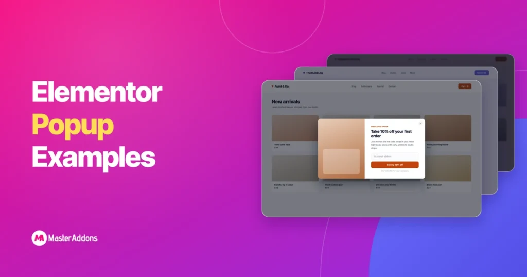
تشترك أفضل أمثلة Elementor المنبثقة في ثلاث سمات: عرض واحد واضح، ومشغل يطابق ما يفعله الزائر، واستهداف يُظهر النافذة المنبثقة فقط في المكان الذي تنتمي إليه. احصل على هذه العناصر الثلاثة بشكل صحيح وتقوم النافذة المنبثقة بتحويل حوالي 4%5 من الزوار؛ احصل على الموضع والتشغيل بشكل صحيح وتظهر بيانات Wisepops أن بعض التنسيقات تصل إلى 12% وما فوق.
كل مثال أدناه يعمل على Elementor المجاني. أداة Elementor المنبثقة مقفلة خلف Pro، ولكنها مجانية ماستر الإضافات المنبثقة منشئ يمنحك نفس تحرير السحب والإفلات، وخمسة مشغلات، واستهداف على مستوى الصفحة، ومكتبة تضم 100+ قوالب العنصر المنبثقة هذا الاستيراد بنقرة واحدة. إذا لم تقم ببناء واحدة من قبل، فقمنا بالتوجيه كيفية إضافة نافذة منبثقة في Elementor مجانًا يغطي الإعداد في حوالي عشر دقائق.
تم تجميع الأمثلة الـ 25 حسب الهدف. يُظهر كل واحد بنية حقيقية، ويسمي المشغل الذي يناسبه، ويشرح السبب المحدد لتحويله. لا تزيد “popups من المشاركة، بل الرافعة النفسية التي يسحبها كل واحد.
جدول المحتويات
ما الذي يجعل Elementor منبثقة تتحول
تجيب النافذة المنبثقة المحولة على ثلاثة أسئلة قبل أن يسألها الزائر بوعي. ماذا أحصل؟ لماذا الان؟ لماذا هذا يقاطعني؟
- عرض واحد، إجراء واحد. تتفوق النافذة المنبثقة التي تحتوي على حقل بريد إلكتروني وزر على النافذة التي تربط أيضًا مواقع التواصل الاجتماعي الخاصة بك والبيع الخاص بك وصفحتك. كل خيار إضافي ينزف التحويلات.
- الزناد مطابق للسلوك. يمكن أن يؤدي الخصم إلى تحميل الصفحة. لا يمكن ترقية المحتوى، لأن القارئ لم يقرأ أي شيء بعد. معظم الشكاوى من “popups لا تعمل، ترجع إلى العرض الصحيح على المشغل الخاطئ.
- الاستهداف الذي يحترم السياق. النافذة المنبثقة لاسترداد عربة التسوق على المدونة هي ضوضاء. تظهر نفس النافذة المنبثقة فقط على صفحة عربة التسوق، وهي تنقذ الإيرادات الحقيقية. شروط العرض على مستوى الصفحة هي التي تفصل أداة التحويل عن الإزعاج.
الأرقام تدعم هذا. يبلغ متوسط التحويل المنبثق حوالي 4.65%، لكن المواضع في أسفل الوسط تحول 12.88% في اختبار Wisepops، وعادةً ما تستعيد النوافذ المنبثقة ذات نية الخروج 10%15% من الزوار الذين كانوا على وشك المغادرة، وتتفوق النوافذ المنبثقة المكونة من خطوتين على النوافذ ذات الخطوة الواحدة لأن بدء إجراء ما يجعل الناس يريدون الانتهاء منه (تأثير Zeigarnik). يطبق كل مثال أدناه واحدًا على الأقل من هذه الروافع.
أمثلة منبثقة لجيل الرصاص
التقاط العملاء المحتملين هو مهمة النوافذ المنبثقة الكلاسيكية. هؤلاء السبعة يحولون القراء إلى مشتركين دون حظر المحتوى الذي أتوا من أجله.
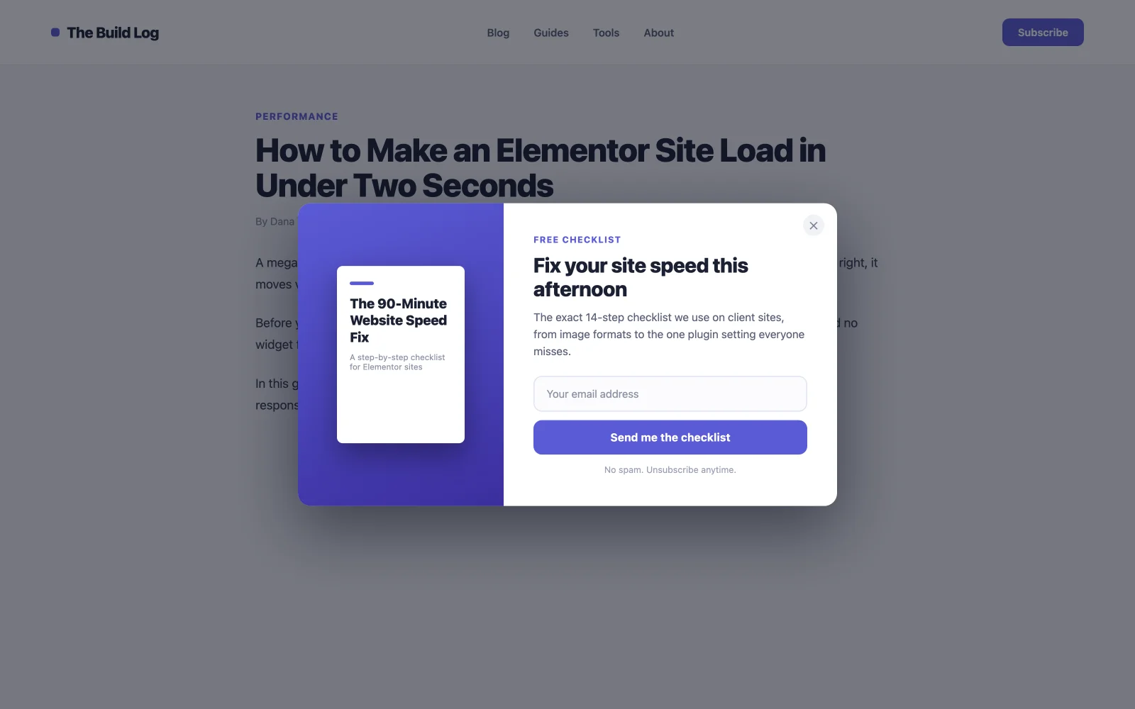
1. تنزيل الكتاب الإلكتروني أو قائمة المراجعة المنبثقة
مورد مجاني مقابل البريد الإلكتروني. هذا يحول بشكل أفضل من طلب “subscribe” العادي لأن الزائر يبتعد بشيء ملموس، وهو يؤهل قائمتك. الشخص الذي يقوم بتنزيل قائمة التحقق من تحسين السرعة يهتم بتحسين السرعة. أطلق النار عليه على التمرير بنسبة 50%، وبالتالي تصل بعد استثمار القارئ، وتستهدف منشورات المدونة فقط. تحتوي مكتبة قوالب Master Addons على العديد من عمليات الاشتراك بأسلوب التنزيل التي يمكنك استيرادها بنقرة واحدة وإعادة صياغتها.
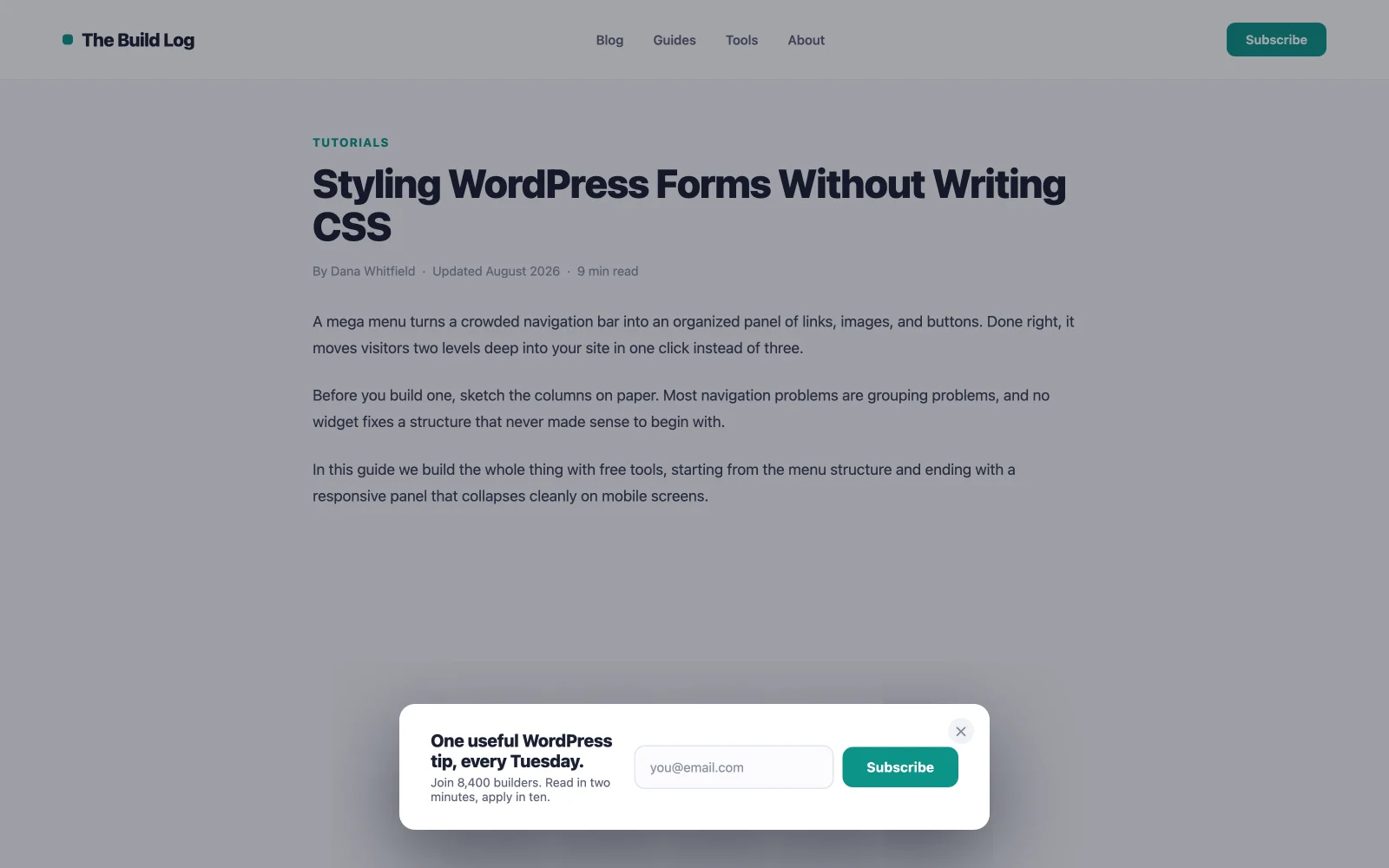
2. الاشتراك في النشرة الإخبارية ذات الحقل الواحد
حقل بريد إلكتروني واحد، زر واحد، جملة واحدة حول ما يحصل عليه المشتركون. كل حقل تضيفه يقطع الإكمالات، لذا اسأل عن الاسم لاحقًا، داخل رسالة الترحيب الإلكترونية. قم بالتمرير بنسبة 40%60، صفحات المدونة فقط، وقم بقمعه لبضعة أيام بعد أن يرفضه شخص ما. قم بإقران النافذة المنبثقة بأحد أفضل المكونات الإضافية للنشرة الإخبارية لـ WordPress لتسليم رسائل البريد الإلكتروني فعليا. يلتقط المنبثق، ويرسل ESP.
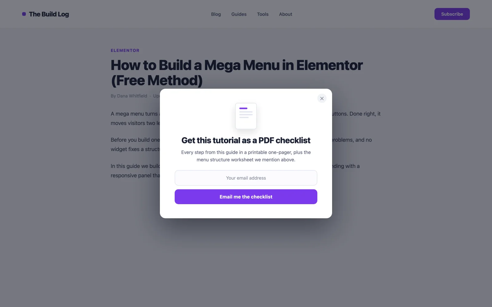
3. ترقية المحتوى بعد المحدد
النافذة المنبثقة الأعلى تحويلًا في معظم المدونات، لأن العرض يطابق المقالة بالضبط: ملف تمرير على منشور كتابة الإعلانات، وقالب على كيفية النشر. الصلة تقوم بالإقناع. استهدف منشورًا واحدًا بشروط العرض وقم بتشغيله بنسبة تمرير تبلغ 80%، عندما يكون القارئ على وشك الانتهاء ويثق بك أكثر. نعم، هذا يعني إنشاء أصل واحد لكل منشور رئيسي. ولهذا السبب أيضًا لا أحد يزعجك.
4. ندوة عبر الإنترنت أو نافذة منبثقة لتسجيل الأحداث
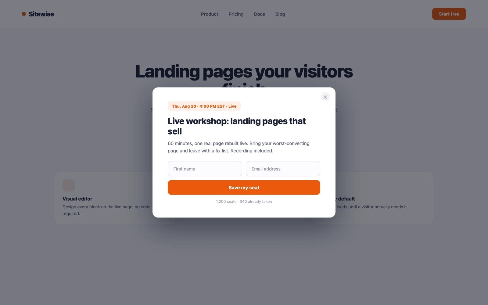
تحمل الأحداث موعدًا نهائيًا مدمجًا، ويتم تحويل المواعيد النهائية. احتفظ بالنموذج للاسم والبريد الإلكتروني، وأظهر التاريخ والوقت بشكل بارز، واجعل الزر يقول “احفظ مقعدي” بدلاً من “Submit. يعمل تحميل صفحة” بتأخير يتراوح من ثانيتين إلى ثلاث ثوانٍ هنا لأن الحدث هو الدعوة الرئيسية للموقع للعمل في ذلك الأسبوع، مما يجعل هذه الحالة الوحيدة التي يكون فيها المقاطعة مبكرًا مبررًا.
5. نافذة منبثقة مجانية للطلب التجريبي أو التجريبي
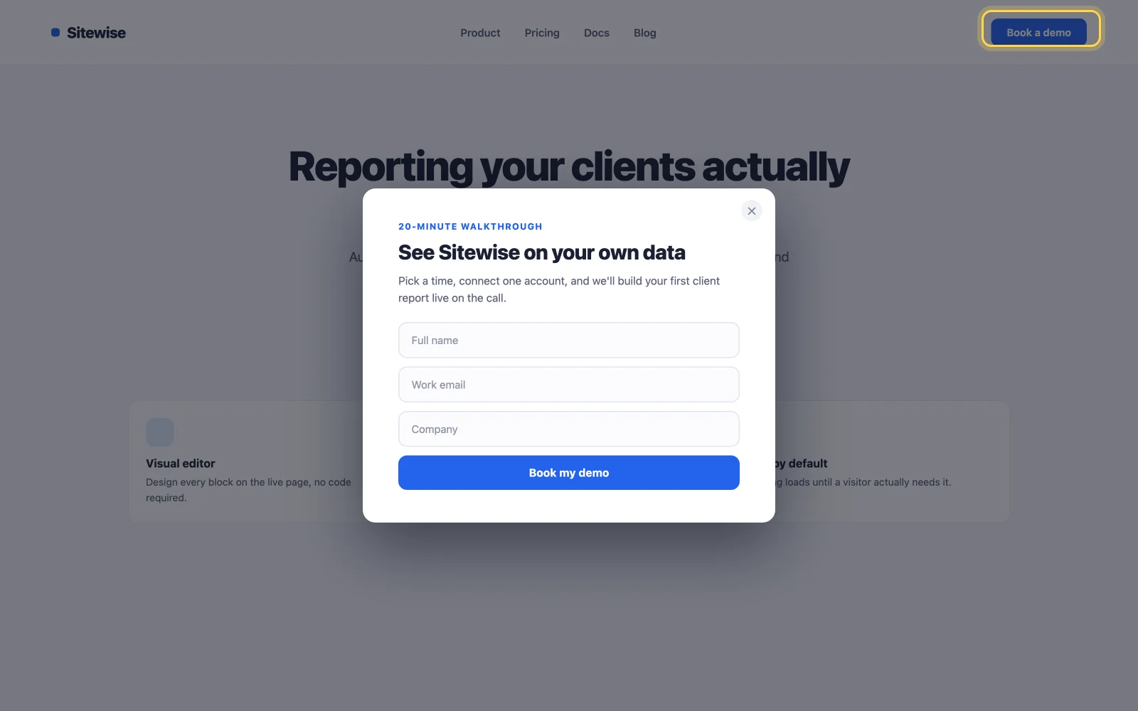
لا تضغط على النموذج التجريبي للجميع. ضع زر “Book وdemo” في الرأس وافتح النموذج على النقر. يتم تحويل النوافذ المنبثقة التي يتم تشغيلها بالنقر بأعلى معدل لأي مشغل لأن الزائر يطلبها. كل شخص يرى النموذج أراد رؤيته، لذلك لا ينزعج أحد وتأتي العملاء المتوقعون دافئين.
6. فتح مكتبة الموارد
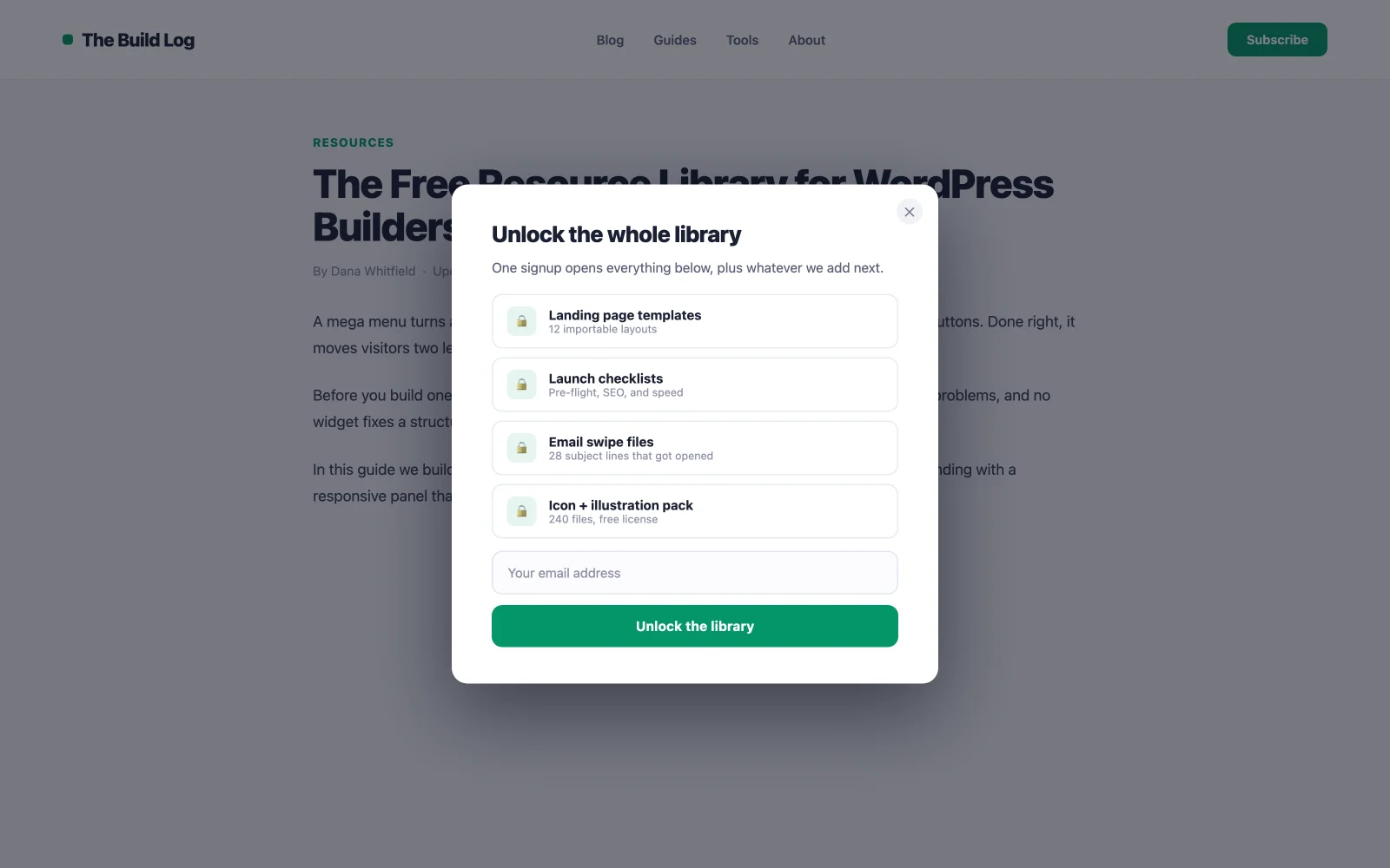
قم ببناء مجموعة من الأدلة أو القوالب أو قوائم المراجعة خلف اشتراك واحد. تتفوق القيمة المتصورة لـ “، حيث يتفوق مؤشر الترابط للمكتبة بأكملها على أي تنزيل واحد، وبالتالي فإن هذا يكسب رسائل البريد الإلكتروني اشتراكًا عاديًا لن يحدث أبدًا. استخدم مشغل النقر على زر “Get Access” الخاص بصفحة المكتبة حتى يظل التدفق مقصودًا، وقم بتسليم رابط إلغاء القفل عبر البريد الإلكتروني للحفاظ على العناوين صادقة.
7. مغناطيس الرصاص ذو نية الخروج
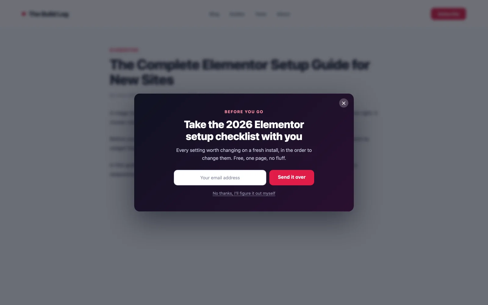
شبكة الأمان. عندما يتحرك المؤشر نحو شريط علامات التبويب، فإن مشغل الخروج والنية يطلق عرضًا أخيرًا، ولأن الزائر كان يغادر على أي حال، فلا يمكن أن يضر الجلسة التي يقاطعها. عادةً ما تستعيد النوافذ المنبثقة عند الخروج 10%15 من الزوار المتخلى عنهم، وقد أنتجت اختبارات تصميمات الخروج بملء الشاشة اشتراكات أكثر بنسبة تصل إلى 50% من الوسائط الصغيرة. قم بالقيادة باستخدام أقوى مغناطيس لديك هنا، وليس رسالتك الإخبارية.
أمثلة على التجارة الإلكترونية وWooCommerce المنبثقة
تكسب النوافذ المنبثقة في المتجر مكانها عندما ترفع متوسط قيمة الطلب أو تنقذ عملية بيع. هذه السبعة تناسب أي إصدار من WooCommerce. إذا كنت تقوم بتجميع المتجر نفسه، فإن تقريرنا عن أفضل إضافات Elementor لـ WooCommerce يغطي الحاجيات من حولهم.
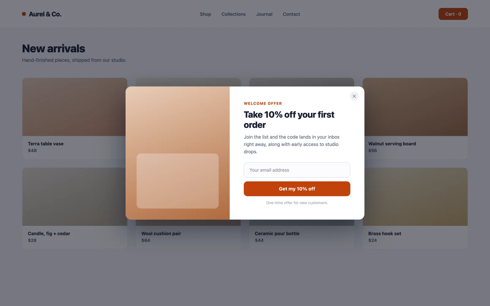
8. نافذة منبثقة للخصم من الدرجة الأولى
العمود الفقري لبناء قائمة التجارة الإلكترونية: نسبة مئوية من الطلب الأول مقابل البريد الإلكتروني. يتم تحويله لأن كلا الجانبين يفوزان على الفور: يوفر المتسوق المال عند عملية شراء كانا يفكران فيها، وتحصل على مشترك بقيمة أكبر بكثير من الخصم. تحميل الصفحة على الصفحة الرئيسية وصفحات الفئات، ويتم استبعادها دائمًا من سلة التسوق والخروج حتى لا تقوم أبدًا بخصم أي شخص كان يدفع السعر الكامل. تقوم مكتبة MA المنبثقة بشحن قوالب الخصم الجاهزة؛ استيراد واحد، وتغيير النسبة، والنشر.
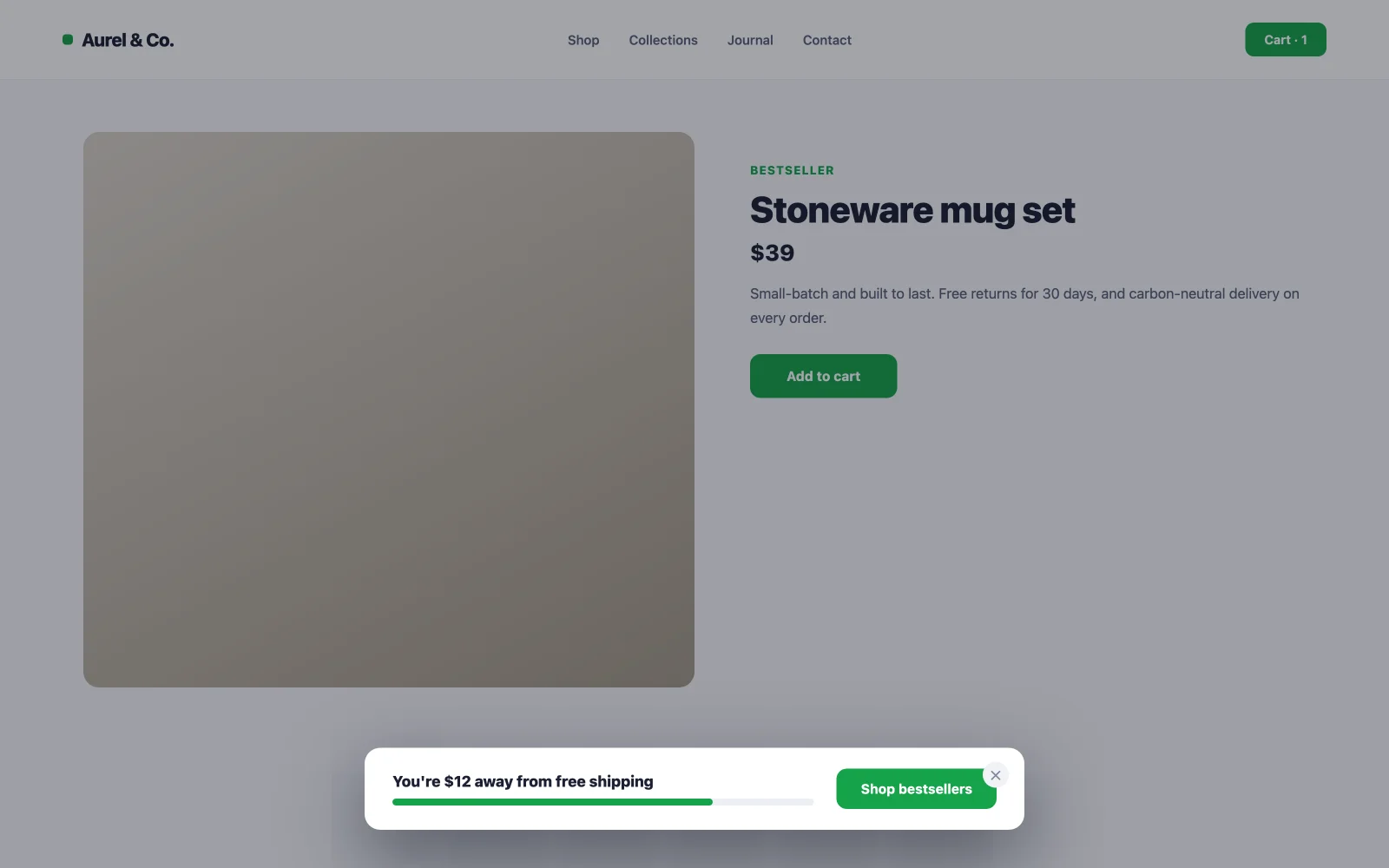
9. دفعة عتبة الشحن الحر
“أنت على بعد 12 دولارًا من الشحن المجاني، حيث تعد عملية تحديد الموقع الإلكتروني آلة ذات قيمة طلب متوسطة: فهي تعيد صياغة إضافة عنصر آخر لتوفير المال. أظهره كنافذة منبثقة رفيعة أو شريط على صفحات المنتج باستخدام مشغل التمرير، واربط الزر مباشرة بمجموعة من أكثر الكتب مبيعًا بسعر قريب من الفجوة. لا يوجد بريد إلكتروني يسأل، مهمة هذا الشخص هي عربة أكبر، وليست قائمة أكبر.
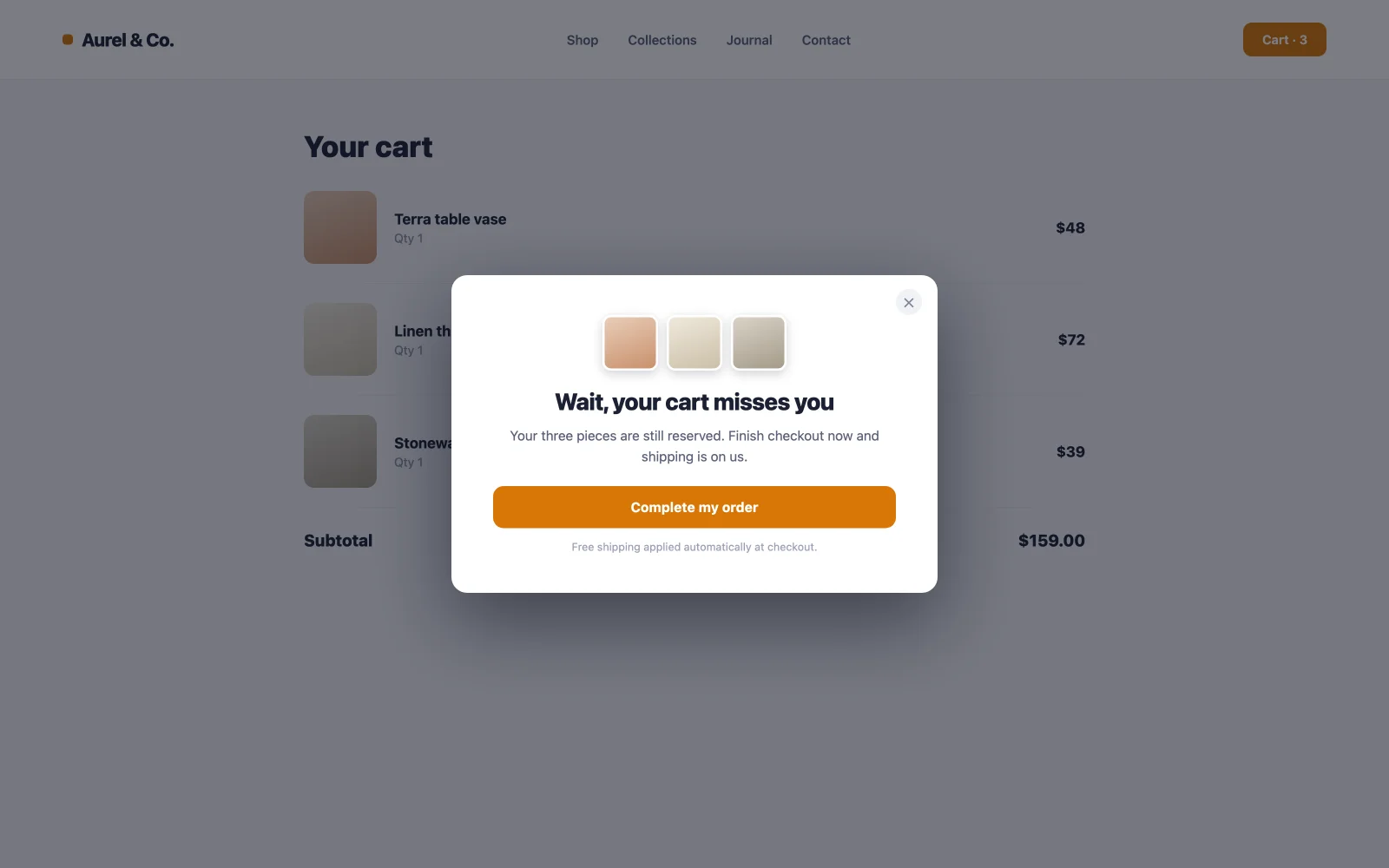
10. عرض الخروج من عربة التسوق
يتم التخلي عن حوالي سبع من كل عشر عربات، مما يجعل صفحة العربة هي العقارات الأكثر خطورة في متجرك. نافذة منبثقة هناك (شحن مجاني، خصم 5%، أو فقط “، يتم حفظ سلة التسوق الخاصة بك، طمأنينة”) تعترض لحظة التردد بالضبط. استهدف صفحة العربة فقط. يتم إطلاق النار على مستوى الموقع، حيث يقوم نفس النافذة المنبثقة بتدريب النظاميين على التخلي عن قصد وانتظار الخصم.
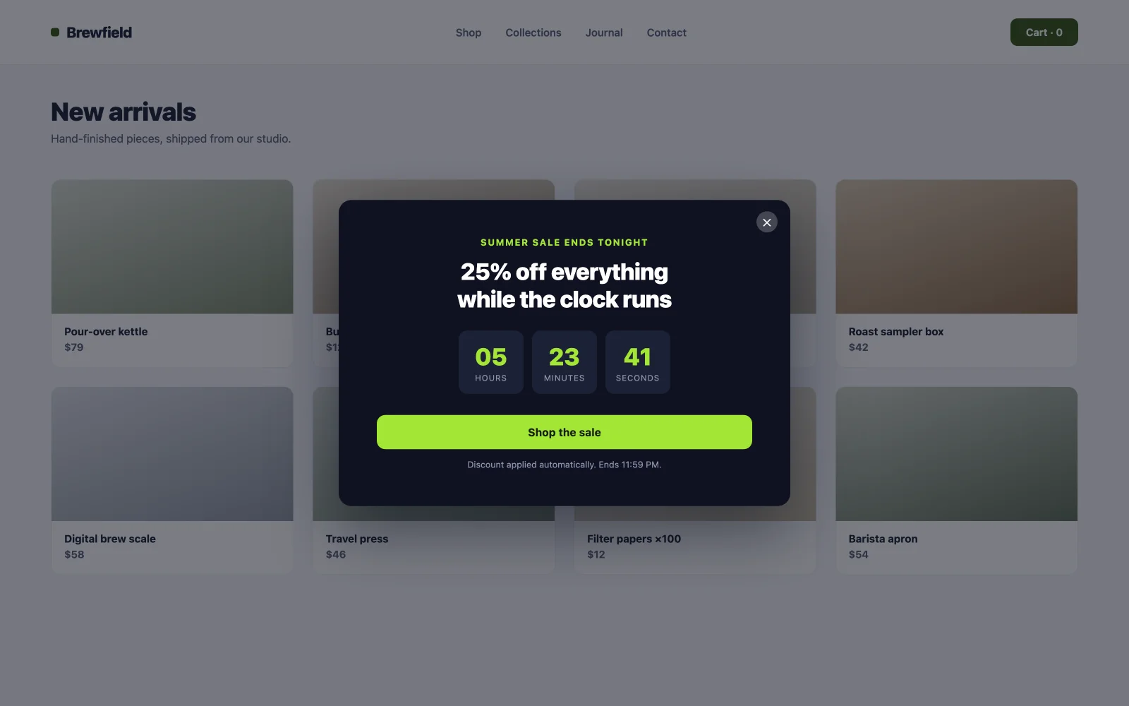
11. نافذة منبثقة للعد التنازلي لبيع الفلاش
الاستعجال يعمل عندما يكون حقيقيا. نافذة منبثقة لتحميل الصفحة مع بث مباشر توقيت العد التنازلي ويضغط تاريخ انتهاء البيع على “سأفكر في ” إلى “قرر الآن.” القاعدة التي تجعله يتحول على المدى الطويل: يجب أن يقول المؤقت الحقيقة. قم بإيقاف النافذة المنبثقة في اللحظة التي ينتهي فيها البيع. يُعلم “ending قريبًا” الدائم للزائرين تجاهل كل موعد نهائي مستقبلي تحدده.
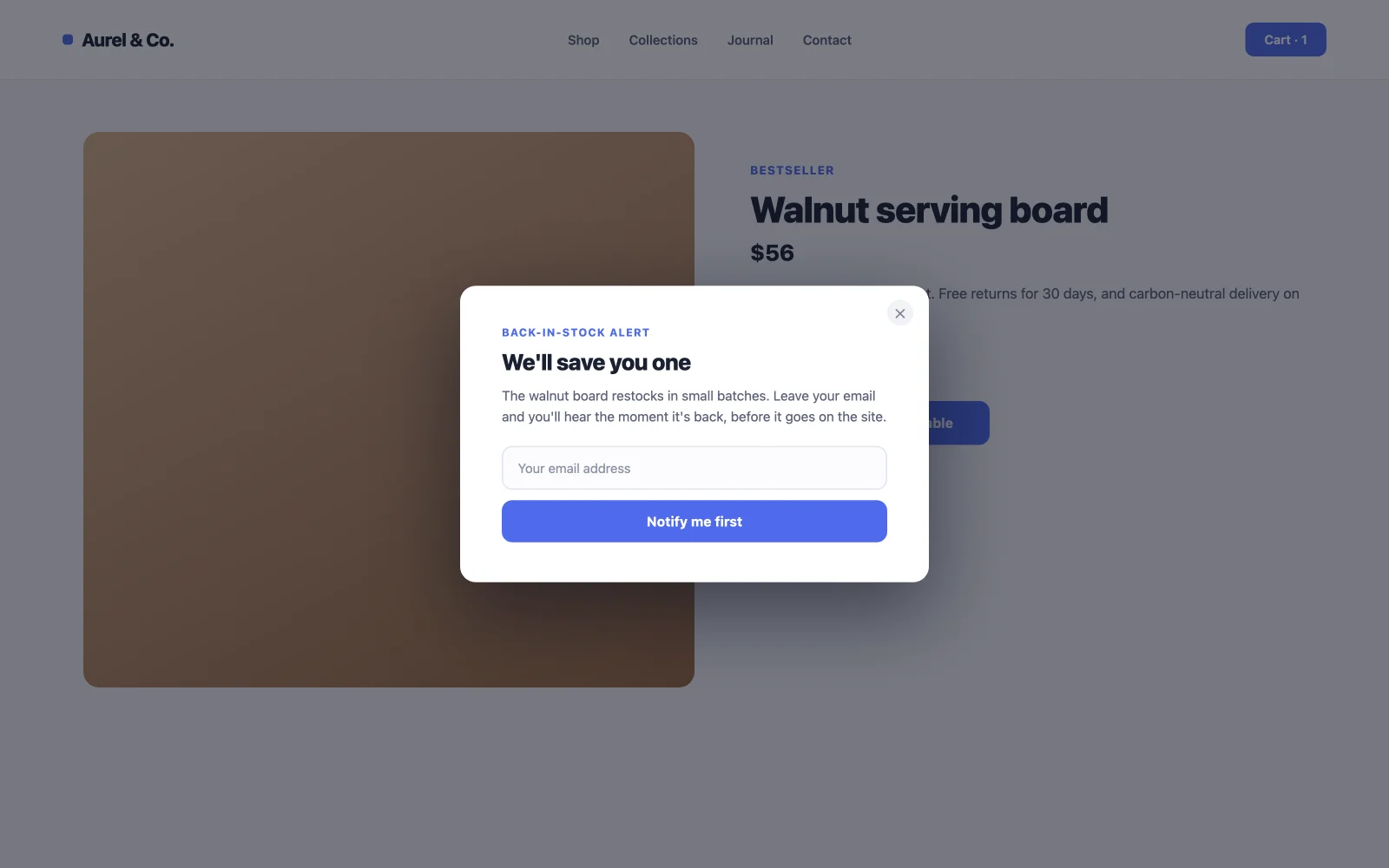
12. الاشتراك في المخزون الخلفي
عادةً ما تعني الصفحة غير المتوفرة في المخزون خسارة عملية بيع. تعمل النافذة المنبثقة “Notify me” التي يتم تشغيلها بالنقر على تحويل هذا الطريق المسدود إلى طلب يمكنك قياسه وقائمة بريد إلكتروني مضمونة الاهتمام. يقوم هؤلاء المشتركون بالتحويل بمعدلات عالية بشكل غير عادي عندما تصل رسالة إعادة التخزين الإلكترونية، لأنهم طلبوا هذا المنتج بالضبط. أضف فئة التشغيل إلى زر يتم وضعه حيث توجد عادةً ميزة "إضافة إلى عربة التسوق".
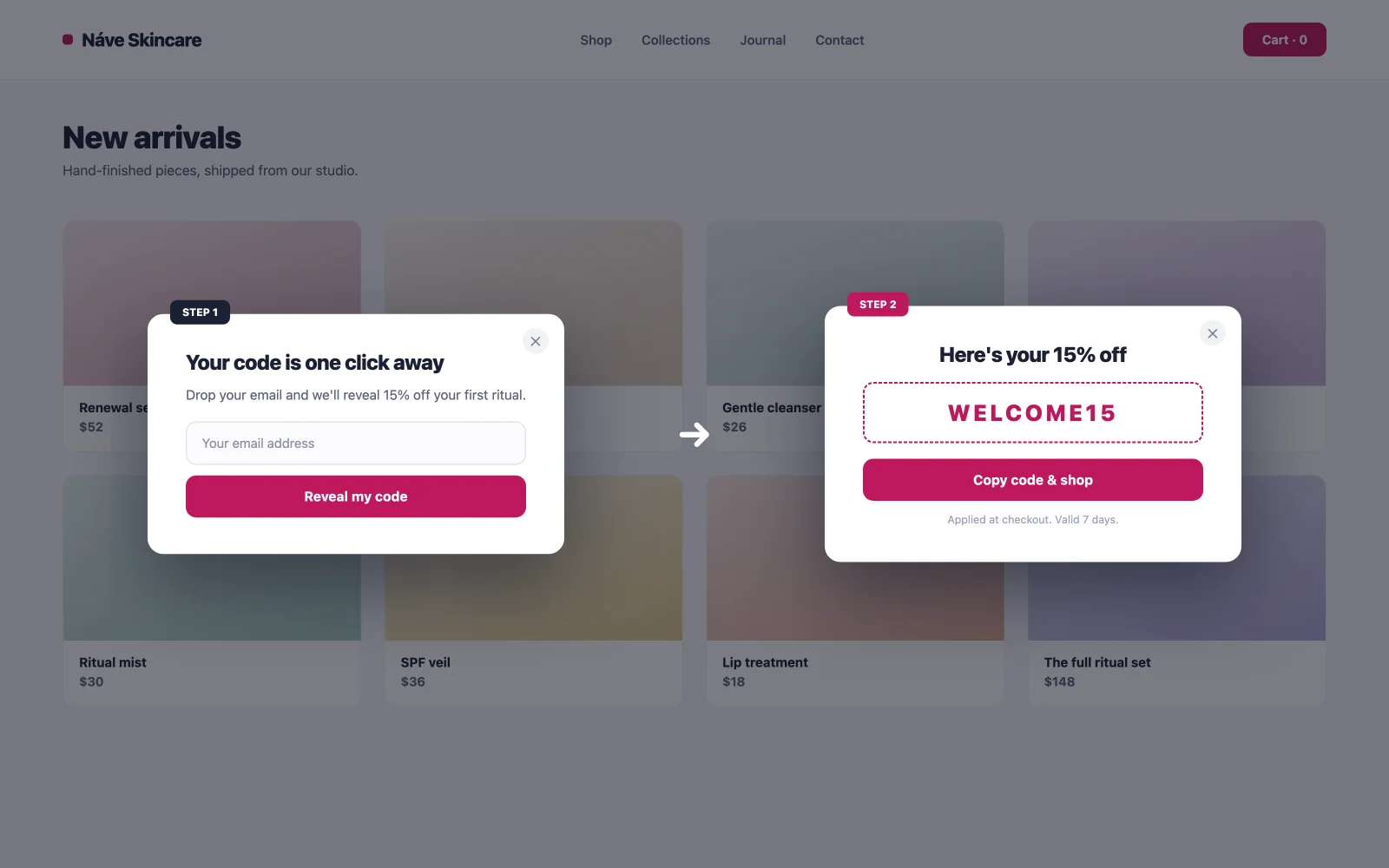
13. كشف القسيمة عن النافذة المنبثقة
خطوتين: يقوم الزائر بالاشتراك، ثم يظهر الرمز. الفضول بالإضافة إلى الالتزام: بمجرد أن ينقر شخص ما على “كشف عن الكود الخاص بي، قم بتسلسل تأثير Zeigarnik الذي يدفعه إلى إنهاء الاشتراك ثم تبريره باستخدام الكود. ملاحظة صادقة: تحتاج عجلة الدوران للفوز إلى أداة لعب منفصلة؛ الكشف البسيط هو الطريق المجاني، ويتحول بشكل محترم بدون جماليات الكازينو.
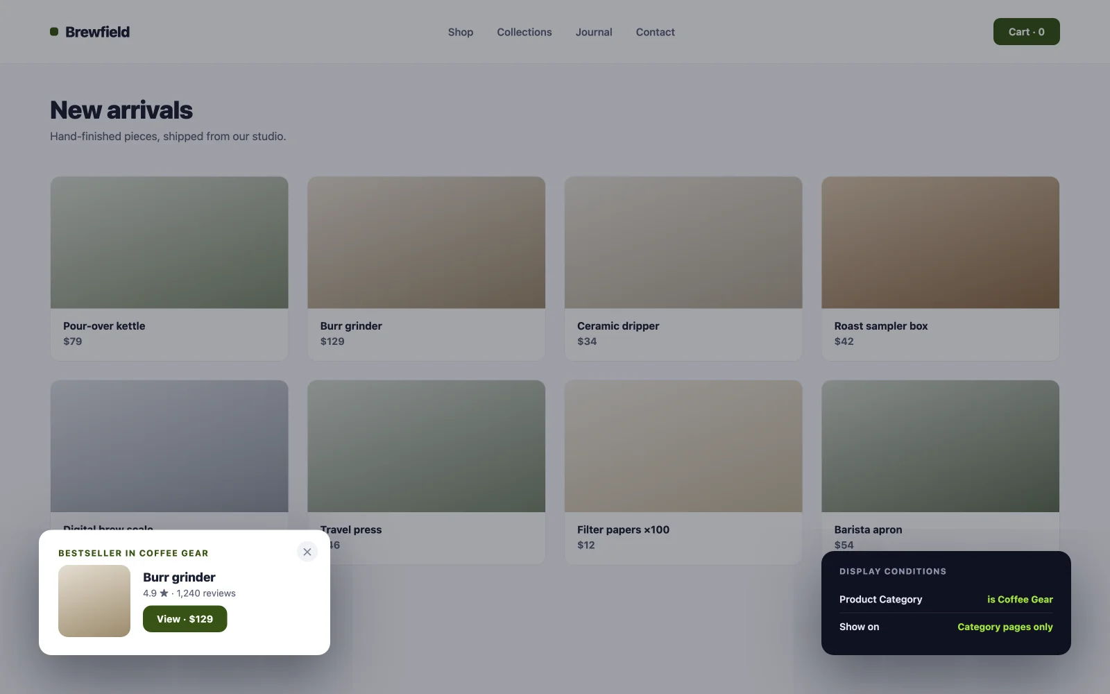
14. نافذة منبثقة للتوصيات الخاصة بفئة معينة
اقترح أن تكون معدات القهوة الأكثر مبيعًا لديك فقط في فئة القهوة. الصلة هي الحيلة الكاملة: “ عام تحقق من النافذة المنبثقة الأكثر مبيعًا لدينا، حيث يبدو الإعلان المنبثق من الفئة وكأنه مساعدة من مساعد متجر. تتعامل ظروف العرض الخاصة بـ Popup Builder مع الاستهداف لكل فئة، ونفس الشيء تمديد شروط العرض يجلب قواعد الصفحة والأدوار المتطابقة لأي عنصر آخر على الموقع.
المشاركة والأمثلة المنبثقة على الصفحة
لا تطلب كل نافذة منبثقة بريدًا إلكترونيًا. يساعد هؤلاء الستة الزائرين على القيام بشيء ما على الصفحة، أو معرفة المزيد دون تركها. التحويل هنا يعني المشاركة أو تشغيل مقطع فيديو أو الإجابة على سؤال.
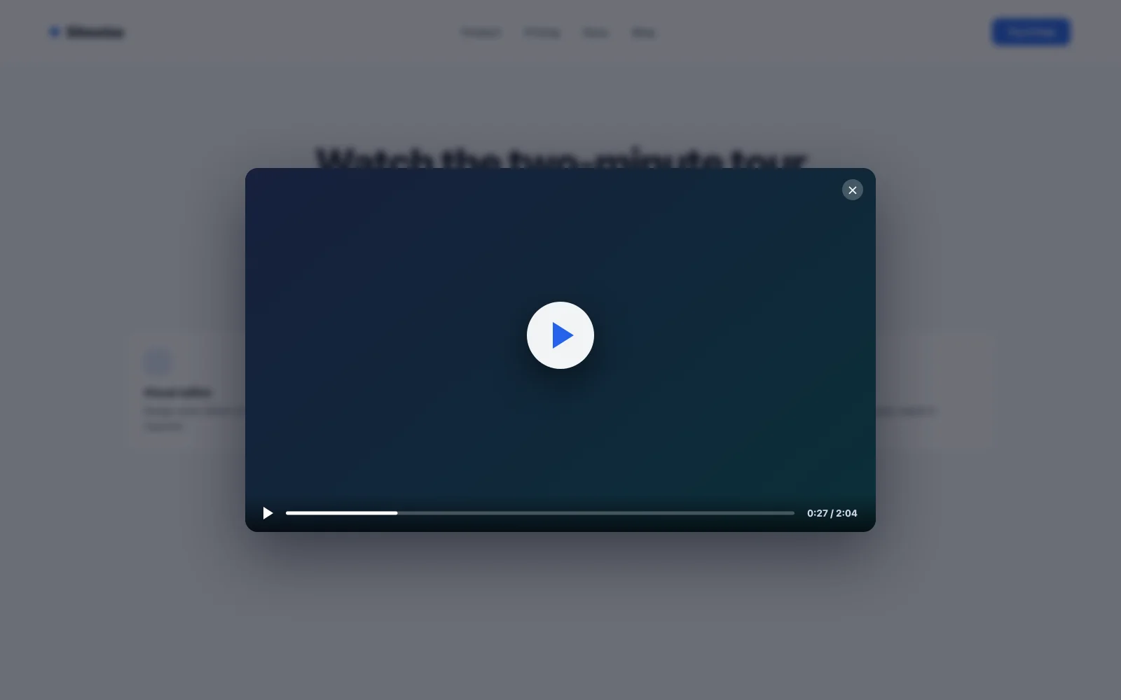
15. نافذة منبثقة لصندوق الفيديو الضوئي
قم بتضمين مقطع فيديو تجريبي مباشرة على الصفحة وسيؤدي إلى تقليل وقت التحميل سواء شاهده أي شخص أم لا. يقلب صندوق الضوء الذي يتم تشغيله بالنقر: تظل الصفحة سريعة، ويفتح الفيديو في تراكب نظيف للزوار الذين يختارونه. تعمل الصورة المصغرة لزر التشغيل على تحويل النقرات بشكل أفضل من رابط النص لأنها تحدد توقعات ما سيحدث بعد ذلك بالضبط. تتضمن مكتبة MA قوالب صندوق ضوئي للفيديو جاهزة للاستيراد؛ قم بتبديل عنوان URL للفيديو وبذلك تكون قد انتهيت.
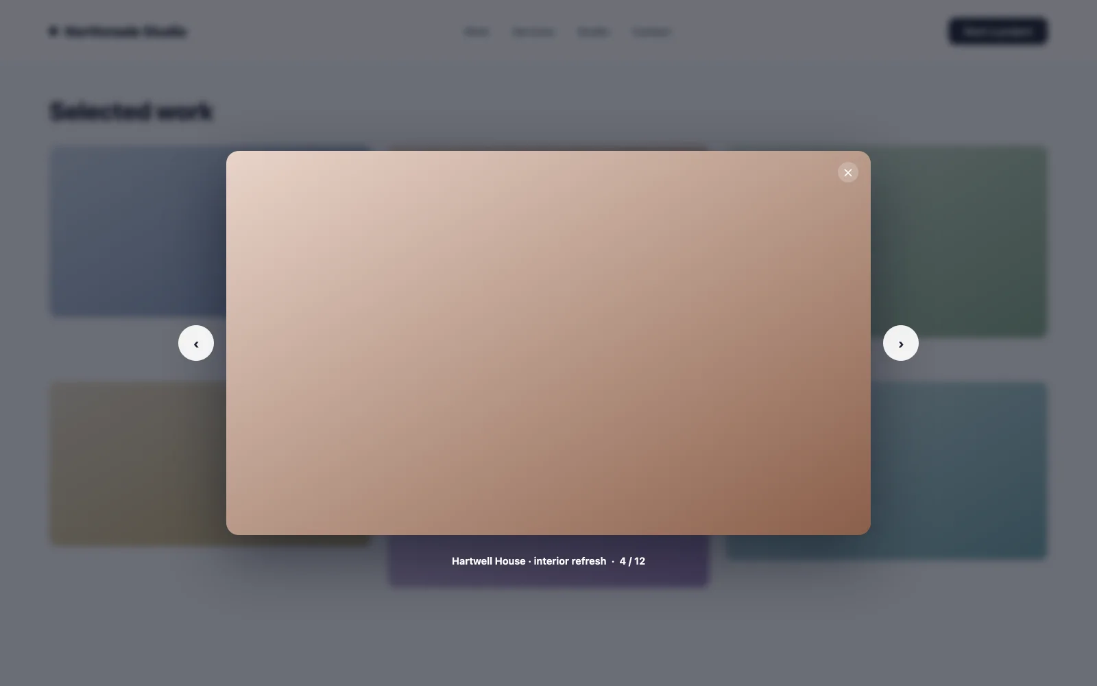
16. معرض الصور لايت بوكس
الصور المصغرة تفتح صورًا بالحجم الكامل في شكل مشروط. بالنسبة للمحافظ واللقطات المقربة للمنتج، هذا هو الفرق بين الزائر الذي يحدق في الشبكة ويفحص العمل فعليًا. الوقت المستغرق في الفحص يرتبط بالاستفسارات. انقر فوق المشغل على كل صورة مصغرة، واحتفظ بالكروم المشروط في حده الأدنى حتى تتمكن الصورة من البيع.
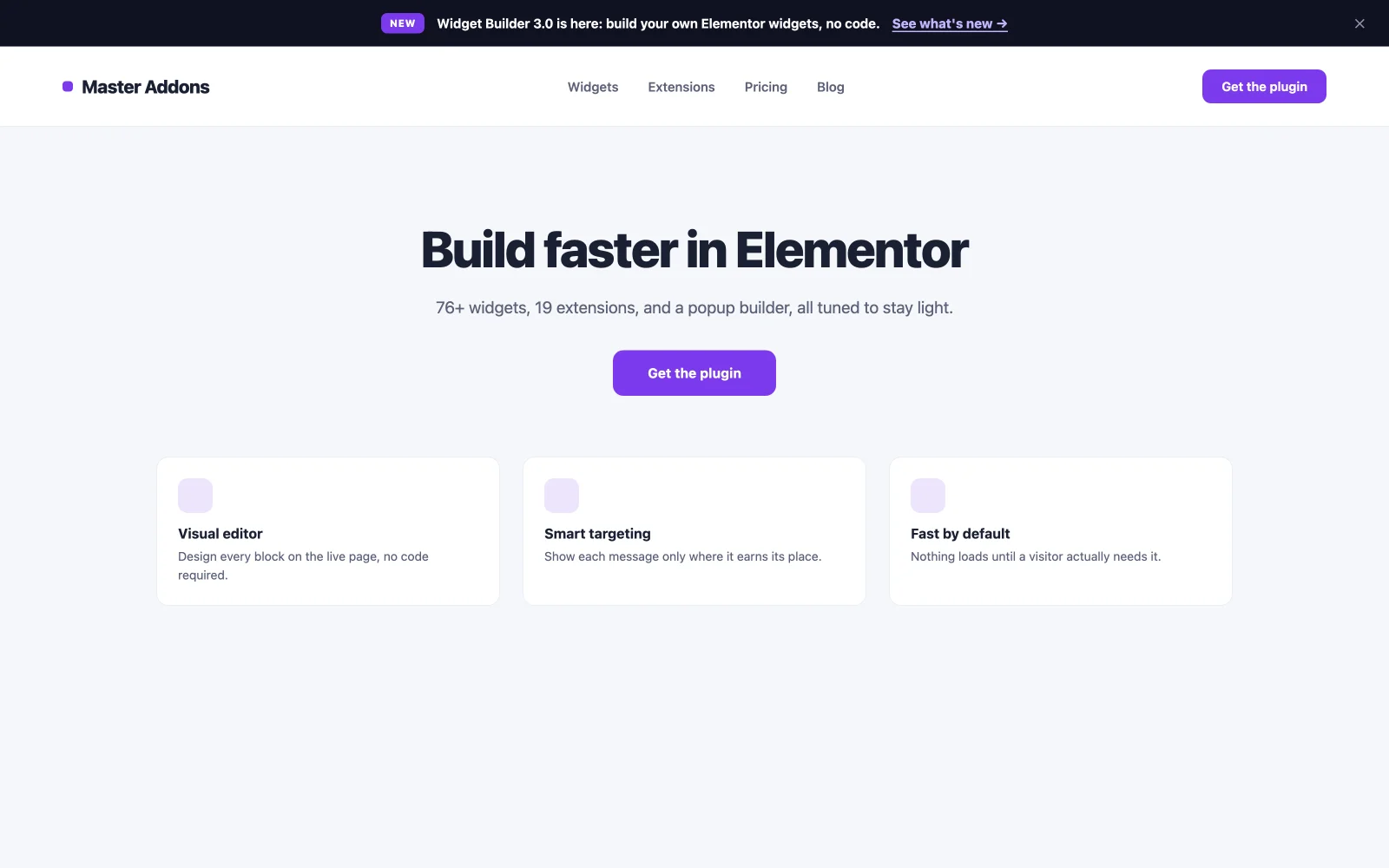
17. شريط إعلانات الميزات الجديدة
يشير شريط تحميل الصفحة الرفيع الموجود أعلى الشاشة إلى تحديث أو صفحة جديدة أو إطلاق دون تغطية المحتوى. نظرًا لأنه لا يتطلب قرارًا، تظل معدلات الفصل منخفضة ويتم رؤية الرسالة عبر الجلسات. إطلاق شيء أكبر؟ إقران الشريط بالشكل المناسب العنصر قريبا الصفحة بالنسبة لنافذة ما قبل الإطلاق، دع الشريط يعلن عن الإصدار.
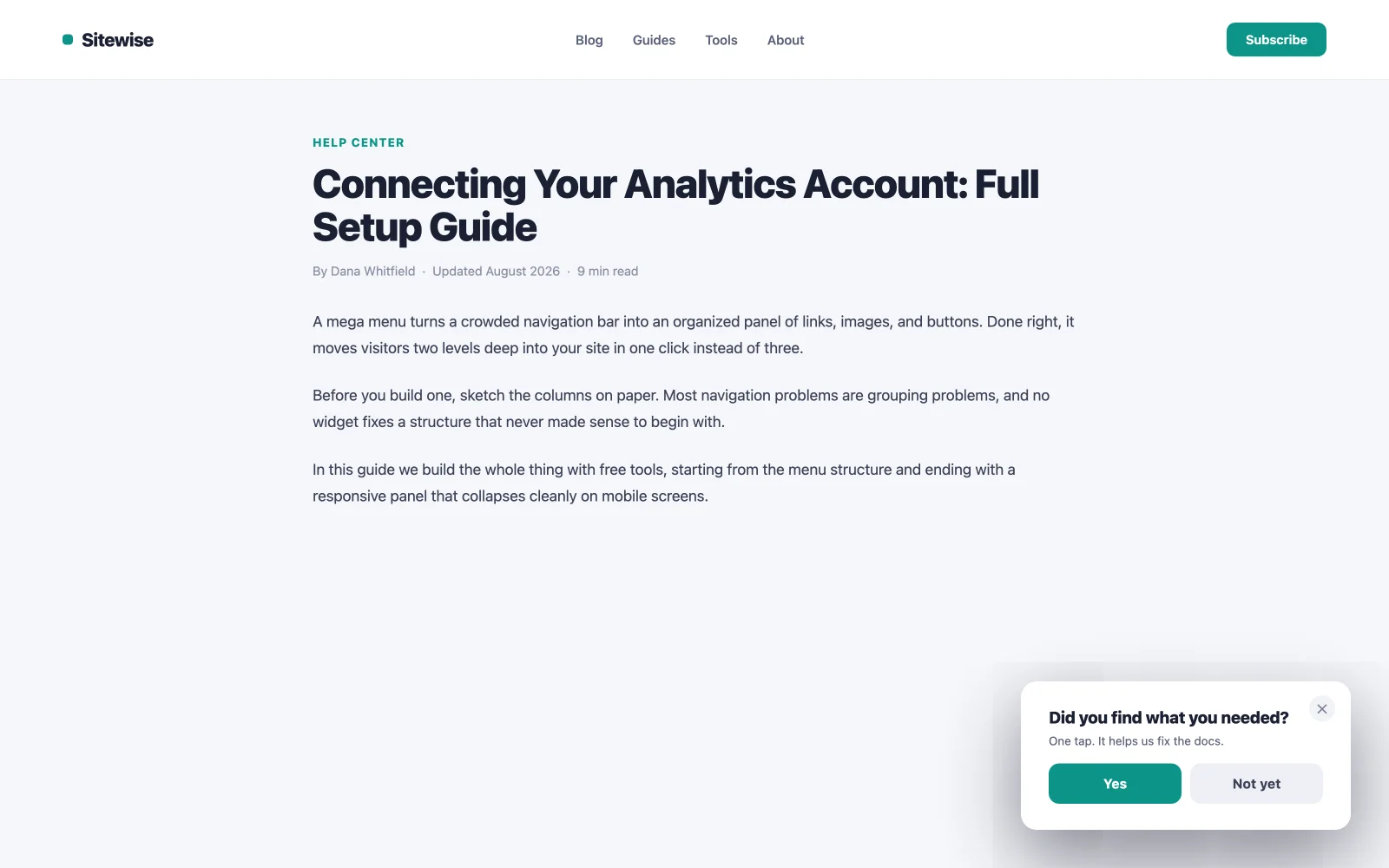
18. نافذة منبثقة للمسح الجزئي للتعليقات
تم طرح سؤال واحد، وإجابتين إلى خمس إجابات قابلة للنقر بعد الخمول. التوقيت هو البصيرة: الزائر الذي يتوقف مؤقتًا يعالج شيئًا ما، ربما ارتباكًا، وربما ترددًا، ويستطلعه استطلاع من سؤال واحد أثناء حدوثه. احتفظ بها بنقرة واحدة دون أي نموذج متابعة، أو تنهار معدلات الاستجابة.
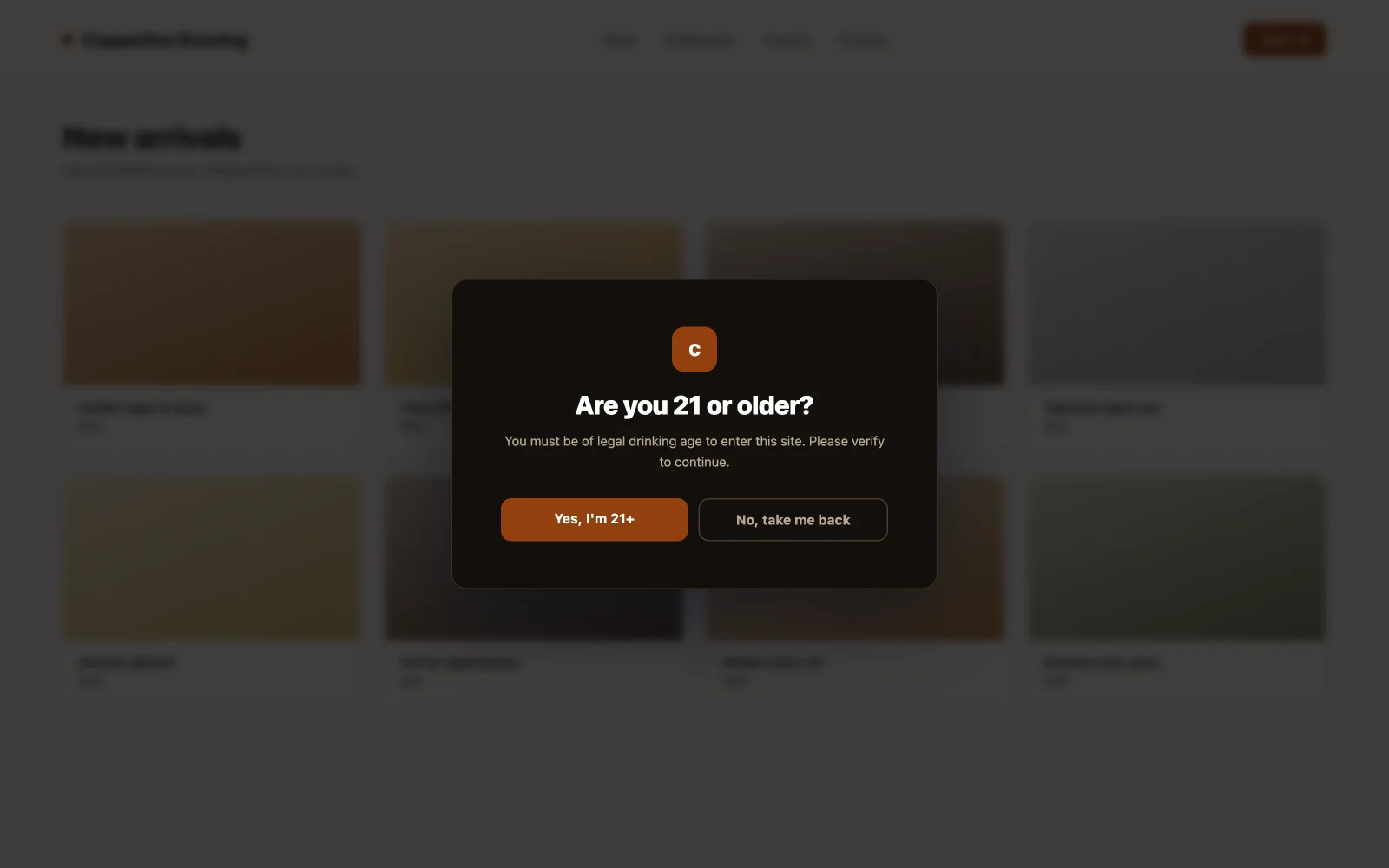
19. بوابة العمر أو المحتوى
نافذة منبثقة لتحميل الصفحة بملء الشاشة تحظر المحتوى حتى يؤكد الزائر عمره. مطلوب للكحول، والتدخين الإلكتروني، وبعض المجالات الصحية، وبعض المحتويات المنظمة. التحويل هنا يعني الامتثال دون فقدان الزائر: زران واضحان، وتصميم العلامة التجارية بحيث لا يبدو وكأنه كمين قانوني، وإعادة توجيه لمسار القاصرين. اضبطه على النار مرة واحدة في كل جلسة، وليس في كل عرض للصفحة.
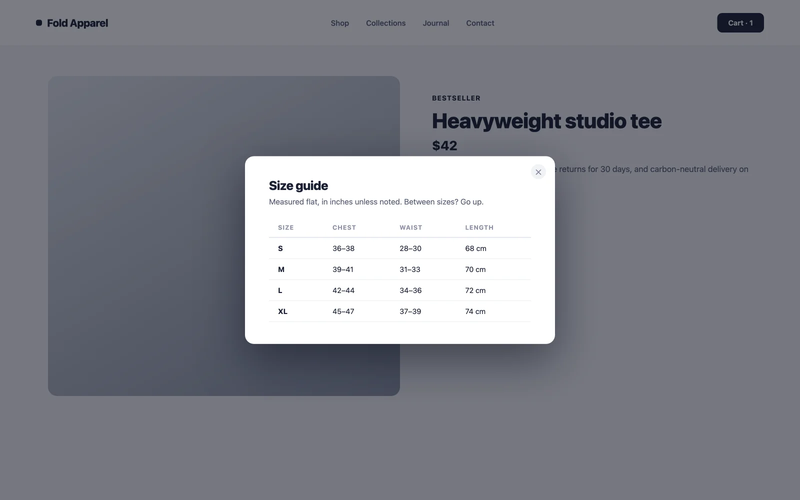
20. نموذج التفاصيل من النقر إلى الفتح
ملاحظات التسعير، وأوراق المواصفات، وشروط الشحن، وأدلة الحجم: المحتوى الذي يهم 10% من الزوار ويشوش الصفحة بالنسبة للـ 90% الأخرى. ضعه خلف رابط “View details” الذي يفتح نموذجًا. يظل التخطيط نظيفًا، ويحصل الباحثون عن التفاصيل على إجاباتهم دون إعادة تحميل الصفحة، وتحافظ دعوتك الرئيسية للعمل على تركيزها.
أمثلة منبثقة عن المنفعة والامتثال
هؤلاء الخمسة يتعاملون مع الوظائف العملية التي يحتاجها كل موقع في النهاية. نادرًا ما يبيعون أي شيء، لكن القيام بذلك بشكل سيء يكلفك زوارًا، لذا فهم يقومون بأعمال التحويل أيضًا.
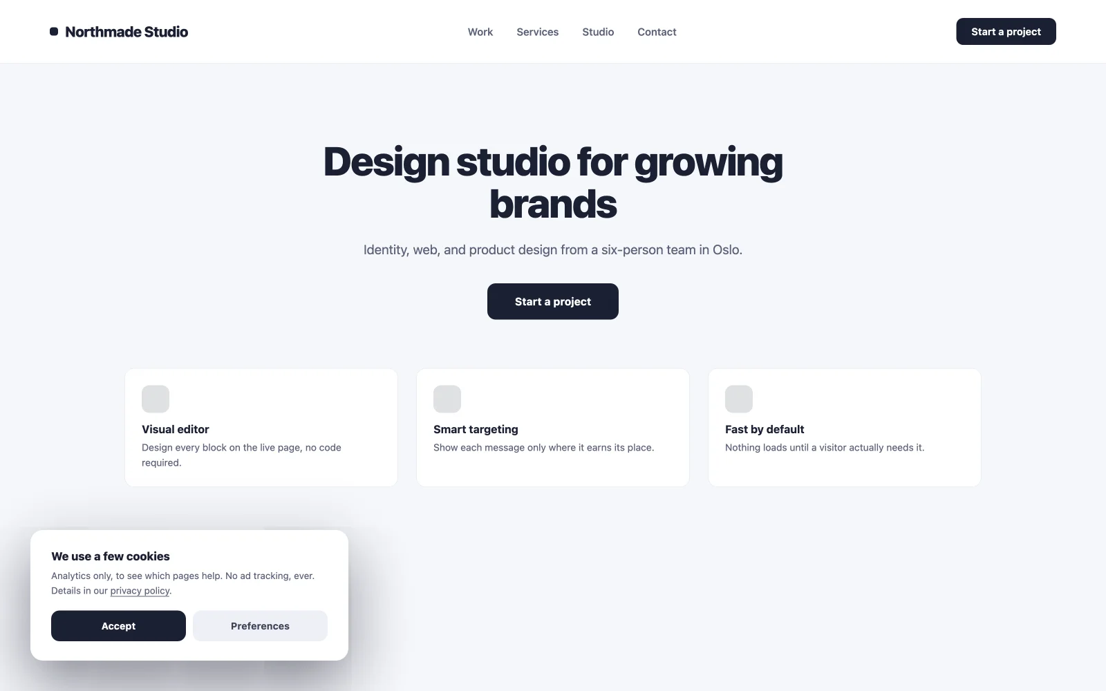
21. إشعار الموافقة على ملفات تعريف الارتباط
شريط صغير لتحميل الصفحة يسجل الموافقة ويبقى بعيدًا عن الطريق. أسفل الشاشة، زران، لا يوجد استحواذ على ملء الشاشة. جدران الموافقة التي تمنع الصفحة تدفع معدلات الارتداد للأعلى قبل أن يقرأ الزائر كلمة ما. قم بتصميمه ليتوافق مع الموقع بحيث يُقرأ كجزء من التصميم بدلاً من كونه أداة قانونية مثبتة بمسامير.
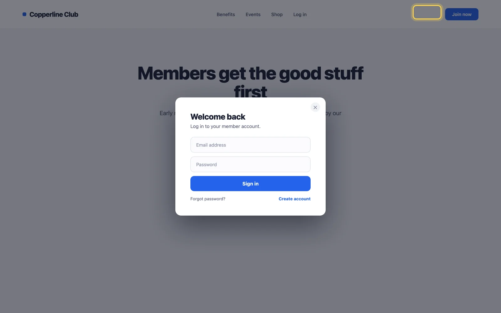
22. تسجيل الدخول أو التسجيل مشروط
افتح تسجيل الدخول عند النقر فوق أحد الوسائط بدلاً من التوجيه إلى صفحة تسجيل دخول منفصلة. تعني عمليات تحميل أقل للصفحات عددًا أقل من عمليات التسليم في منتصف التدفق، وهو الأمر الأكثر أهمية في مواقع العضوية والمتاجر التي يوجد بها تسجيل الدخول بين الزائر والخروج. تأتي قوالب تسجيل الدخول الخاصة بالمكتبة مصممة مسبقًا؛ استيراد، قم بتوصيل النموذج الخاص بك، تم الانتهاء منه.
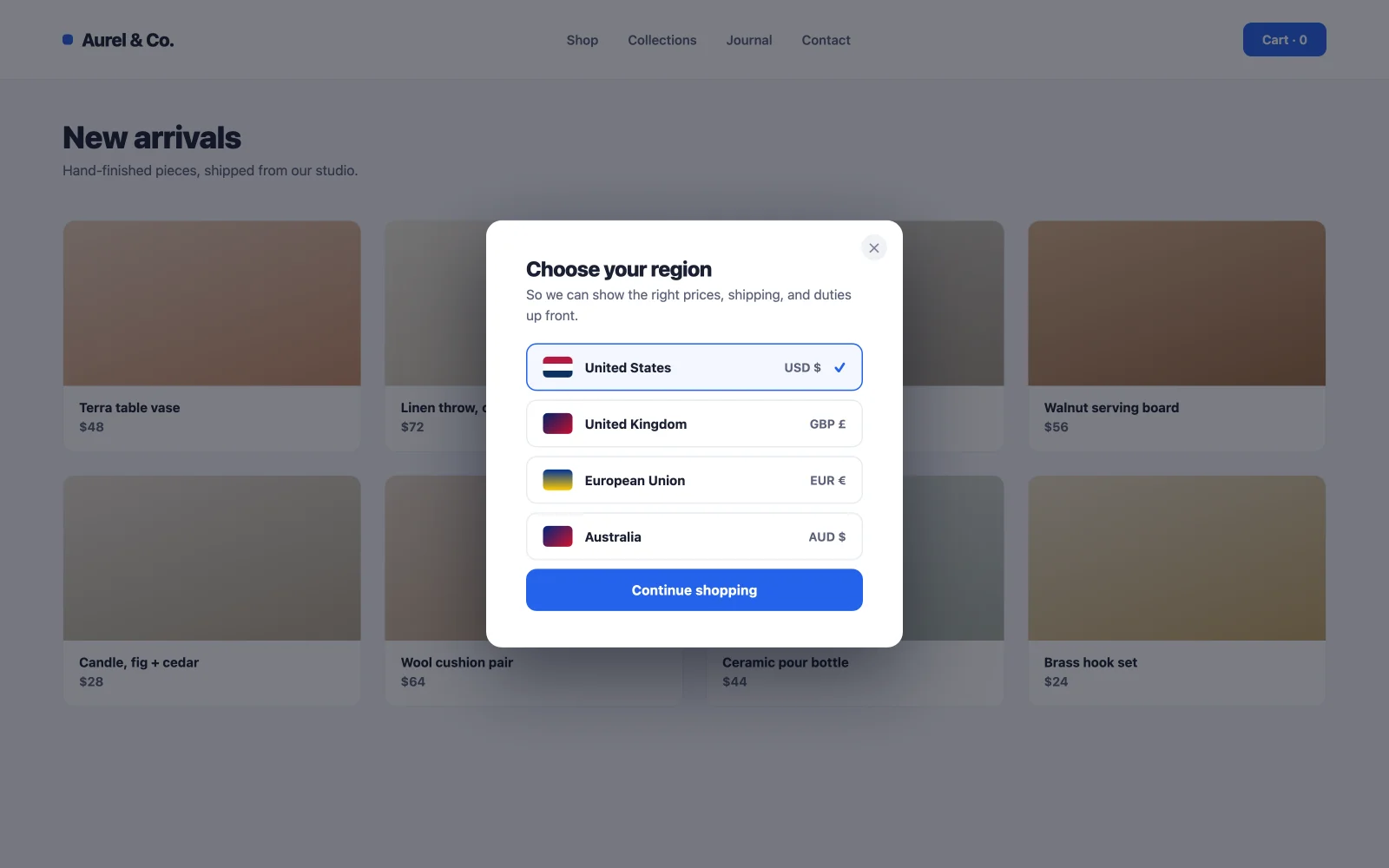
23. الموقع أو محدد العملة
اطلب من الزائرين لأول مرة اختيار منطقة أو عملة عند تحميل الصفحة، ثم تذكر الاختيار. إن عرض الأسعار وشروط الشحن الصحيحة مقدمًا يمنع أسوأ قاتل للتحويل في التجارة الإلكترونية الدولية: المفاجأة عند الخروج. أطلق النار مرة واحدة للزوار الجدد فقط؛ أجاب الزوار المتكررون بالفعل.
24. نافذة منبثقة لنموذج الموعد أو الحجز
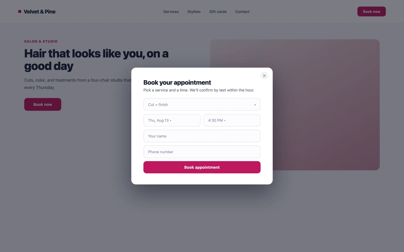
بالنسبة للعيادات والصالونات والاستشاريين وأي شخص يبيع الوقت: النافذة المنبثقة التي يتم تشغيلها بالنقر والتي تحمل نموذج الحجز تعني أن كل زر “Book now” عبر الموقع يفتح نفس النموذج، دون الاحتفاظ بصفحة حجز منفصلة لكل خدمة. خطوات أقل بين النية والموعد، ونموذج واحد للتحديث عندما يتغير التوفر.
25. دفعة إعادة المشاركة
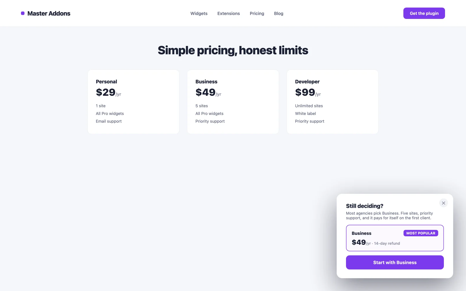
رسالة ما بعد عدم النشاط تعيد زائرًا مشتتًا قبل إغلاق علامة التبويب. مهمة مختلفة عن نية الخروج: الخروج يلفت انتباهًا نشطًا للمغادرة، وعدم النشاط يلفت الانتباه الذي انجرف إلى نافذة أخرى. “ لطيفما لا يزال يقرر؟ إليك خيارنا الأكثر شيوعًا، إعادة تشغيل الدورة بشكل متكرر أكثر مما تتوقع، ولا يكلف الزائر الملتزم شيئًا لأنه لا يراها أبدًا.
قم بمطابقة كل نافذة منبثقة مع الزناد الأيمن
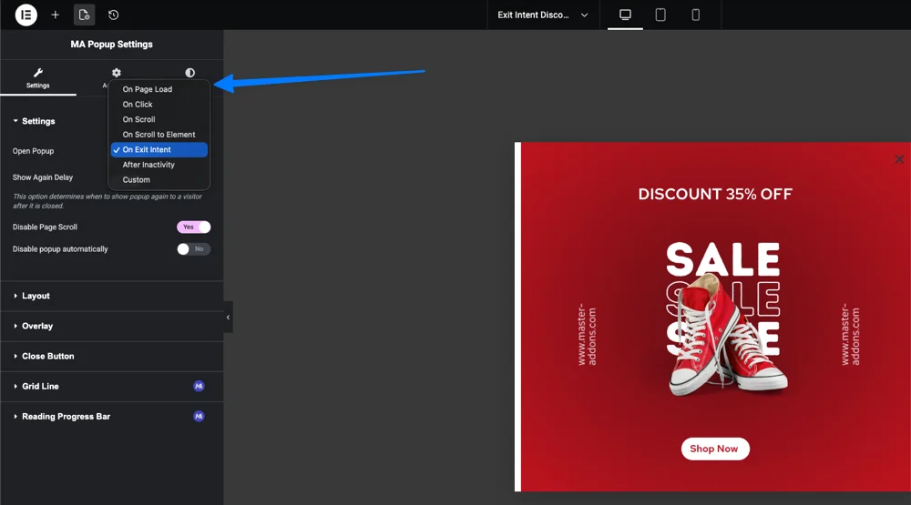
العرض يقرر الزناد. يقوم Master Addons بشحن خمسة (تحميل الصفحة مجاني، والأربعة الآخرون يحتاجون إلى Pro)، واختيار الخيار الخاطئ هو السبب الأكثر شيوعًا لضعف أداء النافذة المنبثقة الجيدة. يقوم هذا الجدول بتعيين المشغلات للأمثلة أعلاه.
| الزناد | الحرائق متى | أفضل مثال مناسب | احترس من |
|---|---|---|---|
| على انقر (برو) | ينقر الزائر على عنصر محدد | طلب تجريبي (5)، فيديو لايت بوكس (15)، نموذج الحجز (24) | يحتاج إلى زر أو رابط للإرفاق به |
| على التمرير (برو) | يتم تمرير الصفحة بنسبة مئوية محددة | ترقيات المحتوى (3)، الاشتراك في النشرة الإخبارية (2) | ضعه منخفضًا جدًا وسيطلق النار قبل أن يكون هناك اهتمام |
| تحميل الصفحة | بعد تأخير قمت بتعيينه | لافتات البيع (11)، إشعار ملفات تعريف الارتباط (21)، البوابة العمرية (19) | أقل من ثانيتين يميل إلى الإزعاج |
| نية الخروج (برو) | يتحرك المؤشر لإغلاق علامة التبويب | استرداد العربة (10)، مغناطيس الرصاص الفرصة الأخيرة (7) | إشارة سطح المكتب، أضعف على الهاتف المحمول |
| بعد الخمول (برو) | التمرير وتوقف الحركة | مسح ردود الفعل (18)، دفعة إعادة المشاركة (25) | استمر في الانتظار لفترة كافية لتشعر بالطبيعة |
كيفية إنشاء أي من هذه النوافذ المنبثقة مجانًا
الإصدار هو نفسه لجميع الأمثلة الـ 25. قم بتثبيت البرنامج الإضافي Master Addons المجاني أعلى Elementor المجاني، وافتح Master Addons → Popup Builder، وأضف نافذة منبثقة جديدة.
- ابدأ من المكتبة، وليس لوحة قماشية فارغة. ال مكتبة القوالب يحتوي على 100+ تصميم منبثق: الاشتراك، وعروض الخصم، وصناديق الفيديو الضوئية، وإشعارات ملفات تعريف الارتباط، ونماذج تسجيل الدخول. ابحث عن المثال المطابق لمثالك ويتم استيراده بنقرة واحدة، وقابل للتحرير بالكامل.
- تحرير باستخدام عناصر واجهة المستخدم Elementor العادية. النص، النموذج، الصورة، العد التنازلي: تعمل اللوحة القماشية المنبثقة تمامًا مثل الصفحة.
- اختر الزناد من الجدول أعلاه. يعمل تحميل الصفحة على البرنامج المساعد المجاني؛ يحتاج الآخرون إلى Master Addons Pro.
- ضبط شروط العرض. الموقع بأكمله على البرنامج الإضافي المجاني، أو صفحات ومنشورات محددة مع Pro. هذه هي خطوة الاستهداف التي يتخطاها معظم الأشخاص ثم يتساءلون لماذا تزعج النافذة المنبثقة الأشخاص أو لا تظهر أبدًا.
الإرشادات الكاملة مع لقطات الشاشة موجودة في دليلنا على كيفية إضافة نافذة منبثقة في Elementor مجانًا.
حد واحد صادق: يلتقط منشئ النوافذ المنبثقة العملاء المحتملين ويعرض العروض، ولكنه ليس منصة بريد إلكتروني أو مجموعة اختبار A/B. إذا كنت بحاجة إلى اختبار مقسم وتحليلات عميقة، قم بإقرانه بأداة مخصصة؛ مقارنتنا أفضل المكونات الإضافية لمنشئ النوافذ المنبثقة لـ WordPress خرائط تلك المنطقة. لإلهام التصميم بما يتجاوز هذه الـ 25، الخاصة بـ Elementor أمثلة منبثقة تستحق التمرير، والمكون الإضافي المجاني موجود على دليل ووردبريس عندما تكون مستعدًا للبناء.
الأسئلة المتداولة
كيف أقوم بإنشاء النوافذ المنبثقة في Elementor؟
لا يحتوي Free Elementor على أداة إنشاء نافذة منبثقة مدمجة، لذا يمكنك إضافة واحدة باستخدام مكون إضافي. قم بتثبيت الإضافات الرئيسية المجانية للمكون الإضافي Elementor، وانتقل إلى الإضافات الرئيسية، والمنشئ المنبثق، وانقر فوق إضافة جديد، وقم بتصميم النافذة المنبثقة باستخدام عناصر واجهة المستخدم Elementor، واختر مشغلًا، وقم بتعيين شروط العرض، ثم انشر. يستغرق التدفق أقل من عشر دقائق.
كيف يمكنني إنشاء نافذة منبثقة في Elementor مجانًا؟
استخدم برنامج Master Addons Popup Builder المجاني. يتم تشغيله على الإصدار المجاني من Elementor ويفتح النوافذ المنبثقة عند تحميل الصفحة عبر الموقع بأكمله. تحتاج مشغلات On Click وOn Scroll وExit Intent وAfter Inactivity والاستهداف على مستوى الصفحة إلى Master Addons Pro. Elementor Pro مطلوب فقط إذا كنت تريد Popup Builder الأصلي الخاص بـ Elementor بدلاً من ذلك.
كيف يمكنني تشغيل نافذة Elementor المنبثقة بنقرة زر واحدة؟
باستخدام Master Addons Pro، قم بتعيين مشغل النافذة المنبثقة على On Click وأدخل فئة CSS مثل النافذة المنبثقة المفتوحة. ثم أضف نفس الفئة إلى أداة الزر ضمن فئات Advanced وCSS. كل زر يحتوي على هذه الفئة يفتح النافذة المنبثقة، وتعمل نفس الطريقة مع الصور والأيقونات والروابط.
هل هناك قوالب Elementor منبثقة مجانية؟
نعم. تقوم مكتبة Master Addons المنبثقة بشحن 100+ قالب داخل المكون الإضافي المجاني، والتي تغطي عمليات الاشتراك ولافتات البيع وصناديق الفيديو الضوئية وإشعارات ملفات تعريف الارتباط ونماذج تسجيل الدخول. يتم استيراد كل منها بنقرة واحدة وتظل قابلة للتحرير بالكامل في Elementor، بدون حد تجريبي أو علامة مائية.
لماذا لا تظهر النافذة المنبثقة Elementor الخاصة بي؟
السبب المعتاد هو فقدان شروط العرض. لا تظهر النافذة المنبثقة التي لا تحتوي على قاعدة تضمين أبدًا في الواجهة الأمامية حتى عندما تبدو مباشرة في المحرر. افتح إعدادات النافذة المنبثقة، وأضف حالة عرض مثل الموقع بأكمله أو صفحة معينة، واحفظها واختبرها في علامة تبويب متصفح عادية بدلاً من معاينة المحرر.
القراءة ذات الصلة
