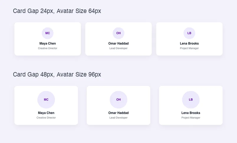
The Slider field puts a drag-to-set range control in your custom widget’s panel, the same one Elementor uses for gaps, widths, and border radius across its own widgets. Inside the Master Addons Widget Builder, you set a minimum, a maximum, a step, and the units the user can pick from. Whoever edits the widget in Elementor then drags a handle instead of typing raw CSS values.
The value a Slider produces is not a plain number. It is a pair: a size and a unit. That one detail decides how you connect the field to your stylesheet, so this doc spends most of its time there.
What the Slider field does #
- Renders a range slider with a draggable handle and a numeric input next to it, matching Elementor’s native slider controls.
- Offers a unit switcher when you allow more than one unit, so the same control can work in px, %, or em.
- Stores a size and a unit together as one value your CSS panel reads with dot notation.
- Supports responsive values, letting users set a different size per device from the device icon.
- Accepts dynamic values and can write CSS through Elementor’s selectors mechanism as an alternative to the CSS panel.
New to building widgets? Read the Widget Builder overview first; this doc assumes you already have a widget open in the editor.
Before you start #
- WordPress with Elementor installed and active.
- Master Addons for Elementor installed and active. New to the plugin? See the installation guide.
- A custom widget open in the Widget Builder editor. Our example is a team card grid whose
.team-rowcontainer needs a user-adjustable gap between cards.
How to add a Slider field #
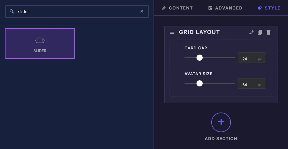
In the Widget Builder editor, scroll the fields panel on the left until you find the Slider field, listed with the other CSS-value fields such as Dimensions.
Drag it into a section under the Style tab, where sizing controls usually live, though Content and Advanced work too. Once it lands, the field’s options open on the left.
Slider field options explained #
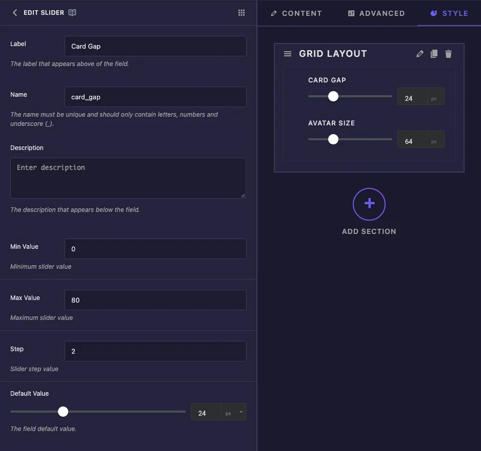
- Label: the text next to the control in Elementor, for example “Card Gap”.
- Name: the unique identifier your CSS refers to, letters, numbers, and underscores only, for example
my_gap. - Default: the starting value, stored as a size plus a unit.
- Min, Max, Step: the range the handle covers and how far each drag increment moves. A gap control might run 0 to 100 in steps of 1.
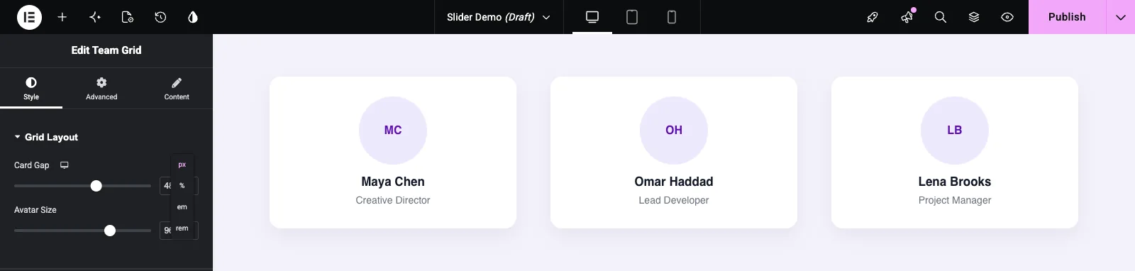
- Size Units: the units the user can switch between, such as px, %, and em. One unit hides the switcher; several show it.
- Responsive: adds the device icon so each breakpoint keeps its own value.
- Dynamic and Selectors: dynamic tag support, and Elementor’s selectors mechanism covered below.
- Description, Show Label, Separator, and Conditions are the same display options every field carries.
Connect the Slider to your CSS #
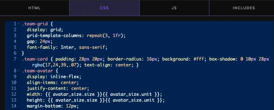
A Slider’s value is an array with two keys: size and unit. Printing the field name on its own outputs nothing, because there is no single value to print. In the CSS panel, always write both parts with dot notation:
.team-row {
gap: {{ my_gap.size }}{{ my_gap.unit }};
}A value of 24 with px selected renders as gap: 24px;. Change the unit switcher to % and the same rule becomes gap: 24%; without touching the template.
Watch out: {{ my_gap }} on its own prints an empty string. If your rule renders as gap: ; and the layout ignores the control, the missing .size and .unit are almost always why. The same silence follows a rename: change the field’s Name later and the old tokens keep rendering, just with nothing in them, so update the CSS panel in the same sitting.
The selectors alternative #
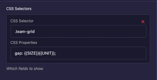
Sliders also work with Elementor’s selectors mechanism, which writes the CSS for you instead of going through the CSS panel. For a slider, Elementor injects a bare value rather than a full declaration, so the builder’s plain Selector field alone does not produce a usable rule. A custom selectors entry has to carry the full property, using Elementor’s own placeholders:
'{{WRAPPER}} .team-row' => 'gap: {{SIZE}}{{UNIT}};'For most widgets the CSS panel token is the simpler route; reach for selectors entries when you want Elementor managing the output.
Use the Slider control in Elementor #
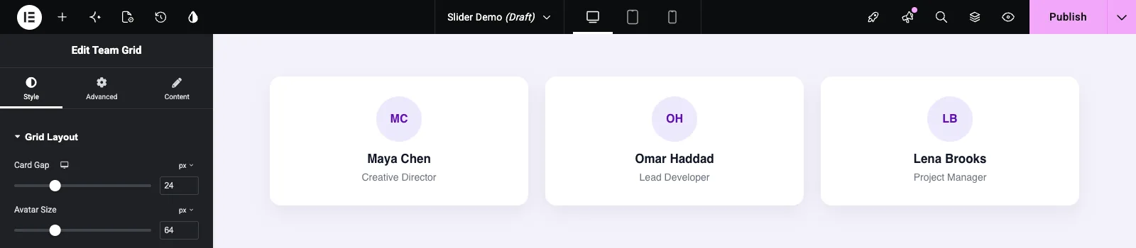
Add your custom widget to a page in Elementor. If the page was already open, reload the editor first, since a stale tab keeps showing the old panel. The Slider appears in the widget’s panel with your label, the handle, the numeric input, and the unit switcher if you allowed more than one unit.
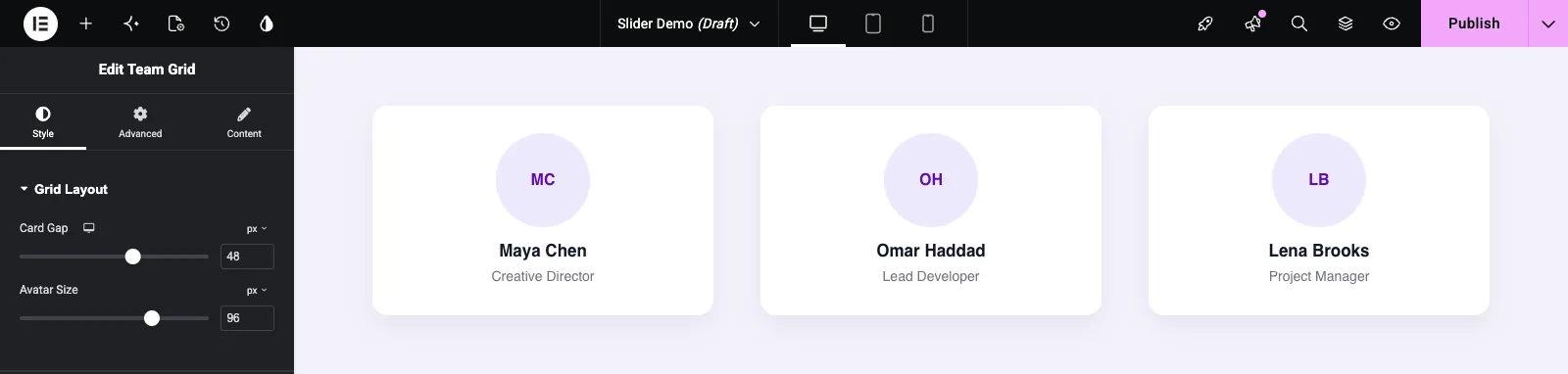
Drag the handle or type a number and the preview follows immediately. With Responsive on, the device icon switches the control between desktop, tablet, and mobile values, so a 40px desktop gap can shrink to 16px on phones from the same field.
Common use cases #
- Grid and flex gaps between cards, columns, or gallery items.
- Element widths and heights, such as an image size or divider length, with a % option for fluid layouts.
- Border radius on cards and buttons when one uniform radius is enough.
- Icon and font sizing where an em unit keeps things relative to surrounding text.
- Spacing offsets like the distance between a badge and the corner it sits in.
Tips for working with the Slider field #
- Always print both parts.
{{ my_gap.size }}{{ my_gap.unit }}is the whole connection; the bare field name gives you an empty string. - Match Min, Max, and Step to the property. A 0–100 range in steps of 1 suits a gap; a radius control may only need 0–50.
- Offer only the units that make sense. A px-only control is clearer than one where % produces broken layouts.
- Keep a fallback in the CSS panel structure. Write the rule so the widget still lays out sanely at the default value on first drop.
- Turn on Responsive for layout values. Gaps and widths almost always need a tighter mobile setting.
- Prefer the CSS panel token over the Selector field. The plain Selector field injects only a bare value for sliders, which is not a complete declaration.
Frequently Asked Questions #
What is the Slider field in the Master Addons Widget Builder?
It adds Elementor’s range slider control to a custom widget. You define the min, max, step, and allowed units, and the user drags a handle to set a value. The field stores a size and a unit together, which your widget CSS prints with {{ name.size }}{{ name.unit }}.
Why does {{ my_slider }} print nothing?
The value is an array holding size and unit, not a single string, so a direct print comes out empty. Use dot notation for both keys: {{ my_slider.size }}{{ my_slider.unit }}.
How do I use the Slider value in the CSS tab?
Write the property yourself and drop both tokens where the value goes, for example gap: {{ my_gap.size }}{{ my_gap.unit }};. The rule updates whenever the user moves the handle or switches units.
Can users switch between px, %, and em?
Yes, when you list several units in the Size Units option. The control shows a unit switcher, and the unit key in the value reflects whatever the user picked, so the same CSS token covers every unit.
Does the Slider support responsive values?
Yes. Enable the Responsive option and the control gains the device icon in Elementor, letting the user store separate values for desktop, tablet, and mobile breakpoints.
Can I use Elementor selectors instead of the CSS panel?
You can, but a slider needs a selectors entry that spells out the full property with {{SIZE}}{{UNIT}} placeholders, such as '{{WRAPPER}} .row' => 'gap: {{SIZE}}{{UNIT}};'. The plain Selector field only injects a bare value for sliders, which is not enough on its own.
Wrapping up #
The Widget Builder Slider field turns any single CSS length in your widget into a control the editor can drag: name the field, bound the range, and print {{ name.size }}{{ name.unit }} in the CSS panel. It pairs naturally with the Dimensions field when a widget needs four-sided spacing alongside single values. Explore the rest of the Master Addons widgets and extensions, and see the pricing page for what each plan includes.