

جدول المحتويات
يمنحك الإصدار المجاني من Elementor نقاط توقف أكثر مما تعترف به معظم البرامج التعليمية: سبع طرق عرض للجهاز إجمالاً، كل منها بعرض بكسل قابل للتحرير، وكلها قيد التشغيل من إعدادات الموقع. لا حاجة لترخيص Pro. حيث يتوقف النظام الأصلي عند تلك الفتحات السبع الثابتة. إذا كان تصميمك يحتاج إلى عرض ثامن، أو عرض جهاز لا يتم تعيين الفتحات المسماة إليه، فهذه الفجوة هي ما هو مجاني تمديد نقاط التوقف المخصصة من مقابض الإضافات الرئيسية. وهو يغطي نصف التصميم للعمل سريع الاستجابة، في حين أن الامتداد يشبه شروط العرض يقرر الأقسام التي تظهر على أي جهاز على الإطلاق.
أدناه: ما يتضمنه Elementor المجاني فعليًا (أكثر من ثلاث طرق عرض، مهما كانت ما تدعيه المنشورات القديمة)، وكيفية تنشيط نقاط التوقف الأصلية الإضافية، وكيفية إضافة نقاط توقف مخصصة حقًا في الأعلى. هذا الجزء الأخير مجاني حتى 3 نقاط توقف، غير محدود مع Master Addons Pro.
ما الذي يمنحك إياه برنامج Breakpoints Elementor المجاني في الواقع
أولاً، الأسطورة التي لن تموت: نقاط التوقف الإضافية في Elementor ليست مقفلة خلف Elementor Pro. لا تزال الكثير من المقالات تقول أنها كذلك. منذ العنصر 3.4 تم شحن ميزة نقاط التوقف المخصصة الإضافية، ويدعم الإصدار المجاني ما يصل إلى سبع طرق عرض للجهاز
- صورة الجوال: ما يصل إلى 767 بكسل بشكل افتراضي (نشط دائمًا)
- المناظر الطبيعية المتنقلة: ما يصل إلى 880 بكسل
- صورة لوحية: ما يصل إلى 1024 بكسل (نشط دائمًا)
- المناظر الطبيعية اللوحية: ما يصل إلى 1200 بكسل
- كمبيوتر محمول: حتى 1366 بكسل
- سطح المكتب: العرض الأساسي لكل الفروع الأخرى من
- شاشة عريضة: 2400 بكسل وما فوق (نقطة التوقف بعرض دقيقة واحدة في المجموعة)
كل واحدة من قيم البكسل هذه قابلة للتحرير. افتح إعدادات الموقع، وقم بتغيير قطع صورة الجهاز اللوحي من 1024 بكسل إلى 900 بكسل، واحفظ، وتم. العنصر وثائق المطور يشرح منطق العرض الأقصى أدناه إذا كنت تريد الآليات.
إذن ما الذي لا يمكن أن تفعله النسخة المجانية؟ شيئين. لا يمكنك إضافة نقطة توقف ثامنة، ولا يمكنك الخروج من الفتحات المسماة: طرق العرض الستة الإضافية لها أدوار ثابتة، وبمجرد استخدامها جميعًا، يكون النظام الأصلي ممتلئًا. هذا السقف هو السبب وراء وجود مكون إضافي مخصص لنقاط التوقف على الإطلاق.
كيفية تنشيط نقاط التوقف الإضافية لـ Elementor (مجانية، بدون مكون إضافي)
قبل تثبيت أي شيء، قم بتشغيل ما يقدمه لك Elementor بالفعل. يستغرق حوالي دقيقة:
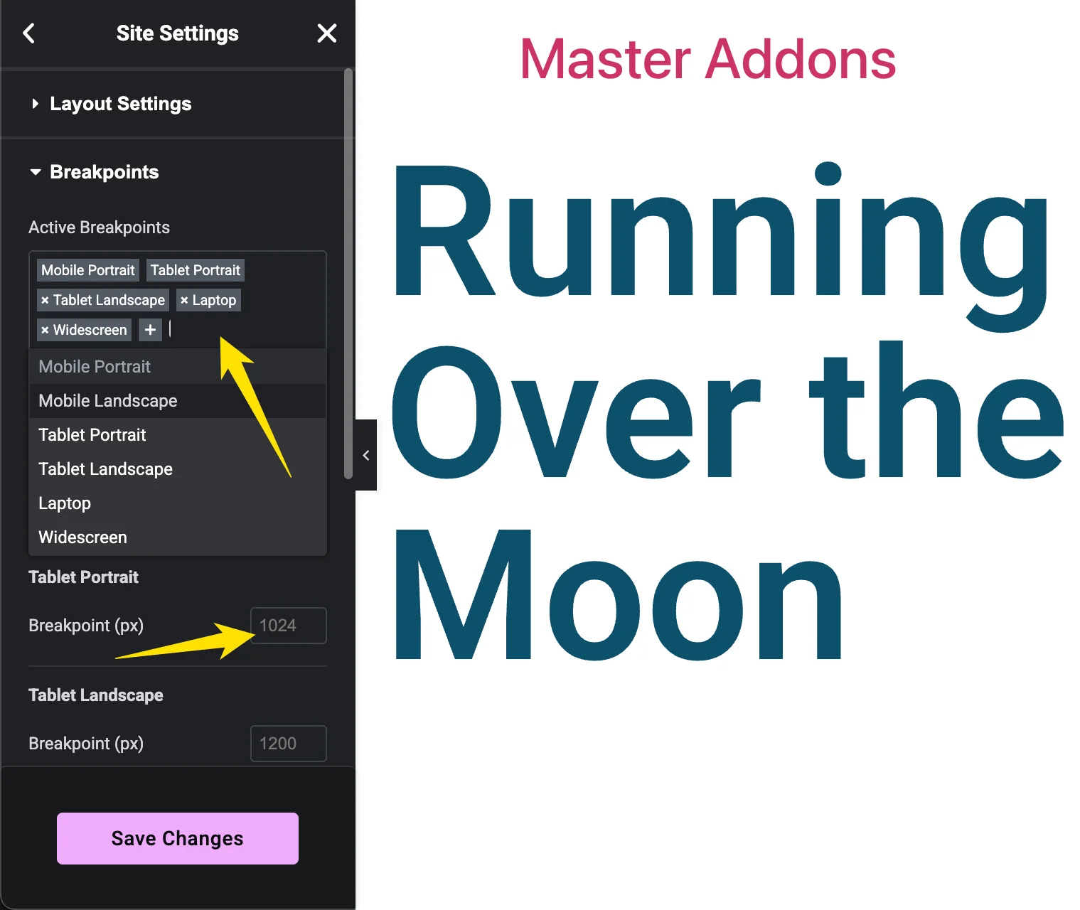
- افتح أي صفحة باستخدام Elementor وانقر على قائمة الهامبرغر في الزاوية العلوية اليسرى من اللوحة، ثم اختر إعدادات الموقع.
- اذهب الى التخطيط → نقاط التوقف.
- انقر في نقاط التوقف النشطة قم بإضفاء الحقل وإضافة طرق العرض التي تريدها: المناظر الطبيعية للجوال، والمناظر الطبيعية للكمبيوتر اللوحي، والكمبيوتر المحمول، والشاشة العريضة.
- اضبط قيمة البكسل أسفل كل نقطة توقف إذا كان الوضع الافتراضي لا يتطابق مع تصميمك.
- يضرب حفظ التغييرات. يقوم Elementor بتجديد CSS الخاص به وتظهر طرق العرض الجديدة في الوضع المستجيب.
إذا كانت سبع طرق عرض تغطي مشروعك، توقف هنا. لم تنفق شيئًا ولم تقم بتثبيت أي شيء. استمر في القراءة إذا كنت بحاجة إلى طرق عرض أكثر من ذلك، أو نقطة توقف لا تستطيع الفتحات المسماة التعبير عنها.
كيفية إضافة نقاط توقف مخصصة تتجاوز نقاط Elementor السبعة
الطريق المجاني بعد سقف Elementor هو نقاط توقف مخصصة للعنصر، مكون إضافي تم إنشاؤه بواسطة فريق Master Addons. يعمل بمفرده بجوار Elementor، ولا يلزم وجود مكون إضافي آخر. كما أنه يقترن مع الإضافات الرئيسية إذا قمت بتشغيله بالفعل، فستقوم بإدارة نقاط التوقف من نفس لوحة المعلومات مثل عناصر واجهة المستخدم الخاصة بك. يضيف الإصدار المجاني ما يصل إلى 3 نقاط توقف مخصصة مع التحكم الدقيق بالبكسل في عرض كل جهاز؛ يقوم Master Addons Pro بإزالة الغطاء بالكامل.
الخطوة 1: تثبيت البرنامج المساعد
في لوحة تحكم WordPress الخاصة بك، انتقل إلى الإضافات → إضافة جديد وابحث عن نقاط التوقف المخصصة لـ “ لـ Elementor”. تثبيته وتنشيطه. إذا كنت تستخدم الإضافات الرئيسية بالفعل، فيمكنك أيضًا تشغيلها من علامة التبويب "الامتداد" في لوحة معلومات الإضافات الرئيسية؛ ينتهي كلا المسارين في نفس صفحة الإعدادات.
الخطوة 2: افتح صفحة نقاط التوقف
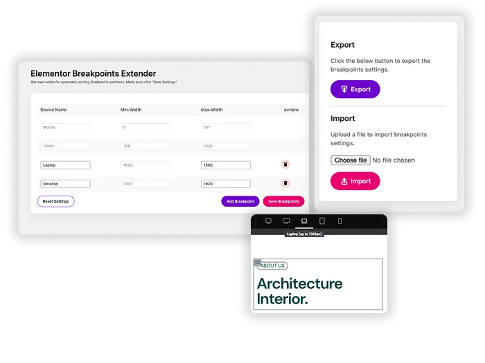
يظهر عنصر نقاط التوقف الجديد في قائمة لوحة المعلومات الخاصة بك. انقر عليه. تسرد الصفحة نقاط التوقف النشطة حاليًا مع نطاقاتها، وتطابق كل ما قمت بتكوينه في إعدادات موقع Elementor، وتمنحك خيارًا لإضافة جهاز جديد في الأعلى.
الخطوة 3: أضف نقطة توقف ذات عرض أقصى
قم بتسمية الجهاز وأدخل الحد الأقصى لعرضه بالبكسل. لاستهداف الهواتف الصغيرة، اكتب 600 واحفظ. يقوم البرنامج الإضافي بضبط الحد الأدنى لعرض الجهاز المجاور لك، بحيث لا تتداخل النطاقات أبدًا: يغطي عرض الهاتف المحمول الصغير الجديد شاشات تصل إلى 600 بكسل، ويبدأ العرض التالي عند 601 بكسل. في الإصدار المجاني، يمكنك إضافة ما يصل إلى 3 من نقاط التوقف المخصصة هذه؛ ماستر أدونز برو يحصل المستخدمون على نقاط توقف غير محدودة بالإضافة إلى الاستيراد/التصدير.
الخطوة 4: قم بتصميم العرض الجديد في Elementor
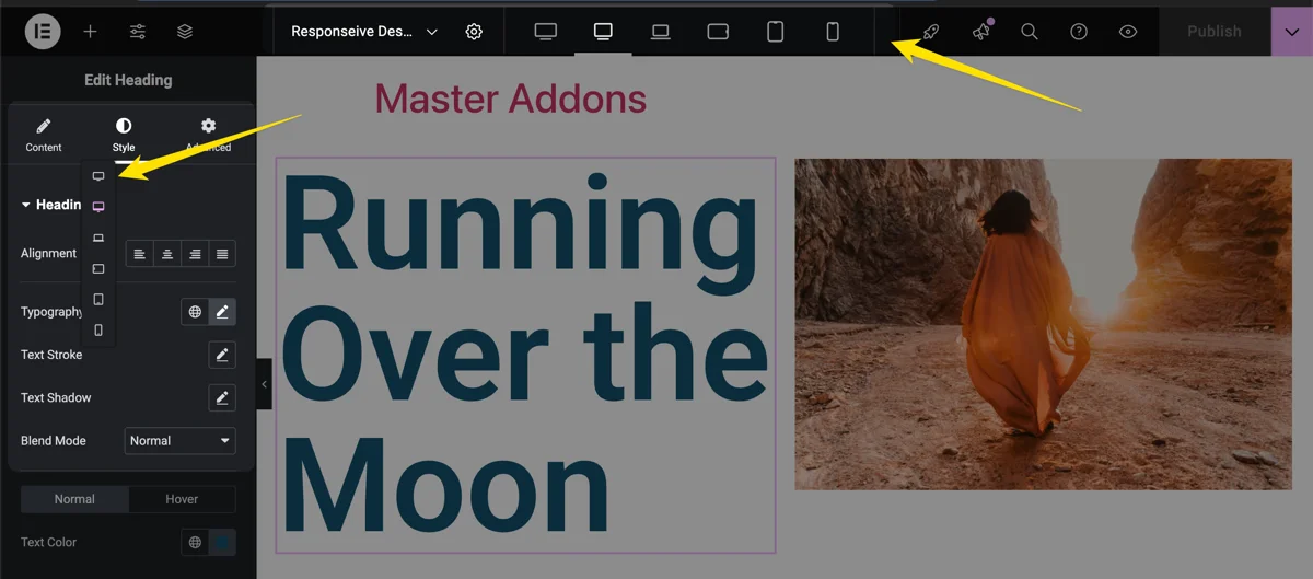
قم بتحرير أي صفحة باستخدام Elementor وانقر فوق أيقونة الوضع المستجيب في أسفل اللوحة. يوجد الآن عرضك المخصص في شريط الجهاز بجوار الإعدادات الافتراضية. حدده، واختر عنصرًا، وقم بتعيين قيم مثل حجم الخط أو الحشو أو عدد الأعمدة التي تنطبق فقط داخل نطاق البكسل هذا. انقر فوق تحديث، ثم قم بتغيير حجم المتصفح الخاص بك لمشاهدة تشغيل الأنماط. للحصول على إرشادات أعمق حول التصميم لكل جهاز، راجع دليلنا لـ تصميم سريع الاستجابة مع نقاط توقف Elementor.
مجاني مقابل احترافي: كم عدد نقاط التوقف التي يمنحها لك كل خيار
إليك المقارنة، بما في ذلك ما يقدمه لك Elementor قبل أن يدخل أي مكون إضافي إلى الصورة
| خيار | تكلفة | ما تحصل عليه | حد |
|---|---|---|---|
| عنصر مجاني (أصلي) | حر | 7 طرق عرض محددة للجهاز، كل منها بعرض بكسل قابل للتحرير | مجموعة ثابتة من 7، لا توجد فتحات جديدة |
| نقاط توقف مخصصة للعنصر (مجاني) | حر | نقاط توقف مخصصة بأسمائكم وعروضكم الدقيقة | 3 نقاط توقف مخصصة |
| ماستر أدونز برو | مدفوع | كل شيء أعلاه، بالإضافة إلى الاستيراد والتصدير | غير محدود |
بالنسبة لمعظم المواقع، تغطي طرق عرض Elementor السبعة بالإضافة إلى 3 مستويات مخصصة كل فجوة حقيقية: عرض هاتف صغير، وعرض فردي للكمبيوتر اللوحي، وشاشة عرض كشك. الوكالات التي تتلاعب بقوائم أجهزة العميل هي التي تصل إلى الحد الأقصى المجاني، وهذا هو من برو هو ل. إذا كنت تزن البرنامج المساعد بأكمله مقابل البدائل أثناء وجودك فيه، فنحن مقارنة الإضافات الرئيسية مقابل الإضافات النهائية يغطي مطابقة الميزات الأوسع.
عندما تقوم نقطة توقف مخصصة بإصلاح التخطيط فعليًا
تستحق نقطة التوقف المخصصة إضافتها عندما ينكسر التخطيط في الفجوة بين عرضين موجودين. الحالة الكلاسيكية عبارة عن شبكة مكونة من 3 أعمدة. يبدو مباشرة على سطح المكتب أعلى من 1025px. يقوم Elementor بإسقاطه إلى عمودين في عرض الكمبيوتر اللوحي 1024px. على جهاز لوحي كبير مثبت في وضع أفقي، يترك نفس العرض 1024px عمودًا فارغًا واسعًا ويضيع المساحة.
أضف نقطة توقف عند 992 بكسل على سبيل المثال، واضبط الشبكة مرة أخرى على 3 أعمدة هناك، وسيناسب التخطيط الجهاز بدلاً من التخمين. تعمل نفس الحركة مع عرض الهاتف الصغير حيث تقوم بزيادة أحجام الخطوط وحشوة الأزرار التي تبدو ضيقة أقل من 400 بكسل، وهو نطاق يعامله عرض صورة الهاتف المحمول الخاص بـ Elementor على أنه دلو واحد.
تقترن نقاط التوقف أيضًا بشكل جيد مع العرض الشرطي. إذا كان القسم منطقيًا فقط على الشاشات الأكبر حجمًا، فإن نقطة التوقف المخصصة تتحكم في تصميمه أثناء ذلك شروط العرض يتحكم في ما إذا كان يظهر على الإطلاق. يحل الاثنان نصفين مختلفين من نفس مشكلة الاستجابة.
هل تعمل نقاط التوقف المخصصة على إبطاء موقعك؟
لن تؤدي مجموعة من نقاط التوقف إلى إبطاء موقعك بأي شكل من الأشكال التي يلاحظها الزائر. يضيف كل واحد استعلامًا قياسيًا لوسائط CSS، ويتم تحميل الأنماط التي قمت بتعيينها تمامًا مثل أنماط الاستجابة المضمنة في Elementor. إن CSS المضاف صغير الحجم بجوار وزن الصفحة النموذجية.
المحرر قصة مختلفة. كل نقطة توقف إضافية تعني أنه يجب على عنصر لوحة أكثر استجابة أن يعرض، لذا فإن تكديس 10 أو أكثر يمكن أن يجعل شاشة التحرير تبدو أثقل. أضف فقط طرق العرض التي ستصممها بالفعل. خمسة أو ستة إجماليًا، تتضمن الإعدادات الافتراضية، وهو أمر كثير لكل مشروع تقريبًا. إذا كانت السرعة هي اهتمامك الأوسع، فدليلنا على ذلك كيفية تسريع مواقع Elementor يغطي الإصلاحات التي تظهر بالفعل في أوقات التحميل.
متى لا يتم إضافة نقطة توقف مخصصة
نقاط التوقف المخصصة ليست حلاً لكل خطأ مستجيب، وغالبًا ما يكون الوصول إلى خطأ واحد أولًا هو المكالمة الخاطئة. إذا أساء عنصر واحد التصرف بحجم شاشة واحد، فستظهر قاعدة مستهدفة Css مخصص عادةً ما يكون أنظف من طبقة الجهاز الجديدة تمامًا والتي تحتاج بعد ذلك إلى التصميم في كل مكان.
حالتين أخريين لتخطيها. إذا أدى تنشيط إحدى طرق العرض الأصلية الخاملة لـ Elementor، أو دفع قيمة البكسل الافتراضية في إعدادات الموقع، إلى إصلاح المشكلة، فافعل ذلك بدلاً من ذلك؛ لا يكلف شيئًا ويحافظ على ضوء المحرر. وإذا كانت المشكلة تتعلق حقًا بالمحتوى الذي يظهر على أي جهاز بدلاً من كيفية تصميمه، فهذه مهمة لظروف العرض، وليست نقطة توقف أخرى.
توجد نقاط التوقف المخصصة جنبًا إلى جنب مع بقية مجموعة أدوات Master Addons، بدءًا من الامتدادات المجانية وحتى منشئ الموضوع، كلها مصممة لسد الفجوات التي يتركها العنصر مفتوحة.
الأسئلة المتداولة
هل يحتوي Elementor free على نقاط توقف مخصصة؟
نعم، أكثر مما يعتقده معظم الناس. يتضمن برنامج Elementor المجاني سبع طرق عرض للأجهزة: صورة الهاتف المحمول، ومشهد الهاتف المحمول، وصورة الجهاز اللوحي، ومشهد الجهاز اللوحي، والكمبيوتر المحمول، وسطح المكتب، والشاشة العريضة. يمكنك تنشيط العناصر الإضافية في إعدادات الموقع → التخطيط → نقاط التوقف ويمكنك تحرير كل قيمة بكسل. ما لا يستطيع Elementor فعله مجانًا هو إضافة نقاط توقف تتجاوز تلك الفتحات السبعة المسماة؛ ولهذا تحتاج إلى برنامج Elementor الإضافي المجاني.
كيف يمكنني إضافة نقطة توقف مخصصة في Elementor؟
بالنسبة لعروض العرض المضمنة، افتح إعدادات الموقع → التخطيط → نقاط التوقف، وأضف طرق العرض التي تريدها إلى حقل نقاط التوقف النشطة، واضبط عرضها. بالنسبة لنقاط التوقف التي تتجاوز نقاط التوقف السبعة الخاصة بـ Elementor، قم بتثبيت البرنامج الإضافي Custom Breakpoints for Elementor المجاني، وافتح صفحة نقاط التوقف الخاصة به، وأدخل اسم الجهاز وعرضه الأقصى بالبكسل، على سبيل المثال 600 للهواتف الصغيرة. ثم يظهر العرض الجديد في وضع استجابة Elementor الجاهز للأسلوب.
كم عدد نقاط التوقف التي يمكنك الحصول عليها في Elementor؟
يتوفر كل من Elementor free وPro في سبع طرق عرض أصلية للجهاز. يضيف المكون الإضافي Custom Breakpoints for Elementor ما يصل إلى 3 نقاط توقف مخصصة حقًا بالإضافة إلى ذلك مجانًا، ويقوم Master Addons Pro بإزالة الحد الأقصى لنقاط التوقف غير المحدودة.
هل تتطلب نقاط التوقف المخصصة Elementor Pro؟
لا، في كلا الأمرين. يتم شحن نقاط التوقف الإضافية الخاصة بـ Elementor (Mobile Landscape، Tablet Landscape، Laptop، Widescreen) في الإصدار المجاني، كما أن البرنامج الإضافي Custom Breakpoints for Elementor مجاني أيضًا. لا يوجد ترخيص Elementor Pro متضمن في أي مكان؛ يتم استدعاء نقاط التوقف المخصصة غير المحدودة فقط لـ Master Addons Pro.
هل يحتاج البرنامج الإضافي Custom Breakpoints إلى إضافات رئيسية للعمل؟
لا. إنه يعمل كمكون إضافي مستقل مع تثبيت Elementor فقط. كما أنه يتكامل مع Master Addons إذا قمت بتشغيل كليهما، لذلك تقوم بإدارة نقاط التوقف من نفس لوحة المعلومات مثل عناصر واجهة المستخدم والإضافات الخاصة بك، وMaster Addons Pro هو ما يفتح نقاط توقف غير محدودة.
هل تؤدي نقاط التوقف المخصصة إلى إبطاء موقع الويب الخاص بي؟
لا. تضيف كل نقطة توقف فقط استعلام وسائط CSS خفيف الوزن، ويتم تحميل الأنماط مثل الأنماط المستجيبة المضمنة في Elementor. يمكن أن يؤدي تكديس العديد من نقاط التوقف إلى جعل المحرر يشعر بالثقل، لذا أضف فقط طرق العرض التي ستنشئها بالفعل.
القراءة ذات الصلة
