

لا توجد أداة دوارة لمنتج Master Addons WooCommerce. هذه هي الإجابة الصادقة مقدمًا، وهي توفر عليك التثبيت.
ما ينجح هو ثلاثة مسارات. يعد Loop Carousel الخاص بـ Elementor Pro هو الوحيد الذي يقوم بتشغيل استعلام مباشر عن المنتج، لذا اختره إذا كان الشريط يجب أن يتبع الكتالوج الخاص بك. يمنحك تصميم الكتالوج الرباعي المجاني عرضًا منسقًا يدويًا مكونًا من تسعة عناصر دون أي استعلام خلفه. وتسلط أداة المنتج المميزة الخاصة بـ Master Addons الضوء على منتج واحد، مع صورة فوتوغرافية مجانية تغطي صورة Carousel للمنتج. الثلاثة يجلسون داخل الأوسع القطعة الدائرية Elementor عائلة؛ إذا كنت تقوم بتجهيز متجر كامل، فإن أفضل إضافات Elementor لـ WooCommerce تقرير إخباري يغطي الباقي.
أدناه: كيف يتم بناء كل واحدة منها، ثم الجزء الذي تتخطاه معظم البرامج التعليمية، وهو المكان الذي يكلفك فيه دائري المنتج المبيعات بشكل فعال.
أي طريقة للاختيار
- لديك Elementor Pro ويجب أن يتتبع الشريط المخزون والسعر والوافدين الجدد → حلقة دائري. إنها الإجابة الحقيقية.
- تريد تسع بطاقات مكتوبة بخط اليد تتحكم فيها حتى السطر الأخير من النسخة → كتالوج صفح صفحات رباعي، مجاني.
- تريد دفع منتج واحد بقوة → منتج مميز، برو.
- أنت فقط بحاجة إلى صور المنتج على المسار → صورة دائري، مجانا.
الطريقة الأولى: حلقة Elementor Pro الدائرية
يقوم Elementor Pro بحل هذه المشكلة محليًا، لذا ابدأ هنا. ال حلقة دائري يأخذ قالب Loop Item، وبطاقة منتج واحدة تقوم بتصميمها مرة واحدة، ويوجهها إلى استعلام WooCommerce. أضف منتجًا، وقم بتغيير السعر، وقم ببيعه بالحجم، ويعكسه الرف الدائري دون أن يفتح أي شخص المحرر. لا يوجد ملحق متضمن.
- قم ببناء قالب عنصر الحلقة. القوالب → منشئ السمات → عنصر الحلقة، تعيين المصدر على المنتج. قم بتخطيط الصورة والعنوان والسعر والتقييم والزر باستخدام العلامات الديناميكية.
- قم بإسقاط عنصر واجهة المستخدم Loop Carousel على الصفحة وحدد هذا القالب.
- تعيين الاستعلام. المصدر هو المكان الذي يحدث فيه العمل الحقيقي: جميع المنتجات، أو الفئة، أو العلامة، أو المعروضة للبيع، أو المميزة، أو الاختيار اليدوي. ثم اطلب حسب التاريخ أو السعر أو الشعبية أو ترتيب القائمة.
- اضبط عدد التحميل. هذا هو إجمالي ما يحمله الكاروسيل، وليس عدد العناصر المرئية. ثمانية إلى اثني عشر بدلة لشريط المنتجات ذات الصلة. قم بتحميل أربعة مع أربعة مرئية وليس هناك ما يمكن التمرير إليه.
- استبعاد ما لا ينبغي أن يكون هناك. العناصر غير المتوفرة في المخزون، وفي صفحة منتج واحدة، المنتج الحالي. يُقرأ شريط المنتجات ذات الصلة الذي يتضمن المنتج الذي تنظر إليه بالفعل على أنه مكسور.
- قم بتعيين الشرائح لكل عرض لكل نقطة توقف. أربعة على سطح المكتب، وثلاثة على الجهاز اللوحي، وواحد ونصف على الهاتف المحمول.
إن “one ونصف على mobile” ليس خطأ مطبعي. البطاقة الكاملة بالإضافة إلى نصف البطاقة التالية هي أقوى إشارة يتم تمريرها على الشريط. تبدو بطاقة واحدة تملأ العرض وكأنها كتلة ثابتة ومعظم الأشخاص لا يمررونها أبدًا.
المصيد هو الترخيص. Loop Carousel احترافي فقط، مع عدم وجود معادل مجاني في Elementor core. تقرير البرنامج المساعد الدائري يمر عبر عناصر التحكم في الاستعلام والحلول المجانية بالتفصيل.
الطريقة الثانية: منسقة يدويًا باستخدام كتالوج رباعي الصفحات (مجاني)
أحيانًا يكون الاستعلام المباشر خاطئًا تمامًا. مجموعة الصفحات الرئيسية التي تريد كتابة كل سطر فيها بنفسك، أو عرض المنتج على موقع لا يقوم بتشغيل WooCommerce على الإطلاق، تريد بطاقات مختارة بعناية.
يعد الكتالوج ذو الصفحات الرباعية واحدًا من الكتالوجات الثمانية المجانية القابلة للاستيراد منشئ القطعة التصميمات: شبكة مكونة من تسعة مربعات عناصر مقسمة إلى صفحات ثلاثة في المرة الواحدة، مع حاجز مقطعي يوضح مكانك ويقفز بين الصفحات. يحتوي كل مربع على صورة، وتسمية فئة، وعنوان، وسطر نسخة، وإحصائيات، كلها مكتوبة يدويًا، وهي النقطة المهمة.
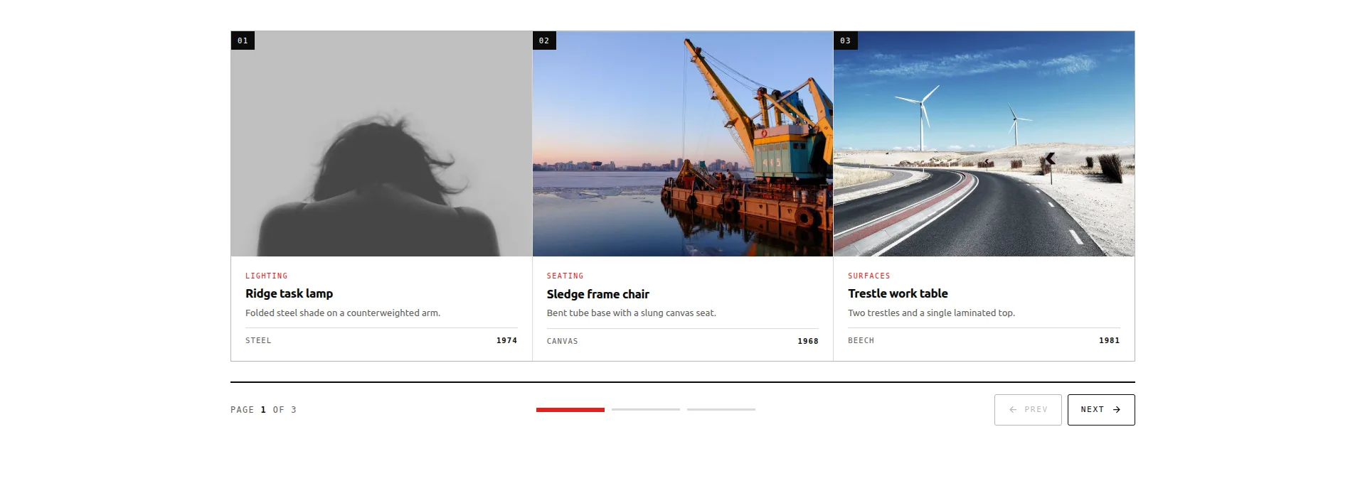
العرض المباشر تحميل القطعة JSON
يتم استيراده على المكون الإضافي المجاني من خلال Master Addons → Widget Builder → Import Widget، ثم يظهر في Elementor ضمن المفضلة. بقية المجموعة، عشرين تصميمًا، ثمانية منها مجانية، موجودة في قوالب منزلق Elementor المجانية تقرير إخباري.
التحذير الصادق: تسعة عناصر، ثابتة. إنه ليس استعلامًا عن المنتج. لا شيء يتتبع المخزون، ولا شيء يقوم بتحديث السعر، ويوجد عنصر مباع بالكامل حتى تقوم بتحرير المربع. استخدمه لمجموعة منسقة نادرًا ما تغيرها. بالنسبة لأي شيء يجب أن يتبع الكتالوج، عد إلى الطريقة الأولى.
الطريقة الثالثة: المنتج المميز ودوامة الصور للصور
يحتوي Master Addons على أداة WooCommerce واحدة بالضبط، وهي ليست دوارة. ال القطعة المنتج المميز is Pro، ويقوم بعمل مختلف: منتج واحد، مع مساحة معينة، مع صورة وعنوان وسعر ووصف وزر شراء موضوع ككتلة بدلاً من بطاقة في شريط.
هذا غالبًا ما يكون الشكل الأفضل على أي حال. منتج واحد به مساحة حوله يتحول بشكل أصعب من نفس المنتج مثل إحدى البطاقات الأربع التي يتعين على الشخص التمرير عبرها. استخدمه للإطلاق، أو الأكثر مبيعًا، أو العنصر الوحيد الذي تم إنشاء الصفحة المقصودة حوله.
لتصوير المنتج على مسار (ست زوايا لنفس السترة، كتاب مراقبة، شريط مواد) مجانًا صورة دائري يعالجها. Lightbox، التسميات التوضيحية، الشرائح لكل جهاز لكل عرض. إذا كانت بعض هذه الزوايا عبارة عن مقاطع وليست لقطات ثابتة، فإن دليل الفيديو الدائري والمعرض المنزلق يغطي الأدوات التي تتعامل مع التشغيل.
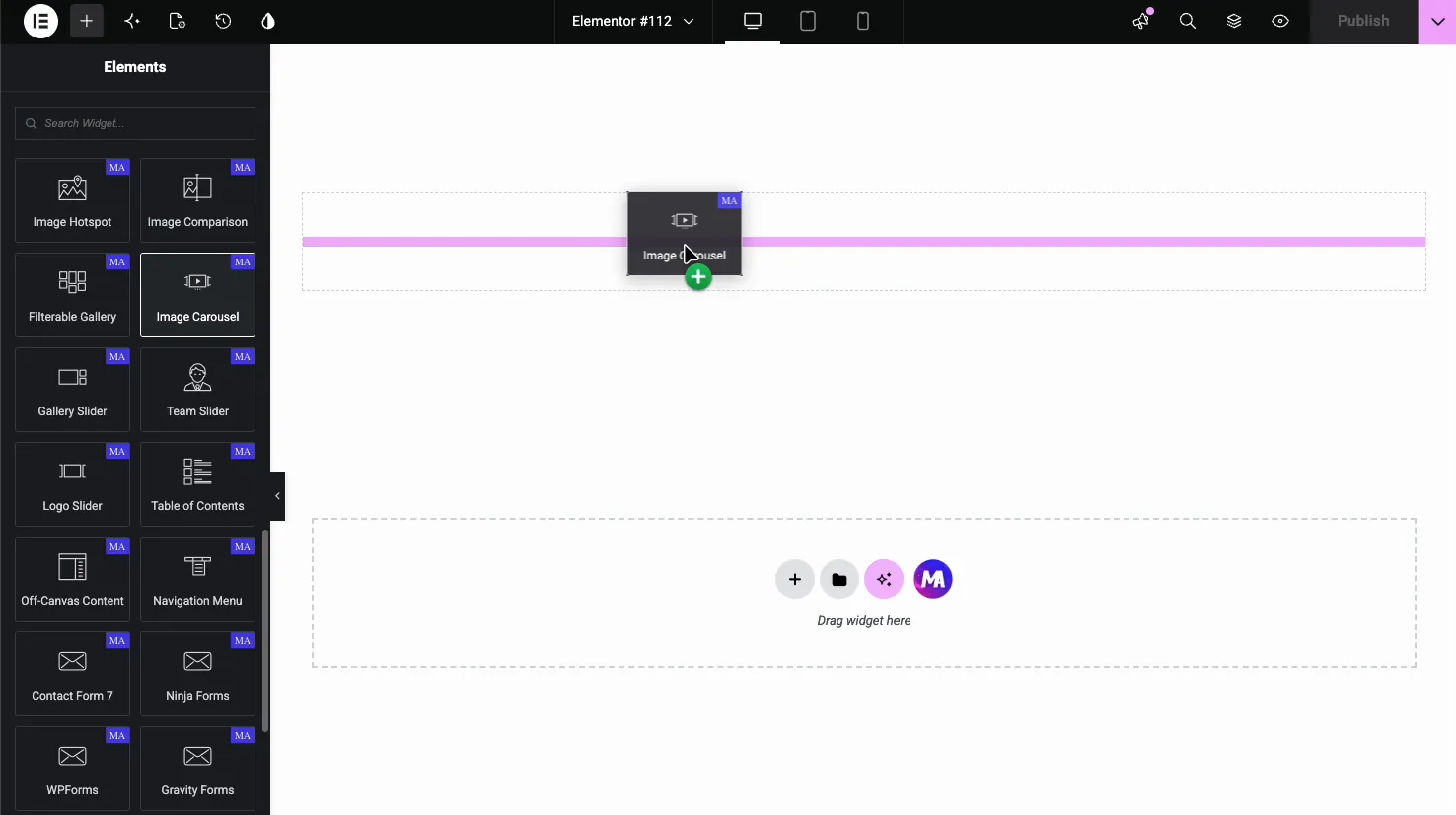
كن واضحًا بشأن ما ليس كذلك: يمكنك إضافة الصور بنفسك ولا ترتبط بالمنتجات إلا إذا قمت بتعيين الروابط يدويًا. إنها عبارة عن دائري للصور، وليست خلاصة متجر.
حيث ينتمي دائري المنتج
أيًا كانت الطريقة التي تستخدمها، تعمل أربعة أوضاع بشكل موثوق
- المنتجات ذات الصلة في صفحة منتج واحدة. الزائر مهتم بالفعل بهذه الفئة. الشريط المنزلق المكون من أربعة بدائل هو خدمة.
- عمليات البيع المتبادل و“ أكمل المظهر.” الملحقات تحت المنتج الرئيسي. لا أحد يحتاج لرؤية الاثني عشر جميعا؛ إنهم بحاجة إلى معرفة وجود اثني عشر.
- مجموعة مميزة أو موسمية على الصفحة الرئيسية. منسقة وليست شاملة.
- تمت مشاهدته مؤخرًا. صغير وشخصي ودوامة هو الشكل الطبيعي لها.
ما حصة تلك: المنتجات اختياري. الصفحة لا تزال تعمل إذا لم يلمس أحد الشريط.
حيث يكلفك المبيعات
لا تضع أبدًا دائري على متجر أو صفحة فئة.
هذا هو الذي يجب الحصول عليه بشكل صحيح. توجد صفحة فئة حتى يتمكن الأشخاص من المقارنة: قم بمسح الشبكة، واكتشف ما يريدون، وانقر عليها. يعرض دائري أربعة منتجات ويخفي الباقي خلف سهم، مما يحول المقارنة إلى تمرين للذاكرة. يجب على الزائر أن يحمل المنتج الثاني في رأسه أثناء النظر إلى المنتج السادس.
هناك تكلفة العرض التقديمي أيضًا. يمكن للدوامة والشبكة إخراج نفس العلامات، ولكن صفحة الفئة التي تعرض بشكل واضح ستة عناصر تُقرأ كفئة رفيعة، سواء للمتسوقين أو لأي شخص يحكم على عمق الصفحة. يجب أن تبدو صفحة متجرك وكأنها متجر.
الموقف السيئ الثاني: فوق الطية على الهاتف المحمول. دائري المنتج عبارة عن استعلام وعرض قالب وتهيئة شريط التمرير قبل طلاء أي شيء. في الجزء العلوي من صفحة الهاتف، هذا هو أكبر طلاء مثير للمحتوى يتم إنفاقه على الدوار. ضع بطلاً ثابتًا هناك وابدأ الكاروسيل أسفله.
أضف إلى سلة التسوق: في الكاروسيل أم لا؟
إظهار الزر للمنتجات البسيطة. إخفائه للمنتجات المتغيرة.
يعد المنتج البسيط الذي يحتوي على إضافة AJAX إلى عربة التسوق في الشريط اختصارًا حقيقيًا: نقرة واحدة، بدون تحميل الصفحة، تحديثات عربة التسوق. يستحق الحصول عليه.
لا يمكن إضافة منتج متغير دون تحديد حجم أو لون، وبالتالي فإن الزر إما لا يفعل شيئًا أو يرتد المتسوق إلى صفحة المنتج. كلاهما يشعر بالكسر. بالنسبة للمنتجات المتغيرة، اجعل البطاقة بأكملها رابطًا وتخطي الزر.
إذا كان الكتالوج الخاص بك يمزج بين الاثنين، فقم بتشغيل دائرتين باستعلامات مختلفة بدلاً من تخطيط تسوية واحد.
شارات البيع وعرض الأسعار
إظهار شارة البيع. إنه الشيء الأكثر تباينًا في بطاقة المنتج وهذا هو السبب وراء توقف الأشخاص عن التمرير.
إظهار السعر، بما في ذلك العناصر الأصلية المعروضة للبيع، لأن المقارنة هي الإقناع.
تعرض المنتجات المتغيرة نطاقًا (“ £20 إلى £45”). تعد محاذاة بطاقات التغليف والكسر طويلة المدى والبطاقات المنحرفة في شريط أفقي أكثر وضوحًا بكثير مما هي عليه في الشبكة. إما تعيين ارتفاع ثابت على صف الأسعار أو إظهار “من £20.”
تصميم البطاقة الذي لا يبدو للهواة
ثلاثة أشياء تهم أكثر من الباقي.
ارتفاعات البطاقة متساوية. تختلف عناوين المنتجات بشكل كبير في الطول، والعنوان المكون من سطرين بجانب العنوان المكون من سطر واحد يدفع صف السعر إلى ارتفاعات مختلفة. قم بتعيين ارتفاع عنوان ثابت مع الاقتطاع، أو قم بتشغيل الارتفاع التلقائي بحيث يستقر الصف نفسه.
نسبة العرض إلى الارتفاع لصورة واحدة. تعد صور المنتج الشخصية والمربعة في نفس الشريط هي السبب الوحيد الأكثر شيوعًا الذي يجعل دائري المنتج يبدو رخيصًا. اضبط النسبة واتركها تظهر.
الفجوة بين البطاقات. 16 إلى 24 بكسل. الفجوة الصفرية تجعل المنتجات تنزف معًا؛ الكثير وأربع بطاقات تتوقف عن القراءة كمجموعة.
التشغيل التلقائي للمنتجات؟
لا، وهذا ليس تفضيلاً. ال قاعدة التشغيل التلقائي يختلف الأمر بالنسبة لشريط تمرير البطل، حيث لا يمكن النقر على أي شيء ولا يكلف التدوير شيئًا.
بطاقات المنتج قابلة للنقر عليها. التشغيل التلقائي يعني أن البطاقة يمكن أن تتحرك عندما يصل إليها شخص ما، وعادةً لا يعود المتسوق الذي ينقر على المنتج الخطأ ويحاول مرة أخرى. يغادرون. يغطي الإيقاف المؤقت سطح المكتب؛ عند اللمس، لا يوجد أي تحليق على الإطلاق، والهاتف المحمول هو المكان الذي يتواجد فيه معظم المتسوقين.
أطفئه.
الأداء: ما هي تكلفة دائري المنتج في الواقع
كل منتج في الاستعلام عبارة عن قاعدة بيانات للقراءة بالإضافة إلى عرض قالب، ولا يمكن تهيئة البرنامج النصي لشريط التمرير حتى وجود هذا الترميز. ثلاثة حدود عملية:
- قم بوضع حد أقصى للاستعلام عند اثني عشر. أبعد من ذلك، أنت تقدم بطاقات لا يصل إليها أحد.
- قم بتحميل كل شيء كسول باستثناء الصف الأول من الصور المرئية. يعد تحميل الشرائح خارج الشاشة بفارغ الصبر هو السبب المعتاد لبطء صفحة المنتج.
- تقديم صورة البطاقة بحجم البطاقة. تعد صورة المنتج بحجم 2000 بكسل والتي تم تحويلها إلى بطاقة 300 بكسل هي التنزيل الأكثر شيوعًا على موقع WooCommerce.
دائري واحد لكل قسم صفحة هو سقف معقول. ثلاث دوارات مكدسة على الصفحة الرئيسية عبارة عن ثلاثة أشرطة تمرير تتنافس على الخيط الرئيسي على الهاتف.
المخطط: لا تقم بلفها يدويًا
تقوم WooCommerce بالفعل بإخراج بيانات منظمة للمنتج على صفحات منتج واحدة، وهذا هو المكان الذي تريده Google. لا تحتاج مجموعة بطاقات المنتج الموجودة على الصفحة الرئيسية أو الصفحة المقصودة إلى ترميز المنتج الخاص بها، وتعد إضافتها يدويًا طريقة جيدة للحصول على بيانات السعر أو التوفر التي تتعارض مع صفحة المنتج الحقيقية.
إذا كانت البطاقات الدائرية مرتبطة بصفحات المنتج، وينبغي أن تكون كذلك، فإن مسار الزحف سليم وتعيش البيانات المنظمة في المكان الذي تنتمي إليه. اتركه وشأنه.
الأسئلة المتداولة
هل يحتوي Master Addons على أداة دوارة لمنتج WooCommerce؟
يحتوي No. Master Addons على عنصر واجهة مستخدم WooCommerce واحد، وهو منتج مميز، وهو يسلط الضوء على منتج واحد بدلاً من الانزلاق عبر عدة منتجات. للحصول على دائري منتج حقيقي، استخدم Elementor Pro's Loop Carousel مع قالب Loop Item الخاص بالمنتج. للحصول على عرض منسق يدويًا على البرنامج الإضافي المجاني، قم باستيراد تصميم الكتالوج الرباعي المقسم إلى صفحات واملأ المربعات التسعة بنفسك.
هل لدى WooCommerce دائري للمنتج؟
ليس أصليا. تقوم WooCommerce بإخراج المنتجات في الشبكات: صفحة المتجر، وأرشيفات الفئات، والمنتجات ذات الصلة. يحتاج الرف الدائري المنزلق إما إلى Loop Carousel الخاص بـ Elementor Pro مع قالب منتج، أو عنصر واجهة مستخدم تابع لجهة خارجية يضيف واحدًا.
كيف يمكنني صنع دائري المنتج في Elementor مجانًا؟
لا يحتوي Free Elementor على دائري منتج ديناميكي، لذا فإن المسار الحر الصادق هو مسار منسق يدويًا: قم باستيراد تصميم الكتالوج المقسم إلى صفحات رباعية من خلال الإضافات الرئيسية → منشئ عناصر واجهة المستخدم → استيراد عنصر واجهة المستخدم واكتب العناصر التسعة، أو استخدم Image Carousel المجاني للمنتج التصوير الفوتوغرافي باستخدام الروابط اليدوية. أي شيء يستفسر عن الكتالوج يحتاج تلقائيًا إلى Elementor Pro.
هل يجب أن أستخدم دائري المنتج على صفحة متجري؟
لا توجد صفحات للفئة والمتجر حتى يتمكن الأشخاص من مقارنة المنتجات في لمحة، ويخفي الكاروسيل معظمها خلف سهم. استخدم شبكة في قائمة الصفحات واحفظ الكاروسيل للمنتجات ذات الصلة وعمليات البيع المتبادل والمجموعات المنسقة.
هل يمكن أن يُظهر دائري المنتج أزرار الإضافة إلى العربة؟
نعم، إذا قمت ببناء البطاقة بنفسك في قالب عنصر الحلقة. ضع الوظيفة الإضافية في القالب وستحصل كل شريحة على واحدة. إظهارها للمنتجات البسيطة باستخدام الوظيفة الإضافية AJAX؛ قم بإخفائها للمنتجات المتغيرة، والتي تحتاج إلى تغيير محدد أولاً، وبالتالي إما يفشل الزر أو يعيد التوجيه.
كم عدد المنتجات التي يجب أن تكون في دائري؟
ثمانية إلى اثني عشر محملة، وأربعة مرئية على سطح المكتب. أقل من ثمانية وبالكاد يوجد أي شيء يمكن التمرير إليه؛ أكثر من اثني عشر والذيل لا يمكن رؤيته أبدًا. إذا كنت بحاجة إلى أكثر من ذلك، فإن المحتوى يريد شبكة.
لماذا تتميز بطاقات المنتج الخاصة بي بارتفاعات مختلفة؟
تعمل عناوين المنتجات ذات الأطوال المختلفة على دفع السعر وصفوف الأزرار إلى مواضع مختلفة. قم بتعيين ارتفاع عنوان ثابت مع الاقتطاع، أو قم بتشغيل الارتفاع التلقائي بحيث يتطابق الصف مع أطول بطاقة. قم بتعيين نسبة عرض إلى ارتفاع ثابتة للصورة أيضًا، لأن الصور الشخصية والمربعة المختلطة تسبب نفس المشكلة.
التالي
تصوير منتج واحد من ست زوايا بدلاً من إدراج ستة منتجات؟ هذا هو صورة دائري البرنامج التعليمي، والذي يغطي الصندوق الضوئي وجانب التسمية التوضيحية.
كل شيء على شكل دائري، مجاني ومحترف، موجود على محور القطعة دائري، و الانهيار المجاني مقابل الاحترافي يوضح بالضبط ما يضيفه الترخيص.
يتم استيراد الكتالوج المقسم إلى صفحات رباعي مجانًا. التصميمات الاثني عشر الأخرى تحتاج إلى ترخيص، و صفحة التسعير يوضح الطبقة التي يقع تحتها كل طبقة.
