


Il n'y a pas de widget de carrousel de produits Master Addons WooCommerce. C'est la réponse honnête d'avance, et cela vous permet d'économiser une installation.
Ce qui fonctionne, ce sont trois itinéraires Le Loop Carousel d'Elementor Pro est le seul qui exécute une requête de produit en direct, alors choisissez-le si la bande doit suivre votre catalogue La conception gratuite du Quadrant Paged Catalogue vous offre une vitrine de neuf éléments organisée à la main sans aucune requête derrière elle Et le widget Produit en vedette de Master Addons met en lumière un produit, le Carrousel d'images gratuit couvrant la photographie du produit Tous les trois sont assis à l'intérieur du plus large Widget carrousel Elementor famille ; si vous faites tout un magasin, le meilleurs modules complémentaires Elementor pour WooCommerce roundup couvre le reste.
Ci-dessous : comment chacun est construit, puis la partie que la plupart des didacticiels ignorent, c'est là qu'un carrousel de produits vous coûte activement des ventes.
Quelle méthode choisir
- Vous avez Elementor Pro et la bande doit suivre le stock, le prix et les nouveaux arrivants → Carrousel de boucles C'est la vraie réponse.
- Vous voulez neuf cartes manuscrites que vous contrôlez jusqu'à la dernière ligne de copie → Catalogue de pages quadrant, gratuit.
- Vous voulez pousser un produit fort → Produit en vedette, Pro.
- Vous avez juste besoin de photos de produits sur une piste → Carrousel d'images, gratuit.
Méthode 1 : Carrousel en boucle d'Elementor Pro
Elementor Pro résout cela nativement, alors commencez ici. Le Carrousel de boucle prend un modèle d'élément de boucle, une carte de produit que vous concevez une fois et le pointe vers une requête WooCommerce Ajoutez un produit, modifiez un prix, vendez hors d'une taille, et le carrousel le reflète sans que personne n'ouvre l'ajout impliqué.
- Construire le modèle de l'élément de boucle. Modèles → Theme Builder → Loop Item, source set to Product Disposez l'image, le titre, le prix, la note et le bouton à l'aide de balises dynamiques.
- Lâchez le widget Loop Carousel sur la page et sélectionnez ce modèle.
- Définir la requête. Source est l'endroit où le vrai travail se produit : tous les produits, une catégorie, une étiquette, en vente, en vedette, ou la sélection manuelle Ensuite commander par date, prix, popularité ou ordre de menu.
- Définissez combien charger. C'est le total que le carrousel détient, pas combien sont visibles Huit à douze combinaisons une bande de produits apparentés Chargez-en quatre avec quatre visibles et il n'y a rien vers lequel faire défiler.
- Exclure ce qui ne devrait pas être là. Articles en rupture de stock, et sur une seule page de produit, le produit actuel Une bande de produits connexes qui comprend le produit que vous regardez déjà se lit comme cassé.
- Définissez les diapositives par vue par point d'arrêt. Quatre sur ordinateur, trois sur tablette, un et demi sur mobile.
Cette “une et demie sur le” mobile n'est pas une faute de frappe Une carte complète plus la moitié de la suivante est le signal le plus fort qu'une bande fait défiler Une carte remplissant la largeur ressemble à un bloc statique et la plupart des gens ne la glissent jamais.
La capture est la licence. Loop Carousel est Pro uniquement, sans équivalent gratuit dans le noyau Elementor. le module externe du carrousel passe en détail par les contrôles de requête et les solutions de contournement gratuites.
Méthode 2 : organisée à la main avec le catalogue quadrant par page (gratuit)
Une requête en direct est parfois exactement fausse Une collection de pages d'accueil où vous voulez écrire chaque ligne vous-même, ou une vitrine de produit sur un site qui n'exécute pas du tout WooCommerce, veut des cartes triées sur le volet.
Le catalogue quadrant par pages est l'un des huit produits importés gratuitement Constructeur de widgets conceptions : une grille de neuf cases d'articles paginées trois à la fois, avec un rail de segment qui montre où vous êtes et saute entre les pages Chaque case contient une image, une étiquette de catégorie, un titre, une ligne de copie et une statistique, le tout tapé à la main, qui est le point.
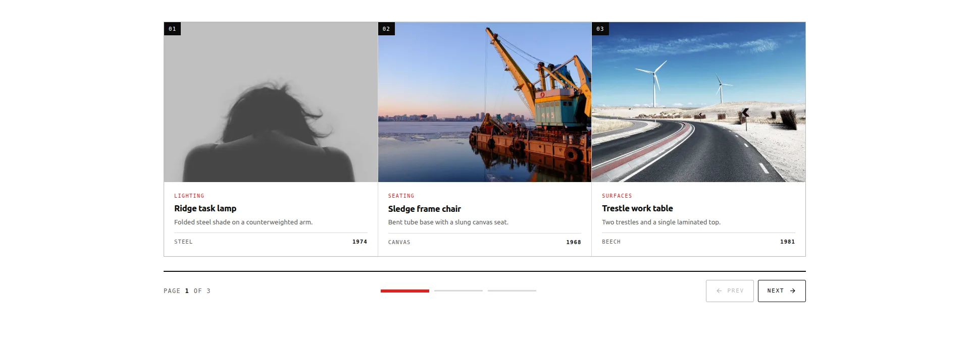
Démo en direct Télécharger Widget JSON
Il importe sur le plugin gratuit via Master Addons → Widget Builder → Import Widget, puis apparaît dans Elementor sous Favoris Le reste de l'ensemble, vingt designs dont huit gratuits, est dans le modèles de curseurs d'éléments gratuits rafle.
La mise en garde honnête : neuf articles, corrigés Ce n'est pas une requête de produit Rien ne suit le stock, rien ne met à jour un prix, et un article épuisé reste là jusqu'à ce que vous modifiiez la boîte Utilisez-le pour un ensemble organisé que vous changez rarement Pour tout ce qui doit suivre le catalogue, revenez à la méthode 1.
Méthode 3 : Produit en vedette et carrousel d'images pour les photos
Master Addons a exactement un widget WooCommerce, et ce n'est pas un carrousel Le Widget Produit en vedette est Pro, et il fait un travail différent : un produit, avec de la place, avec une image, un titre, un prix, une description et un bouton d'achat disposé comme un bloc plutôt que comme une carte dans une bande.
C'est souvent la meilleure forme de toute façon Un seul produit avec de l'espace autour convertit plus fort que le même produit que l'une des quatre cartes que quelqu'un doit faire défiler Utilisez-le pour un lancement, un best-seller ou le seul élément autour duquel une page de destination est construite.
Pour la photographie de produit sur une piste (six angles de la même veste, un lookbook, une bande de matériaux) le gratuit Carrousel d'images le gère Lightbox, légendes, diapositives par appareil-per-view Si certains de ces angles sont des clips plutôt que des images fixes, le guide de curseur de carrousel vidéo et de galerie couvre les widgets qui gèrent la lecture.
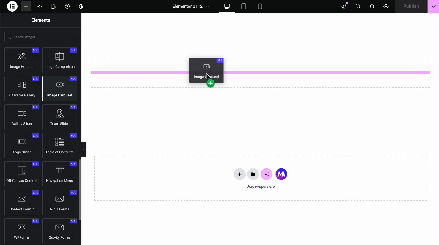
Soyez clair sur ce que ce n'est pas : vous ajoutez les images vous-même et elles ne renvoient pas aux produits à moins que vous ne définissiez les liens à la main C'est un carrousel photo, pas un flux de boutique.
Où appartient un carrousel de produits
Quelle que soit la méthode que vous utilisez, quatre postes fonctionnent de manière fiable :
- Produits associés sur une seule page de produit. Le visiteur s'intéresse déjà à cette catégorie Une bande coulissante de quatre alternatives est un service.
- Ventes croisées et “compléter le look.” Accessoires sous un produit principal Personne n'a besoin de voir les douze ; ils ont besoin d'en savoir douze existent.
- Une collection vedette ou saisonnière sur la page d'accueil. Organisé, non exhaustif.
- Récemment consulté. Petit, personnel, et un carrousel est la forme naturelle pour elle.
Ce que ceux-là partagent : les produits sont facultatif. La page fonctionne toujours si personne ne touche la bande.
Où cela vous coûte des ventes
Ne mettez jamais de carrousel sur une page de boutique ou de catégorie.
C'est celui qui va bien Une page de catégorie existe pour que les gens puissent comparer : scanner une grille, repérer celle qu'ils veulent, cliquer Un carrousel montre quatre produits et cache le reste derrière une flèche, ce qui transforme la comparaison en un exercice de mémoire Le visiteur doit tenir le produit deux dans sa tête tout en regardant le produit six.
Il y a un coût de présentation aussi Un carrousel et une grille peuvent produire le même balisage, mais une page de catégorie qui montre visiblement six éléments se lit comme une catégorie mince, à la fois pour les acheteurs et pour quiconque juge de la profondeur de votre page de boutique devrait ressembler à une boutique.
Deuxième mauvaise position: au-dessus du pli sur mobile. Un carrousel de produits est une requête, un rendu de modèle et une initialisation de curseur avant que quoi que ce soit ne peint En haut d'une page de téléphone, c'est votre plus grande peinture contente dépensée pour une fileuse Mettez un héros statique là et démarrez le carrousel en dessous.
Ajouter au panier : dans le carrousel ou pas ?
Afficher le bouton pour les produits simples Cachez-le pour les variables.
Un produit simple avec AJAX add-to-cart dans la bande est un vrai raccourci : un robinet, pas de chargement de page, mises à jour de panier. Cela vaut la peine d'être reçu.
Un produit variable ne peut pas être ajouté sans choisir une taille ou une couleur, donc le bouton soit ne fait rien, soit fait rebondir l'acheteur sur la page du produit Les deux se sentent cassés Pour les produits variables, faites de la carte entière un lien et sautez le bouton.
Si votre catalogue mélange les deux, exécutez deux carrousels avec des requêtes différentes plutôt qu'une seule mise en page de compromis.
Badges de vente et affichage des prix
Montrez le badge de vente C'est la chose la plus contrastée dans une carte de produit et c'est la raison pour laquelle les gens arrêtent de faire défiler.
Afficher le prix, y compris les articles originaux barrés en vente, car la comparaison est la persuasion.
Les produits variables affichent une gamme (“£20 à £45”).Longues gammes enveloppent et brisent l'alignement des cartes, et les cartes mal alignées dans une bande horizontale sont beaucoup plus visibles que dans une grille Soit définir une hauteur fixe sur la ligne de prix ou afficher “À partir de £20.”
Conception de cartes qui n'a pas l'air amateur
Trois choses comptent plus que le reste.
Hauteurs égales des cartes. Les titres des produits varient énormément en longueur, et un titre à deux lignes à côté d'un titre à une ligne pousse la ligne de prix à différentes hauteurs Définissez une hauteur de titre fixe avec la troncature, ou activez la hauteur automatique pour que la ligne se nivelle elle-même.
Rapport hauteur/largeur d'une image. Les photos de portraits et de produits carrés dans la même bande sont la raison la plus courante pour laquelle un carrousel de produits semble bon marché. Définissez un ratio et laissez-le recadrer.
Écart entre les cartes. 16 à 24 px. Zéro écart fait saigner les produits ensemble ; trop et quatre cartes arrêtent de lire comme un ensemble.
Lecture automatique pour les produits ?
Non, et celui-ci n'est pas une préférence Le règle d'autoplay est différent pour un curseur de héros, où rien n'est cliquable et la rotation ne coûte rien.
Les cartes de produit sont cliquables La lecture automatique signifie qu'une carte peut se déplacer lorsque quelqu'un la cherche, et un acheteur qui appuie sur le mauvais produit ne retourne généralement pas essayer de nouveau Ils partent Les couvertures de pause sur le bureau ; au toucher, il n'y a pas de vol stationnaire du tout, et le mobile est là où se trouvent la plupart de vos acheteurs.
Éteignez-le.
Performance : ce que coûte réellement un carrousel de produits
Chaque produit de la requête est une base de données lue plus un rendu de modèle, et le script de curseur ne peut pas s'initialiser tant que ce balisage n'existe pas Trois limites pratiques :
- Plafonner la requête à douze. Au-delà de cela, vous restituez des cartes que personne n'atteint.
- Chargez tout paresseusement sauf la première rangée d'images visibles. Le chargement des diapositives hors écran avec impatience est la cause habituelle d'une page de produit lente.
- Servez l'image de la carte à la taille de la carte. Une photo de produit 2000 px mise à l'échelle dans une carte 300 px est le téléchargement gaspillé le plus courant sur un site WooCommerce.
Une section de carrousel par page est un plafond raisonnable Trois carrousels empilés sur une page d'accueil sont trois curseurs en compétition pour le fil principal sur un téléphone.
Schéma : ne le faites pas rouler à la main
WooCommerce produit déjà des données structurées par produit sur des pages de produit unique, et c'est là que Google le souhaite Un carrousel de cartes de produit sur une page d'accueil ou une page de destination n'a pas besoin de son propre balisage Produit, et l'ajouter à la main est un bon moyen de se retrouver avec des données de prix ou de disponibilité qui contredisent la page du produit réel.
Si les cartes carrousel renvoient aux pages de produits, et elles devraient, le chemin d'exploration est intact et les données structurées vivent là où elles appartiennent Laissez-les tranquilles.
Questions fréquemment posées
Master Addons possède-t-il un widget de carrousel de produits WooCommerce ?
No. Master Addons a un widget WooCommerce, Produit en vedette, et il met en lumière un seul produit plutôt que de glisser à travers plusieurs Pour un vrai carrousel de produits, utilisez le carrousel de boucle d'Elementor Pro avec un modèle d'article de boucle de produit Pour une vitrine organisée à la main sur le plugin gratuit, importez la conception du catalogue quadrant en page et remplissez vous-même les neuf boîtes.
WooCommerce a-t-il un carrousel de produits ?
Pas nativement WooCommerce sort des produits en grilles : page boutique, archives de catégories, produits connexes Un carrousel glissant a besoin soit du Loop Carousel d'Elementor Pro avec un modèle de produit, soit d'un widget tiers qui en ajoute un.
Comment faire un carrousel de produits dans Elementor gratuitement ?
Free Elementor n'a pas de carrousel de produits dynamique, donc le libre parcours honnête est un parcours organisé à la main : importez la conception du catalogue quadrant par page via des modules complémentaires principaux → Widget Builder → Importez le widget et tapez les neuf éléments, ou utilisez le carrousel d'images gratuit pour la photographie de produits avec des liens manuels Tout ce qui interroge le catalogue a automatiquement besoin d'Elementor Pro.
Dois-je utiliser un carrousel de produits sur ma page de boutique ?
N° Les pages de catégorie et de boutique existent pour que les gens puissent comparer les produits en un coup d'œil, et un carrousel cache la plupart d'entre eux derrière une flèche Utilisez une grille sur les pages de liste et enregistrez les carrousels pour les produits connexes, les ventes croisées et les collections organisées.
Un carrousel de produits peut-il afficher des boutons d'ajout au panier ?
Oui, si vous construisez la carte vous-même dans un modèle d'élément de boucle Mettez l'ajout au panier dans le modèle et chaque diapositive en obtient un. Montrez-le pour les produits simples avec AJAX add-to-cart ; cachez-le pour les produits variables, qui nécessitent une variation sélectionnée en premier, de sorte que le bouton soit échoue, soit redirige.
Combien de produits doit-il y avoir dans un carrousel ?
Huit à douze chargés, quatre visibles sur le bureau Moins de huit et il n'y a presque rien vers lequel faire défiler ; plus de douze et la queue n'est jamais vue Si vous avez besoin de plus que cela, le contenu veut une grille.
Pourquoi mes cartes de produits ont-elles des hauteurs différentes ?
Les titres de produits de différentes longueurs poussent le prix et les rangées de boutons vers différentes positions Définissez une hauteur de titre fixe avec troncature, ou allumez la hauteur automatique pour que la rangée corresponde à la carte la plus haute Définissez également un rapport hauteur/largeur d'image fixe, car les photos mixtes de portrait et de carré posent le même problème.
Suivant
Tirer sur un produit sous six angles plutôt que de lister six produits ? c'est le tutoriel image carrousel(en), qui couvre le côté lightbox et légende.
Tout en forme de carrousel, gratuit et Pro, est sur le hub de widget carrousel, et la panne gratuite versus Pro montre exactement ce qu'ajoute une licence.
Le catalogue quadrant par pages importe gratuitement. Les douze autres modèles ont besoin d'une licence et le page de tarification affiche de quel niveau relève chacun.
