Widgets de carrousel d'éléments
Un carrousel devrait faire plus que glisser Maître Addons vous donne vingt styles de mouvement finis (coverflow, accordéon, flip, timeline, témoignage et plus encore) aux côtés de l'image, du logo, de l'équipe et des carrousels de poteaux qui ne coûtent rien. Huit des vingt importent sur le plugin gratuit(en), et chaque conception a une démo en direct, vous pouvez donc juger un style de mouvement en dix secondes au lieu de lire une liste de fonctionnalités Toutes les vingt sortent des addons principaux Constructeur de widgets(, donc ils importent en tant que widgets de travail et vous les modifiez dans Elementor comme n'importe quoi d'autre Pas de code à coller.


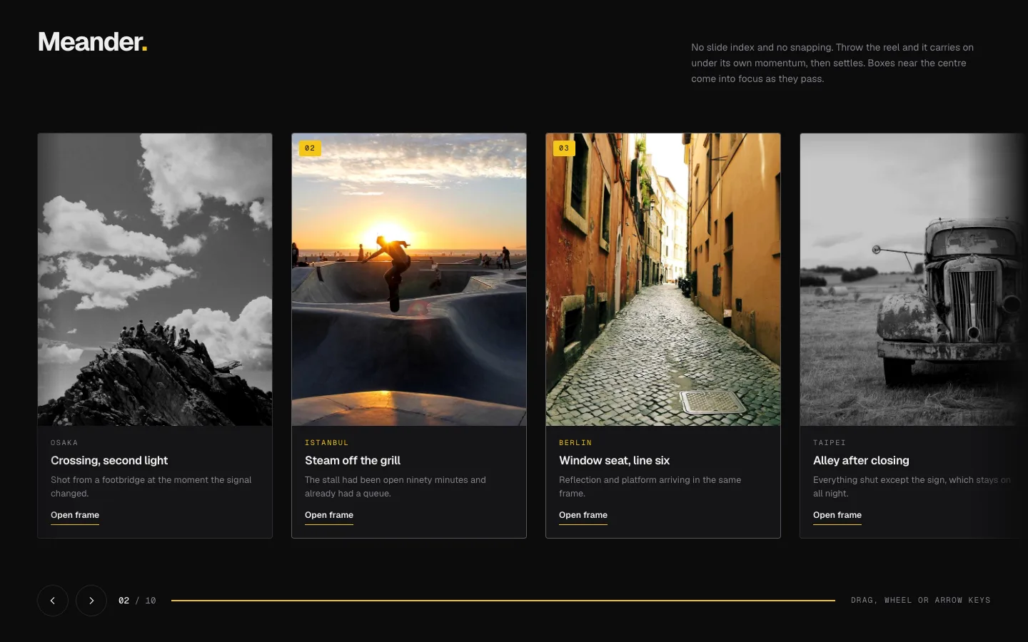

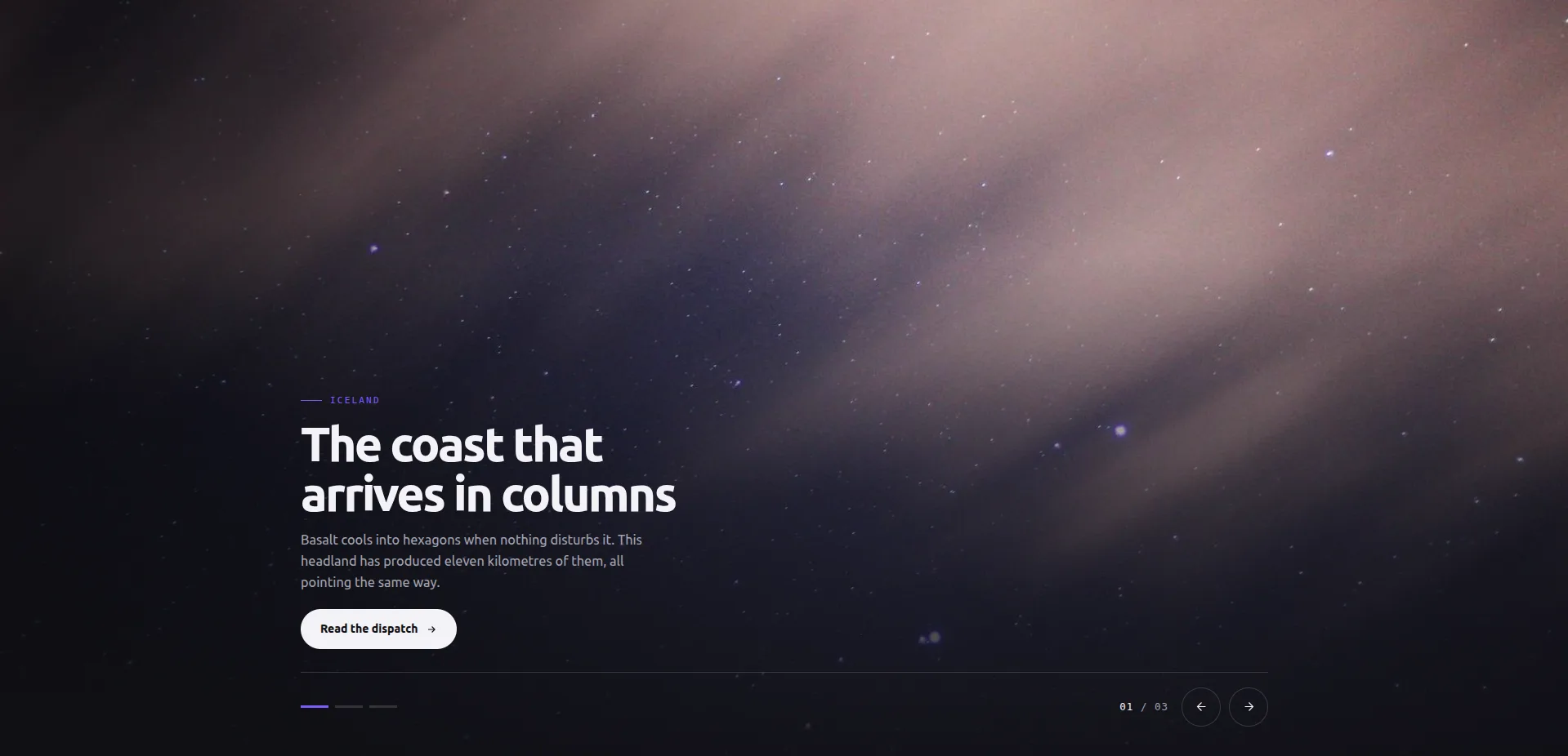
Chaque design, avec sa démo, JSON et docs
L'ensemble se déroule dans une seule liste Ouvrez une démo pour voir comment le mouvement se comporte, comparez le styles basés sur la profondeur contre les plats, prenez le JSON si vous le voulez dans Elementor, et lisez le doc quand un contrôle fait quelque chose auquel vous ne vous attendiez pas Les vingt ont été faites avec le Constructeur de widgets« Donc, éditer l’un d’entre eux est un travail de panel et non du code ».
Trois diapositives sont posées à l'écran à la fois : celle du milieu à l'équerre, les deux extérieures détournées et atténuées pour que l'œil sache où atterrir Les flèches, les tick dots et un compteur sont chacun facultatifs, la lecture automatique porte sa propre étiquette de pause, et les touches fléchées et glissez les deux sur les portefeuilles où la pièce suivante devrait taquiner plutôt que de rivaliser.
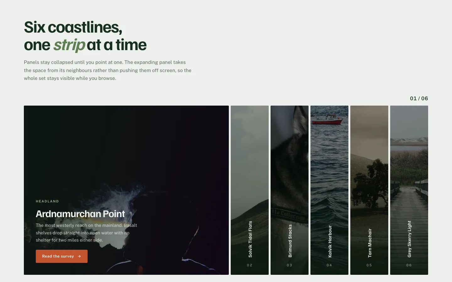
Les panneaux verticaux restent compressés sur leurs étiquettes jusqu'à ce que l'on ouvre et serre ses voisins, donc six sections s'ajustent à la hauteur d'une. Un contrôle de mise en page transforme le tout en un agencement empilé, l'ouverture sur le vol stationnaire peut être désactivée pour le toucher, et vous choisissez quel panneau est ouvert lorsque la page se charge. Un compteur peut se trouver au-dessus ou en dessous.
Une photographie à fond perdu avec la légende s'estompant en un demi-battement après l'atterrissage de l'image, de sorte que l'image se lit en premier et que les mots ne font que la confirmer. Lecture automatique avec une ligne de progression, les pas du clavier et le balayage sont tous intégrés et les images sous le pli se chargent paresseusement. Conçu pour les zones de héros où l'image porte le message, pas pour les longues galeries.
Une pile de cartes offset où celle du haut se soulève et se décolle sur le côté La profondeur laissée derrière est la façon dont les gens jugent ce qui reste, donc aucun compteur n'est nécessaire Chaque carte porte un badge, un prix et une note, vous définissez combien restent visibles dans la pile, et un indice facultatif indique aux débutants de glisser Les suivants et les arrières sont étiquetés texte.
Le cadre se divise au centre et les deux moitiés se déplacent dans des directions opposées, découvrant l'appariement suivant lorsqu'elles se croisent. Un mouvement fort : utilisez-le une fois, près du haut d'une page, plutôt que pour une galerie de douze images. Le clavier, le balayage et la progression de la lecture l'accompagnent, et les lecteurs d'écran apprennent quelle paire apparaît.
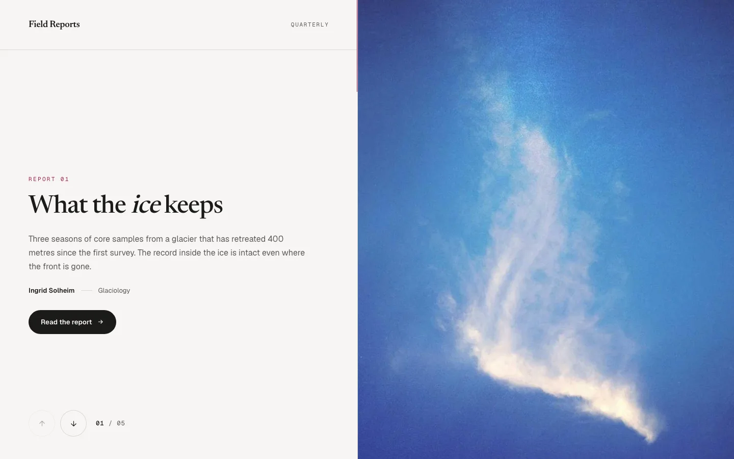
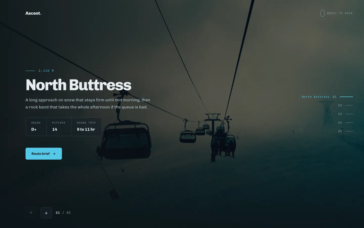
La molette de défilement entraîne les diapositives, et la page reprend le défilement au moment où vous atteignez l'une ou l'autre extrémité, donc personne ne se retrouve piégé dans la section en descendant Les touches fléchées et le balayage font le même travail Le meilleur sur les histoires verticales où lire l'ordre compte plus que laisser les gens sauter, et le mouvement réduit le transforme en un simple pas.
Les cartes tournent sur leur axe vertical pour montrer une deuxième face, donc une diapositive fait le travail de deux : avant pour le terrain, arrière pour la spécification Position de la piste des points, touches fléchées et pas de balayage, et les visiteurs à mouvement réduit obtiennent l'échange sans la rotation Les deux faces sont modifiables Bon pour les spécifications du produit, le détail des prix et les bios d'équipe.
Les diapositives chevauchent le bord d'un cercle ancré sous la fenêtre, arrivant au niveau et basculant en partant, de sorte qu'il se lit comme un mouvement le long d'un chemin plutôt que le long d'une piste. Roue, clavier et glisser tous le conduisent et un compteur marque la position. Convient aux ensembles dirigés par l'image où le mouvement fait partie du pas ; le mouvement réduit aplatit la courbe.
Les tuiles inégales changent de position au lieu de glisser latéralement, de sorte que la composition change de forme pendant que le cadre reste en place. Clavier et glisser les deux le déplacent, et le mouvement réduit obtient une coupe simple. Convient à une galerie où aucune image ne doit passer en premier. L'ensemble est le point, et le classement ne ferait que gêner. Les tailles des tuiles sont définies dans le panneau.
Saisissez et lancez, avec de l'élan et sans points d'encliquetage, de sorte que la bande s'arrête partout où votre film la quitte. La roue et le clavier fonctionnent également, et un compteur maintient la position honnête. La diapositive semi-visible sur le bord est ce que les gens peuvent continuer à tirer. Ce qui indique sans surplomb, les rangées de traînée libre sont lues comme statiques. Les utilisateurs de clavier obtiennent des pas discrets à la place.
Deux panneaux s'écartent pour découvrir la diapositive déjà assise derrière eux Rien ne se déplace horizontalement, donc elle reste calme à l'intérieur d'une page dense où une piste de glisse combattrait tout autour. Les marches du clavier, le glissement et la manipulation à mouvement réduit sont intégrés. Le meilleur avec des images simples fortes ; les compositions occupées se perdent derrière les panneaux.
Les objets parcourent un cercle complet autour d'un centre fixe et se terminent là où ils ont commencé, avec une position de contre-marquage sur le chemin. Clavier et faites glisser les deux sur le clavier, et le mouvement réduit laisse tomber l'orbite pour un changement simple. Gardez-le pour un contenu qui boucle véritablement un processus, un cycle, un cycle où revenir au départ est le point.
Une image remplit la scène et les diapositives échangent instantanément, il n'y a donc rien à bégayer sur une connexion lente ou à tomber désynchronisé lorsque Elementor se rend. Le seul design ici avec un lien sur chaque diapositive plus une étiquette d'appel à l'action partagée Quatre-vingt-cinq commandes couvrent le canevas, les points, les flèches, le compteur, le clavier et le balayage.
Une colonne de lignes d'entrée à côté d'une seule plaque ; le choix d'une ligne échange l'image, le timbre et la légende, ce qui fait de la liste elle-même la navigation. Le sélection en vol est un interrupteur, qui vaut la peine de s'éteindre partout où un pointeur parasite le traversera. Construit pour les catalogues, les archives et les listes d'œuvres. 110 contrôles répartis sur dix-huit sections.
Une grande plaque sous une bande miniature, avec un panneau collant à côté tenant la légende et une table de données de trame : lieu, heure, objectif, ouverture, obturateur, ISO, chaque étiquette modifiable Les cadres sont remplacés en bloc, rien ne glisse La bande est le véritable contrôle ; les flèches sont là pour les personnes qui les veulent Il y a 127 commandes dans le panneau.
Neuf boîtes d'articles paginées trois à la fois, avec un rail segment qui affiche la position et saute directement sur une page Chaque boîte contient une image, une catégorie, un titre, une copie et une paire de statistiques L'unité répétitive est la page plutôt que l'article, qui est le commerce pour le niveau libre : neuf boîtes sur trois sections de contenu Le rail peut être caché.
Une bande à onglets sur des panneaux éditoriaux figure et légende, kicker, titre, lede, copie corporelle, un tableau de faits à trois rangées et une signature. Véritable sémantique des tablistes ARIA avec tabindex itinérant, donc les touches fléchées et les lecteurs d'écran se comportent comme les gens s'y attendent Plus près d'un magazine diffusé qu'un curseur, et mieux pour une copie longue. 131 contrôles.
Une citation à côté de son portrait, étagée avec des chevrons qui peuvent nommer celui qui parle ensuite au lieu de simplement pointer quelque part Une barre de progression et une position de piste de pointage en cours d'exécution La marque de citation est un contrôle de texte plutôt qu'un glyphe fixe, de sorte qu'elle peut correspondre à la langue du site ou être vidée entièrement Cinq champs par voix, trois voix.
Entrées épinglées sur un axe daté, avec un espacement des tiques calculé à partir des années où vous tapez plutôt que de s'étaler uniformément, de sorte que les décennies calmes restent visibles comme des espaces Un peigne de décennie au-dessus de la règle donne cet espacement une échelle à lire contre Le panneau le plus large de l'ensemble à 143 commandes, l'axe conçu seul Neuf champs par entrée.
Un objet tenu en grand avec les autres qui attendent à côté Cliquez sur un satellite et il fait la promotion dans la fente de fonctionnalité, les boîtes se déplaçant dans leurs nouveaux endroits avec une animation FLIP au lieu de s'y téléporter La fonctionnalité porte une plaque de trois faits ; chaque satellite montre seulement son numéro et son nom Construit pour les salles et les expositions tournantes.
Questions fréquemment posées pour les widgets de carrousel d'éléments
Elementor a-t-il un widget carrousel ?
Oui. Image Carousel est livré dans le plugin gratuit d'Elementor et Media Carousel Carrousel de témoignage et Carrousel de boucle venez avec Elementor Pro. Le gratuit n'a pas de légendes de diapositives et un contrôle réactif limité, ce qui est la raison habituelle pour laquelle les gens ajoutent un addon.
Le carrousel Elementor est-il gratuit ?
Six widgets carrousel et curseur dans Master Addons sont gratuits : Carrousel d'images, Curseur de logo« Team Slider », le mode carrousel du widget Blog, Timeline et le curseur Comparaison d'images avant/après, plus l'extension gratuite Background Slider Huit des vingt designs personnalisés importent gratuitement aussi : Plinth Hero, Ledger Index, Vitrine Plate Gallery, Quadrant Paged Catalogue, Bulletin Tabbed Panels, Rostrum Quote, Almanac Timeline et Keystone Feature Les douze autres designs, le Gallery Slider et le News Ticker ont besoin de Pro.
Quelle est la différence entre un carrousel et un curseur ?
Un curseur montre une diapositive à la fois et est généralement un héros pleine largeur Un carrousel montre plusieurs objets à la fois sur une piste horizontale Les deux fonctionnent sur le même moteur Swiper ici, donc la différence pratique est le réglage des diapositives à la vue. Carrousel contre curseur couvre où la distinction change encore ce que vous construisez.
Comment puis-je rendre un carrousel Elementor réactif ?
Définissez les diapositives par vue séparément pour le bureau, la tablette et le mobile à l'aide des icônes de l'appareil en haut de ce paramètre Quatre, deux, un fonctionne pour la plupart des galeries Vérifiez également la taille des flèches sur le mobile, car les valeurs par défaut sont souvent inférieures à la cible du robinet accessible 44 px.
Pourquoi mes glissières de carrousel ont-elles des hauteurs différentes ?
Les titres de différentes longueurs poussent les rangées en dessous d'eux hors ligne, et les rapports d'aspect d'image mixtes font de même Définissez un rapport d'image fixe et soit plafonnez la hauteur du titre avec une troncature, soit allumez la hauteur automatique de manière à ce que les niveaux de rangée jusqu'à la diapositive la plus haute Les cartes de produit frappent aussi fort, que le guide carrousel de produits couvertures.
Mon carrousel a cessé de fonctionner après que j'ai allumé la mise en cache.
La combinaison ou le report JavaScript a arrêté le chargement de Swiper avant l'exécution du code d'initialisation. Exclure swiper, elementor-frontend et jquery-core de l'optimisation JS. Sur LiteSpeed, ajoutez-les également au champ Mode invité Sinon, cela fonctionne pendant que vous êtes connecté et que vous faites une pause pour les visiteurs. Le guide de dépannage Swiper a la liste complète des poignées.
Les widgets de carrousel ralentissent-ils un site WordPress ?
Les actifs se chargent uniquement sur les pages où le widget est utilisé, donc un widget inutilisé ne coûte rien Le poids qui compte, ce sont vos images : un carrousel restitue chaque diapositive, alors servez WebP à la taille de l'affichage et gardez la première diapositive sous 150 Ko. Carrousels vidéo sont le cas coûteux, car chaque diapositive transporte un joueur.
En savoir plus sur les carrousels Elementor
Guides pour chaque type de carrousel sur cette page, du jeu de conception au widget qui le construit.
Conceptions et modèles
- 20 modèles de curseurs d'éléments, dont 8 gratuitsChaque conception de l'ensemble, à quoi sert chacune et qui importe sans licence.
- Carrousel 3 D de l'élémenteur : coverflow, flip, arc et orbiteLes quatre styles de mouvement basés sur la profondeur et les paramètres qui les maintiennent fluides.
- Widgets gratuits pour carrousel Elementor : ce qui est réellement gratuitOù s'arrête le niveau libre, clairement indiqué, avec la liste Pro à côté.
Construire un carrousel spécifique
- Comment créer un carrousel d'images dans ElementorDiapositives par vue, légendes, lightbox et disposition du coverflow, étape par étape.
- Comment créer un carrousel de témoignages dans ElementorLes deux itinéraires, ainsi que l'erreur de schéma de révision qui génère des actions manuelles.
- Comment créer un carrousel logo dans ElementorFaire douze logos dépareillés s'assoient sur une rangée sans ressembler à une demande de rançon.
- Carrousel de produits WooCommerce à ElementorTrois méthodes qui fonctionnent, et les pages où un carrousel de produits vous coûte des ventes.
- Carrousel vidéo Elementor et curseur de galerieAperçu plus vignettes, et le problème d'intégration qui fait de la vidéo le widget le plus lent.
Outils de carrousel propres à l'élémenteur
- Elementor Loop Carousel : comment ça marcheLe carrousel dynamique, axé sur les requêtes, et les itinéraires gratuits si vous n'avez pas Pro.
- Marquee Elementor : texte et logos à défilement infiniTrois façons de construire une piste continue et l'astuce qui l'arrête.
- Curseur Elementor Swiper : comment il fonctionne et comment le réparerLa bibliothèque derrière chaque carrousel Elementor, et les cinq choses qui le brisent.
Choisir
- Carrousel élémentur vs curseur : quelle est la différence ?Une question qui vous indique de quelle forme votre section a besoin.
- 7 meilleurs plugins de carrousel Elementor comparésCe que chaque plugin met dans son niveau gratuit et ce qu'il coûte à la page.
- Meilleurs plugins de curseur Elementor comparésConstructeurs autonomes par rapport aux widgets natifs d'Elementor, pondérés honnêtement.
Widgets et extensions d'éléments tendance
Construisez des sites Web sophistiqués en moins de temps.
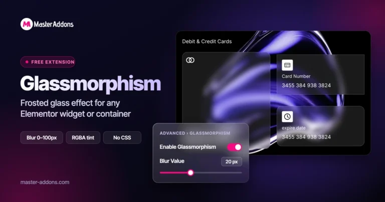
Glassmorphisme
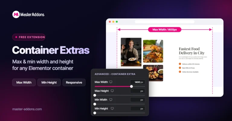
Extras de conteneurs

Modèles
![Modules principaux Extension de duplicateur de messages/pages pour le lien de ligne Elementor : MA Duplicator dans la liste des pages WordPress créant une ébauche de page de destination - [Dupliqué n° 128]](https://d1asvmc6qcowgk.cloudfront.net/wp-content/uploads/2026/09/15102930/post-page-duplicator-768x403.webp)
Duplicateur de messages/pages