


Arraste no Widget do controle deslizante de logotipo, adicione cada logotipo como uma linha repetidora, defina slides-per-view para desktop, tablet e celular e ative a reprodução automática com loop É um widget gratuito, um dos toda uma família de widgets carrossel, e a coisa toda leva cerca de cinco minutos.
A configuração é fácil O que não é fácil é fazer doze logotipos de doze empresas diferentes parecerem pertencer à mesma linha Esse é o problema real com cada tira de logotipo, e a segunda metade disso cobre isso.

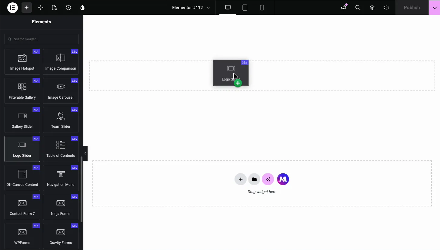
Passo 1: Adicionar o widget Logo Slider
Pesquise no painel Elementor o controle deslizante “logo” e arraste-o para dentro Faz parte do plugin gratuito Master Addons, e a repartição livre versus Pro tem a lista completa do que mais está nesse nível. O Documentação do Logo Slider cobre cada controle se você quiser a versão de referência A maioria dos plugins de addon enviam um widget de logotipo de algum tipo, e o comparação de plugins do carrossel diz quais deles o colocaram atrás de uma licença.
Passo 2: Adicione seus logotipos
Cada logotipo é uma linha repetidora: a imagem do logotipo, um link opcional e um texto flutuante opcional ou imagem flutuante O texto alternativo vem do campo Alt Text da imagem na Biblioteca de Mídia.
Duas coisas para fazer aqui que a maioria das pessoas pula:
Escreva texto alternativo real. “Acme Logotipo da Corp,” não “logo-1.png.” Uma tira de logotipo é um dos poucos lugares onde o texto alternativo carrega informações genuínas, porque os nomes das empresas são o conteúdo Os usuários do leitor de tela não obtêm nada de doze imagens chamadas “image.”
Vincule cada logotipo somente se o destino for útil Vincular logotipos de clientes a sites de clientes envia seu tráfego para longe de uma página onde estava convertendo Vincule-os aos seus estudos de caso em vez disso, ou não vincule-os de forma alguma Uma tira de logotipo funciona bem como um sinal de confiança estático.
Etapa 3: Layout e comportamento
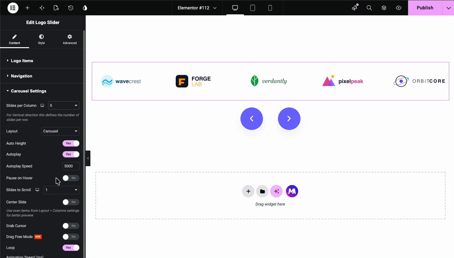
As tiras de logotipo têm padrões diferentes carrosséis imagem, porque o trabalho é diferente Ninguém estuda um logótipo Registam-no em meio segundo.
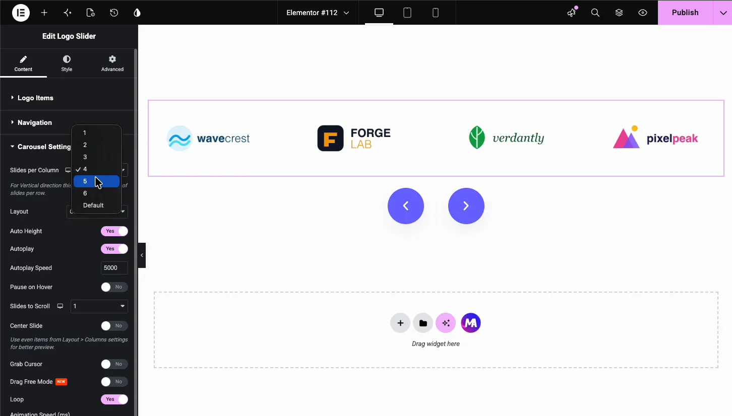
- Slides por visualização: seis no desktop, quatro no tablet, dois ou três no celular Maior densidade do que um carrossel de fotos, porque os logotipos são pequenos e o ponto é a quantidade.
- Reprodução automática: on. isso é o oposto da regra testemunhal Não há nada para ler, então o movimento contínuo não custa nada e mostra mais logotipos do que uma linha estática.
- Velocidade: mais lento do que parece certo. 4000 a 6000 ms. Uma tira de logotipo rápido lê como agitado.
- Loop: ligado, e certifique-se de ter pelo menos duas vezes seus slides-per-view Seis-per-view precisa de doze logotipos no mínimo ou o envoltório saltará visivelmente.
- Setas e pontos: desligado. Uma tira de logotipo não é algo que as pessoas navegam.
Defina o atraso de reprodução automática para 0 e o carrossel se torna uma marquise contínua em vez de pisar slide por slide Esse é o visual que a maioria dos sites modernos usa para tiras de logotipo, e o guia marquise cobre as configurações em detalhes.
Passo 4: Faça com que os logotipos incompatíveis pareçam consistentes
Aqui está o problema real Você tem doze logotipos Quatro são marcas de palavras largas, três são ícones quadrados, dois têm enorme preenchimento interno assado no PNG, e um é um alto bloqueio empilhado Deixe-os cair em uma linha na mesma largura e parece uma nota de resgate.
Dimensionar por largura é o erro Uma marca de palavras larga definida para 160 px de largura é visualmente minúscula; um ícone quadrado com 160 px de largura é enorme Eles são o mesmo número e não se parecem em nada.
Tamanho pela área óptica em vez disso. Exportar cada logotipo na mesma tela, dar a cada marca uma altura visual semelhante de cerca de 40 a 50 px na tira final, e ajustar arquivos individuais para cima ou para baixo até que eles parecem equilibrados O widget mostra cada logotipo na mesma Resolução de Imagem, então este equilíbrio acontece nos arquivos de estrabismo na linha: qualquer logotipo que salta para fora é muito grande, qualquer que desaparece é muito pequeno Confie em seu olho sobre os números, porque seu olho é o que os visitantes vão usar.
Os cartões de produto atingem a mesma incompatibilidade da outra direção, onde fotos de retrato e quadrado em uma tira é o que faz um carrossel produto pareça barato A correção lá é uma relação de aspecto fixa em vez de uma altura fixa.
Mais duas correções para o mesmo problema:
Corte o estofamento assado. Os logotipos exportados dos kits da marca geralmente carregam um espaço livre generoso dentro do arquivo de imagem Esse preenchimento é invisível e torna a renderização do logotipo menor que seus vizinhos na mesma altura. Cortar para a caixa delimitadora visível antes de fazer o upload.
Use SVG onde puder. Os logotipos são obras de arte vetoriais. Um SVG permanece nítido em qualquer tamanho, pesa uma fração de PNG e, esta é a parte útil, pode ser recolorido com CSS, o que torna o tratamento em escala de cinza abaixo trivial.
Passo 5: O pairar em escala de cinza
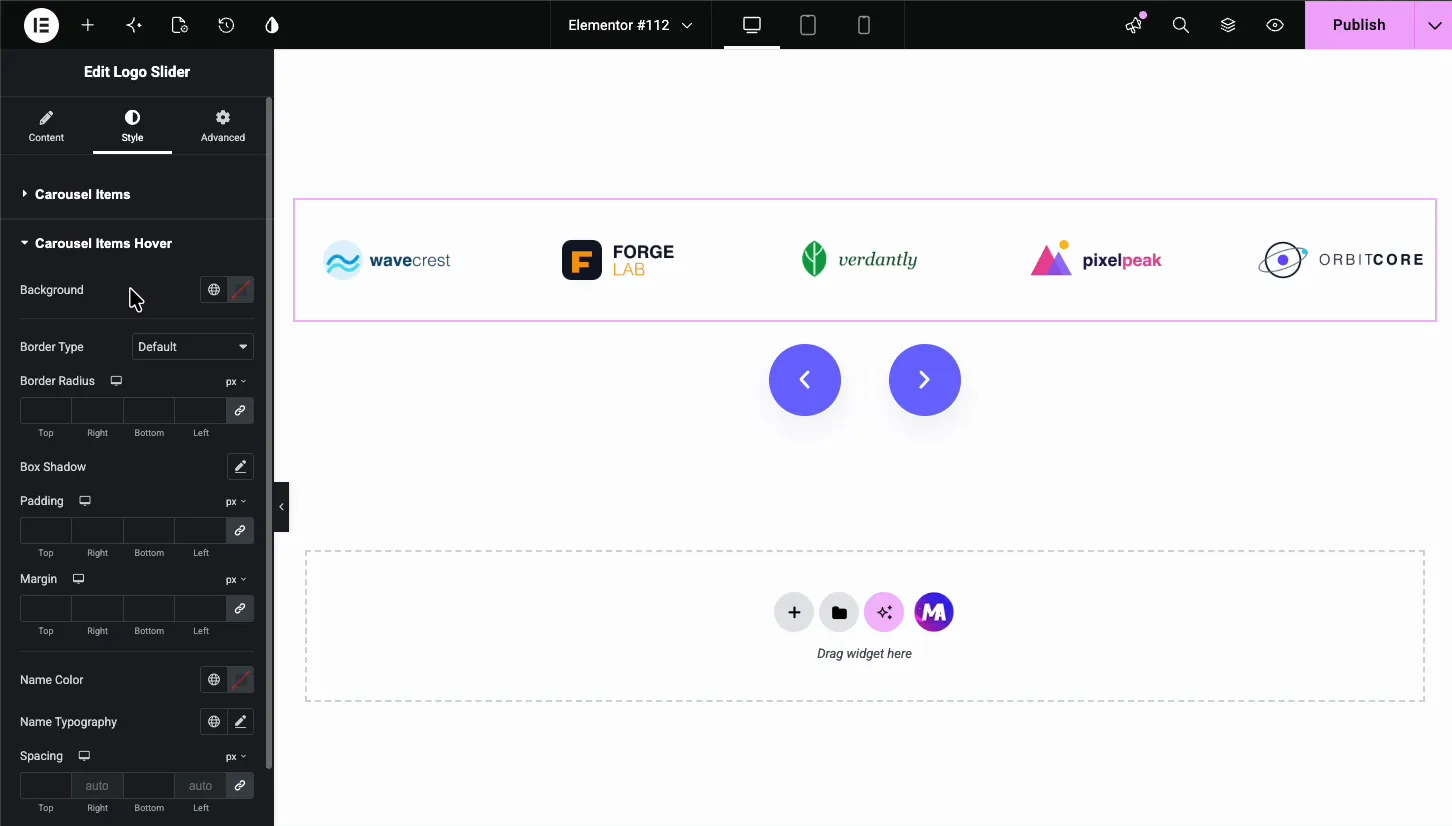
Logotipos dessaturados em repouso, coloridos em pairar É o tratamento padrão por um motivo: doze logotipos em doze paletas de marcas são um caos visual e a escala de cinza os transforma em uma textura coerente.
O Logo Slider não tem interruptor de escala de cinza, então existem duas maneiras de fazê-lo Carregue arquivos em escala de cinza como o Logotipo do Cliente e as versões coloridas como a Imagem do Logotipo Hover, ou adicione um filtro em escala de cinza CSS aos logotipos com CSS personalizado e remova-o no hover A configuração Opacidade nos Itens Carrossel pode diminuir os logotipos para cerca de 0,6 em repouso e 1 em hover Se você usar CSS, mantenha a transição em 200 a 300 ms. Mais rápido do que isso e ele pisca; mais lento e parece pegajoso Para uma legenda ou sobreposição que anima em uma única imagem, use o Widget de efeitos de passagem de imagem.
Um caso em que você não deveria: se os logotipos são menções à imprensa e não clientes, o tipo de tira Forbes e TechCrunch, deixe-os em cores Esses logotipos são reconhecidos por sua cor, e dessaturar custa o reconhecimento que você estava comprando.
A tira acabada

Onde colocá-lo: imediatamente abaixo do herói, ou imediatamente abaixo do chamado primário à ação Ambas as posições funcionam porque ambos são momentos em que um visitante está decidindo se deve confiar em você.
Onde não colocar: o rodapé Uma tira de logotipo no rodapé é decoração Ninguém rola para o rodapé para se convencer.
As tiras de logotipo são uma das poucas seções em que um widget de estoque supera um projetado, e é por isso que nenhum dos vinte Construtor de widgets os designs tentam substituí-lo. Se você quiser os designs Pro para outras seções, o página preços tem os níveis.
Quantos logotipos?
Oito a dezesseis. abaixo de oito e uma faixa de rolagem chama a atenção para o quão poucos são, porque uma linha estática de seis parece mais confiante do que seis logotipos pedalando Mais de dezesseis, ninguém vê a metade de trás, então lidere com os nomes que as pessoas reconhecerão.
E se você tem apenas quatro clientes: mostrar quatro, em uma linha estática, em um tamanho decente Um carrossel é uma maneira de lidar com a abundância Usar um para esconder a escassez faz o oposto do que você quer.
Perguntas frequentes
Elementor tem um widget carrossel de logotipo?
Não está no núcleo. Nem o Elementor free nem o Pro incluem um carrossel de logotipo dedicado, embora o Carrossel de Imagens principal possa mostrar uma linha simples de logotipos. O controle deslizante de logotipo Master Addons gratuito adiciona links por logotipo, texto hover ou imagens hover, dicas de ferramentas e uma faixa estilo marquise quando a velocidade de reprodução automática está definida como 0.
Como faço um carrossel de logotipo rolar continuamente no Elementor?
Ligue a reprodução automática e o loop infinito e, em seguida, defina o atraso da reprodução automática para 0. um atraso de zero remove a pausa em cada slide, de modo que a pista se mova continuamente em vez de pisar Defina a velocidade para 4000 a 6000 ms para que seja lida como calma em vez de frenética.
Como faço logotipos do mesmo tamanho em um carrossel?
Defina uma altura fixa do recipiente, 40 a 50 px, e deixe a largura correr automaticamente, em vez de fixar a largura Em seguida, ajuste logotipos individuais a olho nu, porque uma marca de palavras larga e um ícone quadrado na mesma medida parecem tamanhos completamente diferentes Cortar qualquer preenchimento assado dos arquivos de imagem primeiro.
Os logotipos devem ser em escala de cinza ou coloridos?
A escala de cinza em repouso com a cor paira para logotipos de clientes e parceiros, porque transforma uma dúzia de paletas conflitantes em uma faixa coerente. Mantenha os logotipos da imprensa e da mídia em cores, pois são reconhecidos pela cor e dessaturando-os perde o reconhecimento.
Quantos logotipos devem estar em um carrossel de logotipos?
Oito a dezesseis. menos de oito parece melhor como uma linha estática do que uma faixa móvel, porque a rolagem chama a atenção para o quão poucos são. Mais de dezesseis significa que a metade posterior nunca é vista, então coloque os nomes reconhecíveis em primeiro lugar.
Posso vincular cada logotipo a uma página diferente?
Sim, cada linha repetidora tem seu próprio campo de link Considere se você deseja, no entanto: vincular logotipos de clientes a sites de clientes envia o tráfego de conversão para longe Vinculá-los aos seus próprios estudos de caso mantém o visitante e faz mais trabalho.
Próximo
Fotografias em vez de logotipos? widget diferente, padrões diferentes: como criar um carrossel de imagens no Elementor. Há também uma coleção de vinte designs de controles deslizantes nomeados, oito deles gratuitos para importação, embora nenhuma seja uma faixa de logotipo, para logotipos o Logo Slider continua sendo a ferramenta.
Se a faixa parar de se mover após uma atualização do plugin de cache, isso será um problema de inicialização do Swiper e a correção está aqui. Tudo em forma de carrossel vive no Widgets Carrossel Elementor página.
