

A product photo with a paragraph of specs below it rarely gets read. A floor plan with a legend off to the side gets ignored. The problem is always the same: the image and the information live in two different places, and most visitors never scroll far enough to connect them.
An image hotspot fixes that. You pin small markers directly on the photo, and each one reveals a short label when someone hovers or taps. The Image Hotspot widget from Master Addons does this inside the Elementor editor. Upload an image, drop markers where you want them, write a label for each, and you are done. No CSS, no custom code.
What Is an Image Hotspot in Elementor?
An image hotspot is a small interactive marker pinned at a specific position on an image. Each marker has its own label, icon, or link. On desktop, hovering over the marker shows a floating panel with the content. On mobile, tapping it does the same thing.
A product photo can have a marker on each feature. A floor plan can mark individual rooms. A screenshot can point out buttons or settings with a short explanation. The image itself does not change. The markers just give visitors a way to explore it.
Elementor does not have a built-in hotspot widget. The Master Addons version handles everything from the widget panel: marker placement, label content, icons, animations, and styling. You configure each hotspot individually through the repeater, and the widget takes care of positioning and responsiveness.
Why Use Image Hotspots on Your Website?
Static images create a gap between what the visitor sees and what they need to know. Hotspots close that gap.
On a product photo, pin a marker on each feature so visitors see specs without scrolling to a separate list. On a floor plan, mark rooms or booths so each location opens with its name and details. On an infographic, keep the visual clean and let markers carry the extra context. On a screenshot, point out specific buttons or settings for a tutorial or onboarding flow. On a team photo, label people or departments.
The structure is always the same: one image, multiple markers, each one revealing content when interacted with. The visitor stays on the image instead of bouncing between the image and a text block below it.
How to Add an Image Hotspot in Elementor (Step-by-Step)
The whole setup takes about five minutes.
Step 1: Install Master Addons and Activate Pro
Go to Plugins, Add New in your WordPress dashboard and search for “Master Addons.” Install and activate the free plugin. If you have a Pro license, enter it under Master Addons, License. The Image Hotspot widget only appears after Pro is active.
Step 2: Drag the Image Hotspot Widget into Your Page
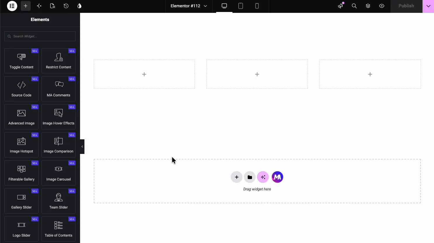
Open any page in the Elementor editor. In the Elements panel on the left, search for Image Hotspot or scroll to the Master Addons section (the widgets carry a purple MA badge). Drag it onto the page. It loads with a sample image and a few placeholder markers you can edit.
Step 3: Upload Your Image
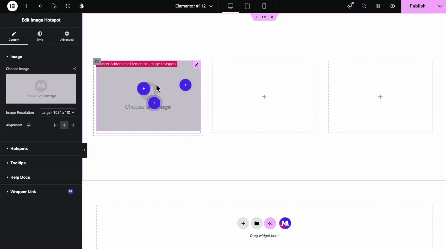
In the Content tab, open the Image section. Click Choose Image and pick a picture from the media library. Set Image Resolution to Full or Large for a sharp render. The Alignment option positions the image within its column: left, center, or right.
Step 4: Add Hotspots to the Image
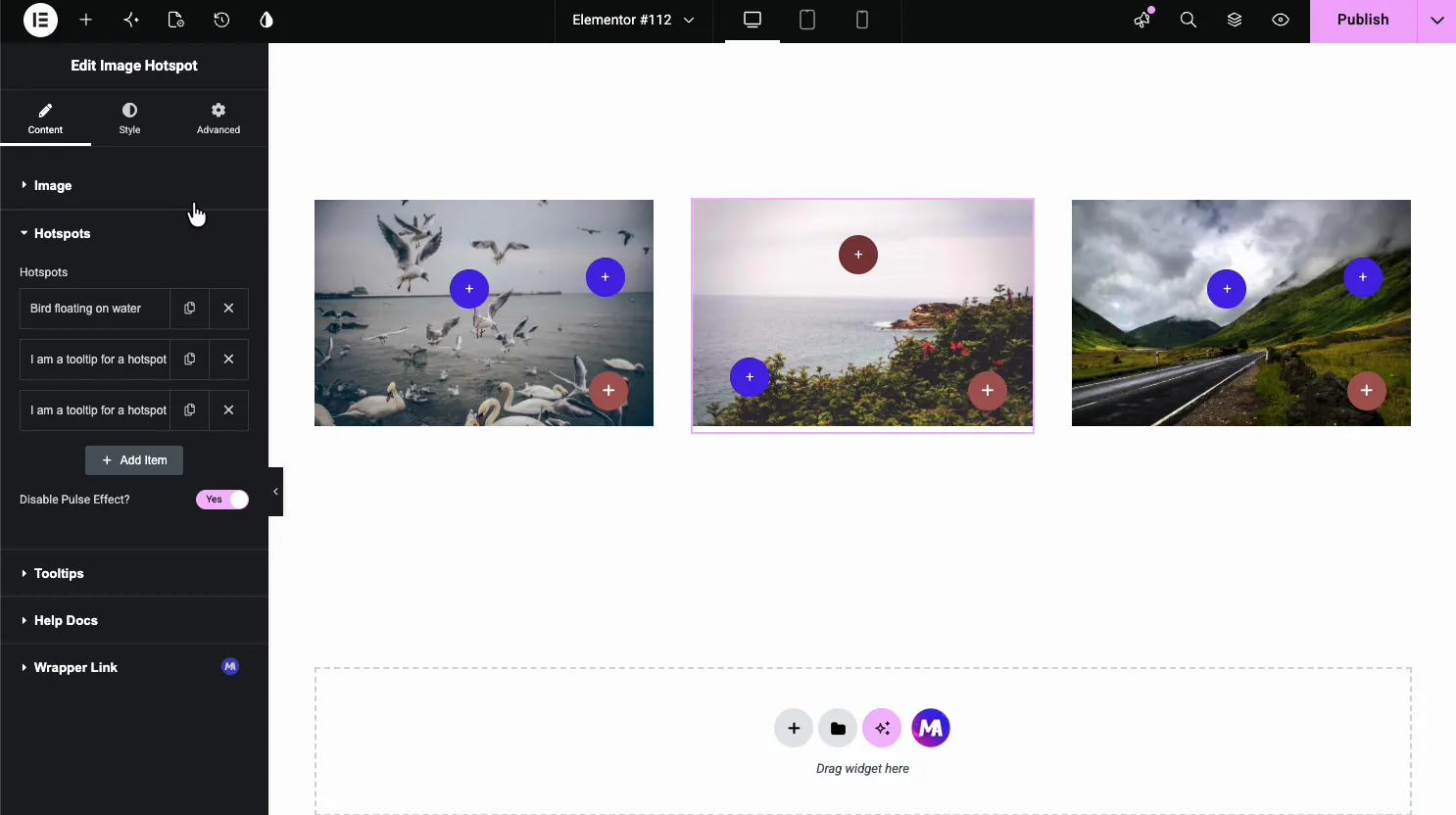
Open the Hotspots section. Each item in the repeater is one marker. Click Add Item to create a new one. You can add as many as the image needs. Open each marker’s Position tab and set the Horizontal and Vertical position sliders, in percent, to place it on the image.
There is a Disable Pulse Effect toggle if you want static markers instead of the default pulsing animation.
Step 5: Set the Marker Type and Label Content
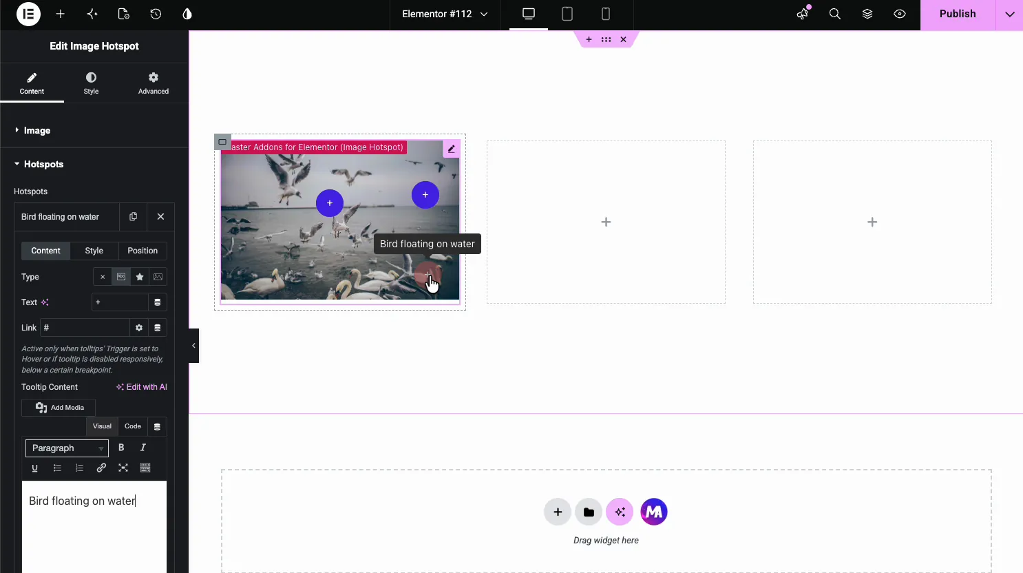
Click a hotspot item to open its settings. Under Type, choose what appears inside the marker: nothing (just a dot), short text (a plus sign by default), an icon, or a small image. The Text field is the text shown inside the marker. The Link field adds a URL, which works when labels open on hover or are switched off for that screen size.
The Tooltip Content editor is a WYSIWYG box for the label text, but the label itself shows plain text. Formatting, images, and links are stripped out, so write one short line.
Step 6: Configure Marker Behavior
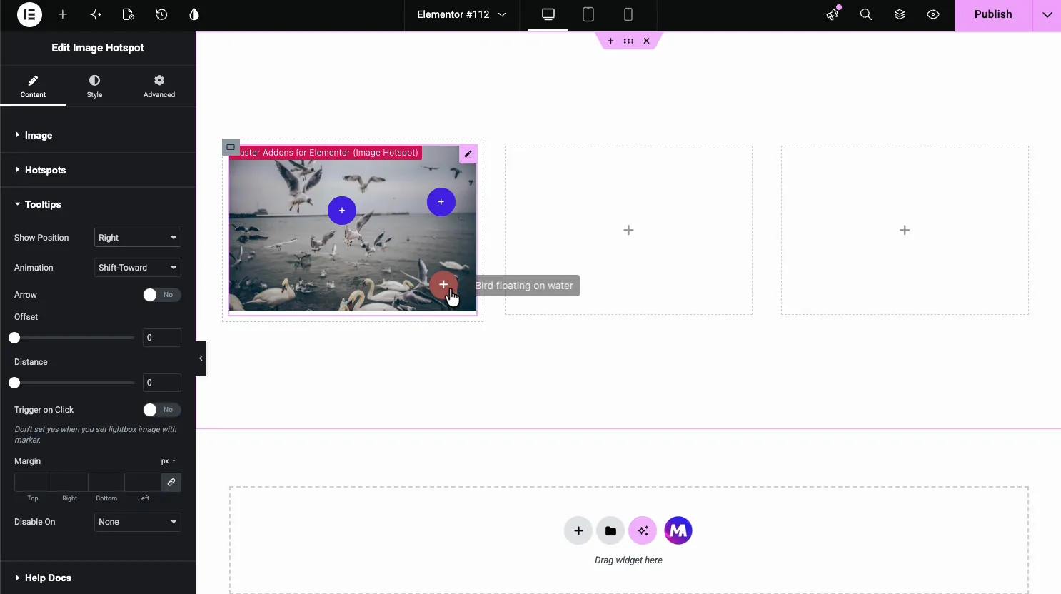
Back in the main Content tab, the Tooltips section controls how labels behave across all markers:
- Show Position: which side of the marker the label opens on (top, bottom, left, right).
- Arrow: toggle a pointer between the marker and the label.
- Animation: the reveal effect when the label appears, such as Shift-Toward.
- Trigger on Click: switches from hover-to-reveal to click-to-reveal. This is the one you want for mobile, since touchscreens do not have hover.
Marker Styling Options
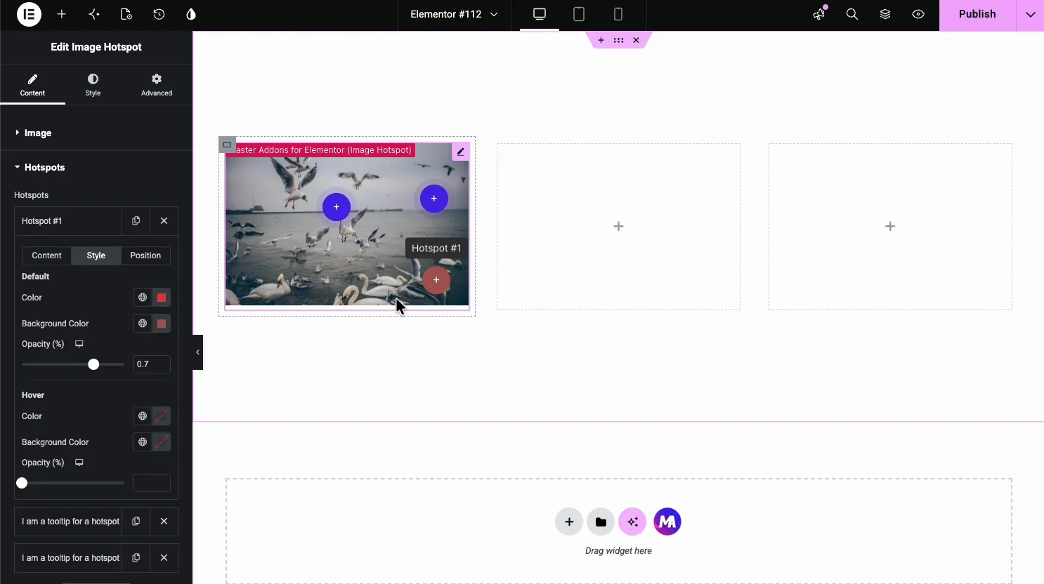
Each hotspot has its own Style tab for the marker’s appearance:
- Default Color and Default Background: the marker at rest.
- Hover Color and Hover Background: how it changes on hover.
- Opacity: how solid the marker looks against the image. Lower values make it more subtle.
Pick a marker color that stands out from the image behind it. A busy photo will swallow a low-contrast marker, and visitors will not notice the hotspots.
Styling the Image and Labels
The widget’s main Style tab has three sections.
Image Panel
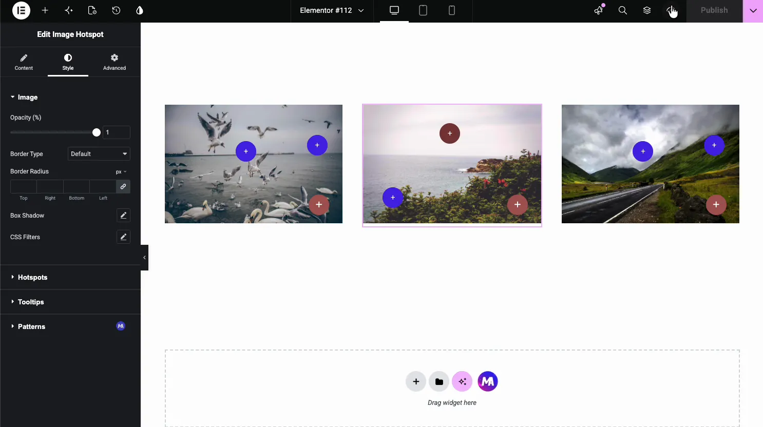
Controls the image itself: opacity, border radius, box shadow, and CSS filters. A border radius or shadow helps the image sit inside a card-style layout. CSS filters let you tweak brightness, contrast, or saturation without re-exporting the image.
Markers Panel
Global settings for all markers: size, text padding, border radius, typography, a transition, and color, background, border, opacity, and box shadow for default and hover. Individual hotspot colors override these.
Labels Panel
Controls the floating panel that appears when a marker is interacted with: background color, text color, typography, padding, border radius, and shadow.
Responsive Behavior on Mobile
Markers use percentage-based positioning, so they stay pinned to the same spot on the image no matter the screen size. The labels resize and reposition to stay within the viewport.
Touch devices do not have hover, so the Trigger on Click toggle in the Tooltips section switches the whole widget to tap-to-reveal. Visitors tap a marker to open the label and tap elsewhere to close it. If your audience is mostly on mobile, turn this on from the start.
On very small screens where labels start to overlap, you can set Disable On to Mobile or Tablet & Mobile and let the marker links do the work instead. Each marker still navigates to its URL on tap.
Image Hotspot vs Tooltip Widget: What Is the Difference?
Master Addons has two features that produce hover labels, and people mix them up:
| Feature | What It Does | Best For |
|---|---|---|
| Image Hotspot widget | Pins interactive markers at specific x/y positions on an image. Each marker opens a label on hover or click. | Annotated photos, product callouts, floor plans, interactive maps. |
| Tooltip widget and Tooltips extension | The Tooltip widget is a standalone hint with its own trigger. The Tooltips extension attaches a hover label to an existing Elementor element, such as a button, icon, text block or section. | Hover hints on buttons, help text on form fields, additional context on any page element. |
Image Hotspot is built for images and places markers by position. If you need markers on a photo, use Image Hotspot. For a hover label on a button or text block that already exists, use the Tooltips extension. If you want a standalone hint instead, the Tooltip widget does that.
Image Hotspot and the Tooltips extension need Master Addons Pro, while the Tooltip widget is in the free plugin. They don’t share selectors or event handlers, so you can use them on the same page.
Tips for Working with Image Hotspots
- Space markers out. Overlapping markers make the image hard to use. If two hotspots sit close together, push their labels to opposite sides or drop one of them.
- Keep labels short. A line or two reads better than a paragraph inside a floating panel. Use the label for a quick summary and link out for the full details.
- Turn on Trigger on Click for mobile. Even if hover works on desktop, touch users need a tap target. The widget handles both modes at the same time.
- Test on different screens. Markers that look well-spaced on a desktop can bunch up on a phone. Check a phone, a tablet, and a wide monitor before publishing.
- Contrast the markers against the image. A bright marker on a dark photo works. A muted marker on a busy background disappears. Use the Hover state to add emphasis when someone focuses on a marker.
- Use the Position tab when alignment matters. Dragging is fast for rough placement. The Position tab with exact percentage values is better when you need markers to line up with specific parts of a diagram or screenshot.
Free vs Pro: What You Get
| Plan | Image Hotspot | Other Widgets |
|---|---|---|
| Free | Not included | Dozens of free widgets such as Dual Heading, Creative Button, Infobox, Advanced Accordion, and the Tooltip widget. |
| Pro | Included | All free widgets plus Image Hotspot, the Tooltips extension, Display Conditions and the rest of the 80+ widgets and extensions. |
The base plugin is free to install from the WordPress repository. The Image Hotspot widget specifically requires a Pro license.
What is an image hotspot in Elementor?
An image hotspot is a small interactive marker placed on top of an image. When a visitor hovers or taps it, a label appears with text, a description, or a link for that specific area of the photo. Elementor Pro has its own Hotspot widget, and Master Addons Pro adds an Image Hotspot widget that can also use small images as markers.
How many hotspots can I add to a single image?
There is no hard limit. Practically, 5 to 7 hotspots per image keeps things readable. Beyond that, markers start overlapping. If you need to annotate more areas, split the content across multiple images.
Do image hotspots work on mobile?
Yes. Touch screens have no hover, so enable Trigger on Click and mobile visitors tap a marker to open its label. Percentage-based positioning keeps hotspots pinned correctly across screen sizes.
Can I link a hotspot to another page?
Yes. Every hotspot has a Link field. The link works when labels open on hover, or on screens where labels are switched off, so a marker can show its label on hover and take the visitor to a product page or external URL on click. With Trigger on Click on, a click opens the label instead.
Is the Image Hotspot widget free or Pro?
The Image Hotspot widget is a Pro feature. The base Master Addons plugin is free, but the hotspot widget requires a Pro license.
What is the difference between the Image Hotspot widget and the Tooltip widget?
The Image Hotspot widget pins interactive markers at specific positions on an image, each showing a label on hover or click. The Tooltip widget is a standalone hint with its own trigger, and the Tooltips extension attaches a hover label to an existing element such as a button, text or icon. Use Image Hotspot for annotated photos and the tooltip options for hover hints on other page elements.
Wrapping Up
The Image Hotspot widget takes a flat image and adds markers that reveal information on hover or click. Upload the image, drop markers on the areas that need explanation, write a short label for each, and style the markers to match your design. Everything happens inside the Elementor editor.
For more on images in Elementor, see the Image Comparison widget and the Image Hover Effects widget. If you need hover labels on buttons or text instead of images, the Tooltip widget tutorial covers that. And the full list of Master Addons widgets and extensions is worth browsing if you want to see what else is available.
Get Master Addons Pro to unlock the Image Hotspot widget and the rest of the 80+ widgets and extensions for Elementor.
