


A skewed background cuts the edge of a section across the page at an angle instead of leaving it flat. It breaks up the usual stack of horizontal bands, and the eye follows the diagonal down into the next section. Landing pages and SaaS homepages use it constantly.
Elementor still has no “skew this section” toggle, so you do it with a few lines of CSS. Trouble is, Elementor’s own Custom CSS field is locked behind Pro. That’s why this tutorial uses the free Custom CSS extension in Master Addons, which adds a CSS box to every element on free Elementor.
This guide has been rebuilt for how Elementor actually works in 2026. The original version of this post was written against Sections and Inner Columns, and both are legacy now. Everything below uses Flexbox Containers, Elementor’s default layout element since 3.6 and the only structure you get on a new page.
What you need before you start
- Elementor free (3.6 or newer, so Containers are on)
- Master Addons: install it free from WordPress.org, then switch on the Custom CSS extension
- A container with a background color or image set. Don’t skip this. Skew transforms the box, so if the box has nothing visible in it, you’ll see no change at all. A transparent container is the number one reason people think this trick is broken.
You won’t need Elementor Pro at any point. If you already have it, its native Custom CSS field behaves the same way, so paste the code there instead.
Understanding the skew before you paste anything
Skewing is a CSS transform. transform: skew(0deg, -10deg) tilts the element along the Y axis by ten degrees, turning its top and bottom edges into diagonals.
What trips people up is that a transform applies to the element and everything inside it. Skew a container and you skew its background, sure, but you also skew the headline, the button, and the image sitting in it. Your text ends up tilted.
So you counter-skew. Nest a second container inside the first and tilt it back by the same amount in the opposite direction. The parent goes to minus ten degrees, the child goes to plus ten, and they cancel. Angled background, upright content.
Two containers, two rules, opposite values. That’s the whole thing.
Step 1: Build the container structure
Open your page in Elementor and drop in a Container. Set its width to Full Width. This is the outer one, the one that carries the angle.
Now drag a second Container inside the first. That nested container holds the actual content: heading, text, button, image, whatever the section is for. Design it however you want.
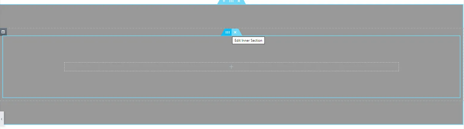
So the structure is:
- Outer container: background color or image, gets the skew
- Inner container: all your content, gets the counter-skew
Maintaining an older page still built on Sections and Inner Sections? The logic is identical. Outer element skews, inner element un-skews. For anything new though, use Containers. They ship a lot less DOM, which adds up if you care about Elementor page speed.
Step 2: Add the skew CSS to the outer container
Select the outer container, go to the Advanced tab, and find the MA Custom CSS box that Master Addons adds. Paste this in:
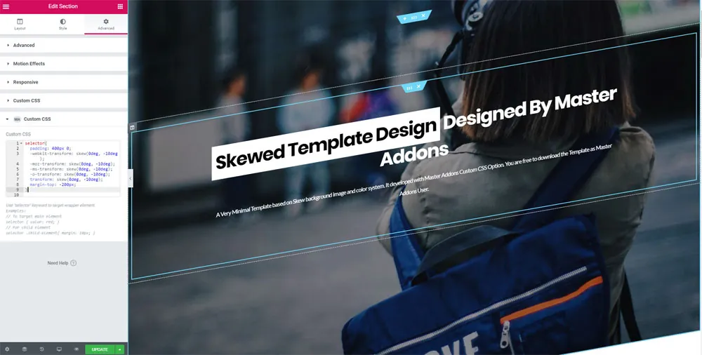
selector {
  padding: 400px 0;
  margin-top: -200px;
  transform: skew(0deg, -10deg);
  overflow: hidden;
}
Here’s what each line is doing, so you can adjust it rather than just hoping:
selectoris Elementor’s shorthand for “this specific element.” Master Addons scopes it for you, so the rule can’t leak onto other containers.padding: 400px 0gives the container enough vertical room for the angled edges to go somewhere. Skew a short container and you just clip the corners off.margin-top: -200pxpulls the container up into the one above it so the diagonal overlaps, instead of leaving a white triangle behind. Half the padding value is a decent starting ratio.transform: skew(0deg, -10deg)is the angle itself. Negative tilts one way, positive the other.overflow: hiddenkeeps the skewed corners from spilling out sideways. Leave it off and you’ll get a horizontal scrollbar, which I’ll come back to.
One thing worth flagging: if you’ve also touched the Transform controls in Elementor’s own Advanced tab, they’ll fight with this CSS, since both write to the same transform property and the last one to load wins. Pick one place to set the angle and leave the other alone.
The 2020 version of this tutorial listed four vendor-prefixed lines (-webkit-, -moz-, -ms-, -o-). Delete them. Unprefixed transform has worked in every browser for about a decade now, and those extra lines just make the CSS box harder to read.
Step 3: Counter-skew the inner container
At this point your content is tilted along with the background. Select the inner container, open its Advanced tab, and paste this into MA Custom CSS:
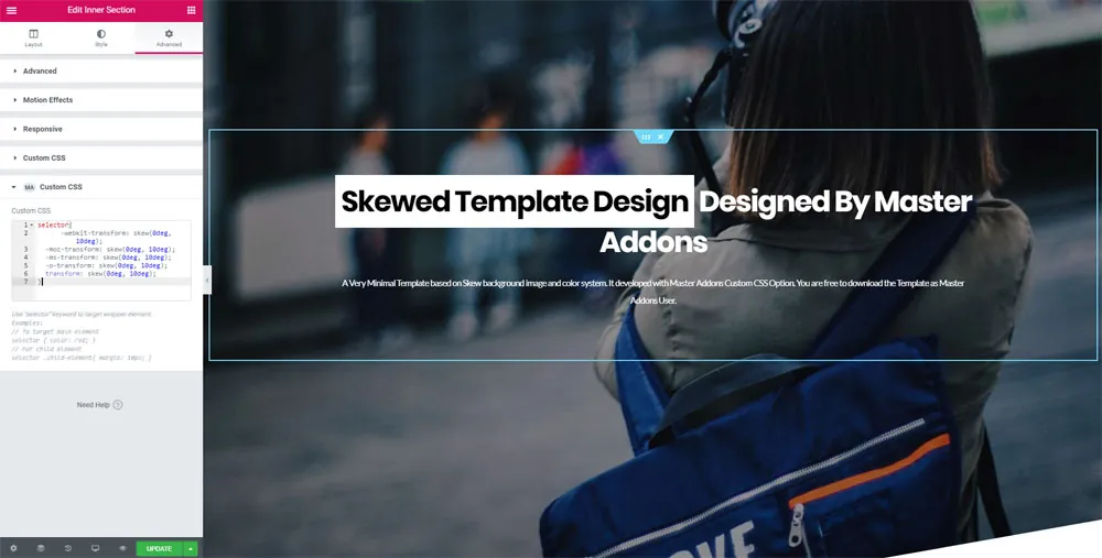
selector {
  transform: skew(0deg, 10deg);
}
Same number, opposite sign. Outer container at -10deg means inner container at 10deg. Change one without changing the other and your text sits at a slight angle that readers notice even if they can’t say why.
Save and preview. You should have an angled background with straight content sitting on top of it. If the editor still shows it tilted, reload the editor tab; custom CSS occasionally lags in the preview iframe.
Step 4: Fix the mobile overflow (do not skip this)
Most tutorials stop at step 3, and this is why skewed sections get pulled back out of live sites a week later.
Skew a full-width element and its corners push out past the edge of the viewport. On desktop, nobody notices. On a phone, that overhang gives you a horizontal scrollbar and the page starts sliding sideways under the user’s thumb. It reads as broken, because it is.
Two things prevent it:
- Keep
overflow: hiddenon the skewed container, as in the code above. - Reduce the angle on small screens. A 10-degree skew that looks sharp on a 1440px monitor turns into a harsh diagonal on a 375px phone, and it eats into your headline.
Add this underneath the code in the outer container’s CSS box:
@media (max-width: 767px) {
  selector {
    padding: 200px 0;
    margin-top: -100px;
    transform: skew(0deg, -4deg);
  }
}
And the matching reversal in the inner container:
@media (max-width: 767px) {
  selector {
    transform: skew(0deg, 4deg);
  }
}
Now the effect scales down instead of wrecking the layout. Test it on a real phone, not just the editor’s responsive preview, since the preview pane doesn’t always reproduce the overflow. If you run custom breakpoints rather than Elementor’s defaults, the Custom Breakpoints plugin lets you match these media queries to your actual device widths.
The modern alternative: clip-path, with no counter-skew at all
Skew-and-counter-skew works, and it’s what the original tutorial taught. There’s a cleaner way now though, and for a new build it’s usually the one I’d reach for.
clip-path cuts a shape out of the element rather than transforming it. Since it clips instead of rotating, the content inside never moves, so there’s no nested container and no second value to keep in sync.
One container, one rule:
selector {
  padding: 160px 0;
  clip-path: polygon(0 0, 100% 6%, 100% 100%, 0 94%);
}
Those four coordinates are the corners, clockwise from top-left. Nudge the percentages to change the angle: raise the 6% for a steeper cut, drop it toward 0 for something subtler. You can also angle only the bottom edge and leave the top flat, which is the usual pattern for a hero.
Which method should you use?
| Situation | Use | Why |
|---|---|---|
| New page, want an angled edge | clip-path | One container, one rule, content is never touched |
| You want the background image itself to tilt | skew | clip-path cuts the box, it does not rotate what is inside it |
| Only one edge should be angled | clip-path | Skew always tilts both edges together |
| Maintaining an older page already built with skew | skew | No reason to rebuild something that works |
Every current browser handles both. Check the clip-path support tables on MDN if you’re stuck supporting something unusual.
Skip the CSS entirely: import the ready-made template
Don’t want to touch code? The skewed background layout ships as a template. Edit any page with Elementor, click the Master Addons Template Library icon next to the add-element button, and look for the skew background template. Import it, then swap in your own text and colors.
Same technique, already wired up. The Master Addons Template Library has ready pages, sections, headers, and footers built the same way, and the Elementor template kits go further with full multi-page site designs.
Where skewed backgrounds actually work
Worth saying, because this effect gets overused: angled sections earn their keep when they mark a transition. Hero into features, features into pricing, pricing into testimonials. They give a long page some rhythm.
They stop working when every section is angled. Nothing reads as a transition anymore and the page just feels busy. On a long landing page, two or three angled edges is usually enough.
If you want more depth without the geometry, other effects layer well on top. Animated gradient backgrounds (Pro) add slow color movement, particles add an interactive layer, and glassmorphism gives cards a frosted look that sits well against a skewed panel. The Transforms extension (Pro) also puts rotate, scale, and skew controls in the Elementor UI, if you’d rather drag a slider than type degrees.
Troubleshooting
- Nothing changed. The container has no background. Set a color or image and look again.
- The whole page scrolls sideways. Add
overflow: hiddento the skewed container, then check that its parent isn’t overflowing too. - The text is still tilted. The counter-skew is on the wrong element, or the sign is wrong. If the outer container is negative, the inner one has to be positive.
- White gap above the section. Increase the negative
margin-topso the angle pulls further into the section above. - The angle jumps around unpredictably. Elementor’s built-in Transform controls are set on the same element and are overriding your CSS. Clear them.
- No MA Custom CSS box on the Advanced tab. The extension is switched off. Master Addons, then Settings, then Extensions, and enable it.
Frequently asked questions
Can I create a skewed background in Elementor free?
Yes. Elementor free has no Custom CSS field, but the Master Addons Custom CSS extension adds one to every element, and it’s free. Paste the skew transform into the MA Custom CSS box on the container’s Advanced tab. No Elementor Pro license needed.
Why is my text slanted after skewing the section?
A CSS transform applies to the element and all its children, so the content tilts along with the background. Nest a container inside and give it the opposite skew value. Outer container at -10deg, inner one at 10deg, and the two cancel out.
Does a skewed background hurt page speed?
No. Both transform and clip-path are GPU-accelerated properties the browser’s compositor handles. They add no scripts and no extra HTTP requests. A few lines of CSS costs far less than an image of an angled shape.
How do I change the angle of the skew?
Edit the degree value. skew(0deg, -10deg) is a moderate tilt, -5deg is subtle, -15deg is dramatic. Change the outer container’s value and the inner container’s counter-value together, keeping them equal and opposite.
Do I still need vendor prefixes like -webkit-transform?
No. Unprefixed transform has worked in every major browser for years. The prefixed lines in older tutorials, including the 2020 version of this one, are safe to delete.
Wrapping up
Creating a skewed background in Elementor comes down to two rules in two CSS boxes: skew the outer container, counter-skew the inner one. Add overflow: hidden, ease off the angle on mobile, and it’ll hold up on real devices rather than only in the editor. On a new build, clip-path gets you the same look with half the setup.
All of it runs on free Elementor, since Master Addons is what puts the Custom CSS box there to begin with. If you later want the rest of the toolkit (Theme Builder, Popup Builder, the full extension set), that’s what Pro covers, but nothing in this tutorial needs it.
Related reading: Elementor animation effects, how to add floating effects in Elementor, and how to create a sticky header in Elementor.
