---
title: Visual Choice
description: "The Visual Choice field adds a row of clickable image cards to a custom widget built with the Master Addons [Widget Builder](https://master-addons.com/widget-builder/). Each card is a small picture of an option, so editors choose a layout or style by looking…"
url: "https://master-addons.com/docs/widget-builder/visual-choice/"
updated: "2026-09-17"
category: Widget Builder
---
# Visual Choice
The Visual Choice field adds a row of clickable image cards to a custom widget built with the Master Addons [Widget Builder](https://master-addons.com/widget-builder/). Each card is a small picture of an option, so editors choose a layout or style by looking at it. Your template gets the key of the card they clicked.
Visual Choice is a Pro field. The free plugin includes a limited Widget Builder, and the full set of fields comes with [Master Addons Pro](https://master-addons.com/pricing/).
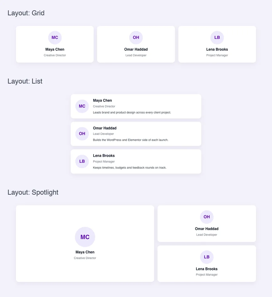
## What the Visual Choice field does
- It shows your options as image cards in the Elementor panel. The selected card gets a highlight.
- Each option has a key, a title and an image. The title is used as the card's tooltip and alt text.
- Your template receives the selected key, such as `grid` or `list`, which you can use in a class name or an `{% if %}` check.
- The Columns setting controls how many cards sit in one row of the panel.
If you haven't built a widget yet, read the [Widget Builder overview](https://master-addons.com/docs/widget-builder/widget-builder-settings/) first. For choices that read fine as text or icons, the [Select](https://master-addons.com/docs/widget-builder/select/) and [Choose](https://master-addons.com/docs/widget-builder/choose/) fields are quicker to set up.
## Before you start
- WordPress with Elementor installed and active.
- Master Addons for Elementor and Master Addons Pro, both active. The [installation guide](https://master-addons.com/docs/getting-started/installing-plugin/) covers setup.
- A small image for each option. Simple line drawings about 240 by 160 pixels, saved as PNG with a transparent background, look clean on Elementor's dark panel.
- A widget open in the Widget Builder. The example in this guide is a "Team Showcase" widget with three layouts: Grid, List and Spotlight.
## How to add a Visual Choice field
1. Go to **Master Addons > Widget Builder** and open your widget.
2. On the **Content** tab, add a section. A layout picker usually goes first, so editors choose the structure before anything else.
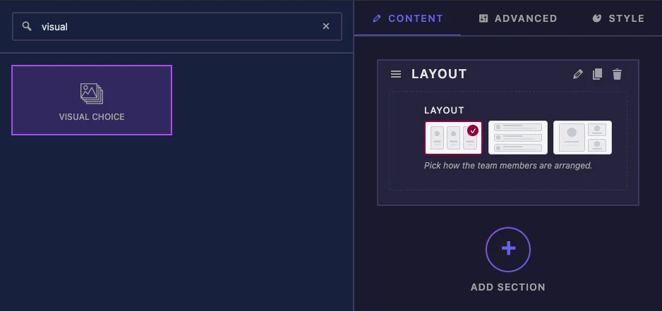
3. Type `visual` in the field search box on the left.
4. Drag **Visual Choice** into the section. Its settings open in the left sidebar.
## Visual Choice field options explained
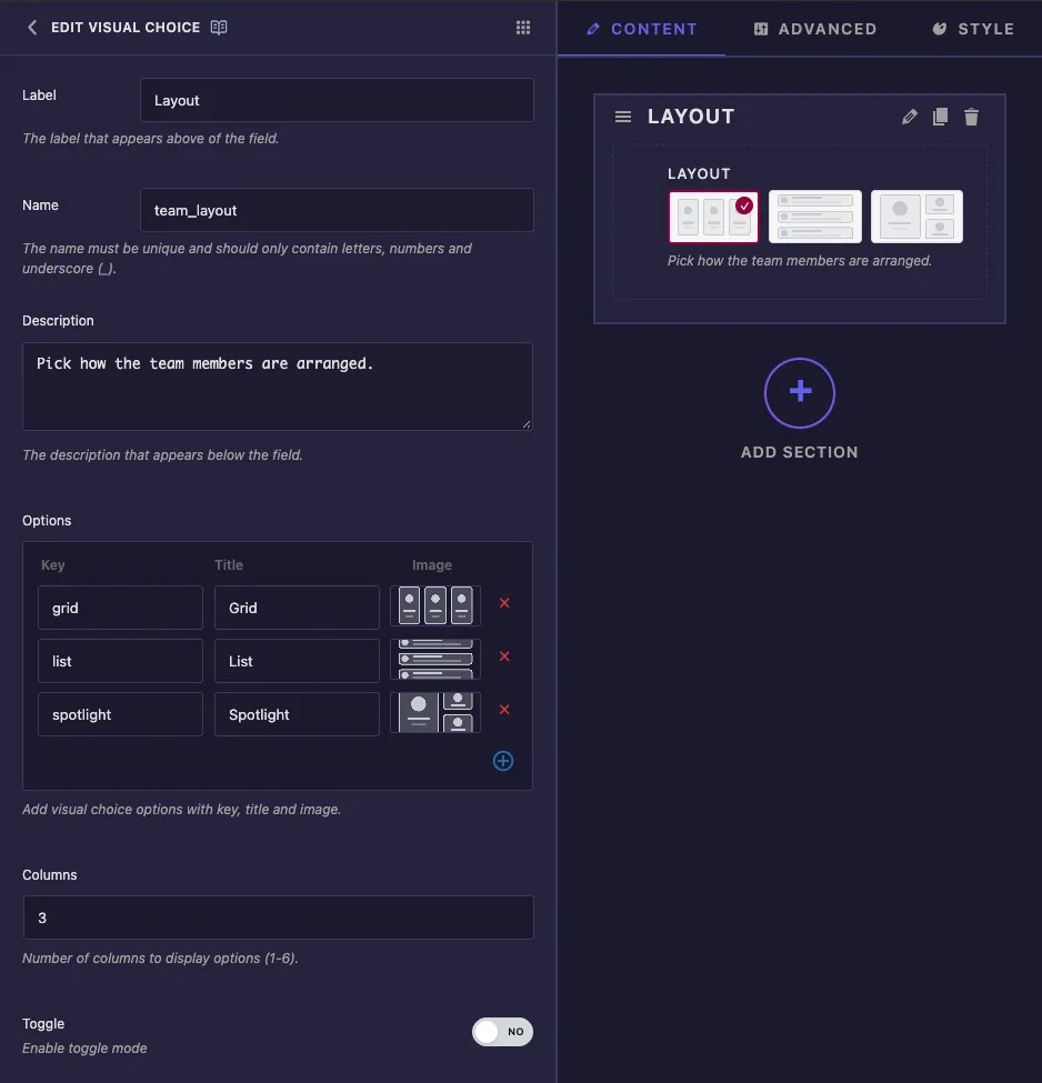
- **Label** is the text above the cards in Elementor, for example "Layout".
- **Name** is the field's unique ID and its template token, so `team_layout` becomes `{{team_layout}}`. Letters, numbers and underscores only.
- **Description** appears under the cards in Elementor.
- **Options** holds one row per card. **Key** is the value your template gets (keep it short and lowercase, like `grid`). **Title** names the card. Click the **Image** box to open the Select Image window, upload a file or pick one from the Media Library, then click **Use this image**. The plus icon adds a row and the red cross removes one.
- **Columns** sets how many cards fit in one row, from 1 to 6. Type the number even if the box already shows 2. The shown number isn't saved until you change it, and without a saved value Elementor puts one card in each row.
- **Toggle** is listed in the panel, but in our tests it made no difference. Editors could always click the selected card again to clear it.
The common settings below work as they do on other fields, including [Conditions](https://master-addons.com/docs/widget-builder/conditions/). The panel has no Default Value for this field, so a new copy of the widget starts with no card selected.
Click **Save Settings** after you add the options.
## Use the selected key in your template
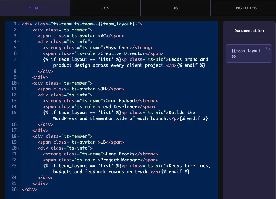
`{{team_layout}}` prints the key of the selected card. The simplest way to use it is a modifier class:
```
...
```
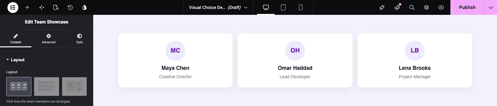
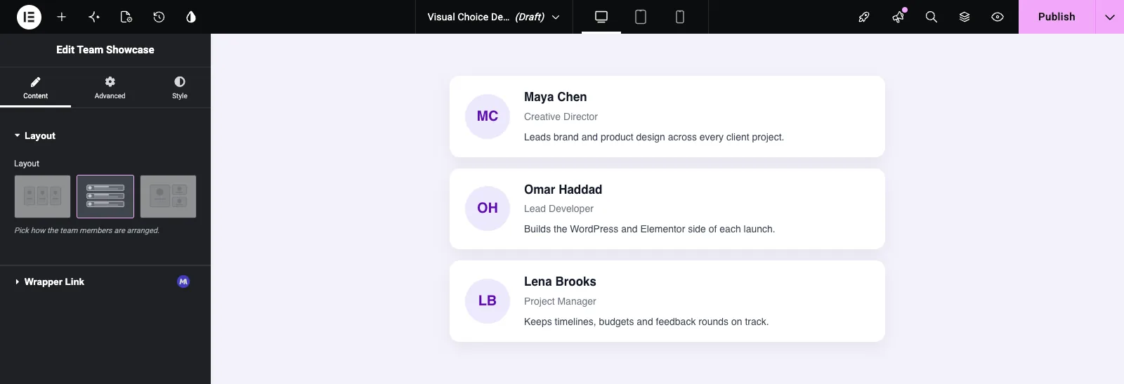
With Grid selected, that renders `ts-team--grid`. When a layout needs different markup, check the key with `{% if %}`. The example shows a short bio only in the List layout:
```
{% if team_layout == 'list' %}
Leads brand and product design across every client project.
{% endif %}
```
Then write one set of CSS rules per key:
```
.ts-team--grid { grid-template-columns: repeat(3, 1fr); }
.ts-team--list { grid-template-columns: 1fr; }
.ts-team--spotlight { grid-template-columns: 1.4fr 1fr; }
```
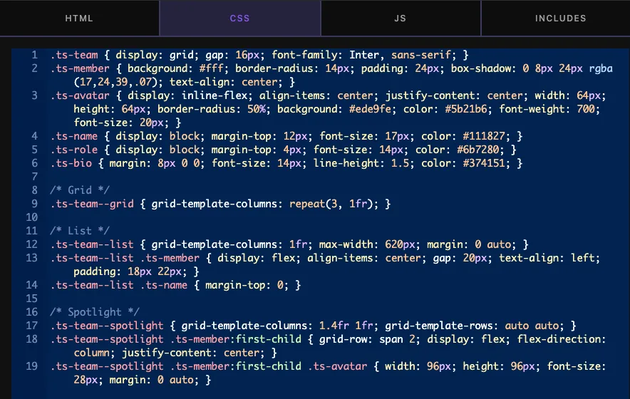
Until an editor clicks a card, the token prints nothing, and the class above becomes `ts-team--`. Give the base `.ts-team` class a layout that looks fine on its own, so the widget never appears broken before a choice is made.
## Use the Visual Choice control in Elementor
Add the widget to a page, or reload the editor if the page was already open. The cards appear on the Content tab. Click one and the canvas updates straight away.
Clicking List switches the team to rows, and the `{% if %}` block adds the bios:
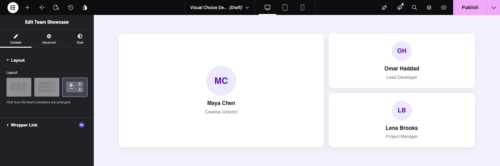
Spotlight makes the first member larger:
Click the selected card again to clear the choice. The template then gets an empty key, as described above.
## Common use cases
- Layout pickers for team, blog, portfolio and testimonial widgets.
- Card or header styles that are easier to recognise from a picture than from a name.
- Image position choices, such as image left, image right or image on top.
- Preset designs that switch several CSS rules at once with one class.
## Tips for working with the Visual Choice field
- Use the same drawing style for every option image, so the cards look like one set.
- Keep keys short, lowercase and free of spaces. They end up in class names.
- Don't rename a key once the widget is in use. Pages that saved the old key won't match your new CSS.
- Set Columns to the number of options when you have three or fewer, so all the cards sit in one row.
- Style the empty state. Until someone picks a card, the key is blank.
## Frequently Asked Questions
Is the Visual Choice field free?
No. Visual Choice is one of the Pro fields in the Widget Builder, so Master Addons Pro has to be active before you can add it to a widget.
What does the template get when a card is selected?
The option's key. If the Grid card has the key `grid`, `{{team_layout}}` prints `grid`. The title and image are only used in the panel.
Why does my widget show only one card per row in Elementor?
Columns wasn't saved. Type a number in the Columns box, even if it already shows 2, then save the widget and reload Elementor.
Can I set which card is selected by default?
Not from the field panel, which has no Default Value for Visual Choice. Style the base class so the widget looks right before a card is picked.
Can Visual Choice add a class to the widget wrapper?
Not from the field panel. Print the key inside your own markup instead, for example `class="ts-team ts-team--{{team_layout}}"`, and target that class in your CSS.
## Wrapping up
Give each option a key, a title and an image, type a Columns value, and use `{{field_name}}` in a class name or an `{% if %}` check. Plan for the empty state, since nothing is selected until an editor clicks a card. For picking from a text list instead, see the [Select2 field](https://master-addons.com/docs/widget-builder/select2/), and check [pricing](https://master-addons.com/pricing/) for what each plan includes.