---
title: Textarea Field
description: "When a custom widget needs more than a single line, the **Textarea field** is the one to use. It gives editors a multi-line box for paragraphs, descriptions, and any longer block of plain text. Inside the Master Addons [Widget Builder](https://master-addons.com/widget-builder/),…"
url: "https://master-addons.com/docs/widget-builder/text-area/"
updated: "2026-08-06"
category: Widget Builder
---
# Textarea Field
When a custom widget needs more than a single line, the **Textarea field** is the one to use. It gives editors a multi-line box for paragraphs, descriptions, and any longer block of plain text. Inside the Master Addons [Widget Builder](https://master-addons.com/widget-builder/), you drop a Textarea field into your widget panel, name it, and its shortcode prints whatever the user types into your HTML, CSS, or JS.
Like every Widget Builder field, the Textarea supports [Conditions](https://master-addons.com/docs/widget-builder/conditions/), so the control can appear only when another field calls for it. Its token prints through the [Twig-syntax template engine](https://master-addons.com/docs/widget-builder/twig-syntax/), which also gives you filters like `|trim` and `{% if %}` checks around the output.
It works like the [Text field](https://master-addons.com/docs/widget-builder/text/), with one extra control: **Rows**, which sets how tall the input box is. Use the Text field for short single-line strings like a headline, and the Textarea field for the paragraph that sits under it.
## What the Textarea field does
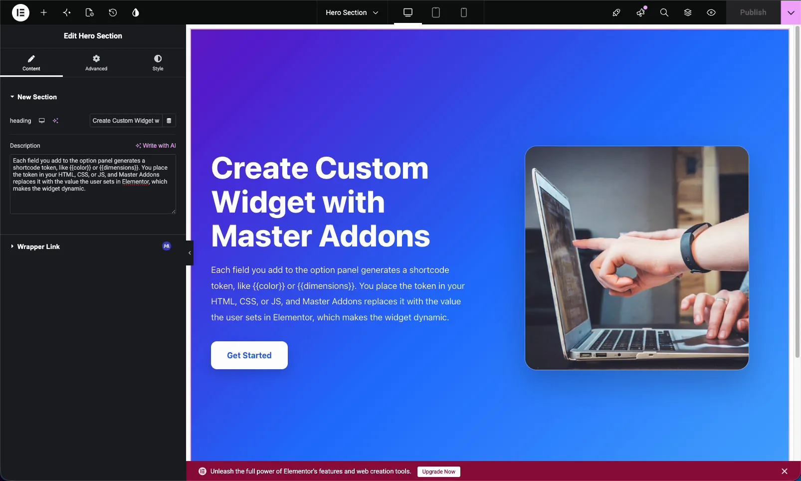
The Textarea field renders a multi-line text input in the widget's option panel. When someone edits your custom widget in Elementor, they type into that box and your widget outputs the text wherever you placed the matching shortcode. Line breaks and longer copy are no problem, which is what sets it apart from the single-line Text field.
For text that needs formatting like bold, links, or lists, use the [WYSIWYG field](https://master-addons.com/docs/widget-builder/wysiwyg/) instead. The Textarea field is for plain multi-line text. New to building widgets? Start with the [Widget Builder overview](https://master-addons.com/docs/widget-builder/widget-builder-settings/).
## Before you start
- **WordPress** with **Elementor** installed and active.
- **Master Addons for Elementor** installed and active. New to the plugin? See the [installation guide](https://master-addons.com/docs/getting-started/installing-plugin/).
- A custom widget open in the Widget Builder editor.
## How to add a Textarea field
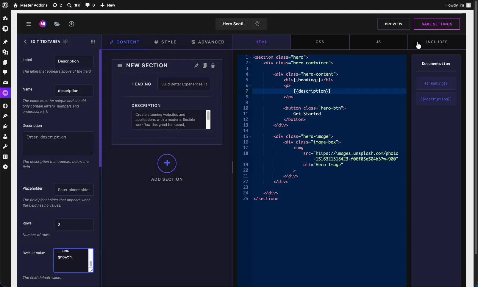
In the Widget Builder editor, find the fields panel on the left and drag the **Textarea** field into a section under the **Content**, **Style**, or **Advanced** tab. Description and paragraph fields usually belong under Content. Once the field is in place, its options open on the left and its shortcode appears in the **Documentation** sidebar next to the code editor.
## Textarea field options explained
Select the Textarea field to open its settings. These options control how the input looks and behaves in Elementor.
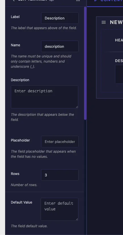
- **Label:** the text shown above the field in Elementor, for example "Description".
- **Name:** the unique identifier for the field. It must contain only letters, numbers, and underscores. This name becomes your shortcode, so a field named `description` gives you `{{description}}`.
- **Description:** optional helper text shown below the field to explain what it controls.
- **Placeholder:** the faint hint shown when the box is empty. It guides the editor without setting a real value.
- **Rows:** how many lines tall the input box is. The default is 3. Bump it up for longer copy so editors can see more text at once.
- **Default Value:** the starting text. Set a sample paragraph here so the widget looks finished before anyone edits it.
## Common settings: responsive, dynamic, and more
Below Default Value you get the same **Common Settings** as every other field in the builder. The ones you will reach for most:
- **Show Label** and **Label Block:** control whether the label shows and where it sits.
- **Responsive Control:** let editors set different text for desktop, tablet, and mobile.
- **Dynamic Support:** enable Elementor dynamic tags so the field can pull its value from a source like the post excerpt.
- **Frontend Available:** expose the value to frontend JavaScript when your widget's JS needs to read it.
- **Separator** and **Conditions:** add a divider, or show and hide the field based on another control.
These behave the same way they do on the Text field, so the [Text field documentation](https://master-addons.com/docs/widget-builder/text/) covers each one in detail.
## Connect the field to your code
Every Textarea field generates a shortcode from its Name. A field named `description` produces the token `{{description}}` in the Documentation sidebar. Drop that token into your HTML where the paragraph belongs, usually inside a `` tag.
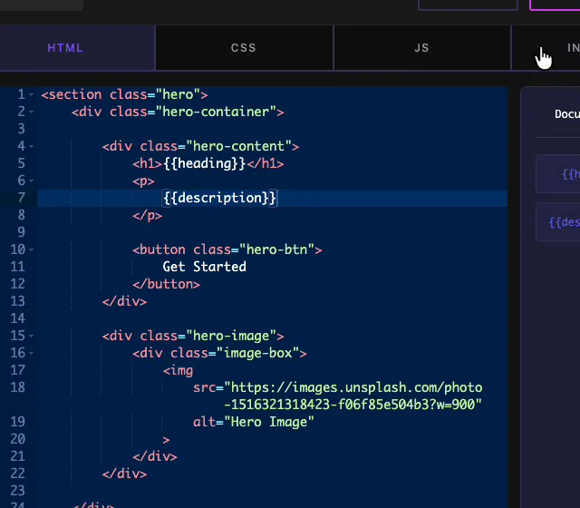
In a hero layout, the pattern is simple: the [Text field](https://master-addons.com/docs/widget-builder/text/) token sits in the `
`, and the Textarea token sits in the `
` below it. Save the widget, and both lines print whatever values the user enters in Elementor. The same token works in your CSS or JS too if you need the text there.
## Use the Textarea control in Elementor
Drag your custom widget onto a page and open it in the Elementor editor. The Textarea field shows up as a multi-line box with your label, placeholder, and default value already filled in. Type or paste your copy and the widget updates live on the canvas.
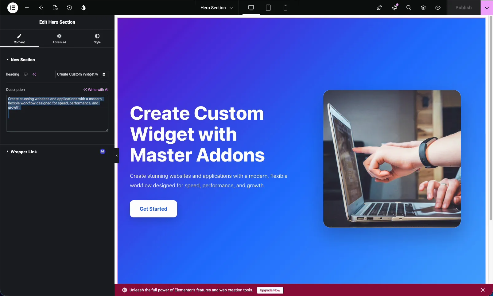
Because it is a standard Elementor control, it sits right alongside the rest of your widget's fields. If you turned on Dynamic Support, the dynamic tags icon shows up next to the box so editors can pull the text from a source instead of typing it. One small thing to remember: the Textarea outputs plain text, so a line break in the box becomes a line break, not a new paragraph. If you need real paragraph tags, that is a job for the WYSIWYG field.
## Textarea vs Text vs WYSIWYG
The builder gives you three text inputs. Pick the one that matches the content:
| Field | Best for | Formatting |
| --- | --- | --- |
| **Text** | Short single-line strings (headlines, labels, button text) | Plain text, one line |
| **Textarea** | Multi-line plain text (paragraphs, descriptions) | Plain text, multiple lines |
| **WYSIWYG** | Rich content that needs styling | Bold, links, lists, headings |
## Common use cases
- **Hero descriptions** under a headline.
- **Section intros** and feature blurbs.
- **Card or testimonial body text.**
- **Short bios** and about-us copy.
- **Any plain paragraph** an editor should be able to change without code.
## Tips for working with the Textarea field
- **Set Rows to fit the content.** Three rows suit a short blurb. Use five or more for longer descriptions so editors are not fighting a tiny box.
- **Always add a Default Value.** It keeps the widget looking complete the moment it is dropped on a page.
- **Name the field clearly.** `description` reads better in your code than `field_2`, and it becomes the shortcode.
- **Reach for WYSIWYG only when you need formatting.** Plain paragraphs stay cleaner in a Textarea.
- **Build the field before referencing its shortcode.** The token exists only after the field is on the panel.
## Frequently Asked Questions
What is the Textarea field in the Master Addons Widget Builder?
The Textarea field adds a multi-line text box to a custom Elementor widget. You name the field, place its shortcode in your code, and whatever a user types in Elementor prints into your widget. It suits paragraphs and longer plain text.
What is the difference between the Text field and the Textarea field?
The Text field is a single-line input for short strings like headlines and labels. The Textarea field is a multi-line box for paragraphs and descriptions, and it adds a Rows option to control the height of the input.
What does the Rows option do?
Rows sets how many lines tall the Textarea box appears in the Elementor panel. The default is 3. Increasing it gives editors a taller box so they can see more of a long paragraph while typing. It does not limit how much text they can enter.
Can the Textarea field use dynamic tags?
Yes. Turn on Dynamic Support in the field's Common Settings. In Elementor, the dynamic tags icon then appears next to the box, so the field can pull its text from a dynamic source like the post excerpt instead of static content.
Should I use a Textarea or the WYSIWYG field?
Use the Textarea field for plain multi-line text with no formatting. Use the WYSIWYG field when the content needs bold, italics, links, lists, or headings, since it gives editors a full visual editor instead of a plain box.
## Wrapping up
The Widget Builder Textarea field is the easiest way to make a paragraph in a custom Elementor widget editable. Name it, set the rows, add a default, and drop its shortcode in your code. After that, anyone can update the copy from Elementor without touching the markup. Have a look at the rest of the [Master Addons widgets and extensions](https://master-addons.com/widgets-and-extensions/), and check the [pricing page](https://master-addons.com/pricing/) for what each plan includes.